Renovation Diary: Our Living Room and Fireplace Revamp

I have lived in period properties pretty much all my life bar a brief stay in a soviet style 1960s halls of residence during my university years. Think less the gleaming spires of Cambridge and more solid concrete Stalin. However bar that brutalist blip I have always been #TeamEdwardianVictorian. The first flat we bought was Edwardian as was our first house. But three kids in when we looking for more space it quickly became apparent that sizing up to a bigger period property in our area would require £500K that we didn’t have (unless there is a lot more loose change down the back of the sofa than I thought). So what we have ended up buying is a 1930 house which offers us the extra space we were after but the compromise is it doesn’t have much in terms of period features.

The Edwardian house and all it’s period features that we have left behind

The Edwardian house and all it’s period features that we have left behind


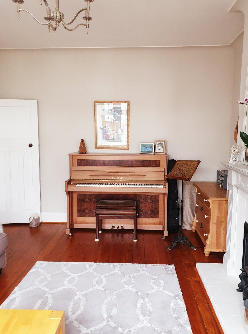
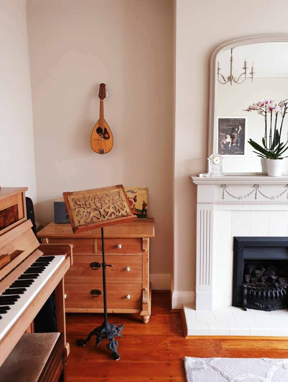
The living room is a case in point. It is a nice wide room with high ceilings neutrally decorated by the previous owner so it feels light and spacious but we have little in the way of attractive cornicing or decorative ceiling roses and no grand fireplace crafted from marble from Roman times. When thinking about how to decorate it to make it a bit more Malmo I had two choices: try and inject some period features into it or go in a totally different direction and try a more contemporary look. My inner Edwardian was shocked to find that I actually leaned towards the latter rather than the former option. There were a couple of key changes I had in mind to take it Twenty First Century. This first was a fairly straight forward sand and oil of the floors to take them down from David Dickinson Orange to Dinesen Doppelgangers.

The living room as it was when we came to view the house. A nice big room but not much in the way of period features

The living room as it was when we came to view the house. A nice big room but not much in the way of period features

Overhauling the fireplace and taking the floors down to a more Scandi shade were two of the main things I wanted to tackle

Overhauling the fireplace and taking the floors down to a more Scandi shade were two of the main things I wanted to tackle

Introducing our own furniture and a few artfully displayed magazines helped to make it feel more us in the short term

Introducing our own furniture and a few artfully displayed magazines helped to make it feel more us in the short term

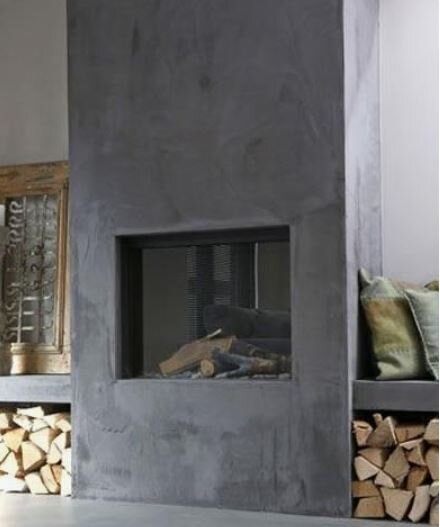
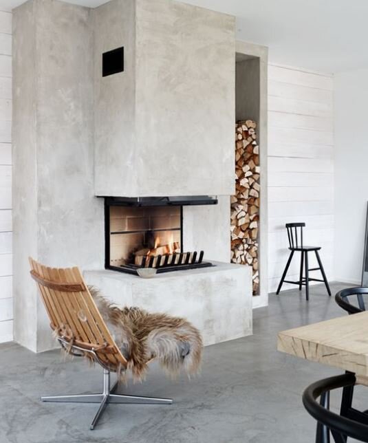
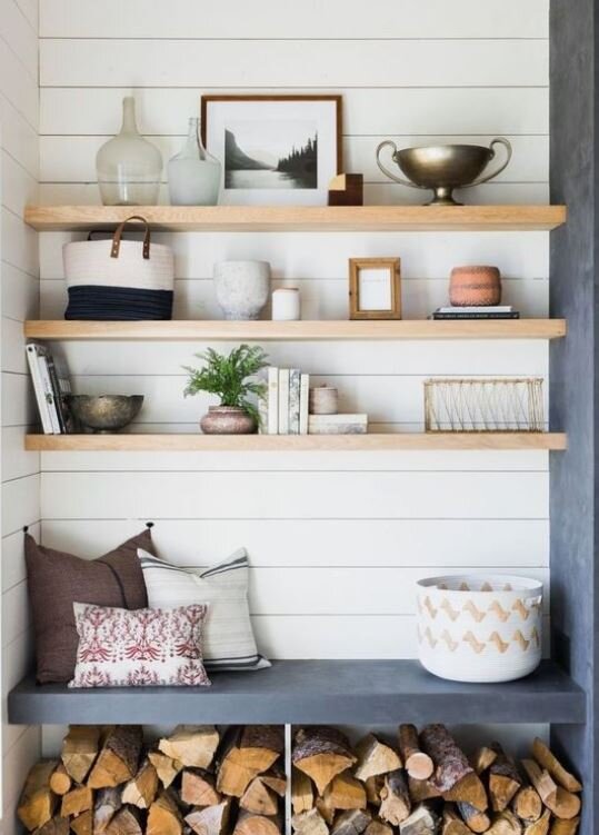
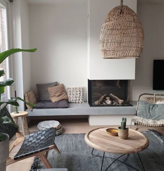
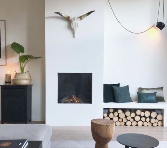
The second change was much more likely to set off Mr Malmo’s “No Fucking Way” alarm because it involved ripping out the existing gas fire, building out the chimney breast, creating two benches either side in the alcoves and then micro cementing the lot. My inspo for this design decision came via Pinterest as well as from a couple of my fave American DIY accounts.

With Tony (Vintage Curator Interiors amazing builder) and, incredibly, Mr Malmo on board we got to work at the end of November. The first step was to cap off and remove the old gas fire and fireplace surround and to then build out the chimney breast by approx 25cm.

Progress by the end of day one: the old fireplace surround is no more and the gas fire is on its way to join it

Progress by the end of day one: the old fireplace surround is no more and the gas fire is on its way to join it

With the old fireplace gone the next step was to build the chimney breast out 25cm and add benches in the alcoves either side.

With the old fireplace gone the next step was to build the chimney breast out 25cm and add benches in the alcoves either side.

Once the structure was extended the next step was to clad it in fire proof plaster board which would then be micro cemented.

Once the structure was extended the next step was to clad it in fire proof plaster board which would then be micro cemented.

I want to be able to give you a detailed description of how this was all done but by Tony’s own admission the young lad he had labouring for him was about as cheerful as Nora Batty with PMT and favoured communication by grunt instead of speech so I mainly stayed out his way instead of taking progress pics. The biggest and messiest part of the job was definitely the micro cementing which required three layers to be applied and then sanded down with a tool that made a kind of high pitch whiny noise not unlike a whippet that has got its tail trapped in a door. You then apply a top coat of oil to seal it. Tony bought the microcement from Imperia Italia in North London and if you fancied having a go with it in your own home they run courses showing you how to do it.

Imperia Italia have a range of different shades to chose from but I went for a natural very pale grey

Imperia Italia have a range of different shades to chose from but I went for a natural very pale grey

This was the microcement after 2 coats. It looked quite shiny at that point so I was feeling a little bit nervous!

This was the microcement after 2 coats. It looked quite shiny at that point so I was feeling a little bit nervous!

Luckily after a third sanding down it lost that sheen and started to look just how I had pictured it

Luckily after a third sanding down it lost that sheen and started to look just how I had pictured it

I am fairly sure that after 3 solid days of this process neither my neighbours nor Tony ever wanted to talk to me again but the end results are 100% worth it. Although a lot of the inspo pics I liked had a dark grey finish I was worried that might be a bit imposing given the height and width of the chimney breast so I opted for a much lighter shade of grey. I couldn’t be happier with how it looks against the newly pale wooden floor which we (well Tony) sanded down and then oiled with Bona wax in Frosted.

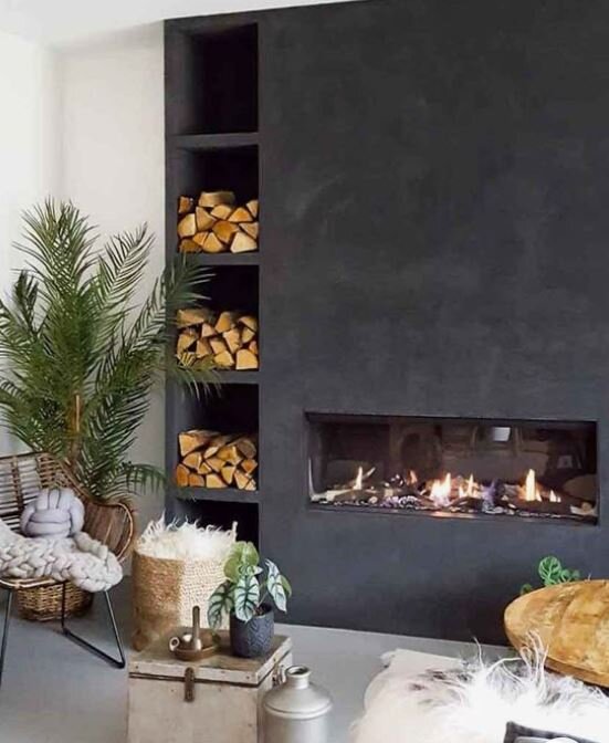
This is the fireplace from Pinterest that was one of my inspo pics but I decided that this shade of grey might be too imposing

This is the fireplace from Pinterest that was one of my inspo pics but I decided that this shade of grey might be too imposing

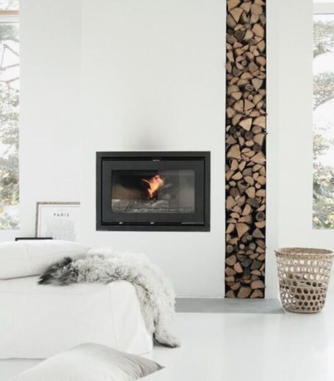
I spent a lot of time trying to decide whether to go for a freestanding or inset wood burner. All of the inspo pics I was drawn to had an inset one but I was worried that given we had a fairly large, wide chimney breast that an inset one might look lost and more like a wayward microwave oven than a stove. However my mind was made up to go for one as soon as I clapped eyes on the Arada i750 Series stove. Arada are a small British Company established in 1966 who manufacture all of their stoves in Dorset. It has really crisp contemporary lines unlike a lot of other ones I had seen and crucially at 750mm wide it was big enough not to feel lost in the space. They also have a freestanding woodburner in the same range which has the same clean contemporary good looks! It is also DEFRA exempt meaning it can be used in smoke control areas. Tony created a rendered opening ready for its installation and then we used Essex Stoves & Chimneys to install it based on the recommendation of one of our old neighbours.

John from Essex Stoves & Chimneys on the day of installation

John from Essex Stoves & Chimneys on the day of installation

Waiting for the flue to come down the chimney to connect to the i750 Arada Stove

Waiting for the flue to come down the chimney to connect to the i750 Arada Stove

They were very reasonable as well as professional with the other quotes we had from companies ranging from £1500 to £3000. They do installation across London and the home counties. One of the largest costs is actually having to hire the scaffold to enable them to get up on the roof. The most dramatic/instagrammable part of the installation is putting the flue down to connect up to the stove.

John waiting to feed the flue pipe up to the guys on the roof

John waiting to feed the flue pipe up to the guys on the roof

In it goes! Did I mention before that the new house has a balcony?!

In it goes! Did I mention before that the new house has a balcony?!

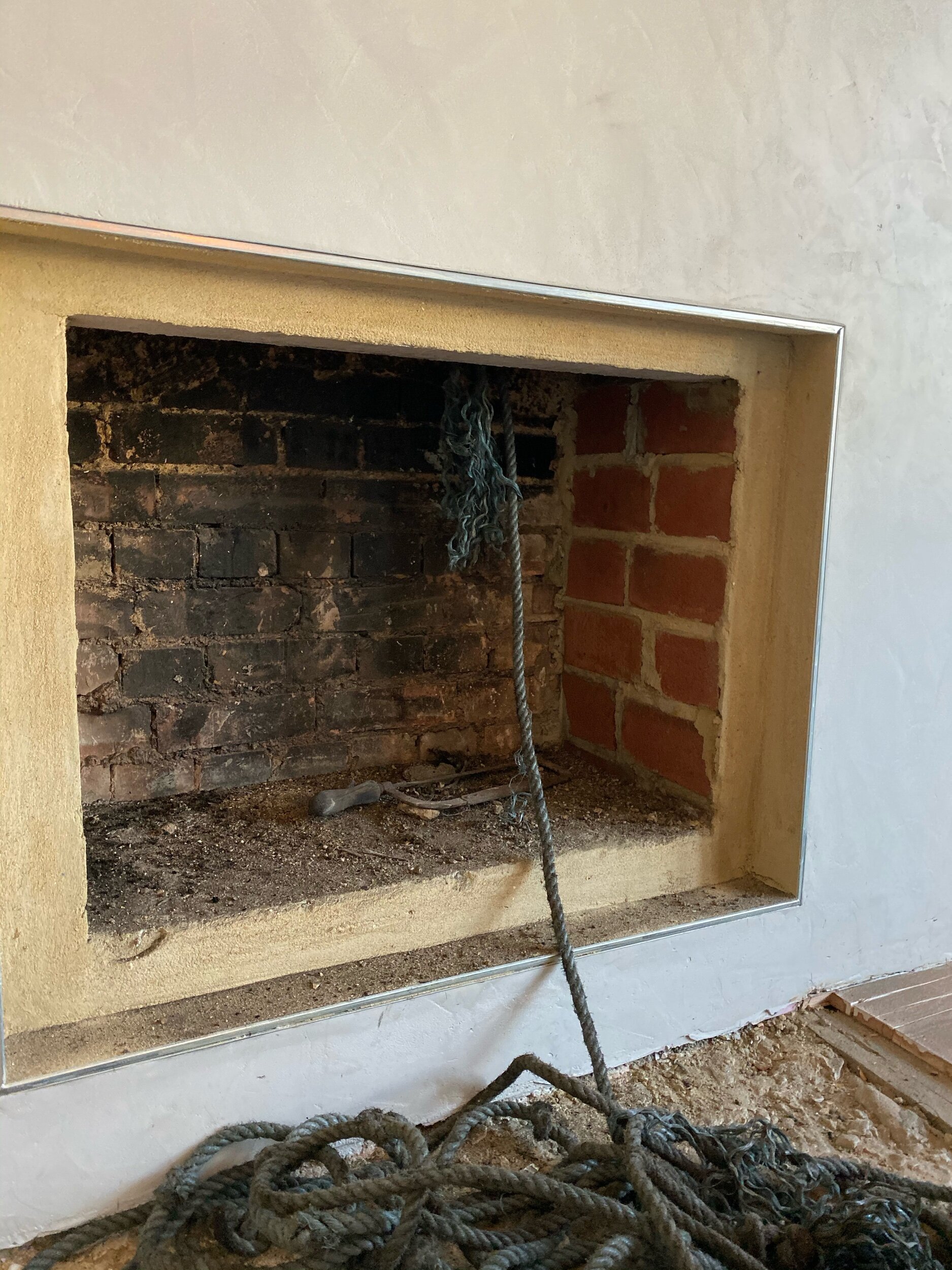
I was slightly alarmed to discover the there was an axe hiding in the chimney when they came to install the flue, hoping that we don’t have the ghost of a serial killing Santa lurking up there!

I was slightly alarmed to discover the there was an axe hiding in the chimney when they came to install the flue, hoping that we don’t have the ghost of a serial killing Santa lurking up there!

With that part done you need to ensure you have a suitable air vent in the relevant room and a carbon monoxide alarm. There are also certain regulations that you need to meet relating to the type and size of hearth you have. I had initially thought I might go for a patterned tile on the hearth (I know crazy times) but in the end I decided to go for a concrete tile to keep things natural and earthy and to make the hearth blend with the floor as much as possible.

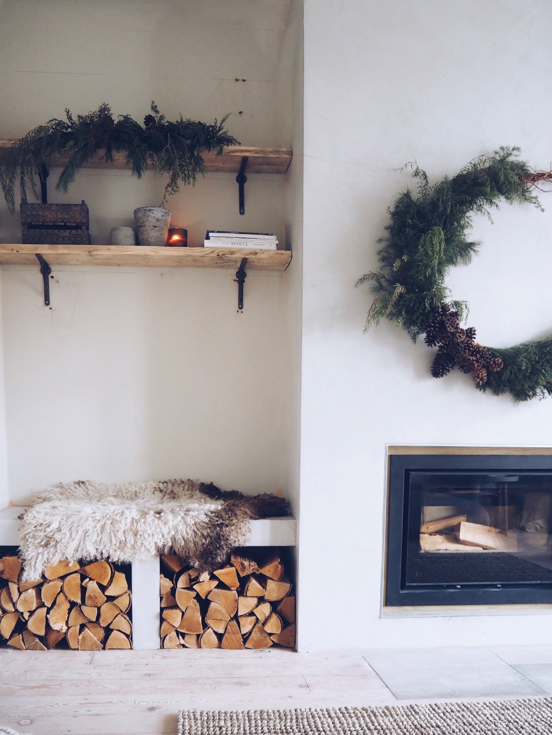
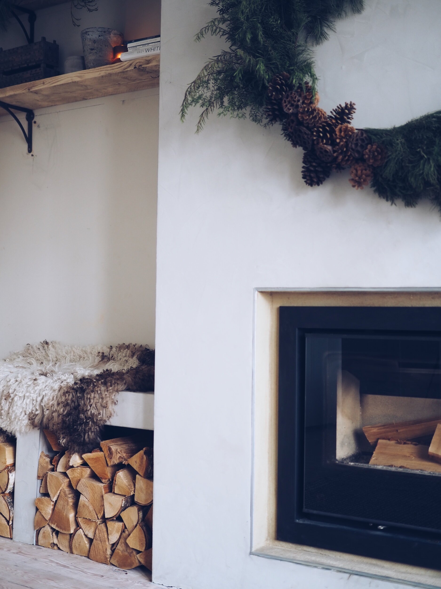
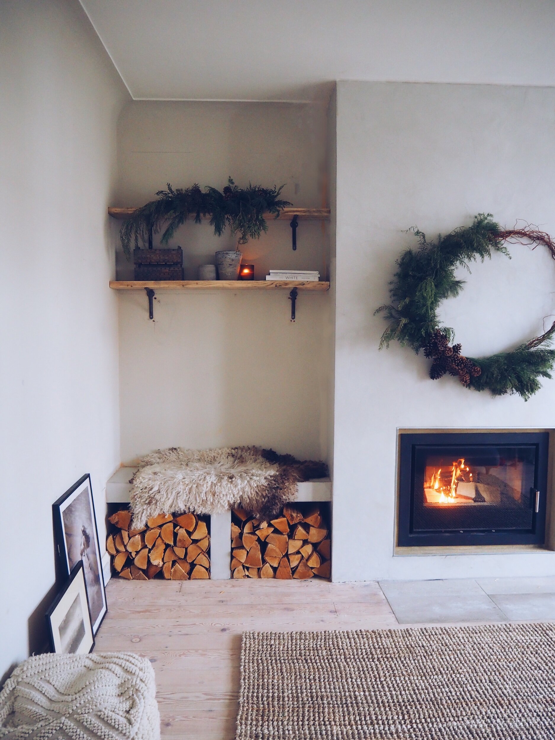
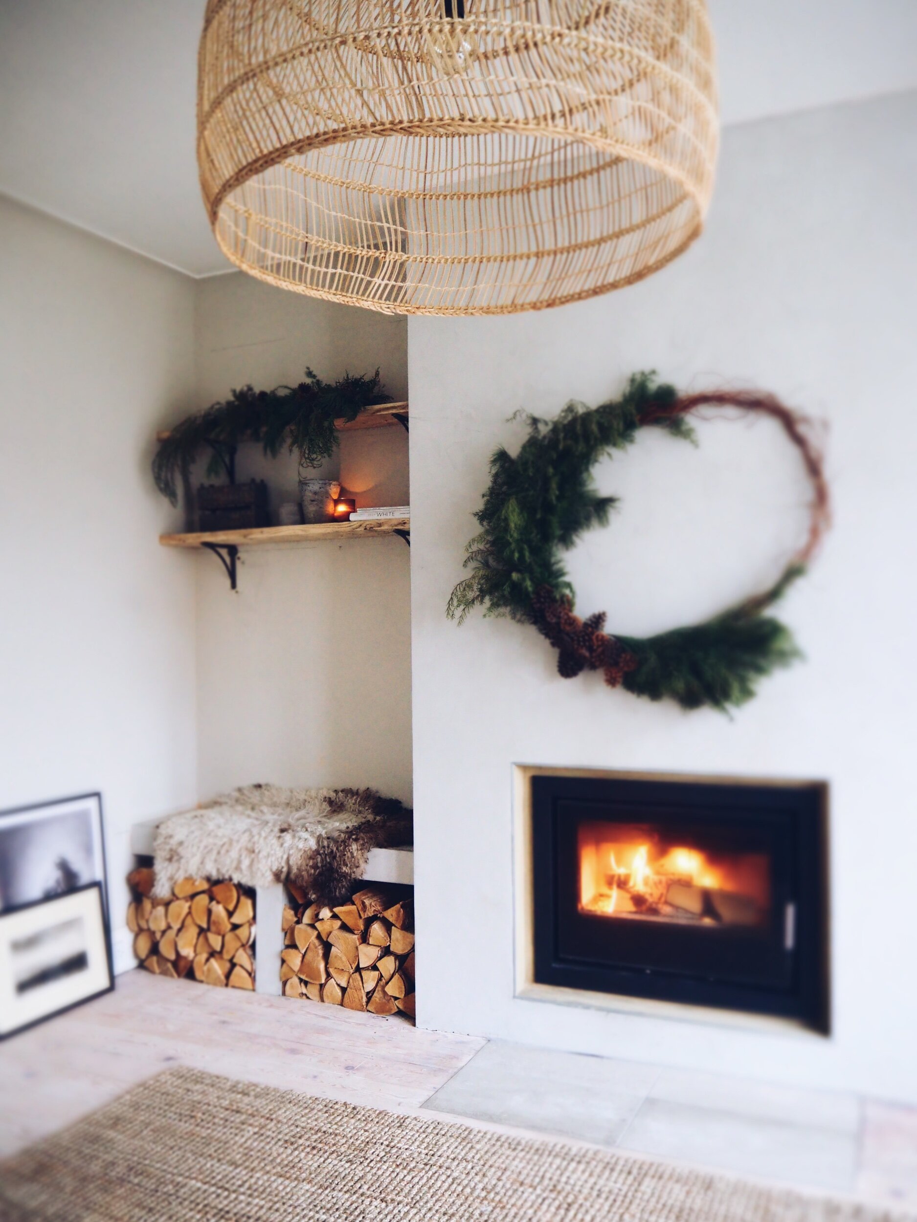
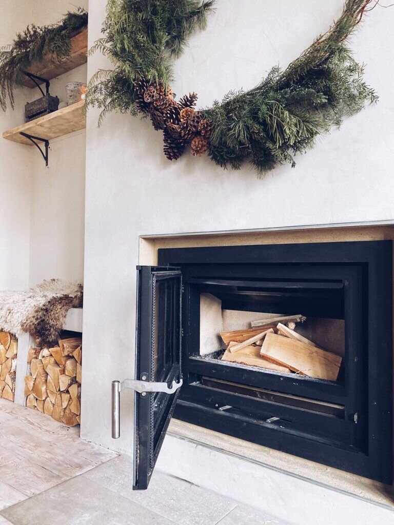
The big reveal!! Stove in, log piles stocked and benches and chimney breast fully microcemented! What do you think??

The big reveal!! Stove in, log piles stocked and benches and chimney breast fully microcemented! What do you think??

I couldn’t be happier with the finish and colour of the microcement and I love the contrast of having the black i750 Arada Stove (although you can also chose from a range of other colour finishes)

I couldn’t be happier with the finish and colour of the microcement and I love the contrast of having the black i750 Arada Stove (although you can also chose from a range of other colour finishes)

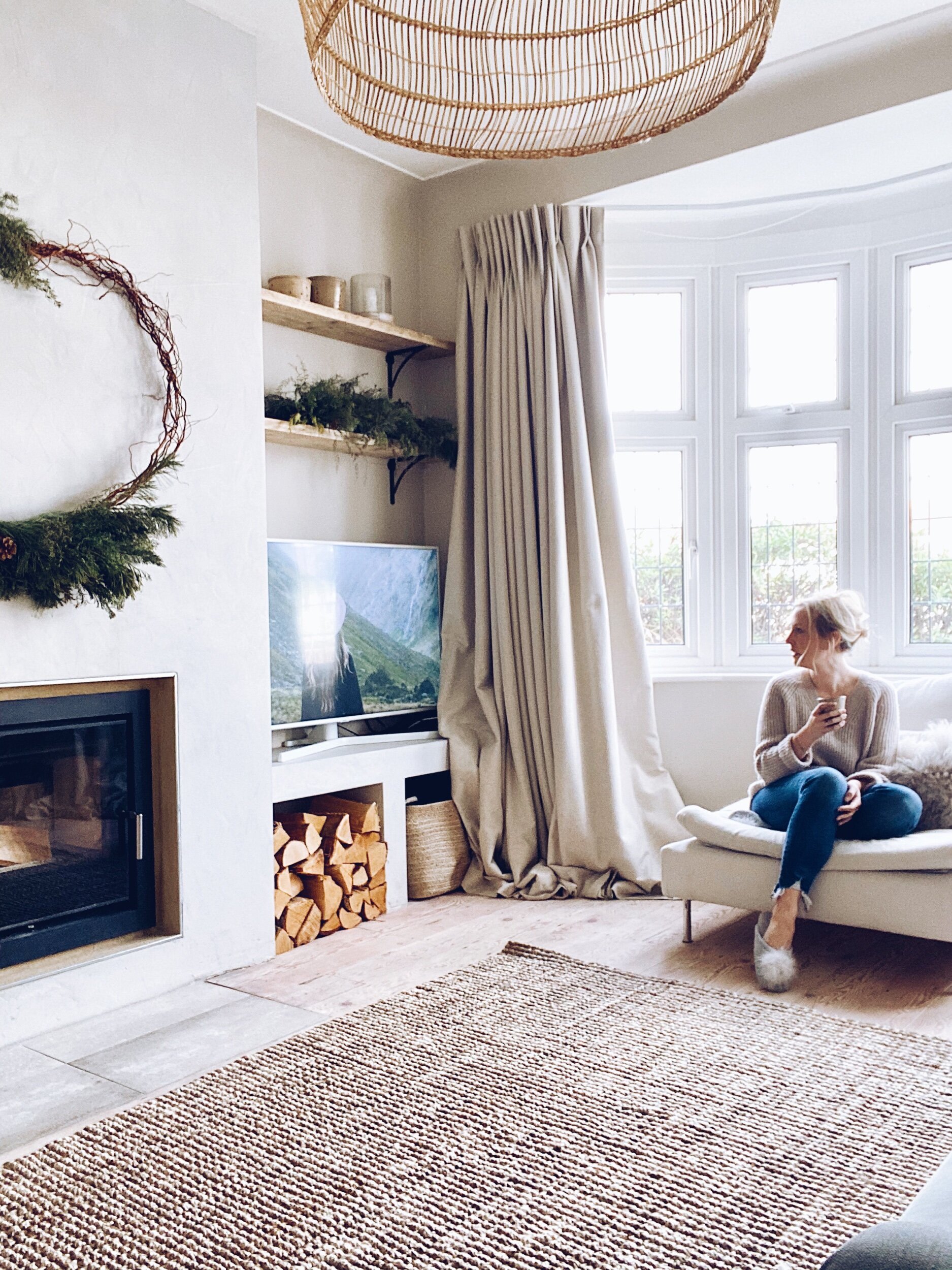
The oversized Espen rattan pendant was gifted as part of a previous collaboration with Cox & Cox and works perfectly with the high ceilings we have in this room

The oversized Espen rattan pendant was gifted as part of a previous collaboration with Cox & Cox and works perfectly with the high ceilings we have in this room

Adjustments.jpeg
6448BBAF-3095-4FA0-B191-10E8E41A87F4.jpeg
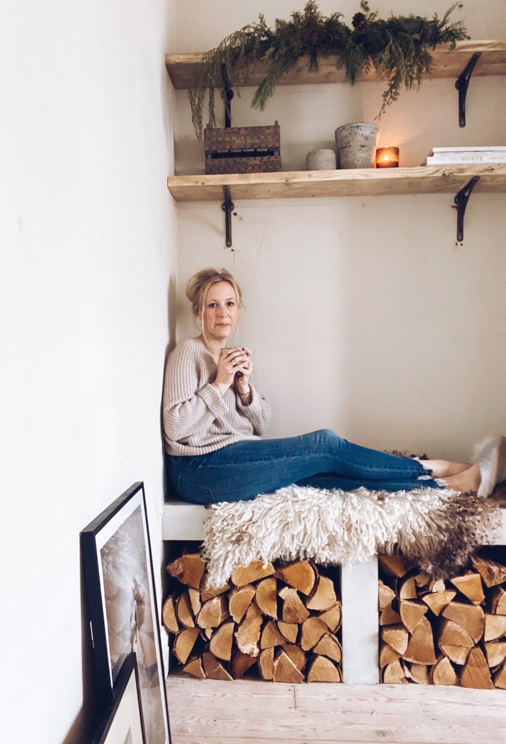
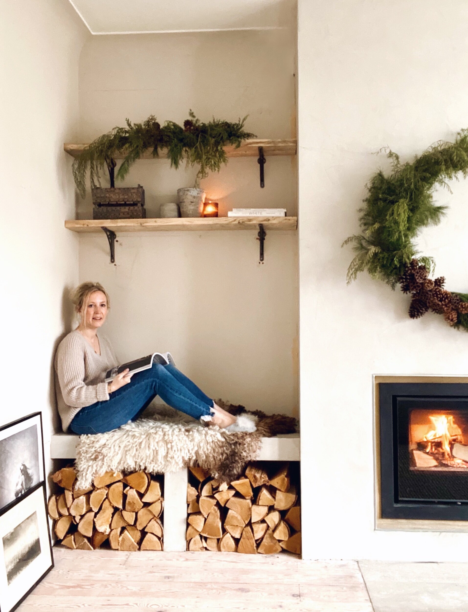
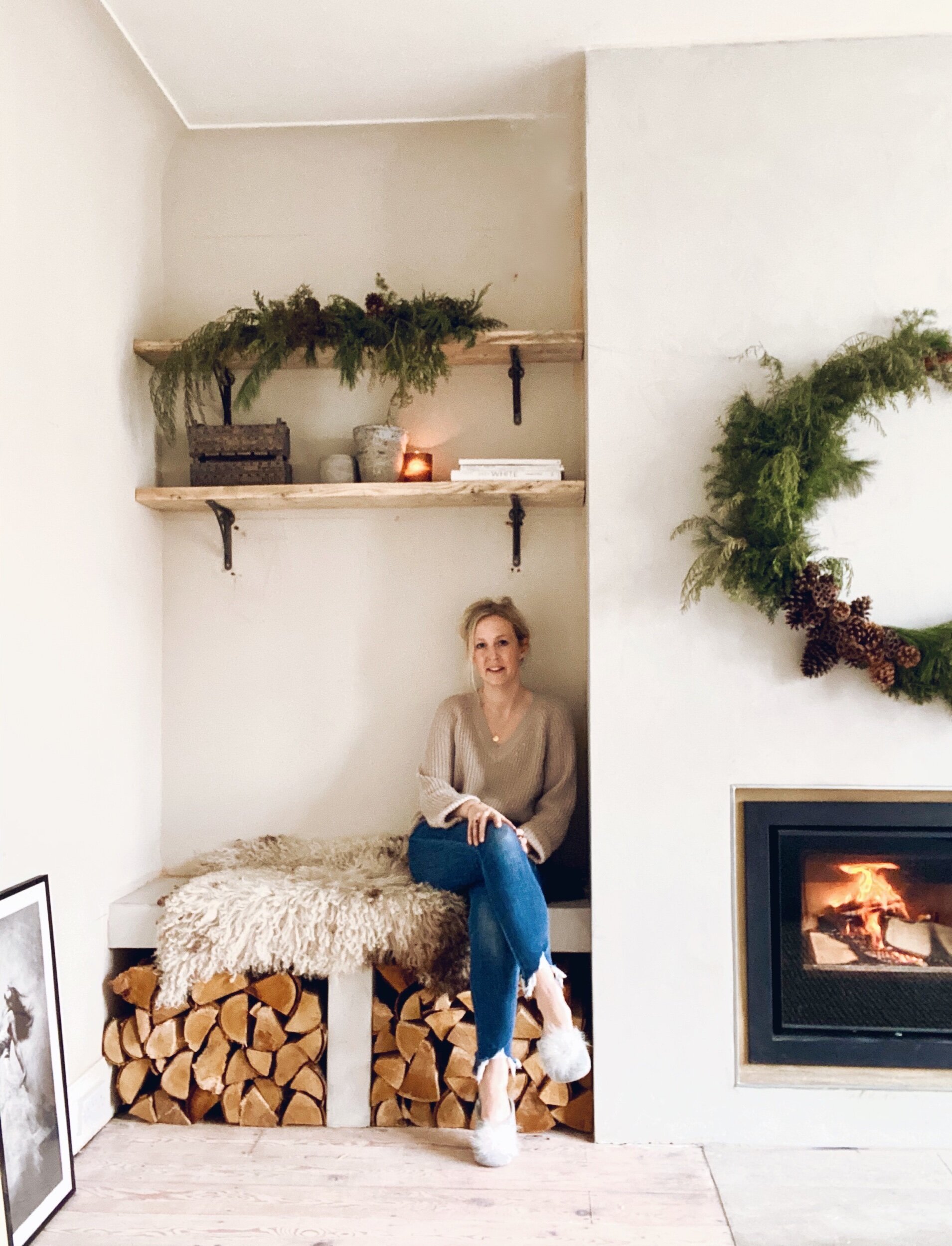
One very happy Malmo in my new favourite spot in the house. It was always my plan that this bench would be wide enough to sit on and I opted for 2 rather than 3 shelves in the alcoves to allow the head room to sit in there.

One very happy Malmo in my new favourite spot in the house. It was always my plan that this bench would be wide enough to sit on and I opted for 2 rather than 3 shelves in the alcoves to allow the head room to sit in there.

I originally envisaged the stove being flush with the chimney breast but building it out meant that wasn’t possible but I actually now quite like the fact that it sits back slightly

I originally envisaged the stove being flush with the chimney breast but building it out meant that wasn’t possible but I actually now quite like the fact that it sits back slightly

Tony sanded down some old scaffold boards and installed shelves wither side of the chimney breast for me

Tony sanded down some old scaffold boards and installed shelves wither side of the chimney breast for me

The room is by no means finished. We need to poly fill and paint the walls, chose a rug that fits the space better ( I have temporarily borrowed this jute one from another part of the house), sort out pictures on the walls, find wall/floor lighting and have about a 17 hour faff with the contents of the new reclaimed scaffold shelves. But I am determined not to rush finishing off the room and to just enjoy the process of tying it all together. The changes we have made have already created a room that we absolutely love. In fact I love it so much that it has taken me pretty much all of January to tear myself away from my spot in front of that fire to pick up a pen and write this blog!!

The rustic wreath and garlands in the alcoves were the work of Your London Florist and were actually meant for Christmas but I love them so much I have kept them up past the 6th of January!

The rustic wreath and garlands in the alcoves were the work of Your London Florist and were actually meant for Christmas but I love them so much I have kept them up past the 6th of January!

Adding new curtains in Kendra Linen from Hilarys (gifted) has helped to really soften the room

Adding new curtains in Kendra Linen from Hilarys (gifted) has helped to really soften the room

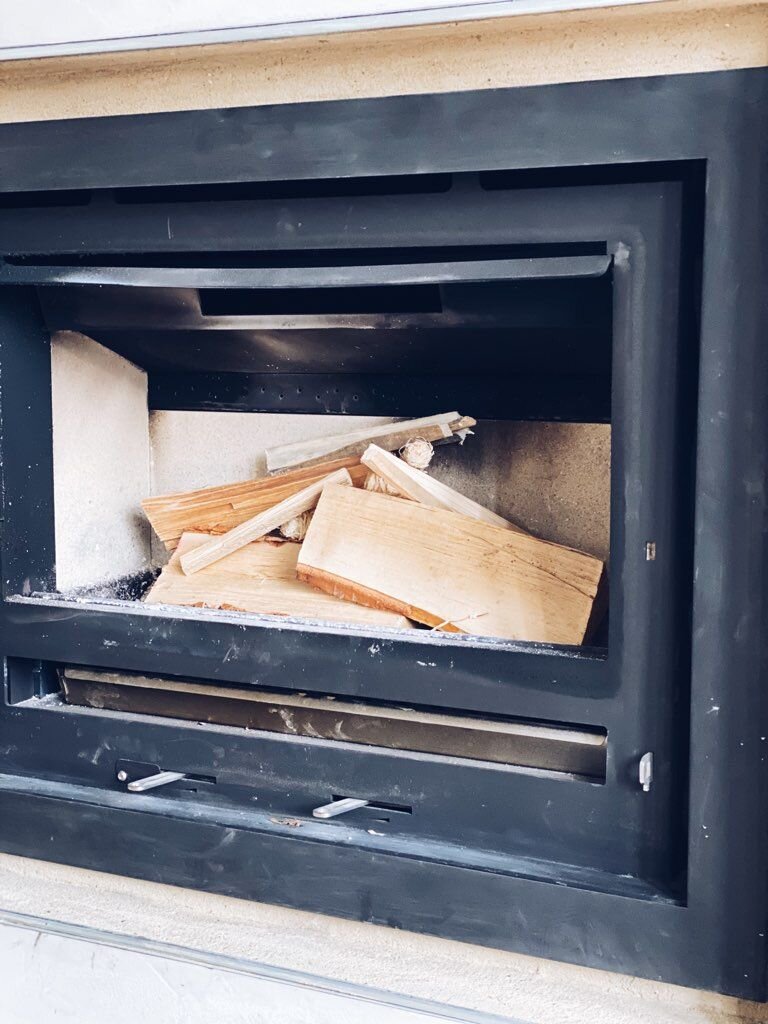
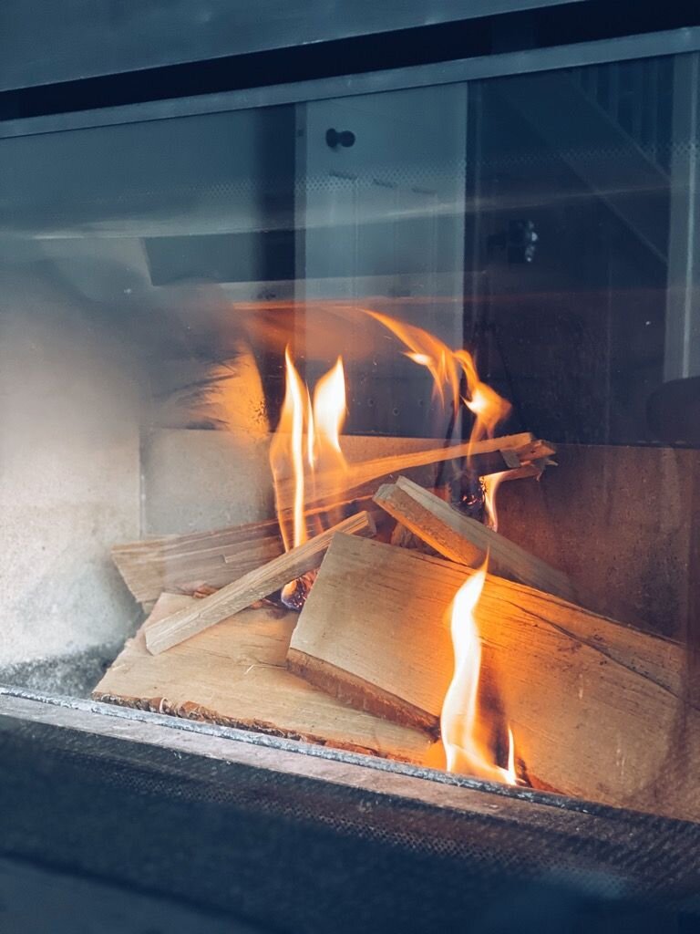
Also for someone who never made it beyond Duke of Edinburgh Bronze (I blame a wet weekend camping in the Brecon Beacons) the stove is stunningly easy to light and keep going. In a reverse of everything watching Bear Grylls has taught me, you actually light a fire in this stove from the top not the bottom. So you lay the logs down first then arrange the kindling on top rather than the other way round. Once you have lit it to get the blaze going you push the air vent levers on the bottom over to the right and then switch them back left again once you have the kind of roaring blaze Ray Mears would be proud of.

Rustic Ray Mears demonstrating her fire laying technique

Rustic Ray Mears demonstrating her fire laying technique

It is super easy to use and the ash that accumulates after each fire collects on a tray at the bottom of the stove that you can then easily pull out and empty. I just use the hand hoover to clear up any ash that falls onto the hearth when I am clean…

It is super easy to use and the ash that accumulates after each fire collects on a tray at the bottom of the stove that you can then easily pull out and empty. I just use the hand hoover to clear up any ash that falls onto the hearth when I am cleaning the fire out.

I am toying with maybe getting a hanging chair to go in this window and the switching this chair to the other side of the room. What do you think?

I am toying with maybe getting a hanging chair to go in this window and the switching this chair to the other side of the room. What do you think?

C13CEF0E-015D-484A-87C6-430EF9896579.jpeg
The jute rug is also a temporary loan from a different room in the how. I would like something thinner in the longer term

The jute rug is also a temporary loan from a different room in the how. I would like something thinner in the longer term

17733EFC-5BC1-4E8A-8720-AC0EFC08476F.jpeg
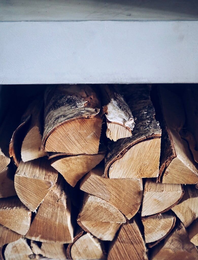
I love the contrast between the pale wooden floors and the logs which we get from Thompsons at Crews Hill in case anyone else is North London/Hertfordshire based and looking for wood!!

I love the contrast between the pale wooden floors and the logs which we get from Thompsons at Crews Hill in case anyone else is North London/Hertfordshire based and looking for wood!!

DB3490CE-A5D2-4455-92D2-2C678CDD20E8.jpeg
Here is where you will find me for the rest of the Winter

Here is where you will find me for the rest of the Winter

Pom Pom slippers on

Pom Pom slippers on

In the cosiest corner in the house

In the cosiest corner in the house

The i750 Series Stove was gifted to me by Arada Stoves. I also received a very small PR discount from Essex Stoves & Chimneys on the cost of the installation. The curtains were gifted by Hilarys and the Pendant light was part of a previous paid collaboration with Cox & Cox

My Hallway Transformation

In a straw poll of reasons why people move house I reckon the most common answers would be: up sizing or down sizing; change of location; moving closer to family; school catchment; taking on a renovation. I would possibly be one of the only people to respond with: to gain a girthier entrance.  There were of course other drivers behind our recent move but it really was a close of love at first sight of spacious vestibule for me.

The skinny hallway in our old house (I miss those tiles!)

The skinny hallway in our old house (I miss those tiles!)

Our old house was an Edwardian Semi with the stairs located in the middle of the house meaning much of the hallway was a long thin corridor.  When the boys were smaller manoeuvring a buggy and bulging nappy bag out of the front door was like a challenge from the Krypton Factor.  On at least one occasion I became an unwitting hallway hostage after the zip of my coat got caught on a rogue radiator valve leaving me effectively manacled to the wall for a good 15 minutes.

The radiator upon which I got impaled and ended up a #hallwayhostage

The radiator upon which I got impaled and ended up a #hallwayhostage

IMG_3235.jpeg

In contrast, in our new house when you walk in the door the stairs are directly in front of you and there is double the width to play with so my days of corridor struggle are over. We also have a separate utility room with an extra set of pegs where a platoon of the army of anoraks can be kettled slashing the likelihood of being hit in the face by a smalls boys anorak as you take your shoes off.

It might not look like much but this was the #vestibuleview that won me over to our new house

It might not look like much but this was the #vestibuleview that won me over to our new house

My Hallway Makeover Plans

The extra space and high ceilings alone are hallway heaven for me and it was all pretty neutrally decorated but this month I have undertaken a mini hallway makeover, in partnership with Cox & Cox to further “enhance my entrance” so to speak.
The main things on my hallway hitlist were: 1) finding a solution to the soviet sized radiator and accompanying cover that dominated the space to the left of the door; 2) changing the mirror for something with a more contemporary, clean feel; 3) finding a way to de-anagylpta that didn’t involve replastering the walls; 4) fitting in some more storage; and 5) lightening up the look and feel in particular of the floors.

Overall the look and feel that I wanted to achieve with the makeover is what I would describe as 1930s Scandi Rustic Chic.  Am thinking Neville Chamberlain was a huge fan of the relaxed Ibiza beach club look.

The decor is all light and pretty neutral it is just not quite Malmo so I will be looking to downgrade the orange factor on the floors and take things more 1930s Scandi Rustic

The decor is all light and pretty neutral it is just not quite Malmo so I will be looking to downgrade the orange factor on the floors and take things more 1930s Scandi Rustic

The anaglypta wallpaper is on my hallway hitlist even though I know it is coming back into fashion!

The anaglypta wallpaper is on my hallway hitlist even though I know it is coming back into fashion!

One of my go to brands when I am searching for Scandi/Rustic furniture, lighting and home accessories has always been Cox & Cox.  I have been shopping with them since right back in 2007 when I bought vintage table place holders from them for my wedding.  14 years and 3 kids later they still tick all my design boxes so I was over the moon when they said they wanted to collaborate with me on the revamp.

Adding Panelling

The first step in the makeover was to call Darren, my long suffering carpenter (who did the kitchen cupboards in my old house) and see if he would take on #Project Panelling aka my solution to “The Anaglypta Issue” (which, by the way, I think makes a great title for a Robert Ludlum Thriller!).  My plan was to remove the dado rail and just panel over the anglypta to avoid a lengthy battle with a wallpaper steamer. 

Panelling dilemmas: to stick below the dado or go above?

Panelling dilemmas: to stick below the dado or go above?

I deliberated long and hard about what height to go for.  The safe option was to stick below the dado rail whilst more adventurous option would be to go all the way to the celling.  In the end I went for a halfway (well ¾ way) house and panelled just under line of the doorway. 

I would love to show you an inspiring DIY tutorial of me doing the panelling but the reality was Darren doing battle with several large sheets of MDF in his garden shed and then attaching them to the wall with a mix of nails and glue with quite a bit of swearing along the way.  I am pretty sure he will be ghosting my calls in future. 

Despite a few doubts along the way I am thrilled with the 3/4 height of the panelling

Despite a few doubts along the way I am thrilled with the 3/4 height of the panelling

Radiator Solutions

Once the panelling was on the next big decisions was what to do about the radiator and what colour to paint the panelling. The radiator cover that was on the left hand side of the hallway as you walked in was my no means hideous but it pretty much dominated the whole space and precluded us having any storage on that wall.

The before with a large radiator on the left hand wall which took up lots of space

The before with a large radiator on the left hand wall which took up lots of space

The after with the radiator dropped in height beneath a bench. The woven fringed cushion and black and white chevron cushion are both Cox & Cox

The after with the radiator dropped in height beneath a bench. The woven fringed cushion and black and white chevron cushion are both Cox & Cox

It no longer dominates the space and I actually love the look of the column one

It no longer dominates the space and I actually love the look of the column one

The solution I came up with  was to go for a much shorter radiator that would sit much lower on the wall and build a  seating bench over the top thus ensuring the radiator was no longer the dominant feature in the hallway and we had somewhere to sit to put our shoes on. The bench was to be built out of reclaimed scaffold planks which I sourced from our local salvage yard and which cost £7 a plank.  They are my number one favourite building material although I don’t think Darren shares my love of reclaimed materials judging by his reaction when I brought them home.  Sample quote “you want me to leave the paint stains on??” accompanied by the kind of look you give someone who has just told you that they would like a threesome with Eaamon Holmes and Boris Johnson.

The Scaffold Planks that I love but which baffle Darren! This natural striped runner from Cox & Cox looks great against the sanded floorboards

The Scaffold Planks that I love but which baffle Darren! This natural striped runner from Cox & Cox looks great against the sanded floorboards

Paint Choices

With my radiator strategy in place it was time to make a decision about the colour of the panelling.  My first thought was to go dark after I came across this image in a Neptune catalogue.  However because the panelling was going on both sides of the hallway I was worried that it might narrow the room down so in the end I erred towards the light side.  A tester pot orgy later I had tried out every shade between bracken beige and perfect putty and arrived at my final choice: Ammonite by Farrow & Ball. 

Slightly too late for me but excitingly next year Cox & Cox are launching their own brand of paint.  There will be 16 dreamy shades and Flaxen or Landsdown would be a brilliant match for the look in my hallway.  It will be formulated by Mylands so expect a great quality consistent finish. 

cox and cox paint.JPG
Enjoying posing againg my newly Ammonite background with a rather spectacular faux string of pearls

Enjoying posing againg my newly Ammonite background with a rather spectacular faux string of pearls

With the panels painted it was time to install the radiator and build the bench.  I opted for a more contemporary column radiator which I bought from this website for roughly £170 which I think is pretty good value.  With the boards sanded down and installed over the top the radiator is now barely visible and it has transformed this side of the hallway. 

B0D323E0-ECE9-4A35-AFED-F0E022E4B01C.jpeg

Malmo vs Mahogany

My final step in lightening things up before I could tackle the fun finishing touches was to tone down the mahogany factor from the floor and the door which were a good 7.5 on the David Dickinson after a week in Barbados scale.  The floorboards are actually really nice pine ones and sanded down they look so much better.  In the longer term I would like to get a new door but for now just painting it in Railings has been a bit of a game changer (don’t look too closely at slapdash Scandi Handy Andy’s paint job!).

53ED77C8-B691-481F-9079-FE938C52370B.jpeg

Adding the finishing touches with Cox & Cox

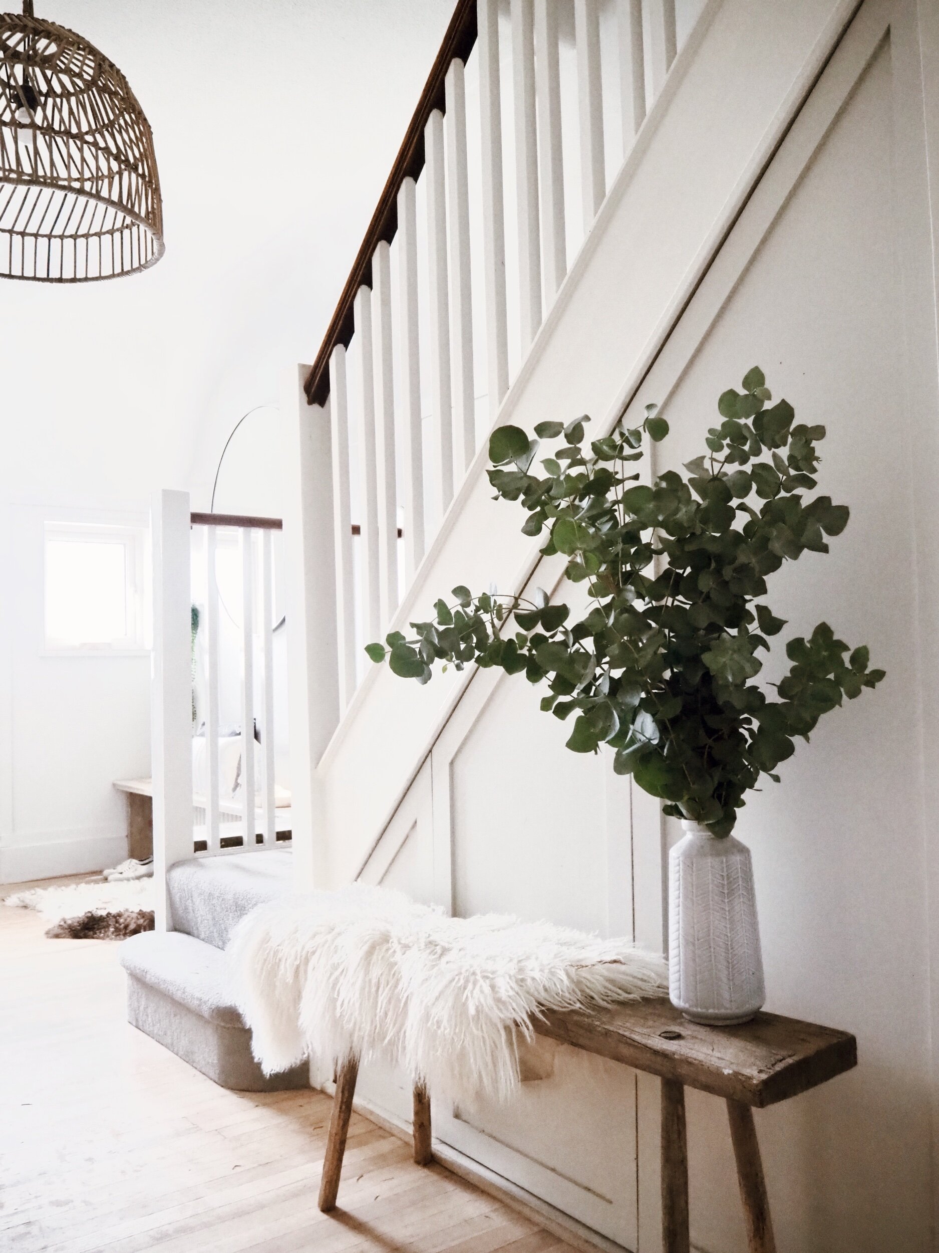
With all of the structural changes complete it was time for the fun stuff: enter Cox & Cox. I have been obsessed with rattan style pendant lights ever since visiting Ibiza last year and Cox & Cox has some beauties. We are blessed with pretty high ceilings so we could afford to go for one of the bigger ones to make a bit of a statement.  I really like this one because it allows a view through it and doesn’t dominate the space too much (or hit us on the head every time we walk down the stairs.

E7E43601-DE94-4ECA-9CA6-D64A282617C2.jpeg

The other big decorative item I was after to complete the makeover was a new mirror.  With the radiator dropped and the bench in place I wanted to add a circular one to break up the square lines of the panelling a little bit.  I think I lost about 1.5 days of my life to the google search large circular mirror until I hit upon this oversized thin frame beauty from Cox & Cox.  Unlike lots of the ones I looked at it has a really thin black rim and adds a really subtle crisp contemporary edge to the hallway revamp.

The Oversized Mirror of dreams

The Oversized Mirror of dreams

I know some people might have opted to put pegs where I have put the mirror but I think it really opens up the space and reflects light and I have, instead, added pegs further back so they are not in your face as you wanted in the door.  Oh and when I say added pegs let me introduce you to these #heavenlyhooks from Cox & Cox with a black slate base and burnished gold hook .  You can buy a set of three but I opted for four five individual hooks instead and think they add a nod to understated glamour. 

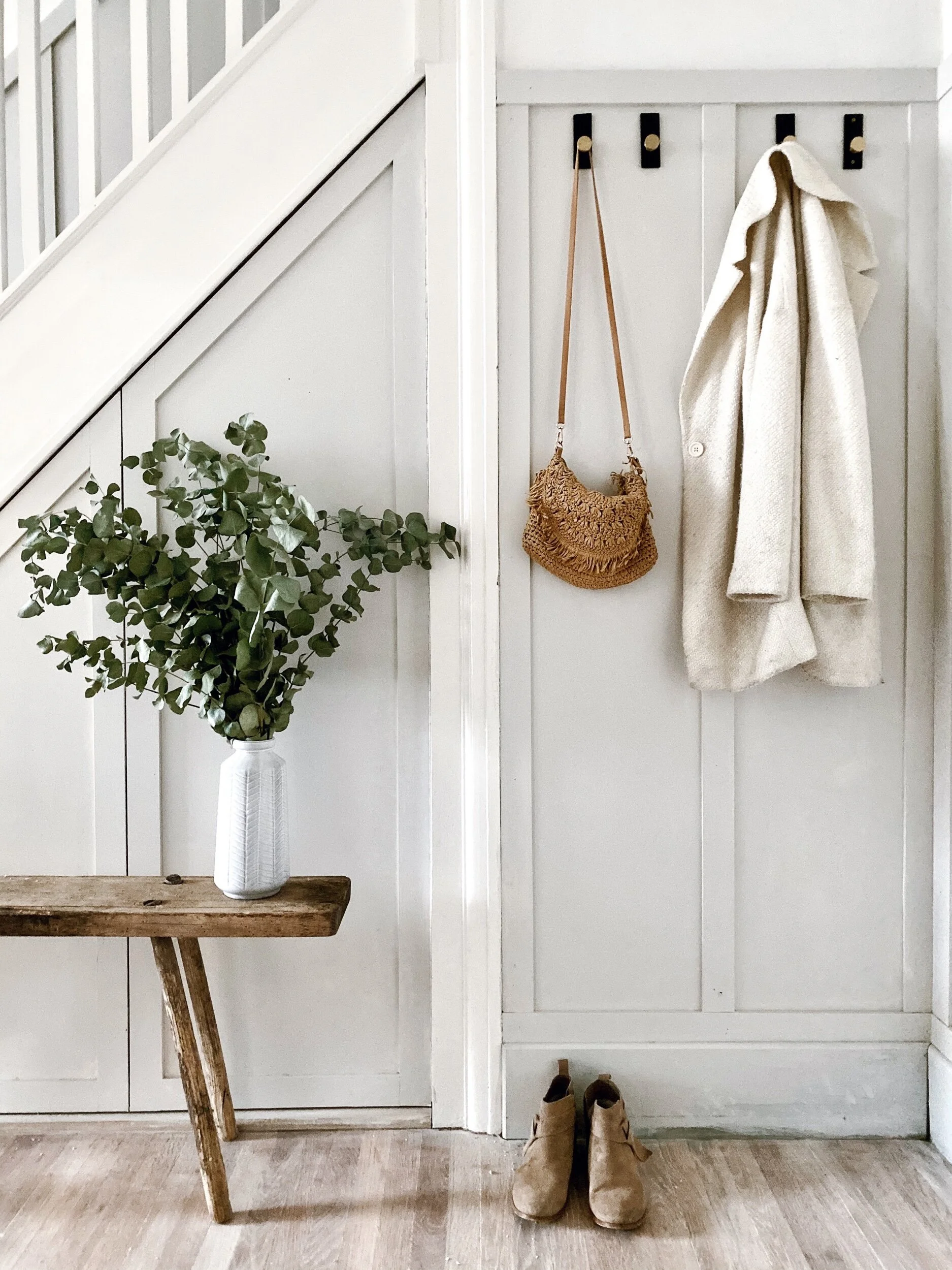
Obviously the insta reality of this photo is 5 primary coloured anoraks rather than an artful rattan bag and a pleasingly pale cream coat

Obviously the insta reality of this photo is 5 primary coloured anoraks rather than an artful rattan bag and a pleasingly pale cream coat

I have four behind the door for coats and practical items and one is located next to the mirror for maximum insta faffery.  I am imagine it will play host to artfully poised baskets, bags of impractical pampas and oft be draped in fairy lights.

Let the faffing commence. I am looking forward to the styling possibilities offered by the hook!

Let the faffing commence. I am looking forward to the styling possibilities offered by the hook!

The First Noel …..in my hallway

With the hallway revamp complete just in time for the opening of advent calendars I am super excited by all the fresh festive styling opportunities that it affords me.

First and foremost the bannister!  Our old one was boxed in by the downstairs loo totally raining on my garland parade.   This year I will be going to Scandi town on our new ones.  Cox & Cox have a great range of garlands to grace your stairs and work with a variety of different looks.  I chose this really simple but effective pre lit pine one .  It looks great even just on its own but has really nice thick branches/foliage that are perfect for adding further foliage of the faux or real variety to if you wanted to add more drama to your bannister.
The pre lit eucalyptus garland is lovely and bushy and easy to manipulate and can easily have foliage added to it for extra drama

The pre lit eucalyptus garland is lovely and bushy and easy to manipulate and can easily have foliage added to it for extra drama

03FD0690-5936-4F84-8A0B-68EB1F66A144.jpeg

There is also a matching pre lit wreath which fits rather perfectly on my insta faffery hook by the mirror.  Again you could leave it plain of add extra foliage if you wanted to dial up the drama. 

With thanks to Your London Florist I have added some extra eucalyptus and soft white dried grasses to complement the wreath

With thanks to Your London Florist I have added some extra eucalyptus and soft white dried grasses to complement the wreath

768E8B9F-CCD1-4632-9733-3892B81F3184.jpeg
I have struggled for years with winding fairy lights into wreaths and trying to disguise the wires so really love the pre-lit one

I have struggled for years with winding fairy lights into wreaths and trying to disguise the wires so really love the pre-lit one

The bench has not only created a handy place to sit when putting our shoes on but also lends itself to lots of great display possibilities.  I love these beautiful crackle glaze ceramic Christmas trees that Cox & Cox have introduced this year to help you achieve a pared back minimal Christmas look.  They look great on their own or in small groupings.  I would happily have a whole forest of them!
These speckle glaze trees are a lovely minimal take on Christmas

These speckle glaze trees are a lovely minimal take on Christmas

But my very favourite type of tree has to be these beautiful illuminated ones. They add such a soft pretty twinkly light to the hallway and you can either keep them plain or hang them with baubles in the same way as a normal tree. 

Welcome to Malmo’s Winter Wonderland created with a little help from these illuminated snow tipped trees from Cox & Cox
Welcome to Malmo’s Winter Wonderland created with a little help from these illuminated snow tipped trees from Cox & Cox

It was the night before Christmas….

It was the night before Christmas….

I love the soft warm white light of the trees

I love the soft warm white light of the trees

Cox & Cox have a fantastic selection of baubles for all looks and plenty that appeal to my Scandi aesethic, I particularly like these ones which wooden cut out stars and trees in the middle of a thin gold ring which are from their New Neural Noir range.

White chevron baubles adding all the boho feels to my hallway

White chevron baubles adding all the boho feels to my hallway

A43513A3-5B66-4962-85D0-DA5F95836DB9.jpeg

If you wanted to add a bit of extra twinkle to your Christmas scheme then I have to let you in on a fairy light secret.  I have had my fingers burnt in the past by fairy lights which promised to be warm white on the box only to turn up and turn out to be football stadium floodlight florescent but Cox & Cox have some naked wire cluster lights which are genuinely the warmest of whites! 
My own mini forest of illuminated snow tipped trees

My own mini forest of illuminated snow tipped trees

To complete the warm white winter wonderland feel to my entrance I have also add a couple of great outdoor lighting products from the Cox & Cox range. I think I may love the 7ft outdoor illuminated tree more than any Christmas tree I have ever owned. Mr Malmo I fear has less fond feelings towards it after a botched erection attempted on his part saw the top section hit him on the head at 7:30am on a Monday morning! I have also given our porch a dusting of twinkle with a brilliant indoor/ourdoor star. The lights on both the star and the tree are also the warmest of warm whites #fairylightwin.

Announcing our arrival in the neighbourhood with some Christmas twinkle!

Announcing our arrival in the neighbourhood with some Christmas twinkle!

The new apple of my eye, our outdoor Christmas tree

The new apple of my eye, our outdoor Christmas tree

A4609B48-A230-4C61-BD73-9072EB9F088C.jpeg

The fairy lights along with all of the other Cox & Cox products I have used in the make over are listed below if you would like to shop my look!

Illuminated Indoor/Outdoor Star

Outdoor light up Christmas Tree

Indoor/Outdoor Magical Light Up Snow Tipped Trees

Grey and White Chevron Baubles

Speckle Glaze Tree

Indoor/Outdoor Pre-Lit Wreath and Garland

Indoor/Outdoor Naked Wire Cluster Lights

Oversized Frame Mirror

Round Rattan Pendant

Natural Striped Runner

Hanging Potted Faux String of Pearls

Black and Brass Hook

Black and White Chevron Cushion

Woven Fringed Cushion

There are a few final finishing touches I need to make to finish the makeover off like applying a stain to the newly sanded floors and deciding whether to paint the bannister or sand it down but those can wait until I have finished my figgy pudding.

 This blog post was part of a paid partnership with Cox & Cox. Many thanks also to Your London Florist for providing me with some foliage for styling my hallway and to Tia Talula for coming to my outdoor photography aid this week!

How I Transformed My Hallway With An Affordable Alternative to Crittall

When people ask us if we can ever see ourselves moving house, Mr Malmo and I often give contrary answers. He is very much “Remain” on the basis that moving involves a) spending money and b) the very real risk of me “losing” in any move i) his collection of Sheffield Wednesday Programmes dating back to 1989 and ii) the maroon sweatshirt he loves but which I think makes him look like a cross between a teenager on day release from Borstal and a Songs of Praise presenter. My answer is also “Remain” but with the caveat that I would instantly trigger Article 50 and leave for a house with a double width hallway like this.

The spacious hallway of my dreams. Picture credit www.livingetc.com

The spacious hallway of my dreams. Picture credit www.livingetc.com

I have this yearning for double width because our house is semi-detached and the hallway is an L Shape. You can’t see the stairs when you first come in the house as they are located in the middle of the house. If that makes about as much sense as inviting Jim Davidson to be the keynote speaker at a vegan mindfulness seminar then hopefully the two photos below will clarify what I mean.

The hallway as you come in the front door

The hallway as you come in the front door

The view looking backwards towards the front door. With the stairs in the middle of the house to the right

The view looking backwards towards the front door. With the stairs in the middle of the house to the right

When we first moved in the hallway was dark, narrow and a bit damp (which I realise sounds a bit like a tagline for a vaginal deodorant). My first tactic to brighten it up was by painting both the walls and floors in a lighter colour. From memory the colour I chose was Farrow & Ball’s Slipper Satin although I could be suffering from a bad case of middle class amnesia and getting my Slipper Satins and Wimborne Whites mixed up.

The hallway after my initial attempts to brighten it up by painting the walls and floors in Slipper Satin

The hallway after my initial attempts to brighten it up by painting the walls and floors in Slipper Satin

This definitely helped to bounce more light around the space but there is only so much Slipper Satin can achieve when your only source of natural light is a window on to a side alley and you have to contend with the shadows cast by the army of anoraks that come with having three boys (and a husband with a penchant for a Liam Gallagher mac). I started dreaming of a more radical solution to the problem involving replacing the wall between the hall and dining room with a crittal partition like this.

Crittal doors in the hallway of House Curious (Picture credit www.livingetc.com )

Crittal doors in the hallway of House Curious (Picture credit www.livingetc.com )

However, after getting a couple of quotes, I started to realise I had crittal dreams on a cornflake budget. They were coming it at around £7-10K for doors to fill a 2 x 3 metre space. It was actually Kevin my quotes guy (who had come round to price up making the opening for the doors) who came up with the idea of installing timber panelled doors instead of crittal ones. A quick Pinterest later and I realised this was a compromise I could live with. Compared to crittal the price of having bespoke timber doors made was just £2K (with the labour for knocking the wall through and making the opening about £1.5K ).

These timber doors from Plain English (pic credit www.remodelista.com) made me realise that there was life after crittal!

These timber doors from Plain English (pic credit www.remodelista.com) made me realise that there was life after crittal!

This is what the space looked like just before “Project Partition” began. Although it was to be hastily renamed “Project Opening” after realising the former sounded less like a plan to remove a wall and more like Hitler’s code name for his plans to annex the Sudetenland. Project Opening admittedly did have slight working title of a 1970s porno connotations but it at least had less #annexationovertones.

The view from the kitchen before “Project Partition” commenced

The view from the kitchen before “Project Partition” commenced

The night before work commenced on taking out the wall and putting the doors in

The night before work commenced on taking out the wall and putting the doors in

The builders took the wall down in stages and I have to confess that I nearly called the whole thing off after they took the plaster off the wall and left me alone with the exposed brick wall of my dreams for a night. #BareBrickBradPitt as it became known even scooped me the honours in #myhomevibe after the addition of some festive pom poms and illuminated Noel letters around Christmas time. But just like Angelina Jolie, I ultimately waved Brad goodbye with the rest of the wall being knock down and temporary supports being put in place.

For one night only: #BareBrickBradPitt in all his glory

For one night only: #BareBrickBradPitt in all his glory

It’s totally normal to decorate your building supports in the style of a Winter Wonderland right?

It’s totally normal to decorate your building supports in the style of a Winter Wonderland right?

The builders had originally thought that it might be necessary to put a steel in above the doors as it is a load bearing wall but it turned out there was already a timber beam in place that did the job which saved us a bit of money. After the opening had been made good, the bespoke doors were installed unpainted.

The unpainted doors installed and waiting for me to decide on a paint colour

The unpainted doors installed and waiting for me to decide on a paint colour

Only one of the doors opens (the furthest to the left if you are looking at them with the front door behind you) but it has hinges that mean it can be folded right back. If I was to go back in time I think I would have opted for them to be concertina doors so that we could have the option to fold all three of them all the way back. However, that is but a minor quibble because with the doors in place we now have a view straight through the house out to the garden when we open the front door and there is so much more light in the hallway.

This door folds right back but the other two are fixed in place.

This door folds right back but the other two are fixed in place.

After much deliberation about what colour the doors should be I ultimately decided to go for a really dark colour and chose Charcoal from the Valspar paint range at B&Q (not an ad!). I am really happy with that choice now but I like the fact that because they are timber I can change the paint colour to change the feel of the room in future if I wanted to. (something I couldn’t do if there were crittal!).

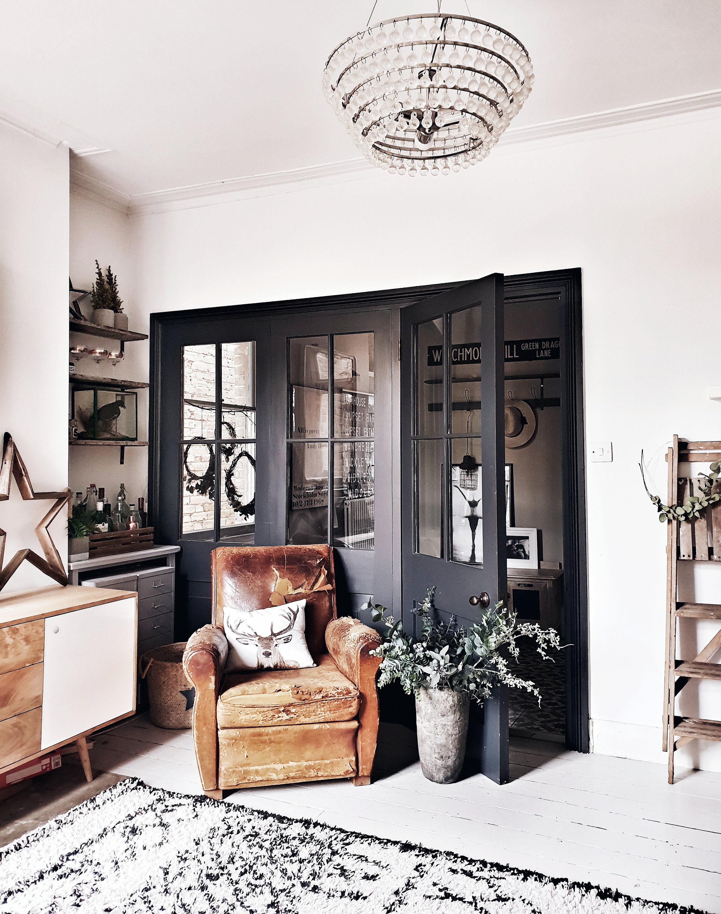
The finished doors in Charcoal paint by Valspar. I wanted to them to look crittal-esque which is why I went dark with the paint colour

The finished doors in Charcoal paint by Valspar. I wanted to them to look crittal-esque which is why I went dark with the paint colour

A lovely spot to hang out pretending to read an interiors book.

A lovely spot to hang out pretending to read an interiors book.

Having the doors in place lets lots more light into the hallway from this room

Having the doors in place lets lots more light into the hallway from this room

I love the new view from the kitchen with doors in

I love the new view from the kitchen with doors in

upload.jpg

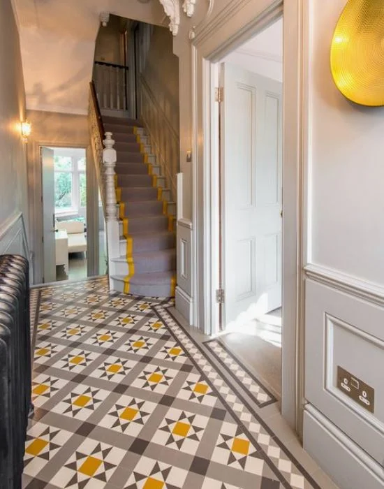
The other big change we made at the same time as installing the doors was to replace the original floorboards with a tiled floor instead. Whilst I love wooden floors there were lots of gaps in ours so that in winter it was like being on the set of “Whistle Down the Wind”. I was really torn as to whether to go for a statement Victorian style floor with some colour in it (inspired by the picture below from Living Etc) or something more muted.

The tiles I spotted in Living Etc (Pic Credit www.balancemedesign.com) which for a brief moment tempted me to go for something bold in the hallway

The tiles I spotted in Living Etc (Pic Credit www.balancemedesign.com) which for a brief moment tempted me to go for something bold in the hallway

Ultimately I chose a monochrome design from Mosaic del Sur which at about £900 came in about £4000 cheaper than the Victorian tile option! They have proved pretty hard wearing so far. We don’t clean them with any special products (perhaps mistakenly so!) and they actually show up mud much less than the wooden floors they replaced. Every now and again I have a pang and wonder if I actually ought to have gone for polished concrete floors but that is a project for a different house me thinks, maybe one with that double width hallway that makes me trigger my Article 50

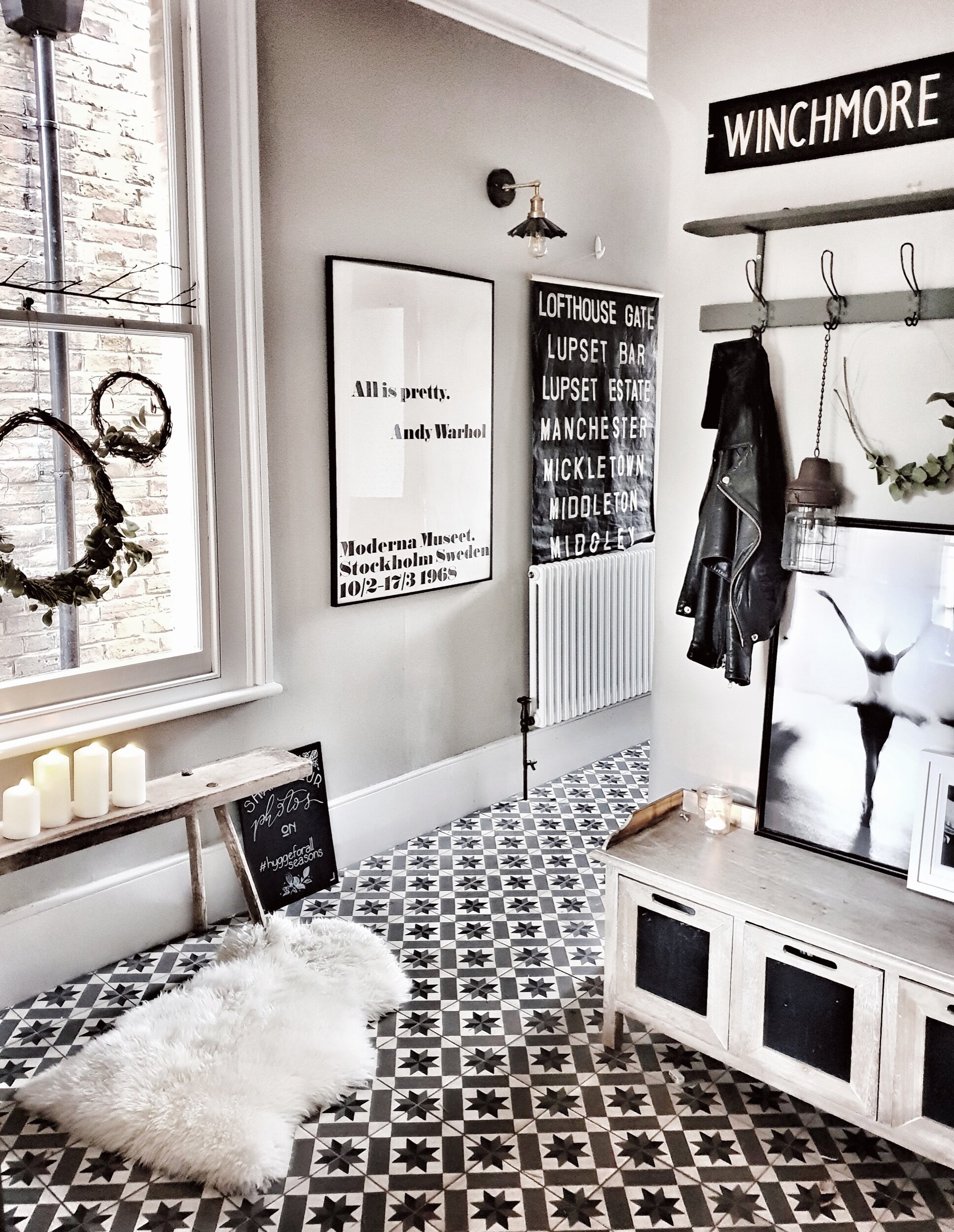
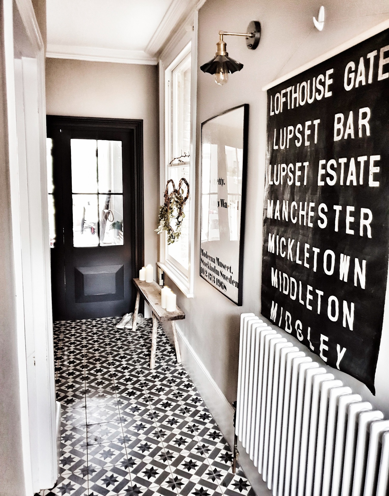
I am really happy with my ultimate choice of monochrome encaustic tiles from Mosaic del Sur.. Sheepskin placed there entirely for instagram purposes…

I am really happy with my ultimate choice of monochrome encaustic tiles from Mosaic del Sur.. Sheepskin placed there entirely for instagram purposes…

They are a good balance between a modern and traditional tile

They are a good balance between a modern and traditional tile

Final hallway picture
upload.jpg

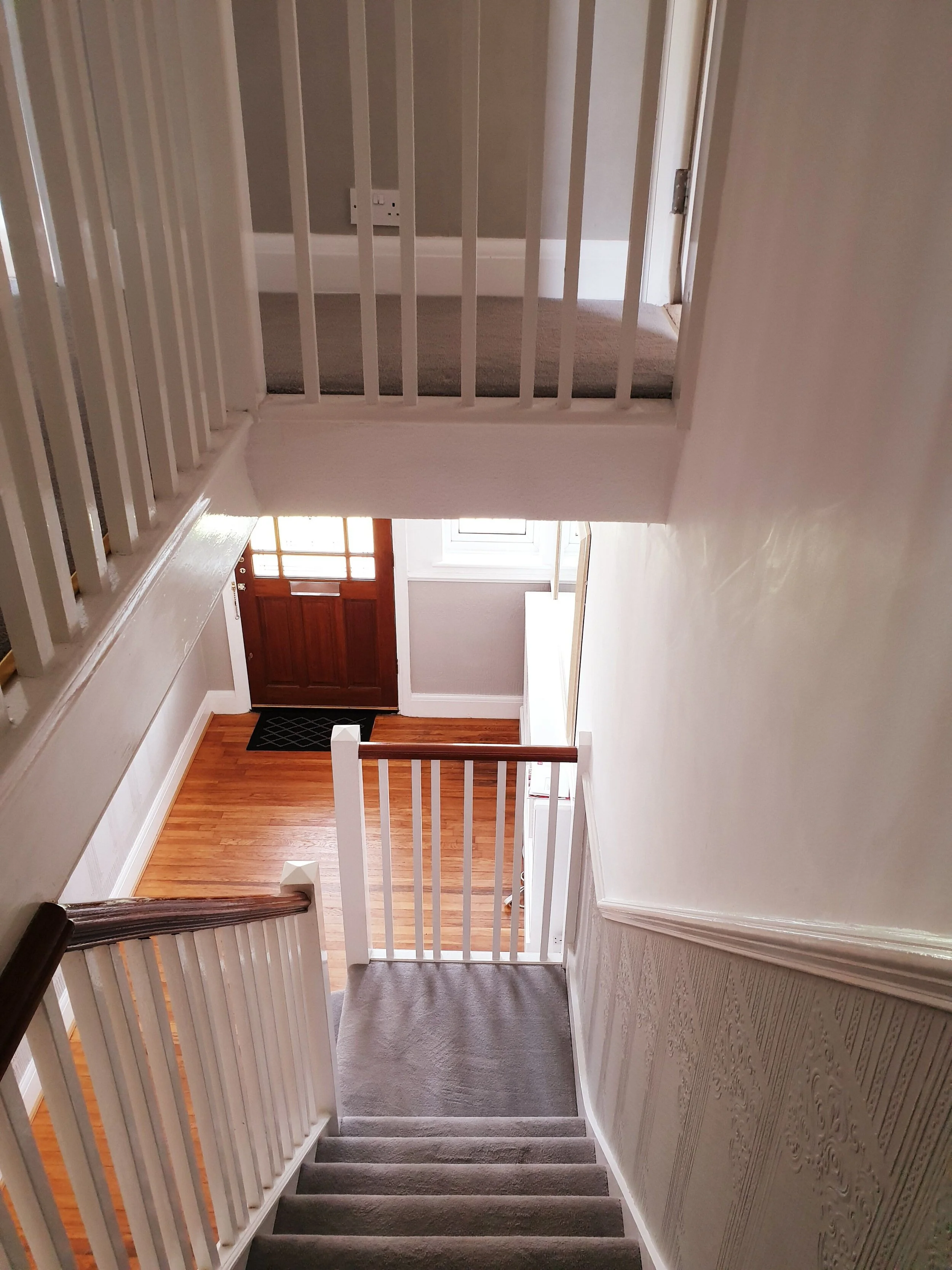
The next step in our hallway renovation is to tackle the stairs and bannisters. The sisal carpet we laid after a couple of years suffered a horrendous middle class atrocity when it had a tester pot of Annie Sloane Chalk Paint thrown down it by our toddler. Let’s just say Sloane and Sisal don’t mix. What I would actually like to do is to replace the Jackson Pollock carpet with a runner, painting the stairs and banister at the same time. The current banister is the kind of shade of mahogany that David Dickinson turns after 5 weeks on the Costa Brava so I am desperate tone it down or potentially paint it dark but even thinking about the amount of sanding required to get that project going makes me feel tired so, for now, it is on the back burner.

David Dickinson banister is on my 2019 hitlist as in the #SloaneOnSisalShitShow you can see on the stairs!

David Dickinson banister is on my 2019 hitlist as in the #SloaneOnSisalShitShow you can see on the stairs!

Hopefully this view will include the carpet runner of my dreams once I have found the motivation to sand down and repaint 30 plus stairs

Hopefully this view will include the carpet runner of my dreams once I have found the motivation to sand down and repaint 30 plus stairs

But for now I am just going to enjoy hanging around here holding an impractical hat

But for now I am just going to enjoy hanging around here holding an impractical hat

Thanks for reading all about my hallway overhaul hope it inspires you to see that you can achieve a crittall look on a cornflake budget afterall!

upload.jpg

My Living Room Makeover Plans

Do you have a room or area of your house that is off limits for Instagram? Without wishing to sound too Joseph Fritzl, our “hidden room” is our dining room. I call it the dining room because 8 years ago when we first moved in (and prior to doing the kitchen extension) this is where our kitchen table used to be. Once the extension was complete we moved the table to the bottom end of the kitchen, opened up the wall between the kitchen and this room and made it into a second living room. Confused?

This side of the room often pops up on Instagram as it features one of my favourite additions to the house: these faux crittal doors

This side of the room often pops up on Instagram as it features one of my favourite additions to the house: these faux crittal doors

The kitchen table which has been relocated to the new extension

The kitchen table which has been relocated to the new extension

I want to say I will artfully sketch you a floor plan in charcoal so you can see how it all fits together but unfortunately I have drawing skills that are on a par with those of a worm drunk on tequila so I am hoping that these next photos will help to make things a bit clearer!

The kitchen used to be accessed by a narrow door to the left of this picture. Knocking out more of the wall and shifting the entrance has allowed lots more light into the “dining room”

The kitchen used to be accessed by a narrow door to the left of this picture. Knocking out more of the wall and shifting the entrance has allowed lots more light into the “dining room”

Opening the artist formerly known as the dining room to the kitchen has made a huge difference to our family life and we use it lots as a relaxed family living room but this space very rarely graces the grid for the following reasons:

1) It is home to a toy storage unit which regularly belches out brightly coloured plastic objects and which can only be moved with the assistance of a small crane or Hulk Hogan

upload.jpg
Thanks to Hulk Hogan for popping round and helping me move it for the purposes of this blog. The whimsical rustic ladder was all Hulk’s idea.

Thanks to Hulk Hogan for popping round and helping me move it for the purposes of this blog. The whimsical rustic ladder was all Hulk’s idea.

2) There is a 1980s radiator stranded behind the sofa shitting on every shot with it’s Soviet Era bad looks (although it does come in incredibly handy for resting a mug of tea on). In all seriousness as well limiting my insta possibilities it’s current location means it is mainly heating the back of the sofa rather then us.

upload.jpg
My temporary radiator cover up solution!

My temporary radiator cover up solution!

3) The kids treat the sofa as both a trampoline and dinner table meaning it looks like the kind of two piece suite you often find in a mini cab office that has been sat on by 27,876 15 stone men called Keith eating kebabs whilst waiting for a cab.

But I have some plans for this space which may see it making more of an appearance on Instagram in 2019 which I thought I would share with you here (mainly to give myself a kick up the arse to get on with them)

The sofa in all of it’s banana and butter stained glory

The sofa in all of it’s banana and butter stained glory

Hoping that my mum isn’t reading this blog as I know she will be telling me off for having my shoes on the sofa!

Hoping that my mum isn’t reading this blog as I know she will be telling me off for having my shoes on the sofa!

Step One: Re-positioning the Shits On Every Shot Radiator

This is 95% because all of the heat it emits gets lost behind the sofa and 5% because it limits my insta possibilities in it’s current position (ok maybe more like 75%/25% but still…). Kevin my quotes guy has been round to suss out alternative positions and assures me it can fairly easily be removed from this wall and a new vertical column radiator positioned on the wall leading to the kitchen instead. I haven’t mentioned this plan to Mr Malmo yet on the basis that it involves taking floorboards up and he will probably therefore receive it as warmly as an invitation to set his own pubic hair on fire. There were some murmurings from Kevin about BTUs (which I believe relates to heat output rather than the currency of Moldova) which may slightly restrict the choice of radiator I can go for but I am thinking of either a white or light grey one so that it is not too noticeable in it’s new location.

upload.jpg
The re positioned radiator will go on the wall to the right in this picture

The re positioned radiator will go on the wall to the right in this picture

Step Two: Pimp My Wall Rustic Industrial Style

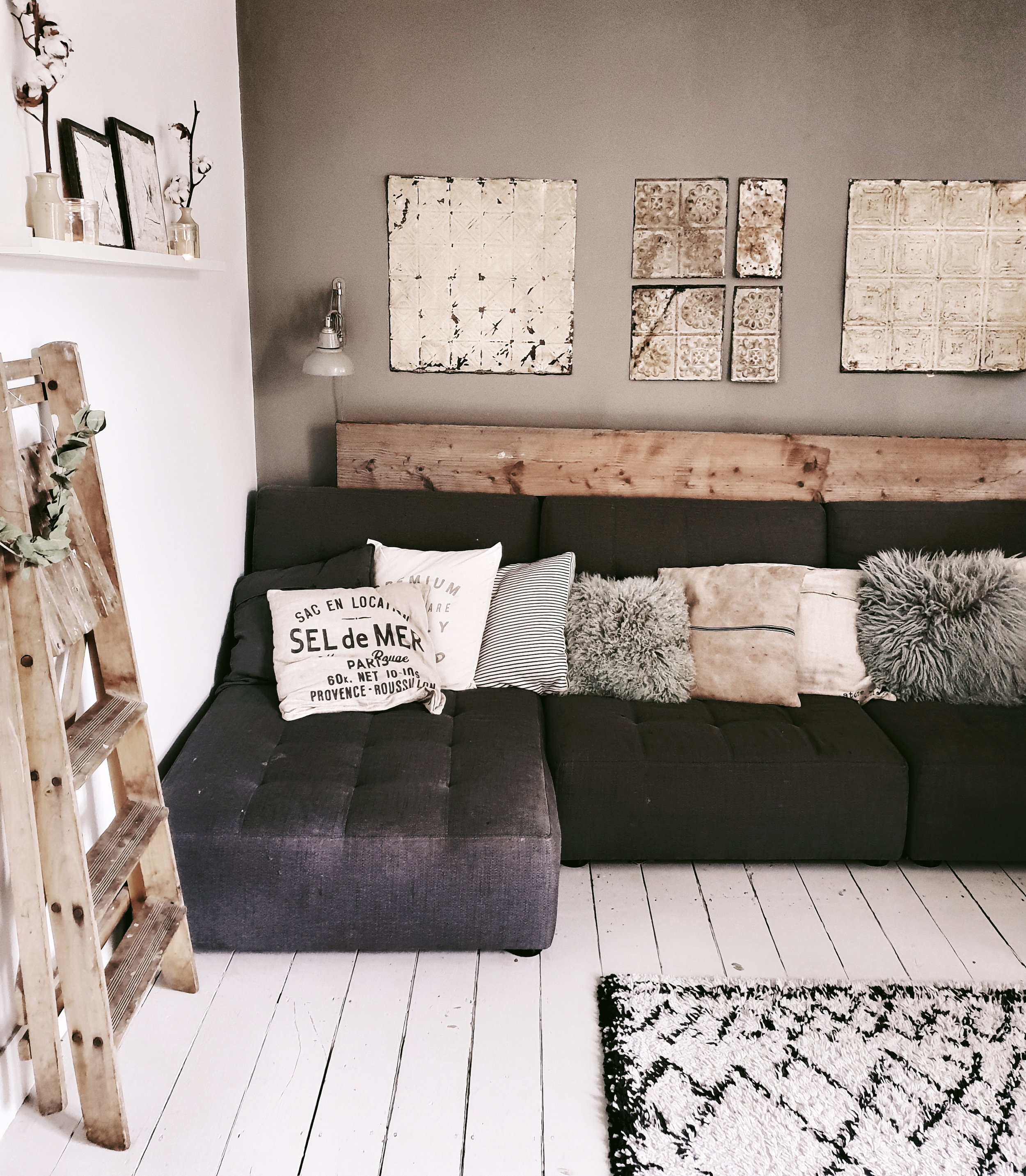
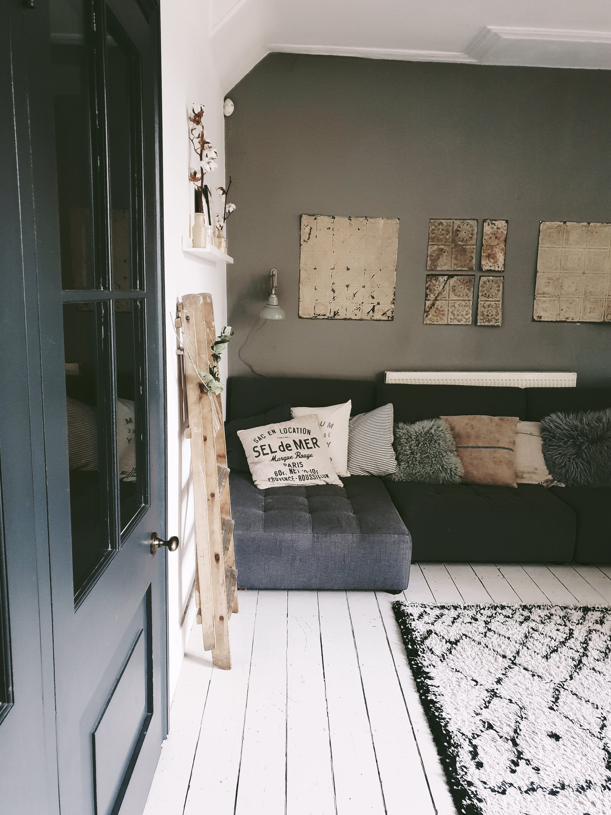
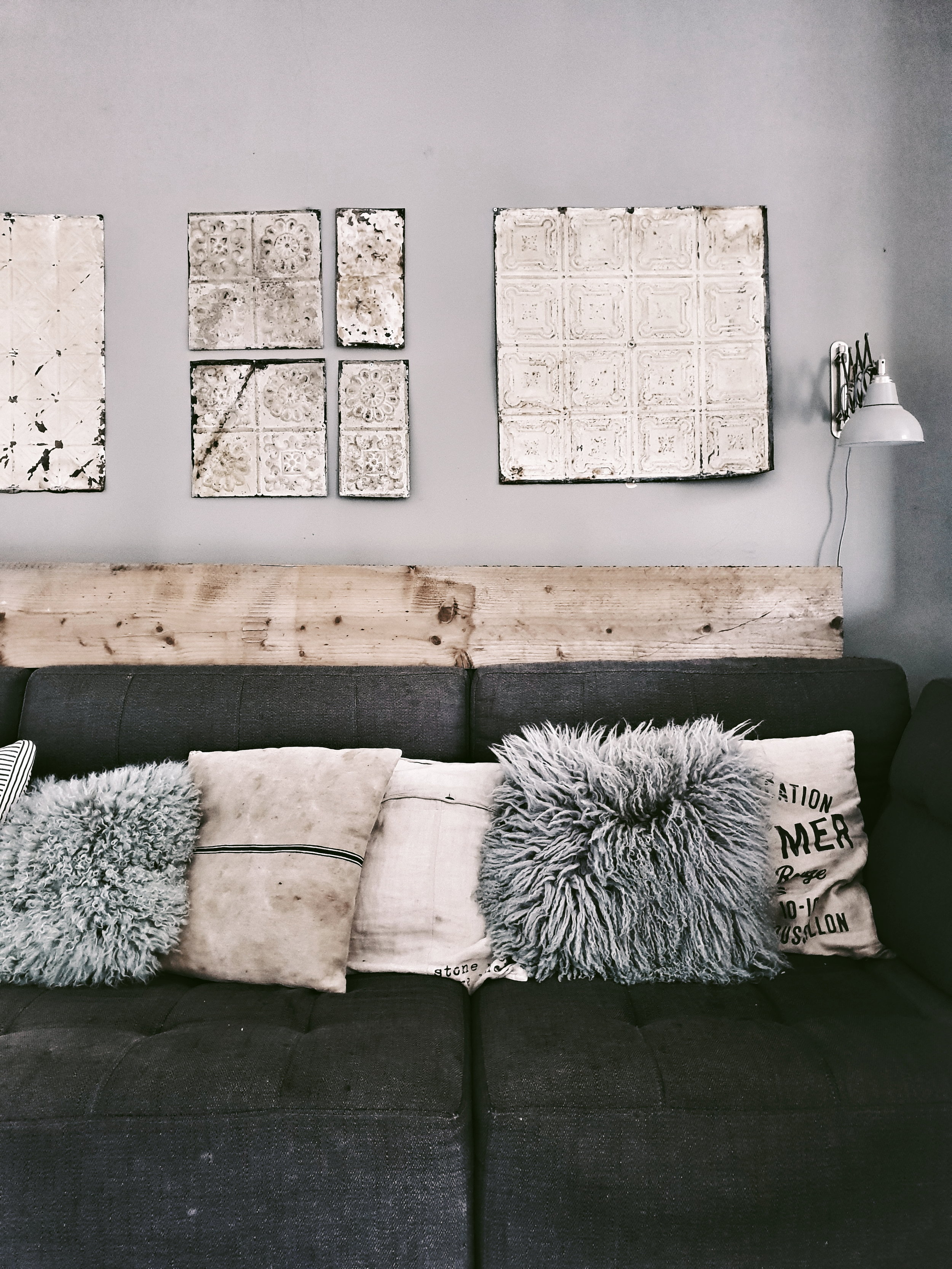
With the radiator shot cock block out of the way I am planning on making the wall behind the sofa more of a feature wall. Not in the Lawrence Lwellyn Bowen flocked wall paper sense obviously. It will not surprise you to learn that I have a more rustic/industrial plan up my sleeve. I currently have three of these gorgeous old Brooklyn ceiling tiles on the wall but I now want to go large and cover the whole wall with them. I know that you can now get wall paper with them printed on but I really want the texture and feel of the real deal. My inspiration comes from Baileys Home and Garden where they have done this to stunning effect. Nailing 50 of them to the wall should be simple right? If in the big room reveal it actually turns out to be a feature wall of LLB’s new satin flocked wallpaper you will know that it has turned out to be anything but.

Ceiling tiles on the bar at Baileys Home and Garden as captured by @kinshipcreative_dc

Ceiling tiles on the bar at Baileys Home and Garden as captured by @kinshipcreative_dc

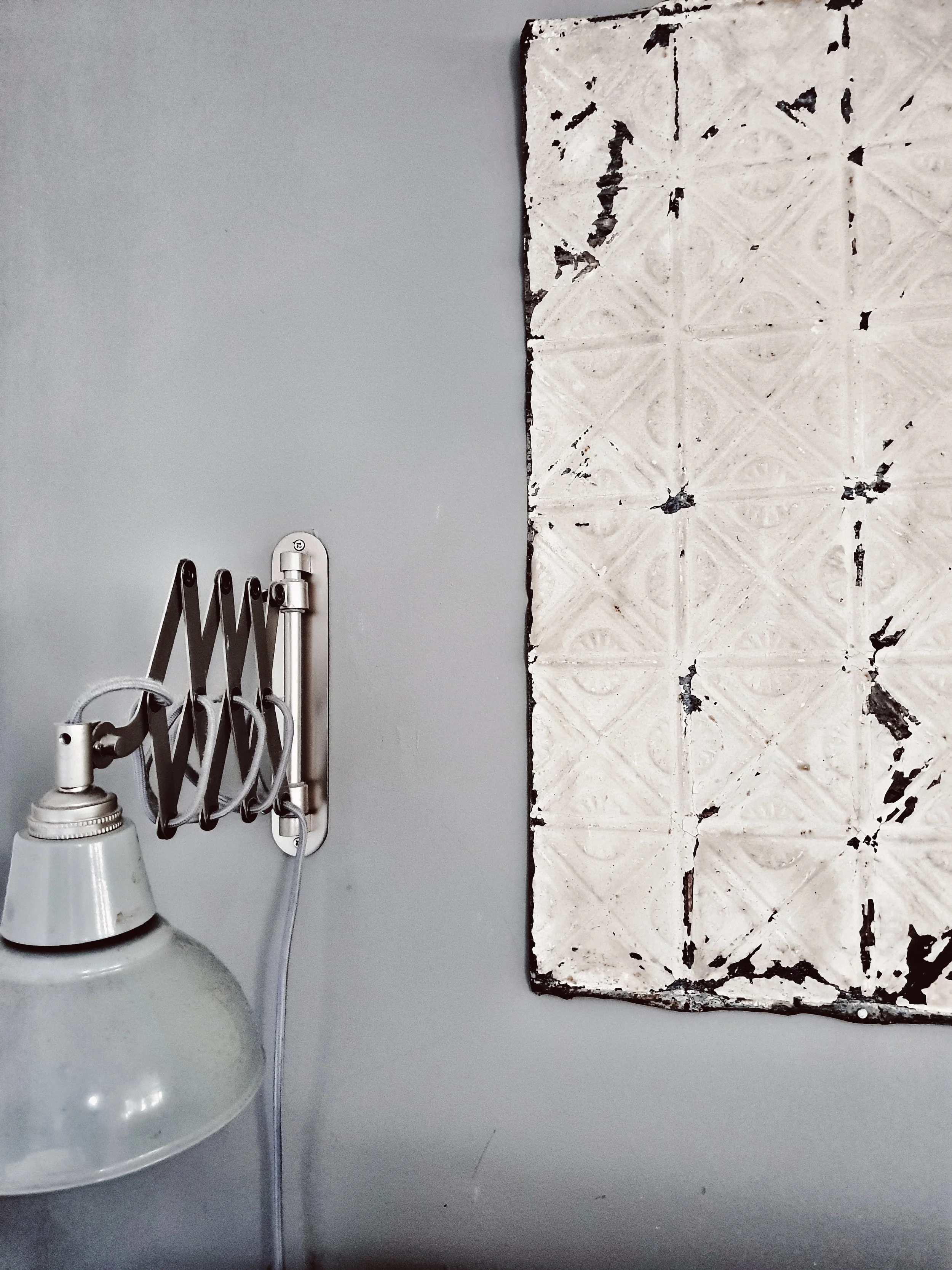
I picked up three of these beautiful Brooklyn ceiling tiles at Sunbury antiques fair a couple of years ago.

I picked up three of these beautiful Brooklyn ceiling tiles at Sunbury antiques fair a couple of years ago.

Only need to find another 49 of them now…..

Only need to find another 49 of them now…..

Step Three: Saying Goodbye to the Seatdrop Sofa

There is a school of thought that says that we should hang on to the minicab office sofa until the boys are of an age when they are able to eat a banana without nearby surfaces ending up looking like they have a bad case of fruit based thrush. However, I am going with a different more visually pleasing school of thought that says that if we have the corner sofa of my dreams in a smoky grey velvet they will love it so much that eschew their previous #badbananamanners. Has anyone else combined velvet soft furnishings and three boys without having to take a Valium anytime they go near it?

Trying to demonstrate to the boys that the sofa is for sitting pretending to read a coffee table interiors book on rather than trampolining

Trying to demonstrate to the boys that the sofa is for sitting pretending to read a coffee table interiors book on rather than trampolining

upload.jpg

Step Four: Trimming down the Toy Storage and Creating a Magazine Library

We are currently in the midst of a lengthy rearrangement and redecoration of the boys bedrooms which make building the Taj Mahal look like a quick project. Once that is complete I am hoping to relocate the current toy storage holder upstairs and replace it with something that belches plastic less frequently (ideas on a postcard please!). I would then love to add some more picture shelves to this wall to display some of my abundant collection of interiors mags because what woman doesn’t love to get her Kinfolk out for the lads? Although do you think that having more picture shelves might be too much with the wall of many rustic tiles as well?

This stunning shot from the home of @bloggabis is inspiration for my picture ledge extension

This stunning shot from the home of @bloggabis is inspiration for my picture ledge extension

The wall to the left is where I am envisaging the additional picture shelves going

The wall to the left is where I am envisaging the additional picture shelves going

But do you think it will be too much with my rustic tile feature wall as well?

But do you think it will be too much with my rustic tile feature wall as well?

Modern Scandinavian kitchen diner

So there you have it my Living Room makeover plans for 2019.  Apologies for the slightly analogue presentation of them.  Learning how to create a digital mood board is one of my life goals for 2019 after I have nailed more regular (by which I mean more frequently than twice yearly) maintenance of my bikini line and the art of loading the dishwasher so that it doesn’t look like it has been done by Gazza upon returning home from a night on the lash.


Styling a Scandinavian Christmas Table

Christmas can be an expensive time of year with presents, parties and panto combining to mean you have taken on the national debt of Belgium by the 1st of January. I love decorating my home for Christmas but I don’t think you need to spend a fortune doing it or to invest in loads of stuff that you are going to chuck away after Santa has set off back to the North Pole. If, like me, you are operating with more of a Morrisons than Macy’s budget then going for a Scandinavian inspired Christmas look is ideal. Our Scandinavian friends like to keep things simple and minimal and to use lots of natural foliage that you can forage from your garden or local parks under the cover of darkness.

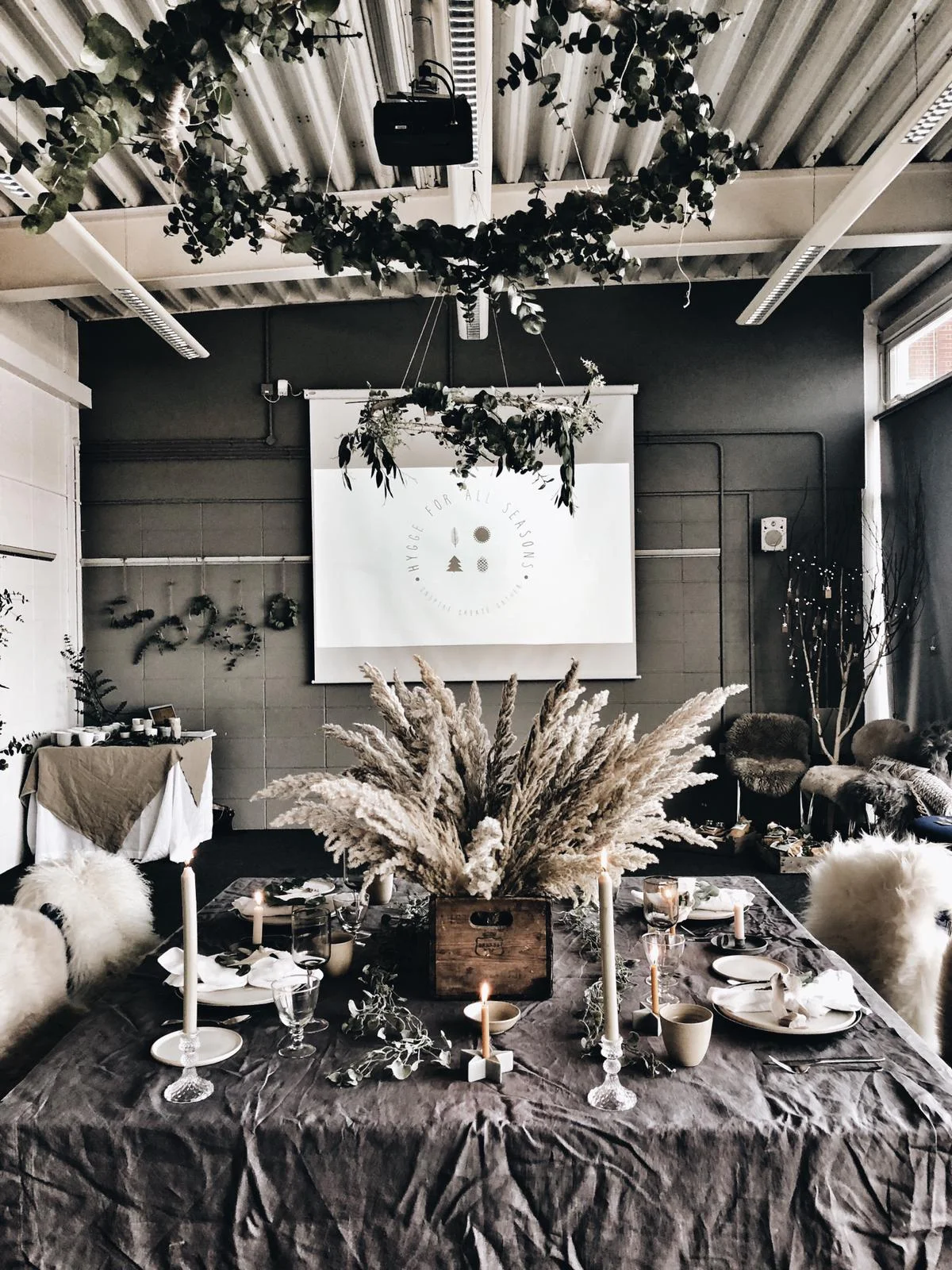
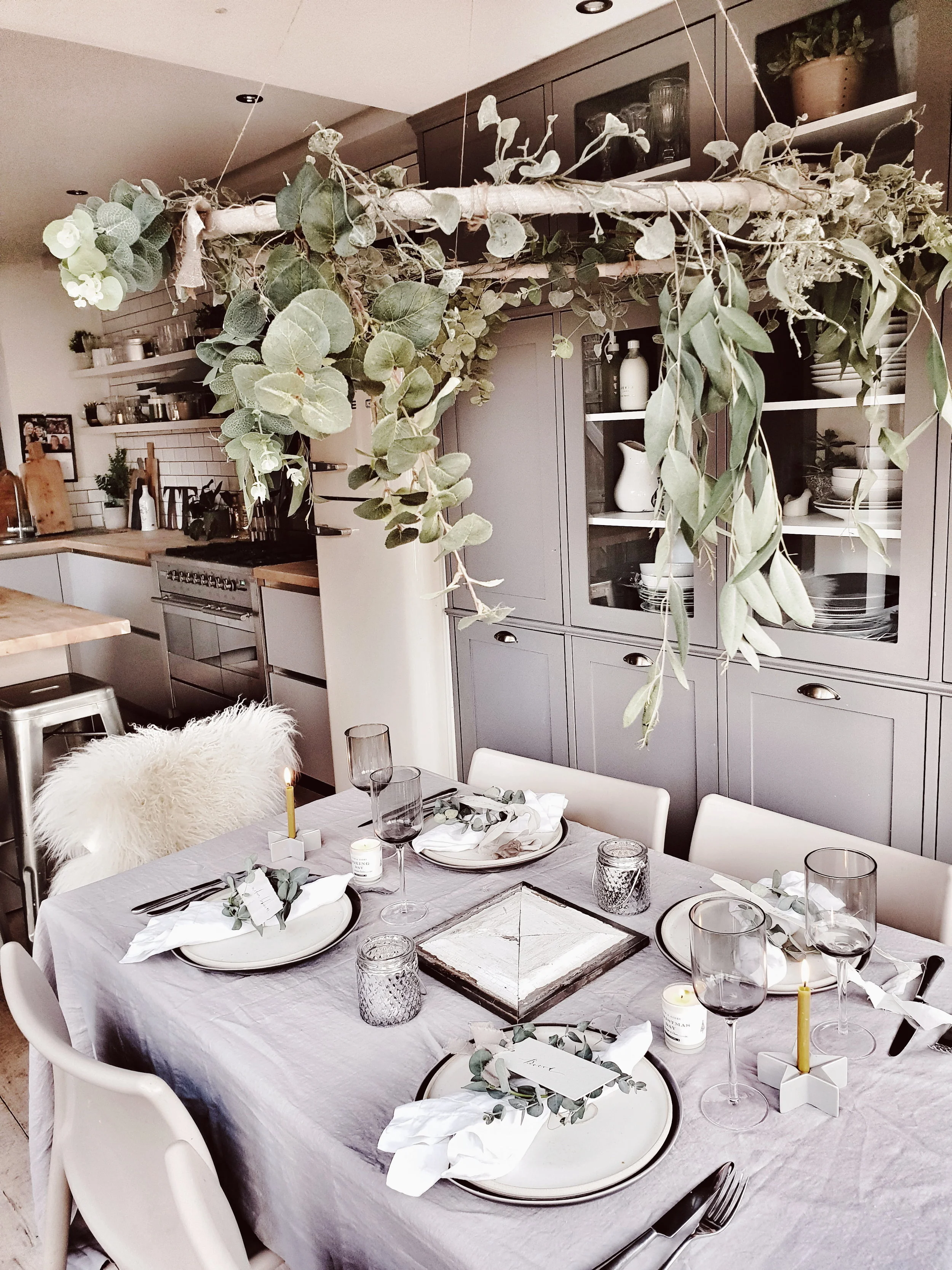
The Christmas table Reena and I created at our recent Hygge for all Seasons workshop

The Christmas table Reena and I created at our recent Hygge for all Seasons workshop

At our recent Hygge for all Seasons workshop at the Occasional Home Store, Reena (@hygge_ for _ home) and I created a Modern Rustic/Scandi inspired Christmas table scheme featuring 3 simple ideas for table decorations inspired by our favourite Nordic instagram accounts and nature. If you are not already following our inspiration accounts then you are in for a treat

The beautiful account of German sisters @babes_ in _boyland

The beautiful account of German sisters @babes_ in _boyland

Cool white Christmas with a boho twist in the Swedish home of @bytrineravn

Cool white Christmas with a boho twist in the Swedish home of @bytrineravn

Rustic maximalism in the Finnish home of @storm_ and _ clay

Rustic maximalism in the Finnish home of @storm_ and _ clay

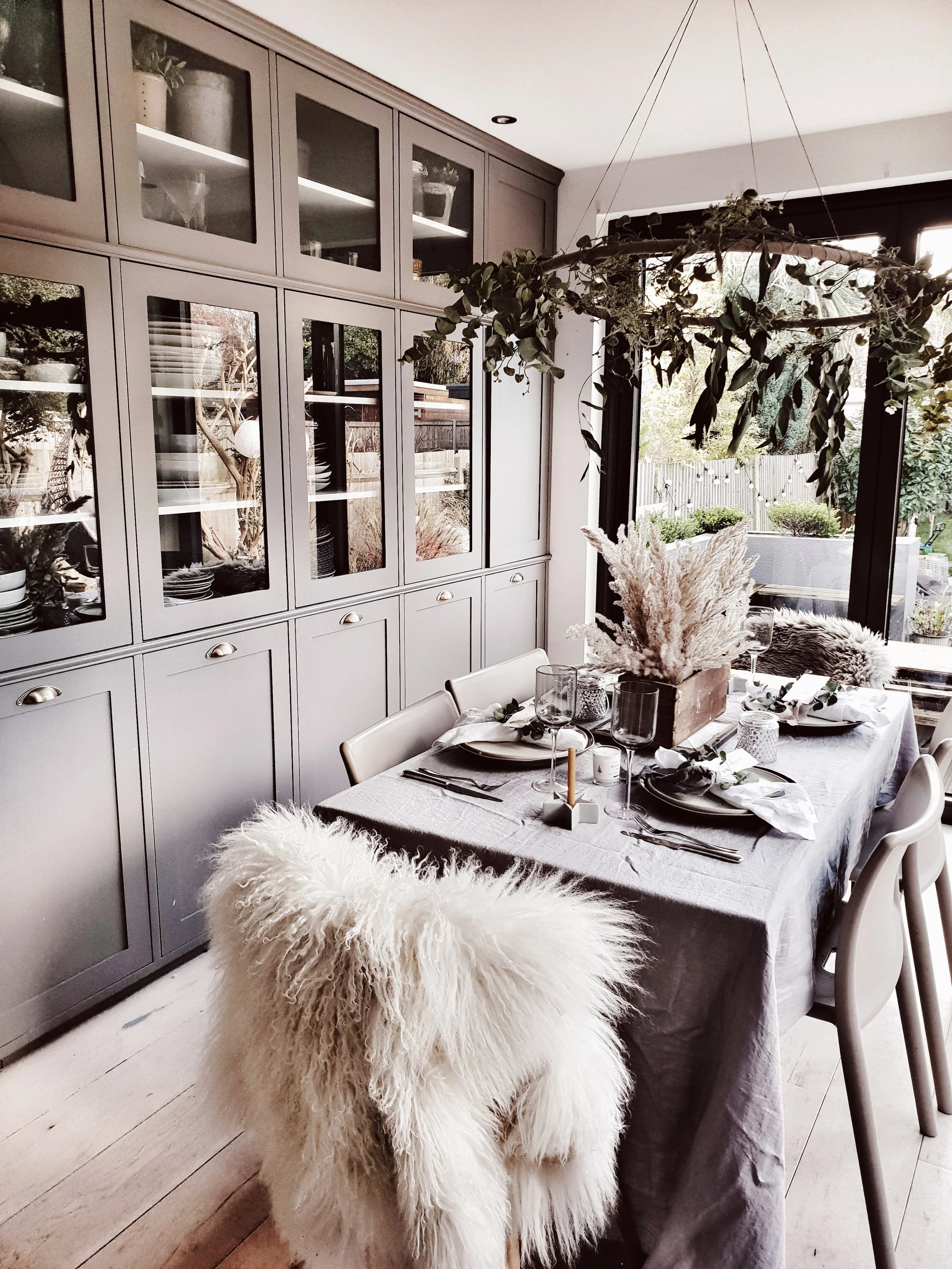
The space we were transforming for Hygge for all Seasons was a big lecture room overlooking a beautiful reservoir. It meant we were working with quite high ceilings and a bigger table than the average family would be sitting down to on the 25th December. But to show that the ideas can work in any setting I have also recreated them at home so you can see just how easy it is to do

The view out over the West Reservoir from our workshop room

The view out over the West Reservoir from our workshop room

Our workshop venue, a beautiful 1930s former water filtering station

Our workshop venue, a beautiful 1930s former water filtering station

We used a dark grey linen tablecloth kindly loaned to us by Chalk Pink Linen for the base of our table along with some of their lovely crisp fresh white linen napkins. They also do all of their linen in a gorgeous dove grey which I used when I styled my table at home. For our tableware we used earthy ceramic plates and beakers in muted neutral colours from Igigi General Store and then added interest to the table with some simple Scandi candle holders in the shape of stars from The King and I and I and for a tiny touch of twinkle some vintage crystal ones from Hellish Designs. We added a bit of Nordic drama to the table with our dramatic pampas table centrepiece and hula chandeliers.

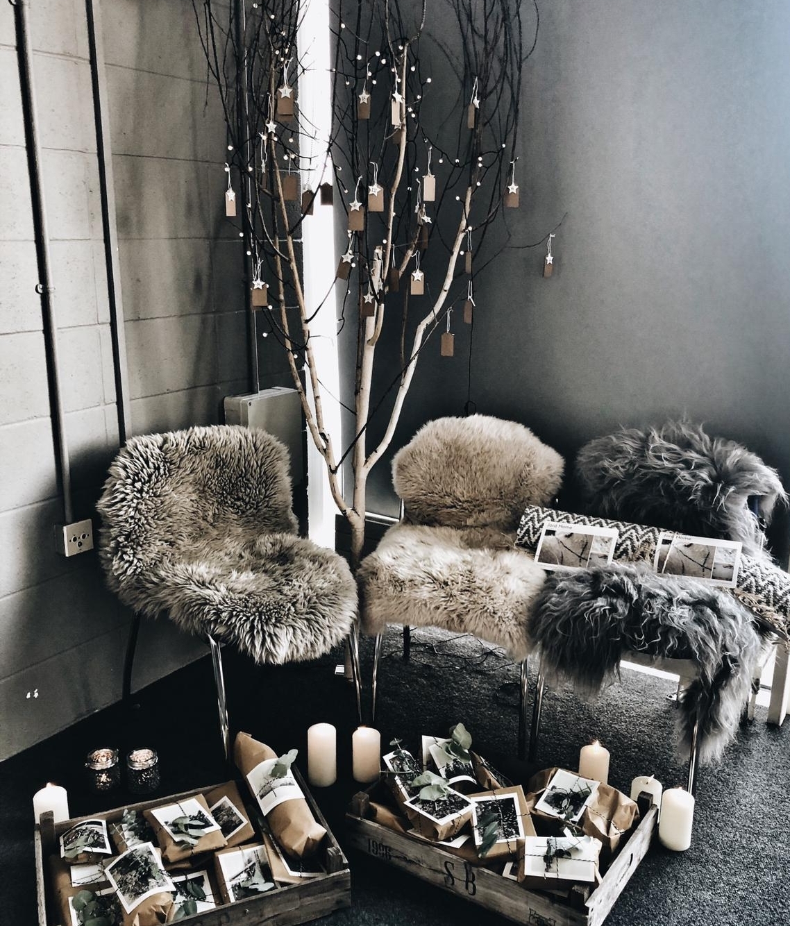
Our gifting advent tree allowed Scandi Santa to share some suprises with our guests from Jord Home, Malako Skincare, Sevin London, Thornback and Peel, Lovestruck Interiors, Kate and the Ink, Igigi General Store, and A Little Botanical

Our gifting advent tree allowed Scandi Santa to share some suprises with our guests from Jord Home, Malako Skincare, Sevin London, Thornback and Peel, Lovestruck Interiors, Kate and the Ink, Igigi General Store, and A Little Botanical

A charcoal grey tablecloth from Chalk Pink Linen provided a great backdrop to our table scheme

A charcoal grey tablecloth from Chalk Pink Linen provided a great backdrop to our table scheme

We were working with quite a big space so went for a dramatic table centre piece using pampas grass and made the table cosier by adding sheepskins to our chairs from Jord Home

We were working with quite a big space so went for a dramatic table centre piece using pampas grass and made the table cosier by adding sheepskins to our chairs from Jord Home

After feasting on Bronuts from Norahs Brownies (it turns out that combining two of my favourite cakes together creates a third cake I like even more) our work shoppers went home with a luxury botanical candle from Join London which are hand poured in Jen’s South-East London riverside studio and use only natural ingredients. If you were not able to come along on the day but would like to create a similar modern rustic look for Christmas table then read on and find out how to use chicken wire, a hula hoop and fencing wire to create a Nordic Noel.

The Hygge for all Seasons look recreated on a slightly smaller scale in my kitchen

The Hygge for all Seasons look recreated on a slightly smaller scale in my kitchen

Make your own rustic advent chandelier

What you need: One hula hoop, approx 1 metre of linen or hessan, masking tape, floristry wire, mixture of faux and real foliage of your choice

Ok so you maybe reading this think a chandelier?? I thought she said this was going to be full of affordable ideas not looks to steal from the Palace of Versaille. But bear with me because the chandeliers in question are made using the humble hula hoop. I sourced mine off E-Bay for about £3 but charity shops often have them too. To cover them I used natural linen but a cheaper alternative would be to use hessian which is roughly £5 a metre.

Start by cutting the hessian into 10cm wide strips. Either tie on to the hula hoop or, for a neater look you can use masking tape to secure it in place. Wrap the strips around the hoop until it is fully covered, this is your base. The next step is to wrap a foliage garland around the hoop securing using florists wire. I used a simple garland made by Parlane that cost me £8. Depending upon how dramatic you want your hoop to look tie on mixture of faux and natural foliage (eucalyptus is good as it looks fine even when dried). I wanted mine to have a bit of drama so i tied springs of eucalyptus on pointing downwards using florists wire. Finally, cut four lengths of twine (mine were about 60cms long but it depends on the ceiling height you are working with) and tie each length on about 30cm apart around the hoop.

The humble hula hoop transformed into a stunning scandi chandelier

The humble hula hoop transformed into a stunning scandi chandelier

Once you have completed all of those steps, all you need to do is find a way to suspend it from your ceiling. I got Mr Malmo to screw a small hook in (i think I made this request after he had had a couple of beers as screwing things into plasterboard usually sets off his ‘no fucking way’ alarm). You could equally just use command hooks if you are willing to accept that at some point in December they may lose their stick and deposit a chandelier on your crackers.

Pampas Grass Table Centrepiece

What you need: 30cm x 20cm wooden box, chicken wire, plyers and 10-15 stems of pampas grass

Pampas grass has been all over Instagram this year which either means swinging is having a big revival or that there is a massive trend towards using natural dried grasses in floral arrangements. I am really hoping it is the latter as I don’t fancy throwing my car keys in a bowl and going soixante neuf with my 86 yr old neighbour George who last possessed his own teeth sometime around 1987 and favours using an outside toilet. I have seen some great ideas for using pampas in your home, from creating a stunning hanging installation (check out the account of Signe Bay for inspo) to the more suited to a surban semi option of using it in a vintage box that I have gone with.

Pampas grass table centrepiece on christmas table setting

Because the scale of the venue at our Hygge for all Seasons workshop was big with high ceilings I was able to go a bit more dramatic creating lots of height with a vintage Canadian Dry box (which I am careful never to leave Reena alone in a room with in case she disappears off into the modern rustic mist with it). However back home I used a smaller box I picked up for £10 from Sunbury antiques and a bit less grass to create a slightly pared back version.

upload.jpg

My box was about 30-40cm long and 20cm wide. If you are struggling to source a vintage one then H&M Home also have some similar size ones with a rustic look to them. All you need apart from the box is some chicken wire, plyers and a bunch of pampas grass. I got my chicken wire online (which am fairly sure may have placed me on some sort of Interpol list) but you can also source from petshops.

Pampas looks beautiful but be warned it sheds more fluff

Pampas looks beautiful but be warned it sheds more fluff

Chicken wire is quite sharp so maybe pop some gardening gloves on for this bit

Chicken wire is quite sharp so maybe pop some gardening gloves on for this bit

Cut a roll of wire that will fit inside of your box (maybe wear gardening gloves to do so as I emerged from my skirmish with it looking like someone who had stuck their arm in a holly bush). Then basically just poke your pampas grass into the holes in the chicken wire in a manner that creates an arrangement you are happy with! If you have you mother-in-law coming round for Christmas lunch and want to avoid making chit chat with her about Barry from her Bridge group’s prostate then leave the stalks long. But if not maybe cut them to a more conversation friendly level of about 30cm. You may want to be careful about how closely you position it to candles as pampas is right up there with a shellsuit in terms of flammability.

I used a mixture of natural and faux foliage on my hoop chandelier. Dunelm is my favourite place to source realistic looking reasonably priced faux.

I used a mixture of natural and faux foliage on my hoop chandelier. Dunelm is my favourite place to source realistic looking reasonably priced faux.

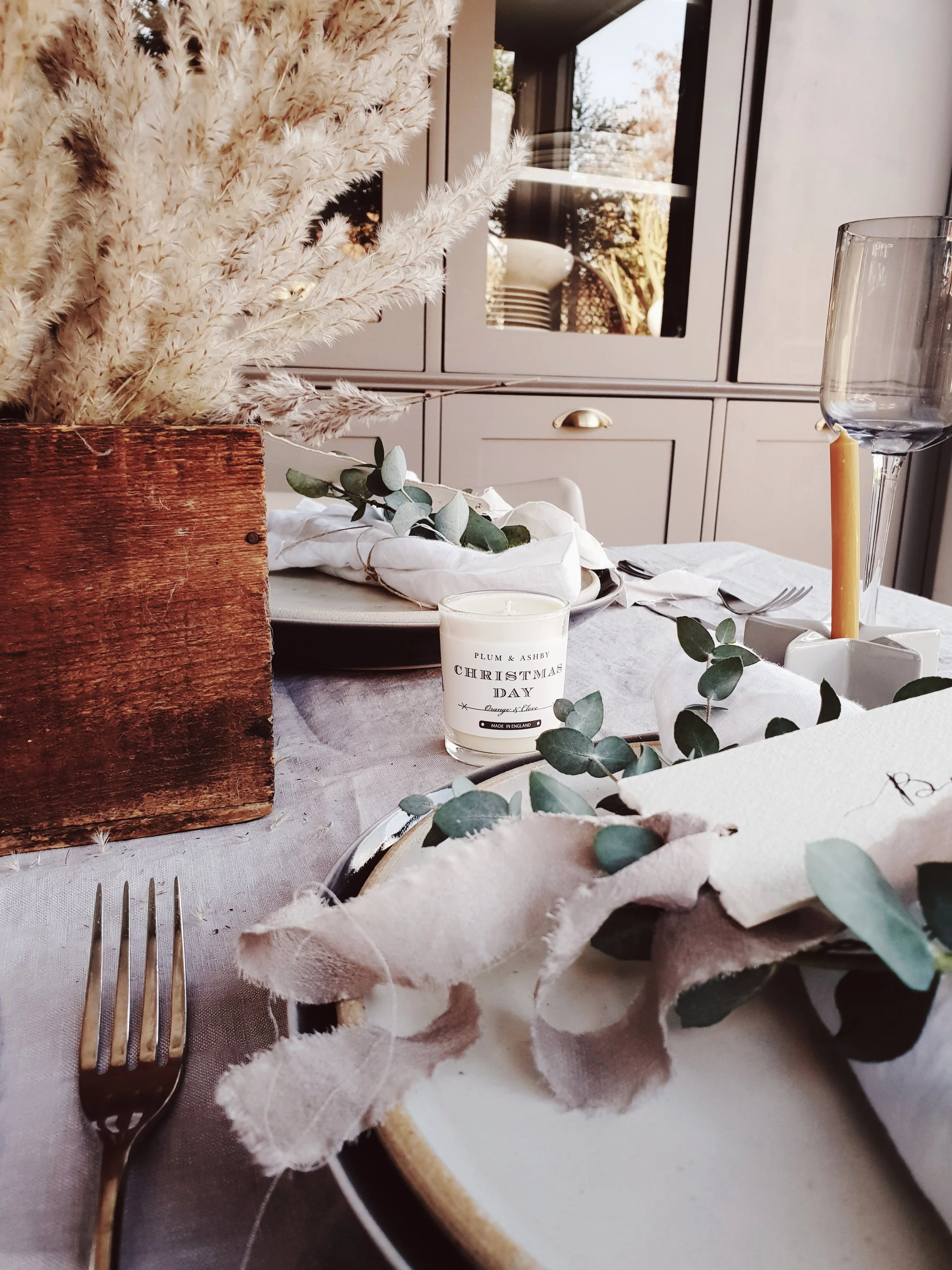
I love the height that the pampas adds to the table.

I love the height that the pampas adds to the table.

The wooden box adds warmth and texture to the Christmas table

The wooden box adds warmth and texture to the Christmas table

Scandi Christmas table setting

Mini Eucalyptus Wreaths

What you need: euclyptus, wire and floristry wire.

To add some greenery into our Christmas table we made mini eucalyptus wreaths which acted as a backdrop to beautiful calligraphy christmas labels from Oysterbridge Co. My original idea was to make mini rosemary wreaths having seen them on Pinterest. I don’t know if it was because my supermarket rosemary was just too short but 45 minutes into my minature wreath making all I had was a herb heavy lap and a sprig of rosemary balder than Kim Kardashian’s bikini line tied in a circle. So I went back to the drawing board, rejected the rosemary and turned to the far more plyable eucalyptus instead.

upload.jpg

The wire helps to create structure and it means you can secure the foliage in place using floristry wire. You can make them as big or as small as you like in terms of the size of the hoop (this idea would equally work to make hoops to hang on a wall as the wire is quite sturdy). And you can go simple or more dramatic in terms of how much foliage you add. I kept ours quite simple because we were putting the labels on top and didn’t want to detract from them. The mini wreaths will also make your christmas table smell amazing.

Create a wire base (close your loop by simply wrapping the wire ends together) and then secure your foliage in place with small lengths of floristry wire.

Create a wire base (close your loop by simply wrapping the wire ends together) and then secure your foliage in place with small lengths of floristry wire.

Et voila one mini eucalyptus wreath

Et voila one mini eucalyptus wreath

Add a personal touch to your table with these gorgeous handwritten labels from Oysterbridge Co

Add a personal touch to your table with these gorgeous handwritten labels from Oysterbridge Co

upload.jpg
I made this wreath a little bit less neat as I loved how it looked with the sprigs fanning out slightly

I made this wreath a little bit less neat as I loved how it looked with the sprigs fanning out slightly

We would like to say a huge thank you to the 31 lovely people who came along to Hygge for all Seasons in November and made it so much fun. We have loved seeing how people have incorporated the ideas from the workshop into their Christmas decor already. We would also like to thank all of the brands that collaborated with us in providing gifts for our works shoppers (including Join London, Sevin London, Malako Skincare, Igigi General Store, Love Struck Interiors, Thornback & Peel, Kate and the Ink and Chalk Pink Linen) and items to use in our table styling (Chalk Pink Linen, Igigi General Store, Lights 4 Fun, Hellish Designs and The King and I).

upload.jpg

Autumnal Table Styling Ideas

There are a couple of job interview questions I always struggle to answer. The first is “what is your greatest weakness”. This is not tricky because I think I am perfect but more because the answer on the tip of my tongue is always Cornish Cruncher Extra Strength Cheddar Cheese and a packet of Pickled Onion Monster Munch rather than the more employment friendly “a small blind spot when it comes to understanding full functionality of the wrap text field of Microsoft Excel.” Second on my list of dreaded questions is “tell me about your hobbies”. I am pretty sure the “You’re Hired” answer has something to do with running triathlons whilst reading ‘A Brief History of Time’ whereas in truth one of my favourite ways to while away my leisure time is creating seasonal tablescapes. So when Sainsbury’s Home asked me if I would like to pick a few items from their Autumn/Winter range for my kitchen I was in my hobby heaven

My kitchen in October

My kitchen in October

After 11 years of marriage and 14 years of dating a remarkably high percentage of our shared kitchenware still dates back to our student days when it was put through its paces cooking high end cuisine such as beans on toast and fish fingers on a bed of super noodles (don’t knock it until you have tried it people). With the motely selection we have accrued approaching the end of its life I chose a selection of kitchen and tableware from the rustic retreat and escape ranges that Sainsbury’s have introduced this Autumn/Winter. I selected Scandinavian inspired items in a neutral colour palette of soft greys and natural materials such as wood that would stand the test of time in my kitchen beyond this season. Affordable homeware doesn’t have to mean disposable homeware.

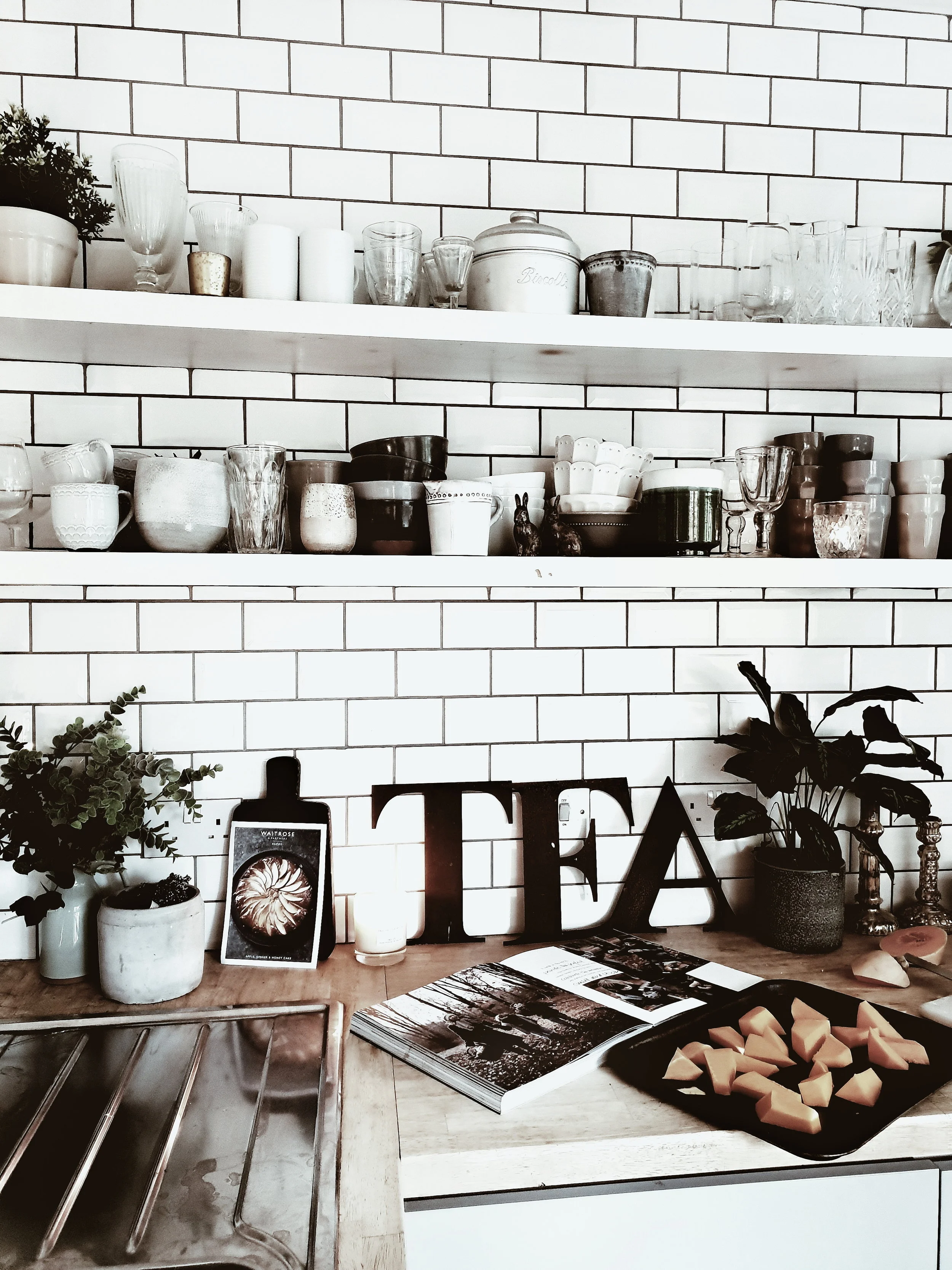
My scandinavian kitchen with grey kitchen units, open shelving and metro tiles on the wall. It is a light, contemporary kitchen with modern rustic feel #modernrustic #contemporarykitchen #greykitchen #kitchenideas #kitchendesign

I put them through their paces cooking a couple of my favourite autumnal recipes, taken from a book I cook from on repeat: Seasons by Donna Hay. The photography and the food are both amazing. The recipes I selected both use just 4 main ingredients and can be whipped up with about 5 minutes preparation: perfect for a quick but delicious midweek meal if, like me, you often need to cook with a toddler attached to a leg and whilst shouting at someone to stop playing FIFA and start doing their homework.

upload.jpg
upload.jpg

I sourced all of the ingredients for the recipes from our local Sainsbury’s which I think it is fair to say is where I spend about 35% of my life in trying to keep up with the insatiable appetites of 3 hungry sons who consume sliced bread, bananas and milk at an alarming rate.

Butternut squash after a struggle chopped up and ready to go in the oven once mixed with some olive oil and seasoned

Butternut squash after a struggle chopped up and ready to go in the oven once mixed with some olive oil and seasoned

Butternut Squash, Mozzarella and Palma Ham Salad

Ingredients (serves 2-3)

2 Butternut Squash, 375g Mozzarella Cheese, 500g Palma Ham, handful of thyme, salt and peppper to season

Method

It is so simple to make there is almost need to type out instructions! Basically you peel the Butternut squash then chop into wedges (this is the hardest part as I ending up sweating like a shotputter trying to slice through a particularly stubborn butternut), place on a tray, drizzle with olive oil and season then cook for 25-30 mins. In the meantime tear up the mozzarella and cut the palma ham into strips. Take the butternut squash out of the oven and combine in an instagram friendly fashion on a plate scattering chopped up thyme on to taste. Simple to make but totally delicious

Larking around with my big butternuts….

Larking around with my big butternuts….

I may look calm and composed in this picture but the outtakes capture me looking like an irate Bulgarian shotputter after the butternut refused to yield to my knife.

I may look calm and composed in this picture but the outtakes capture me looking like an irate Bulgarian shotputter after the butternut refused to yield to my knife.

Having emerged victorious from the #BattleOfTheButternut I set to work on the fun part: creating my tablescape. I chose dinner plates and pasta bowls from the Urban Escape range in a lovely muted grey. They are the kind of plate that you can use everyday without fear of chipping and stick in the dishwasher but their simple Scandi good looks lend themselves to fancier dining as well (featuring non-beige food). To compliment the plates I also selected a really lovely carafe and set of wine glasses in a smoked grey and I loved the contrast they create with the plates

Smoked grey wine glasses and carafe from the Urban Escape range and an oak chopping board from the Rural Retreat range

Smoked grey wine glasses and carafe from the Urban Escape range and an oak chopping board from the Rural Retreat range

Tablescape set and ready to receive food! I love how the simple minimal scandi style of the tableware and glasses works against vintage items that I added to the table to create texture and warmth

Tablescape set and ready to receive food! I love how the simple minimal scandi style of the tableware and glasses works against vintage items that I added to the table to create texture and warmth

The oak chopping board makes the perfect centre piece for bread to share, this is clearly not a tablescape for dining with the kids as the bread would be the far less instagrammable Hovis 50/50 medium sliced otherwise…

The oak chopping board makes the perfect centre piece for bread to share, this is clearly not a tablescape for dining with the kids as the bread would be the far less instagrammable Hovis 50/50 medium sliced otherwise…

Butternut squash, palma ham and mozzarella salad. Simple but totally delicious and the battle with the butternut guarantees you will probably burn more calories in preparing it than you will consume eating it!

Butternut squash, palma ham and mozzarella salad. Simple but totally delicious and the battle with the butternut guarantees you will probably burn more calories in preparing it than you will consume eating it!

I love the contrast that the smoked grey glasses create with the plates and it all pops out when using a dark linen table cloth as a backdrop

I love the contrast that the smoked grey glasses create with the plates and it all pops out when using a dark linen table cloth as a backdrop

Vintage wooden kitchen table set with grey linen table cloth, pale grey plates and bowls from Siansbury's Home and rustic oak chopping board #rustickitchen #tablesetting #autumntableideas #autumnalinteriors

For pudding I turned once more to Donna and selected a delicious sounding maple and pear tarte tatin.

Maple Pear Tarte Tatin

Ingredients (serves 4-6 depending upon how greedy they are!)

6 dessert pears, 375g puff pastry, 4 spoonfuls of golden syrup, 80g of butter

Method

Peel and slice the pears to about a one pound coin thickness (which are a joy to work with compared to the bastard butternuts). Melt the butter in a pan over a medium heat and then add to syrup and bring to the boil. Turn down to a simmer for 2 minutes and then remove from the heat. Arrange the pears to cover the bottom of a 20cm oven proof pan and then pour over the butter/syrup mixture. Then place over the top the puff pastry cut to a 22cm circle and place in the oven. Cook for 20 mins (or in my case until the smoke alarm goes off because some of the syrup mixture has escaped the pan and formed a mini bonfire on the bottom of the oven). Serve with creme fraiche or clotted cream

The kitchen set read for round two. Gorgeous grey mixing bowl and wooden and grey silicone cooking utensils pictured all from the Rural Retreat range

The kitchen set read for round two. Gorgeous grey mixing bowl and wooden and grey silicone cooking utensils pictured all from the Rural Retreat range

Taking time out for a cup of tea and praying that pears are easier to peel than butternuts…

Taking time out for a cup of tea and praying that pears are easier to peel than butternuts…

Bowl and whisk pictured from the Rural Retreat range. Behold the Maple Pear Tart Tatin of dreams

Bowl and whisk pictured from the Rural Retreat range. Behold the Maple Pear Tart Tatin of dreams

But will mine turn out this well?!

But will mine turn out this well?!

It is a stunningly easy and delicious dessert to make and it was a dream to use new kitchen utensils which had not seen active service in the University of Manchester Halls of Residence kitchens mainly stirring supernoodles. I love the earthy contrast of the oak handles of the rural retreat range against the scandi inspired grey. They look great against the white metro tiles in my kitchen and make my utensil selection about 100% more stylish!

Mixing the pears in with the butter and syrup mixture and trying not to set light to my ill advised take on chefs whites

Mixing the pears in with the butter and syrup mixture and trying not to set light to my ill advised take on chefs whites

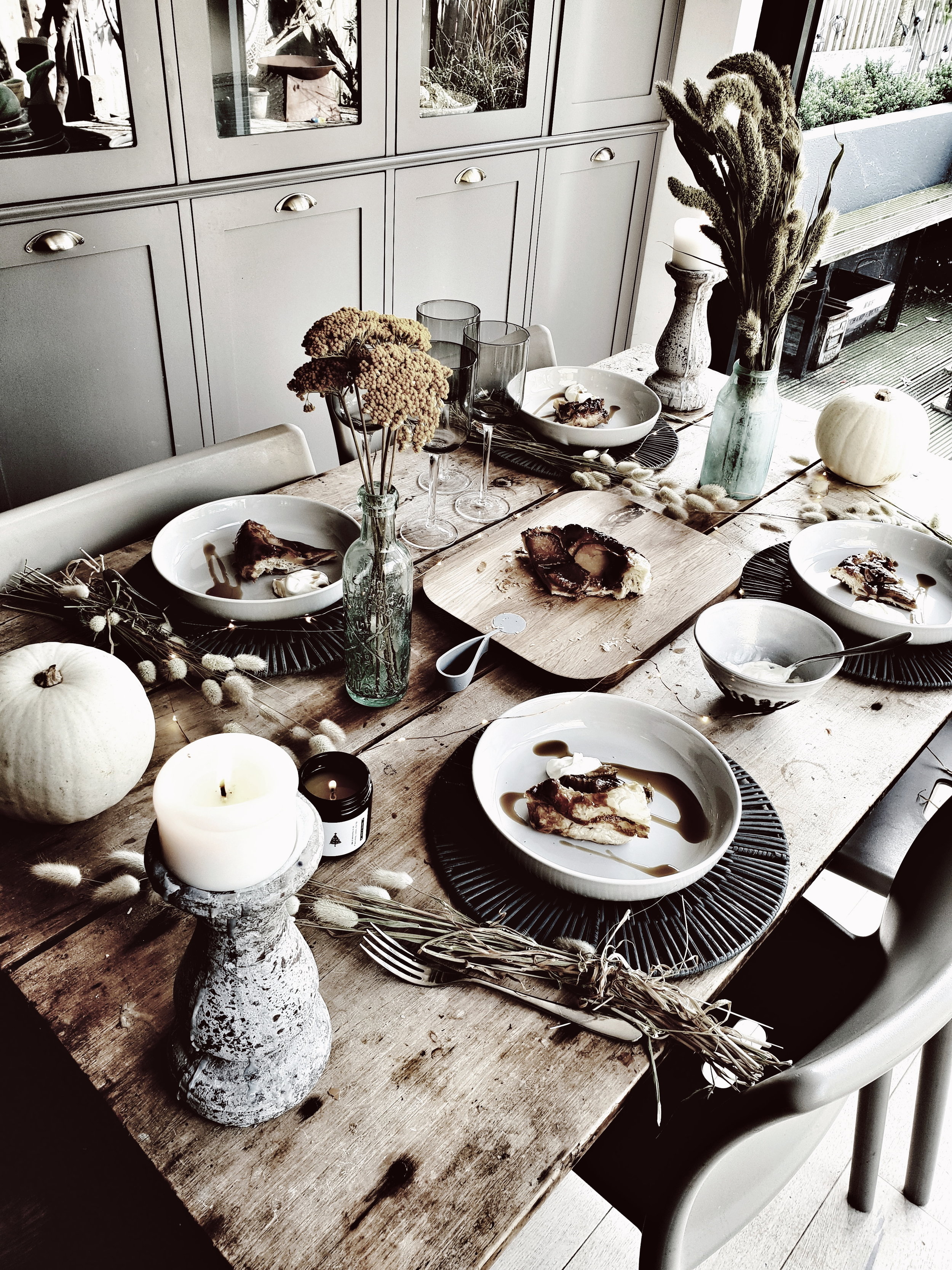
With the tarte tatin in the oven I performed a quick turnaround on tablescape number two. Whipping away the table cloth to reveal the natural texture of our vintage farmhouse kitchen table and adding in some gorgeous dried flowers in autumnal colours and some scandi white pumpkins to up the autumn factor. I love the contrast between the texture of the table and the simple pale grey of the plates. The pasta bowls are great for serving dessert in as you can add in a drizzle of maple syrup and dollop (is there a more satisfying word known to man?!) of creme fraiche without fear of it escaping!

The dark grey table mats look great against my vintage farmhouse table. They are available in store but not online

The dark grey table mats look great against my vintage farmhouse table. They are available in store but not online

White pumpkins adding a modern rustic touch to the table

White pumpkins adding a modern rustic touch to the table

I also added in these lovely rattan table mats from the Urban Escape range (available in store but not online) to provide a bit of additional contrast, they are a timeless style and colour that I know I will get lots of use out of. I used the oak chopping board to display the tarte on which turned out pleasingly like the picture despite its emergency evacuation from the oven

Dried flowers are a great alternative to fresh as they can last you through the Autumn season and beyond and are really versatile.

Dried flowers are a great alternative to fresh as they can last you through the Autumn season and beyond and are really versatile.

I love how the new items I have added from the Rural Retreat and Urban Escape ranges mix with my collection of vintage bottles and the natural texture of my french farmhouse table

I love how the new items I have added from the Rural Retreat and Urban Escape ranges mix with my collection of vintage bottles and the natural texture of my french farmhouse table

Just add creme fraiche and a drizzle of maple syrup to serve

Just add creme fraiche and a drizzle of maple syrup to serve

Pear Tarte Tatin served up on pale grey plates from Sainsbury's Home on a rustic wooden farmphuse table and set with vintage bottles and dried flowers for a modern rustic feel #farmhousekitchen #farmhousedecor #kitchentable #vintagekitchentable #aut…

So there you have it, two ideas for autumnal tablescapes with a rustic Scandi twist. I hope you enjoy giving the recipes a try and updating your kitchen with the Rural Retreat and Urban Escape ranges from Sainsbury’s Home.

Pear Tarte Tatin served up on pale grey plates from Sainsbury's Home on a rustic wooden farmphuse table and set with vintage bottles and dried flowers for a modern rustic feel

This blog post was kindly sponsored by Sainsbury’s Home

Mood board your perfect space with Corian® Design

*This blog post is a paid advertorial with Corian Design*

When we extended and renovated our kitchen back in 2012 I had just given birth to our second son and was about to embark upon a career change that would involve forfeiting two thirds of my previous salary (remind me why I thought that was a good idea again?!).  That meant we were working to quite a strict budget and so there were certain items on my wish list that I had to compromise on.  Worktops were one such item. 

Corian Kitchen.jpg

I had my heart set on marble, concrete, or Corian surfaces but it was a case of champagne taste and lemonade budget. In the end,  we ended up going for wood.  Five  years later,  I still regret that decision.  It is not that I don’t like the wood it is just that I don’t love it and I have been slowly working on persuading Mr. Malmo that it would be a good idea to upgrade the worktops ever since.

The worktop in the holiday home we recently stayed in during a trip to the Netherlands made me regret my original wooden worktop choice!

The worktop in the holiday home we recently stayed in during a trip to the Netherlands made me regret my original wooden worktop choice!

So when Corian® Design asked me to try their new Moodboard Maker tool I jumped at the chance!  I am one of those people who is literally unable to visualise anything using only my imagination so the Moodboard Maker is the perfect tool for me.

Who is  Corian® Design?

Corian® Design is a  designer and manufacturer of high quality Solid Surfaces which are made using a blend of minerals and acrylic and can be shaped into literally any design or size you want.  There are over 100 different colours and patterns available to choose from so whatever your interior style there will be an option that will work for your space. 

The Corian Moodboard Maker

If you are ever having a bad week at work or the kids are winding you up,  forget yoga, pilates or meditation and get mood boarding!  It may be less likely to tone your abs, improve your core or flexibility, but I think it is one of the most relaxing and therapeutic things you can do as it allows you to escape from reality for a little bit and get in touch with your creative side. The mood boarding I have done in the past when planning out room schemes has been of the analogue variety in the sense that it involved pritt stick, scissors and lots of ripped out pages from magazines.  I was really keen to try the much less messy digital version.

An introduction to the Moodboard maker

An introduction to the Moodboard maker

I am not naturally good with technology.  Actually, I am naturally terrible with technology.  I have an innate ability to crash an app at 50 paces and I think the IT guy at work has now started fielding my calls to avoid the almost daily questions I have about how to use Microsoft Excel.  Therefore, when I say if I can use the Corian Moodboard Maker tool, then anyone can. I really mean it!  It is super simple and straightforward.   The end goal is to create a visual mosaic with several  pieces that represent different surfaces, textures and materials to create a design story for your space. 

The first step in the process is to choose a style that you think best represents you. The options include Organic, Minimal, Relaxed, Modern, Refined, Bohemian or Edgy.  The different styles come with a different range of inspiration pictures to choose from. But, you can also upload your own images to the tool quite  easily to give you extra choices and personalization.  I played around with Organic and Bohemian styles but in the end decided on Minimal as I felt it best captured my Scandi-inspired look. 

My kitchen and the existing wooden worktops

My kitchen and the existing wooden worktops

You then have a blank Moasaic shape with several  different segments to fill.  The first step is to pick a Corian® Design swatch that you want to showcase and then you can build the rest of the mosaic around it.  You can select more than one Corian® Design Solid Surface swatch if you are struggling to narrow down your options or want to play around with the look and feel.   I chose Corian® Solid Surface in Silver Gray and Arrowroot because I am most drawn to these two and am struggling to make a decision.

Corian Moodboard Maker

You then fill up the rest of the segments either using the bank of pre-existing images available in the tool or by uploading your own images which could be anything that inspires you, it doesn’t have to be strictly interiors related.  So if you have of a beautiful sunset from your holiday that you really like the colours/feel of then add it into the mix. 

I used a combination of images from my own home (both room shots and close ups on textures such as the front of one of my cupboards) and then also drew upon some of the existing Corian images as they blended really nicely with my own pictures. 

Photo credit Vintage Piken

Photo credit Vintage Piken

I used a picture of the front of one of my kitchen cupboards because I like the distressed wood

I used a picture of the front of one of my kitchen cupboards because I like the distressed wood

You can easily drag and drop images in and switch them around if you don’t think you have the right combination.   Et voila one finished moodboard which you can download to your phone or computer, share on your social media platforms, pin to your Pinterest board for your project or even order a framed print of!  Here’s my final moodboard:

My final mood board created with the Corian Moodboard Maker

My final mood board created with the Corian Moodboard Maker

Discovering the Dutch Coast

Tell people you are going on holiday to the Maldives and you will be greeted with reactions such as "wow that sounds amazing" or "you lucky thing I am so jealous" or "you are going to have such a fabulous time".  Tell them you are going to spend a week taking in the beaches of the North Sea in Holland and you are more likely to encounter perplexed looks (think Joey from Friend's smell the fart acting face) and querying comments such as "Holland?  That is an unusual choice" or "What made you decide to go there?"  Chances are nobody will say "Ohh Holland, you are going to love the stunning coastline, oodles of beach clubs with amazing boho interiors and tiny hamlets over looking the water with cobbled streets and clapboard houses." Well, unless you tell Kinship Creative, my Scandi Sister from another mother that is.

The gorgeous interior of Branding Beach Club

The gorgeous interior of Branding Beach Club

It was on her instagram feed a year or so ago I first spotted an amazing looking beach bar with bleached rattan furniture and rustic textures galore that I mistook for a hotspot in Ibiza but which turned out to be on the Dutch coast just 30 mins away from Amsterdam, a city we had a one night stand with (not in) last February.  One night was enough to make me think I would very much like to go steady with the Dutch capital city.  Dotted as it is with beautiful buildings, amazing cafes, cool lifestyle and homeware stores and great museums and parks to keep kids entertained.

Amsterdam through the eyes of Petite Passport

Amsterdam through the eyes of Petite Passport

So just after Christmas I started doing my Air BnB research.  It quickly became apparent that to stay in central Amsterdam itself in the Summer holidays in something that was not a shoebox or a youth hostel (although to be fair some of those looked quite nice) would potentially cost more than the UK's Brexit bill.  I was about to give up when I widened out my search area a little bit and spotted a clapboard house located on a dyke (an inland sea) about 15 mins drive outside of Amsterdam which fitted the bill perfectly.

Talk about kerb appeal, our Air BnB for the week

Talk about kerb appeal, our Air BnB for the week

Sometimes in life things which look great in a photo or on the TV turn out to be disappointing in real life.  Like Dermot O'Leary for example who I used to be rather partial to until I spotted him in Euston WH Smith and realised he is about the size of a small Irish Leprechaun in the flesh.  Happily when we arrived out our home in the Holland for the week it turned out we had the luck of the Irish on our side.  Click here for the Air BnB link but the pictures really can't convey what an amazingly idyllic setting it is in.  Durgerdam is a tiny Hamlet of impossibly appealing houses looking out to sea.  Our view to the front of the house was of boats bobbing in the harbour and sailing in the sea beyond and from the back there were meadows with sheeps and cows grazing with a stream running out throught the field.

The beautiful veranda looking out over meadows

The beautiful veranda looking out over meadows

upload.jpg
upload.jpg

The house is arranged over 3 levels and is a perfect base for a family break.  The owners also have three sons of very similar ages to ours so there were a wealth of toys and activities to keep the trio of todgers entertained including a pool table, a mini astroturf pitch a full scale basketball net and a sandpit  all in a safely enclosed garden.  This meant that I actually managed to spend ten minutes lying in the huge hammock on the veranda which wraps around the house without anyone under the age of 8 appearing to tell me they were bored, had accidentally flushed their lego down the loo/wanted to use my phone to play a game that involves a sausage on legs running an assault course that would consume my annual data allowance.

I had competition for the hammock

I had competition for the hammock

Anyone for Tennis/Volleyball/Football/Basketball ? The mini astroturf pitch in the garden kept the boys very happily entertained as did the cows who would occasionally pitch up to spectate over the fence

Anyone for Tennis/Volleyball/Football/Basketball ? The mini astroturf pitch in the garden kept the boys very happily entertained as did the cows who would occasionally pitch up to spectate over the fence

There was also a huge range of indoor toys to keep them happy

There was also a huge range of indoor toys to keep them happy

There are 4 bedrooms, two double, two single kids room and two bathroom all decorated in a crisp clean Scandi inspired style with some gorgeous rustic features like the pine cladding wall in the main bedroom and concrete sinks in both of the bathrooms.  It is a style I am going to call Netherlands Nordic.  

The stunning master bedroom

The stunning master bedroom

I loved the wood cladding wall which added a rustic edge to the Scandi decor

I loved the wood cladding wall which added a rustic edge to the Scandi decor

Miniest Malmo's bed for the week

Miniest Malmo's bed for the week

The real jewel in the crown though is the kitchen which leads out on to the wrap around veranda I mentioned.  This is where we spent most of our time with breakfasts around the huge oval table which had a really cool built in plywood benches to sit on with lots of storage incorporated.  Dinners were taken out on the deck watching the sun go down over the fields.  The kitchen leads through to a living space and kids play corner and I loved the crittal style windows that linked the two spaces and the timber ceilings in the kitchen which added a touch of cabin chic to proceedings.

I loved this idea of having custom built ply seating with storage incorporated

I loved this idea of having custom built ply seating with storage incorporated

Kitchen 4.jpeg
The wooden clad ceiling was one of my favourite features

The wooden clad ceiling was one of my favourite features

As were the crittal style windows linking the kitchen to the living space

As were the crittal style windows linking the kitchen to the living space

Kitchen 3.jpeg
Breakfasts al fresco on the veranda

Breakfasts al fresco on the veranda

10 minutes up the road from the house is a Landmarkt supermarket for all of your grocery requirements.  I think it might be the Dutch equivalent of Whole Foods judging by the amazing range of mouthwatering fresh produce and slightly eye watering prices.  It is definetely not the cheapest place to stock up on nappies and bin bags but all of the food on offer was delicious.  There is also a lovely little restaurant in Durgerdam with tables right on the water and seems to be the place that Amsterdammers like to come and moor their boats and grab a bite to eat and glass of wine of a weekend so make sure to book in advance.  

The local bar and restaurant in Durgerdam

The local bar and restaurant in Durgerdam

upload.jpg
Spotted on one of our evening strolls, my dream house though think it is technically a boat shed....

Spotted on one of our evening strolls, my dream house though think it is technically a boat shed....

upload.jpg

The weather when we were there was amazing so we were happy to have the option of cooling down by going or a swim in the sea from the pontoons leading out to sea or to let the kids paddle in the shallow waters from a little beach just 5 mins walk from the front door of the house.

At the end of this track was a little beach where you could swim in the inland sea just 5 mins walk from the house

At the end of this track was a little beach where you could swim in the inland sea just 5 mins walk from the house

If you can tear yourself away from this little corner of paradise then Amsterdam is just on your doorstep and you are within an easy drive of the beaches to the North.  I have rounded up below a few of my favourite places that we visited but it is a far from comprehensive guide to all of the delights that Amsterdam and the coast have to offer (and definitely doesn't include delights including ping pong balls I am afraid).  I hope to go back many times to this gorgeous area to build up the Malmo & Moss guide gradually!

Amsterdam

Westergasfabriek

Having kids is a wonderful life enriching experience but it does mean sacrificing some of the things you previously took for granted.  Like the ability to cough without also doing a little wee or any hope of going to the toilet without someone bursting in within two minute of your cheeks hitting the seat.  Mooching whilst on a city break is another one to add to the list.  By which I mean idly wondering pretty streets with no clear aim other than pottering in and out of little boutiques and stopping in whichever bijou winebar, cute cafe or rustic restaurant takes your fancy.  If, like me, you are exploring Amsterdam whilst also keeping an eye on 3 boys, 3 footballs and with a buggy more heavily loaded than an Eddie Stobbart lorry then head to the Westerpark neighbourhood and explore the Westergasfabriek, the site of a former gas works which has been redeveloped into a beautiful park and cultural complex with indie shops, elecetic eateries, an arthouse cinema and brewery all housed in gorgeous old buildings.  We ate at Westergas Terrass which had statement boho lighting, industrial textures and vintage features and tables opening onto a huge public space in which the boys could run around and play whilst we waited for the food to arrive.

Parental heaven: a table overlooking an open space so the kids don't have to sit down until the food arrives on the table at the Westergas TerrassWestergas Terrase

Parental heaven: a table overlooking an open space so the kids don't have to sit down until the food arrives on the table at the Westergas TerrassWestergas Terrase

The interiors of the former industrial building were right up my street

The interiors of the former industrial building were right up my street

Dignita

Dignita.jpeg
Dignita 2.jpeg

On the other side of town, the Vondelpark runs through the centre of the City with miles of cycle paths, open space and playgrounds for kids to explore.  Just aroound the corner from the park is Dignita which sounds like it might specalise in Euthansia but which is actually a kid friendly cafe that serves a mean brunch,  They have a play area to enterain the kids and a licensed bar should you fancy a bloody mary with your eggs benedict.

Pluk

If you are in Amsterdam unencumbered by junior chaperones then the 9 Streets is the area to head to for mooching.  There are a myriad of gorgeous lifestyle stores and cafes to while away the day in.  By allowing the boys to plunder my annual data allowance watching Thomas the Tank Engine/Angry Birds/Fifa rerun videos on my phone we managed to squeeze in an instagrammable brunch at Pluk, a cafe within a lovely lifestyle store with plenty to tempt you in the way of food and homewares.

Hello lovely herringbone tiles at Pluk

Hello lovely herringbone tiles at Pluk

The cakes were as delicious as the decor

The cakes were as delicious as the decor

And there was lots of lovely home ware to tempt you over your cup of tea

And there was lots of lovely home ware to tempt you over your cup of tea

Zandvoort & Noordwijk

The nearest beach to Amsterdam is in Zandvoort about 30 mins drive away and then slightly further up the coast is Noordwijk.  The towns themselves are nothing to write home about (there is a slight air of Soviet by sea about the drab concrete buildings that line the seafronts) but when you get down onto the beach all thoughts of Gorbachov will be forgotten.  The beaches are miles long, wide open and, compared to Majorca or the South of France, relatively deserted.  The sea is perfect for swimming in and surprisingly warm and there are shallow inland channels perfect for kids to paddle in without any fear of being swept out to the North Sea. 

On the beach in Noordwijk

On the beach in Noordwijk

Dutch Coast 5.jpg

The real stars of the show are, however, the beach clubs which, with their relaxed rustic boho vibes will have you thinking you are in Ibiza not the Netherlands.  Think bleached wood, rattan lampshades and lashings of botanicals mixed in.  Our three favourites (all under the same ownership) were Hippie Fish on Zandvoort beach and Tulum and Branding Beach Club in Noordwijk.  The atmosphere was super relaxed and friendly with great brasserie type food with an asian fusion twist being served up.  The prices were not the cheapest but definitely not as eye watering as St Tropez.  When the sun goes down bonfires are lit and festoon lights turned on to add to the magic

I loved the floor to ceiling crittal style windows in Tulum beach club

I loved the floor to ceiling crittal style windows in Tulum beach club

I loved all of the statement lighting at Tulum

I loved all of the statement lighting at Tulum

The concrete hexagonal tiles in the kitchen at the Branding Beach Club really caught my eye

The concrete hexagonal tiles in the kitchen at the Branding Beach Club really caught my eye

I loved this idea of creating a feature wall with old door panels at Branding Beach Club

I loved this idea of creating a feature wall with old door panels at Branding Beach Club

upload.jpg
upload.jpg

Creating a Relaxed Rustic Bedroom

One of the main attractions of our house when we bought it was that it had 4 double bedrooms with the loft already having been converted to create a large master bedroom with ensuite.  However whilst that meant we had all the space upstairs we needed, the finish of the loft conversion was about as inspiring as the interior of a portakabin.  It had clunky white pvc doors with a metal rail across the outside that lent the room a feel that was one part dentist surgery to two parts lunatic asylum.  The previous owners had installed laminate wooden floors in a shade I would describe as satsuma and the ensuite was En Vogue around the same time the girl band of the same name topped the charts.  I will leave the story of the bathroom renovation until another day when I have finished the course of therapy I had to embark upon following my dealings with Brian, the right wing misogynist tiler with strong views about my abilities as a housewife and the Enfield cycle lane scheme. For now let's stick with the bedroom.  We carried out an initial round of cosmetic changes including painting the floors and walls and wallpapering a corner to use as a dressing table space

The bedroom after we had carried out an initial range of changes to tone down the satsuma floor by painting it in Farrow & Ball Strong White

The bedroom after we had carried out an initial range of changes to tone down the satsuma floor by painting it in Farrow & Ball Strong White

old bed 3.jpg
This wallpaper was on the front cover of Living Etc and I loved it at the time although it is not my usual Scandi Rustic style!

This wallpaper was on the front cover of Living Etc and I loved it at the time although it is not my usual Scandi Rustic style!

After a couple of years we saved up enough to get rid of the #lunaticasylumdentistdoors and replaced them with a big picture window instead which gives us an amazing view out over the garden and makes the loft extension blend (or speak as Kevin McCloud might say) much better with the contemporary style of our kitchen extension. 

The newly installed big picture window. We also have a smaller window to the side which opens.

The newly installed big picture window. We also have a smaller window to the side which opens.

The new gallery wall with prints from We are Amused and Desenio

The new gallery wall with prints from We are Amused and Desenio

I also went for a darker paint shade on the walls (Dark Lead from Little Greene) and added a gallery wall to create more of a focal point.  The room started to feel a little bit less portakabin but I wanted to make more a feature of the wall behind the bed so I wallpapered it with some faux wood effect wallpaper from Andrew Martin.   Whilst it definitely made the room more interesting and looked pretty convincing in photographs I couldn't ignore the nagging feeling that my dad (who I usually don't defer to on decorating decisions on account of his love of #clutteredgothicchic) might be right when he said it looked a bit naff up close.  

The faux wood wall

The faux wood wall

bedroom 2.jpeg

I also couldn't get this picture from my pinterest out of my head which featured a bed against a wall of reclaimed wood.  I loved the texture and warmth it created.  However I was pretty sure that my DIY skills didn't extend to cladding an entire wall in wood on the basis that they are yet to encompass changing a light bulb so I got my next door neighbour who is a carpenter to give me a hand.  Note to self if you ask your neighbour to nail a ton of old scaffold planks to your bedroom wall he will regard you in much the same as way as if you are asking him to nail Sanitary Pads to the wall.  However it was worth enduring #AlwaysUltraWallFace because I absolutely loved the finished result.  If you are London based and looking to recreate the look then Forest Recycling Project based in Walthamstow is a great place to source your reclaimed wood.  They have a huge stock of scaffold boards all for a reasonable price compared to some I have seen being sold on ebay for the same price as a small convertible car.

The inspiration behind my wooden wall spotted on the Herdy Sleep website

The inspiration behind my wooden wall spotted on the Herdy Sleep website

Scaffold planks lined up and ready to go

Scaffold planks lined up and ready to go

Step one was to attach wooden planks (or batons as I believe carpenters may call them!) to the wall to help hold the weight of the planks which were then just nailed on to the vertical planks

Step one was to attach wooden planks (or batons as I believe carpenters may call them!) to the wall to help hold the weight of the planks which were then just nailed on to the vertical planks

The final big change I have made is to upgrade our mattress and bed which, after 10 years and the arrival of three kids had seen a lot of action (although latterly probably less of the kind Mr Malmo would prefer!).  The fabric on our old bed had started to fray and the mattress was getting saggier than my spaniel's ears.  I had always wanted a button back head board but they can stray into foootballers wives territory (and alas I am not Victoria Beckham).  I wanted to find one which was less Rooney and more rustic.

The picture I spotted in a magazine of my dream bed from Button & Sprung

The picture I spotted in a magazine of my dream bed from Button & Sprung

I therefore jumped for joy when I spotted this picture of a Button & Sprung bed in a magazine featuring not only the bed of my dreams and with a wooden wall behind it to boot! Button & Sprung are a predominantly online bed & mattress retailer (although they have a showroom in London) and all of their beds come a right to a free return within 100 days.  However there is no chance I will be sending my bed back.  The fabric and frame are both brilliant quality and it fits perfectly with my rustic/scandi style.  It is the Foxtail in Nickel soft wool but there are a range of other great fabrics to choose from including some lovely linens and velvets in both neutral and brighter colours.

Model not included

Model not included

I loved the way the wool looks against the wood

I loved the way the wool looks against the wood

bed 3.jpeg

When it came to the mattress I was lucky enough to be approached by Emma Mattress and asked to try out one of their memory foam matresses.  I was, I confess, initially quite skeptical when it arrived in a box that looked liked it contained a hole punch rather than a kingsize mattress but after a couple hours out of the box it was ready to roll.  If you like your mattresses firm without it feeling like you are sleeping on a concrete slab then this is the baby for you.  It genuinely delivers an insanely good night's sleep and having err fully road tested it so to speak, I can confirm it also copes well with activity of a slightly more vigorous nature than sleeping.  If you would like to see for yourself (the mattress rather than us road testing it) then you can get £100 off any original or second generation Emma Mattress with the code Malmo100.

One mattress out of the box and ready to be road tested once I have moved those instagram styling props!

One mattress out of the box and ready to be road tested once I have moved those instagram styling props!

Emma 2.jpeg

With the new bed and mattress in place our duvet and pillows, which had seen Mr Malmo through his student days at Manchester and somehow joined us in marital life, were seriously letting the side down.  The duvet was about the same consistency as cold rice pudding and the pillows could easily have been used as sandbags should the Environment Agency require extra flood reinforcement this Winter. Their replacements are from the Secret Linen Store and it now feels like we are sleeping in Angel Delight (in the sense that the duvet and pillows feel gorgeous, light and fluffy rather us emerging covered in pink mousse of a morning).  We went for a goose down all season duvet which means it has an extra layer of fluffiness you can clip on when our weather front once more steps back in line with Siberia rather than Spain. Secret Linen Store were also kind enough to gift me some of their bedding to try out. 

Bedroom makeover complete with the arrival of a new duvet and pillows from Secret Linen Store

Bedroom makeover complete with the arrival of a new duvet and pillows from Secret Linen Store

Slubby bedding perfection achieved with the Pebble linen bedding from Secret Linen Store

Slubby bedding perfection achieved with the Pebble linen bedding from Secret Linen Store

I went for the pebble linen bedding and dove grey striped undersheet.  The linen is just the right kind of no need to iron but still looks amazing slubby and I can really tell the difference in quality compared to budget linen sets I have bought in the past.  I am also a sucker for beautiful packaging so I loved how all of the bedding arrived parcelled up.

bedroom 3.jpg
No ironing required, just out of shot Mr Malmo having a crumbie induced meltdown about croissants on the bed....

No ironing required, just out of shot Mr Malmo having a crumbie induced meltdown about croissants on the bed....

bedroom 5.jpg

There are still a few tweaks I am thinking of making to finish the renovation of this room off, including most importantly acquiring either curtains or a blind for that big picture window as am fairly sure my neighbour doesn't want to see #MalmosMuff when he is taking his bins out.  But for now I am pretty happy with how it has all come together. 

Many thanks to Button & Sprung, Emma Mattress and Secret Linen Store for partnering with me on this project and helping me to transform it from #SuburbanPortaKabinPants to the relaxed rustic bedroom of my dreams.


Malmo & Moss House: Adding Hygge to the Living Room

As regular Malmo & Moss blog readers will recall, when we moved into our house 7 years ago one of our first decorating steps was to paint the previously sanitary pad purple front room Farrow & Ball Wimborne White.  However, the white combined with original sash windows that looked great but which were about as energy efficient as a pair of your granny's moth eaten pants, meant that we actually rarely used the room or at least not without our winter coats on.   To up the hygge factor and reduce the freezer aisle at Tesco factor we laid a carpet, got shutters and went over to the dark side (on the walls) to create a cosier space that we actually wanted to spend time in without an electric blanket.  With those changes complete it ceased to be #SittingRoomSiberia' but there was last change I had been hankering after making: installation of a woodburner.  

The sitting room pre woodburner but post sanitary pad purple phase

The sitting room pre woodburner but post sanitary pad purple phase

We had inherited a gas fire when we moved in which, when lit, gave off about as much heat as a mouse's fart and when unlit had fake stones which our toddler was fond of stealing and then throwing around the living room cackling like a contestant at the Highland Games who has drunk too much Iru Bru.

Stones in the fire just waiting for a toddler game of cabertoss

Stones in the fire just waiting for a toddler game of cabertoss

However, just as I had started to throw myself into some serious woodburner research, a slew of headlines hit the Daily Mail which basically suggested that the sole cause of global warming was not cows, energy intensive industries or the rapid growth of the Chinese economy but too many middle class people installing woodburners.  It turned out that the Daily Mail story was not actually 100% accurate.  In fact it was not even 1% accurate and they had needlessly caused the kind of middle class panic that ensues when Waitress runs low on olive oil or pomegranate molasses.  Sadiq Khan had expressed concern about particulate emissions from woodburners in a letter to Michael Gove but not from stoves manufactured in accordance with the latest Ecodesign standards which are designed to destroy a huge amounts of those nasty particulates meaning more of the warmth is emitted to your front room instead of vanishing up the chimney.  So when you are choosing a stove just make sure it is one which complies with the Stove Industry Alliance's "Ecodesign Ready" label and you are all good.  If you want to read more about it all our installers Stoake Ltd have produced a really handy Q&A.

Looks cosy but in reality emitting about as much heat as a mouse's fart

Looks cosy but in reality emitting about as much heat as a mouse's fart

Having reassured myself that my woodburner would not be plunging the Capital back to the Great Smog of 1952, I got to work on the fun stuff, choosing the tiles and stove of my dreams.  My main dilemma was whether to keep the existing marble mantlepiece and go for some statement tiles or replace it with a more rustic looking surround and keep things more au natural in the hearth.  In the end Option 1 won out because I just couldn't get these Grey Santona tiles from Bert & May out of my head  and I wanted to experiment with having a bit of pattern in the house so it was either getting the tiles or getting Mr Malmo to get a huge chest tattoo of them.

The Bert & May tiles of my dreams

The Bert & May tiles of my dreams

I wasn't quite sure what installing a woodburner actually involved.  I had visions of Bert from Mary Poppins scampering around on my roof singing chim chimmney chim chim chicheroo as he dropped a flue line down our chimney pot.  Luckily this is where the lovely guys from Stoake Ltd (a local North London business) came in.  The first step in the process was for them to come round a do a site visit and they then followed up quickly with a written quote setting out the installation process and how much each stage and the associated materials would cost. They are able to arrange scaffolding for you or you can do that bit yourself.  We did it ourselves as it worked out a bit cheaper although that meant dealing with a guy who punctuated his conversation with farts rather than commas *Apologies to any more #SophisticatedScaffolders out there*

IMG-20180412-WA0003-02.jpeg

With the scaffolding finally up, the process of removing the existing fire surround, capping the gas supply and rendering and tiling the new opening took just 2 days.  We decided to keep our existing hearth stone to keep the costs down which also saved time.

Stoake at work!

Stoake at work!

Gas fire gone, opening ready for tilng

Gas fire gone, opening ready for tilng

And my Bert & May Santona tiles are in. Candles purely for effect zero heat emitted!

And my Bert & May Santona tiles are in. Candles purely for effect zero heat emitted!

20180225_020505.jpg

2 weeks later, just as the Beast from the East blew in, Nigel and team returned to install the stove itself.  By the time I had battled the beast to and from work (which sounds dramatic but in reality just involved me walking to the station in wholly impractical shoes squeaking "gosh it is windy" every now and again) the stove was in.  

Snowy scenes in the suburbs on the day the stove went in

Snowy scenes in the suburbs on the day the stove went in

IMG-20180412-WA0001-01.jpeg
The tiles were covered up to keep them safe during the stove install

The tiles were covered up to keep them safe during the stove install

I chose a Skye stove from Charnwood in a lovely cream colour which is handmade on the Isle of Wight and, in Charnwood's own words is "a new state-of-the-art stove with a remarkably efficient combustion system. It’s innovative burn technology ensures efficiencies of up to 86% and exceeds the new Eco Design standards and Defra exemption limits; allowing wood to be burnt cleanly in smoke control areas". If you have space in your hearth there is also an option to chose a version of the stove which has an integrated log store adding to it's rustic good looks.  Charnwood are a family owned British company and can help you to find a trusted local installer in your area.

I love the contrast of having a cream stove with the dark walls in our living room

I love the contrast of having a cream stove with the dark walls in our living room

20180327_161625-01.jpeg

I am no boy scout (I look terrible in Khaki for starters) so I was a little bit worried that I would struggle with the lighting the fire aspect of having a woodburner.  However, the Skye is honestly so easy to use that it renders Ray Mears completely surplus to requirements.  You literally just assemble a mini pile of kindling wood around a firelighter, strike a match, shut the door and within seconds you will have a blaze ready to chuck a log on.  My biggest challenge now is stopping #chriswaddlecat from blocking out all of the heat by plonking himself in front of the stove whenever it is lit and embarking on an epic clean of his feline nether regions.

20180327_161937-01.jpeg
20180327_161902-01.jpeg

With thanks to Charnwood, Bert & May and Stoake Ltd for partnering with me on this project. 

Malmo & Moss House: Bringing Scandi Back

As regular readers of the blog will know, we spent our Summer holiday this year in Denmark visiting both Copenhagen and Tisvildleje on the Danish Coast. It was a dream of a trip for a Scandophile like me.  I came home more convinced than ever before that I am in fact a Danish Girl trapped in a Geordie Girl's body (Danish girl in the sense of a female from Denmark rather than the Eddie Redmayne man wanting to be a woman film sense).  Unfortunately my actual body returned home looking less Helena Christensen and more Danny Devito owing to my excessive consumption of kanelsnegles.  Whilst I am waiting for Nationality realignment surgery to become available on the NHS I thought I would share with you some of the fresh Danish interiors inspiration for the kitchen and garden that I picked up on the trip and how I have been translating it into the Malmo & Moss house now I am home.

Let's Go Outside.....

Whilst staying in Tisvildleje we stumbled upon a cafe somebody had set up on their front garden to sell their own home brewed slow drip coffee.  The contrast with our own front garden couldn't have been greater.  There wasn't a wheelie bin or fox poo in sight.  What they had instead, which I fell more than a little bit in love with, was a garden seating area constructed out of palletts.  It was totally inexpensive but looked amazing and I loved the seating cushions they had made to fit it which were a mix of muted greys and monochrome and looked great against the backdrop of abundant lavender, mint and rosemary growing in the planters.  

I had already seen pallets used in other Scandi gardens on pinterest and loved them so when I got home I started scanning skips in search of some I could use to recreate the look.  Luckily @vintagecuratorinteriors came up trumps before I had to go full #StigOfTheSkip.  My long term plan for them is to create a coffee table on wheels but it has been a busy Summer and any time I have started the sentence "could you just pop to B&Q to get some castors" Mr Malmo has given me the kind of look that suggests I have got more chance of getting him to go on a crochet blanket making course with out 75 yr old neighbour Margery.  But for now I kind of like the way the look just stacked one on top of the other.

I have also added an extra shot of Scandi to my outdoor seating area through the purchase of some new cushions and a rug.  All in a mixture of patterns and textures but sticking to a monochrome palette.  I sourced some of the cushions from two of my favourite independent stores for Scandi homeware, Grey September Store and Jo & Co Home, but also picked up a cushion and the rug from B&Q who, in amongst the endless drill bits and polyfiller supplies actually have some really great soft furnishings at bargain prices (this is not a sponsored blog either!).  The large zig zag cushion was just £7 and the rug a mere £15. 

pallett seating 4.png
pallett seating 3.png

Now that Autumn is upon us, I have also borrowed another trick from the Danes and introduced a shot of hygge to the garden with a gorgeous rusty firepit from Cox & Cox.  I did a lot of research before choosing this one #firepitbore.   You can easily spend hundreds of pounds but this one is just £80 and is super lightweight and easy to move around the garden.  We gave it a debut burn at our tenth wedding anniversary party in October which was themed around recreating a mini version of the Woodstock festival in our garden.  

coxandcox1.jpeg
coxandcox.jpeg
outdoor 8.jpeg

Unfortunately as we are only amateur urban arsonists we did not dry our hastily purchased petrol station logs before chucking them on the fire.  Therefore, instead of creating a warm blaze around which people could huddle, drink hot chocolate and chat, we instead had a smoking inferno on our hands that sent people running inside for a drink of water.  I have since discovered that you can actually buy smokeless logs from Tesco should anybody else find themselves hosting a middle class party and not have twenty four hours to dry their wood out in advance. 

coxandcox5.jpeg

Bringing Scandi to the Kitchen Table

I follow lots of beautiful Scandinavian instagram accounts for inspiration but my all time favourite has to be that of Signe Bay, a photographer and stylist based in Copenhagen.  Her feed often features of two of my greatest Danish loves: cinnamon buns and ceramics.  Our Summer holiday featured lots of both.  I could have piled the car high with pottery but the reality of going away on holiday when you have 3 children is that you have to travel with essentially all of your possessions so slipping a small dinner service into the footwell was sadly not an option.  

Signe Bay 2.png

When we got home I started looking for places I could source some of the beautiful ceramics I had seen on holiday here in the UK.  My inner Signe lit up when I came across Feather & Marble,  a small independent business set up by Emily & Ollie in 2016 after they too visited Copenhagen and fell under the Danish spell.  They now stock over 1000 handpicked items from Danish brands including the beautiful tableware of Broste Copenhagen whose Salt cup and saucer is my new favourite mug and believe me I don't bandy that title around lightly.   It takes quite a cup to come along and turn my tea drinking head.

Taking a tea break with my new favourite mug. Gorgeous calligraphy label made for me by the very talented Kate of Oysterbridge & Co

Taking a tea break with my new favourite mug. Gorgeous calligraphy label made for me by the very talented Kate of Oysterbridge & Co

feather & marble 14.jpeg
This beautiful bluey bowl from Feather & Marble reminded me of the sea in Tisvileje

This beautiful bluey bowl from Feather & Marble reminded me of the sea in Tisvileje

Having secured ceramics fit for a flat lay, I started researching cinnamon bun recipes so I had something #suitablysigne to serve up on my Danish table.  I am not, by nature, a patient baker.  If a recipe features more than 5 steps I tend to turn over.  This BBC Good Food recipe for "simple cinnamon rolls" has, therefore, proved perfect for me.   If I had to sum it up in 4 simple steps it would be mix dry and wet ingredients together to make a dough, roll out into a rectangle, smear huge ammounts of melted brown sugar, butter and cinnamon on said rectangle, roll up and cut into segments like a swiss roll, cook for 30 mins then cram into your mouth fresh from the oven.  The slightly more detailed version is set out below should you be the kind of person who likes to know actual quantiies of ingredients, cooking times and the like.

Feather & Marble 5.jpeg
Feather & Marble 6.jpeg

I made them on the morning of the Occasional Home Store Autumn Fair for our stallholders and they got hoovered up very quickly.  I have had a few mishaps along the way witht them though.  For example, if you add more cinnamon to the dough than the recipe dictates because you don't think they will be cinnamony enough all you will achieve is giving your buns an off brown appearance that is reminiscent of a pair of corduroy trosuers  your dad might wear in.  Leaving them in too long/cooking them at too high a temperature has also caused me problems as then the sugar filling bubbles out and goes black leaving you with buns that look more like lumps of coal than kanalsnegle.  But other than those two small glitsches I would say they are pretty much fool proof and I would love to know how you get on with making them.

Simple Cinnamon Bun served on beautiful Broste side plates from Feather & Marble

Simple Cinnamon Bun served on beautiful Broste side plates from Feather & Marble

Simple Cinnamon Buns

Ingredients

  • Rolls:

  • 350g/12oz self raising flour

  • Pinch of salt

  • 2tbsp caster sugar

  • 1tsp ground cinnamon

  • 100g/3.5oz butter, melted and extra for greasing

  • 2 egg yolks

  • 200ml/7 fl oz milk, extra for glazing

  • Filling:

  • 1 tsp ground cinnamon

  • 55g/2oz brown sugar

  • 2 tbsp caster sugar

  • 1 tbsp butter, melted

  • Icing:

  • 125g/4.5 oz icing sugar, sifted

  • 2 tbsp cream cheese, softened

  • 1 tbsp butter, softened

  • about 2 tbsp boiling water

  • 1 tsp vanilla essence

Method

  1. Grease a 20-cm/8-inch round tin and line the bottom with baking parchment.

  2. Mix the flour, salt, caster sugar and cinnamon together in a bowl. Whisk the butter, egg yolks and milk together and combine the dry ingredients to make a soft dough. Turn out onto a large piece of waxed paper, lightly sprinkled with flour, and roll out to a rectangle 30 x 25cm/12 x 10 inches.

  3. To make the filling mix the ingredients together, spread evenly over the dough and roll up, Swiss-roll style to form a log. Using a sharp knife, cut the dough into 8 even-sized slices and pack into the prepared tin. Brush gently with extra milk and bake in a preheated oven, 180C/350F, for 30-35 minutes or until golden brown. Remove from the oven and cool for 5 minutes before removing from the tin.

  4. Sift icing sugar into a large bowl and make a well in the centre. Place the cream cheese and butter in the centre, pour over the water and stir to mix. Add extra boiling water, a few drops at a time, until the frosting coats the back of a spoon. Stir in the vanilla essence, then drizzle the icing over the rolls. Serve warm or cold.

Recipe reproduced from BBC Good Food.


Malmo & Moss Sleeps: Copenhagen

I spent my formative years in the North-East of England where my only contact with Scandinavia was the Gateshead branch of Ikea and even on trips there I was initially more interested in the mini hotdogs and 50p whippy icecreams than the bleached birch Billy Bookcases, Sodermalm sofas and fabulous faux sage.  But somewhere along the way I discovered my inner Agnetha and this North-Eastern girl went Nordic. I began to dream of moving to a Scandinavian country and even went to so far as to take Swedish lessons with Mr Malmo who proved his undying love and devotion to me by spending his Thursday evenings desperately trying to form a Swedish sentence that didn't just sound like he was trying to clear a sticky piece of flem out of his throat.   When it became obvious that we would struggle to ask for a Daim bar in a Netto we downgraded the plans to emigrate to frequent holidays there instead.  Two Summers ago we went Scandi with the kids for the first time (if you don't count frequent trips to Edmonton Ikea) staying in Copenhagen and then crossing the bridge (yes, The Bridge) to Malmo to stay in the house of one of my all time favourite bloggers My Scandinavian Home.  We had a brilliant time so this year, having sired another son (in medieval times I would surely have been given a cow or something by now) we decided to head back to Copenhagen. 

The beautiful living room of My Scandinavian Home

The beautiful living room of My Scandinavian Home

My Scandihome 1.png

Where We Stayed

I am one of life's nervous flyers. I am about as comfortable on a plane as Nigel Farage would be at a Liberal Democrat conference in a vegan cafe.  However, it was not my extreme fear of flying that led to our last minute decision to drive rather than fly to Denmark.  It was rather the fact that I left it until 2 weeks before the date of departure to book seats by which time return Ryanair flights were about the same price as a small helicopter.  But 14 hours with 3 small children crammed into an overpacked Audi were quickly forgotten the moment we stepped inside our Air BnB apartment in Copenhagen.  Even with my right eyeball still manically twitching from the 4 large cans of Redbull consumed to keep me awake on the autobahn, I could see that it was the apartment of my Danish dreams.  

It is owned by a couple in their early thirties called Signe and Mark who live there with their two young children.  They describe themselves in their profile as civil servants and design entrepreneurs causing me to radically re-evaluate my previous stereotypes of civil servants as people who wear short sleeve beige shirts, keep pens in their top pockets and have an encyclopaedic knowledge of Common Agricultural Policy.  

The apartment is part of a block in which the Danish Prime Minister lived during the second world war.  But as you can see it is no gloomy underground Anderson shelter.  The main living space is a huge, double reception room with high ceilings and gorgeous sanded original wooden floors. The rest of the rooms lead off that main space and are all painted white creating a beautifully spacious, light and serene feel. 

It was a case of love at first sight for the boys as well.  However, it was the massive smart enabled TV loaded with car racing games rather than the Dinesen reminiscent floorboards that captured their young hearts.  Whilst their new found precious bought us a few uncharacteristic holiday lie-ins, the downside was that anytime we left the apartment to take in some Danish culture at one of the many brilliant museums and galleries Copenhagen has to offer, they had a tendency to ask us at 10 minute intervals when we would be going back to the holiday home to play Nitro Blast.

The boys with their precious

The boys with their precious

I loved the the texture and colour they had added to the living room with their choice of rugs and throws

I loved the the texture and colour they had added to the living room with their choice of rugs and throws

\

\

My favourite part of the apartment was, in contrast, the kitchen.  It featured all the modern rustic elements that I love.  Rough hewn wood: tick, earthy collections of ceramics: tick, accents of dark metallics: tick.  It was a lovely space to sit with a cup of tea flicking through one of their Nordic cookbooks pretending that I am not the kind of person who thinks that rye bread should be reserved for hamsters instead of humans.  We tended to eat out at lunchtime and then come back to have dinner at the apartment around the lovely rustic kitchen table having picked up ingredients from the local Meny (the Danish equivalent of Waitrose) on our way home.  

There was also a branch of  Lagkaghuset  next door to Meny so at breakfast time, whilst one of us put the kettle on and stood in the weetabix firing line, the other would pop out to pick up the best cinnamon buns I have ever tasted (and believe me when I say I have tasted a lot!).   It is a chain so you can find branches all over Copenhagen should you need a cinnamon top up at any time during the day.  I guess they are the Danish equivalent of Greggs but with polished concrete floors, pale wood, twinkling candles and handsome bakery assistants called Lars.  

In the evenings once we had the kids in bed we would light some candles in the kitchen (when I say we I obviously mean me as there is about the same chance of Mr Malmo independently lighting a candle as there is him suggesting we sit down to watch a Vicar of Dibley boxset) pour a glass of wine and make plans for the next day together. One of my favourite features of the kitchen was the black pendant lights hung at different heights over the table and worktops, they added a little bit of edge to all the natural textures and got me thinking about changing up our kitchen lights at home.

The kitchen looked out over a gorgeous internal courtyard which was a lovely spot to sit in the sun, watching the boys play with toys shared by all of the apartments with the Danes not being territorial over their tiny tikes.  When we visited in late July there were mounds of hydrangeas in whites and pinks in full bloom to enjoy.

Copenhagen Apartment 3.jpg
Copenhagen Apartment 13.jpg

There were 3 bedrooms.   The master bedroom was a beautiful tranquil space as it was flooded with light from the two big windows which looked out over the quiet street and a small park.  The only blot on the bedroom landscape was that the bed had, as is the Scandi way, two separate single duvets on the bed rather than one double.  I am not sure if this is because Danish men are chronic duvet stealers so the divorce rate is kept low by everyone having their own duvet, but I found that it meant that I frequently woke up in the night to find that Mr Malmo had rolled off with both duvets leaving me exposed to the Danish indoor elements.  

Bed, Buns and Bolig = Bliss

Bed, Buns and Bolig = Bliss

Getting our hygge on

Getting our hygge on

Although the other two bedrooms were used as kids bedrooms, one had a double bed in and could easily have been used as an adult bedroom if you didn't mind waking up with the squad of FC Copenhagen (on the wall rather than in your bed that is unless you had enjoyed a particularly wild night on the Aquavit.) The other bedroom had a small cabin bed in and the only adult it would be suitable for would be wee Jimmy Krankie.  Although the bathroom didn't have a bath it had a huge walk-in shower which was perfect for hosing down three mucky boys at the end of every day.

The Local Area

The apartment is located in the Østerbro neighbourhood and is about 15 mins walk from the City centre.  It is known as the old wealthy neighbourhood in Copenhagen with lots of beautiful old architecture, broad shopping streets and leafy squares with cafes and shops. Whilst it is definitely not as hip and trendy an area as say Norreborre or Vesterbro, it is super family friendly so will work well if it is first class playgrounds rather than pulsing nightclubs you are after.  If your kids are good at walking without claiming their leg batteries have run out, then take a stroll down to the lakes where there are some great restaurants and a section of townhouses so drool worthy that you will be wondering if having watched every episode of the Killing, Borgen and The Bridge will be enough to qualify you for Danish citizenship post Brexit.

Cafe Bopa was our local brunch spot.

Cafe Bopa was our local brunch spot.

Bopa 7.jpg
Osterbro 1.jpg
Osterbro 2.jpg

2 minutes walk from the apartment was Faelled Park which our kids completely loved. It has an adventure playground, outdoor trampoline park, beach volleyball courts, football pitches, a mini traffic roadway system, a play equipment recreation of the Danish equivalent of Buckingham Palace and vast expanses of green open space.   The home stadium of FC Copenhagen also borders the park if you have football fans in the family.  Mr Malmo took our eldest son to see a match, buying tickets on the day that cost less than £30 for both of them.  

Faelledpark.jpg

Make sure you tune into the blog this Autumn when I will be sharing more Malmo & Moss tips on where to eat, shop and entertain kids in Copenhagen (when you can prise them away from Nitro Blast that is) and how Danish design has influenced my interiors style at home.

Malmo & Moss Meets: Lucy Whitehouse

I was thrilled when my husband agreed to a last minute holiday to Cornwall this Easter. First and foremost because it is one of my favourite places in the world but secondly because it meant I could sneak in a visit to the home of Lucy Whitehouse on the way down.  Her modern Scandi inspired house in Wells is one of my absolute Instagram favourites.  New to the blogging game I was hoping to turn up on Lucy’s doorstep rocking a cool, creative and vaguely Parisian vibe.  Unfortunately the M4 had other plans and after spending 2 hours in a traffic jam in a car with three small children I turned up instead desperate for the loo and rocking a look that was much more frazzled mum than French ingénue.  I also realised when I took off my shoes that in my haste to get out of the house, I had mistakenly pulled on some novelty socks my mum got me for Christmas that had flying pigs all over them.  So far so not Juliet Binoche.  Luckily Lucy was a lovely as her house so I will stop talking about my bladder and bad socks and introduce you to her gorgeous home instead.

After growing up in Edinburgh, going to University in Newcastle and moving to London as a graduate surveyor, Lucy ended up in Wells after meeting husband Paul at an army ball in Middle Wallop whilst he was both dressed as a woman (it was a Halloween Ball I should point out at this stage.) and wearing the same dress as the friend that Lucy was with that evening. Paul is excitingly a helicopter pilot, the kind of profession that action movies starring Tom Cruise get made about as opposed to banking law (my husband's chosen profession) which is more BBC4 documentary about the collapse of Enron territory.   

Their current home was built in the 1930s and used to be a farmhouse to a Dairy but had been badly redeveloped around the Millenium by owners with a penchant for mustard shagpile, peach wallpaper and vertical blinds.  Despite being initially put off by a weird layout and 1970s porn movie set decor, a combination of light spacious rooms and a location staggering distance from Well's city centre won the day and Lucy and Paul moved in just days after the birth of their second daughter.   

All traces of mustard shagpile removed, only "The IG Rug" from LaRedoute to sink toes into now

All traces of mustard shagpile removed, only "The IG Rug" from LaRedoute to sink toes into now

I loved the way Lucy had mixed the texture and patterns of her cushions

I loved the way Lucy had mixed the texture and patterns of her cushions

They quickly set to work renovating the place to produce a more family friendly contemporary open plan layout. During this process the name Fred and the date 1887 was discovered etched into one of the walls and, despite raised eyebrows from the builders,  Lucy has left it exposed to create a talking point in the downstairs loo.  I have to confess i didn't notice it when I burst in there to relieve my traffic jam bladder but that is probably because I was staring in horror at my airbound porcine novelty socks (note to self to ask Hexham branch of Fatface not to admit my mother during the sale as the socks join some cut price fingerless gloves I was also gifted which make me look like an alpine cross between Michael Jackson and Fagin).

The Ercolesque kitchen bench was one of my favourite features of Lucy's home

The Ercolesque kitchen bench was one of my favourite features of Lucy's home

448.JPG

Despite the Victorian toilet graffiti, the house otherwise lacked period features so Lucy and Paul decided to embrace this and go for a light, modern Scandi look with white walls, pale floors and lots of light flooding in through the huge bi-fold doors in the kitchen/living space. The doors provide access to a lovely big deck and garden which is perfect for their two daughters Mariella (4) and Beatrice (2) to run around in.  Alas for Wells, Lucy has put her student streaking days behind her and whilst at one time she was regularly to be found sprinting starkers down Jesmond High Street after a night on the toon, these days she keeps her Middle Wallop firmly under wraps when out in the garden.   Growing up in the North-East I never managed a streak of Jesmond High Street but did nearly catch hypothermia of the fanny wearing an indecently short miniskirt on a night aboard the Tuxedo Princess in December.

516.JPG

Putting a brief flirtation with Shabby Chic behind her (well in the garage to be precise) these days Lucy is firmly a Scandi gal at heart with not a distressed pastel coloured piece of furniture in sight.  It is Scandi with a vintage/industrial edge though with e-bay and flea market finds looking right at home alongside the cool, calm nordic colours.  Inspired by an episode of Grand Designs that featured a house with climbing walls, secret passage ways and hidden passages ways for the kids, Lucy has tried to incorporate some of those fun touches into her house, with Beatrice getting a secret reading nook in her bedroom and Mariella a secret fairy kingdom under the stairs.   Although apparently Lucy's west country builders hadn't caught that episode of Grand Designs because the request for the reading nook met with the kind of reaction I would reserve for someone asking me to nail sanitary pads to their front door.  Lucy must have a better #KellyHoppenRestingBitchFace than me because she duly got her reading nook which makes Beatrice's bedroom a brilliantly fun space.

Lucy's favourite places to shop include La Redoute, Maisons du Monde, H&M Home, Rockett St George, Bath & West Flea Market, charity shops, Ikea, Ebay and MonPote Home in Bristol.  I think the Scandi gods must like Lucy because she seems to have managed to track down some really great Ikea finds which I swear have never graced the aisles of my Edmonton local. Although that was the store where someone lost their shit trying to bag a £50 leather sofa on opening day and stabbed another customer so maybe they dare not stock the instagram cat nip weaved baskets for fear of a shoot out.  

I need to find somewhere in my house to have this gorgeous hummingbird wallpaper. am wondering if pencilling footballs onto the beaks of the birds would mean i could sneak it into the boys bedroom

I need to find somewhere in my house to have this gorgeous hummingbird wallpaper. am wondering if pencilling footballs onto the beaks of the birds would mean i could sneak it into the boys bedroom

Whilst I was trying to look like Mario Testino (sans the camera skills, close relationship with the Royal Family and Peruvian accent of course) I asked Lucy to tell me a bit about her home city of Wells.  Pub quiz fact to be stored away, Wells is in fact England's smallest city  but instead of tower blocks and inexplicably complicated one way systems it has a beautiful Cathedral and a Palace with a Moat surrounding it. It was also the backdrop of the film comedy Hot Fuzz.  A term which I discovered when researching this piece that you should be very careful about googling unless you are keenly interested in the pubic hair of Brazilian porn stars as well as the cinematic back catalogue of Simon Pegg.  As the wife of a huge Hot Fuzz fan (to clarify am talking about the film rather than the Brazilian Porn Star pubes now)  I decided to keep this information under my hat so that our brief time in Wells was not spent trying to track down places where Simon Pegg duelled with murderdous village busybodies.   If we had been visiting in Summer I much preferred the sound of the openair cinema and theare events staged at the Bishops Palace.  

IMG_20170412_212758_655 (1).jpg
Oh hello parquet flooring of my dreams

Oh hello parquet flooring of my dreams

Food wise, Lucy recommended a great sounding industrial style dive bar called Subhouse that has both great atmosphere and great burgers and helps her to feel like there is a little slice of London in her corner of the West Country.  I also liked the sound of  Da Luciano in Wells which is family owned and includes a welcome from Nonna with your Pizza.  It also apparently serves deep-fried dough balls, a dish which would almost certainly cause Deliciously Ella to have a gluten induced meltdown but which sound right up my quinoa averse street.  

IMG_20170412_210515_271.jpg

Further afield Chez Bruce in Wandsworth is one of Lucy's favourites (it used to also feature on my friend's restaurant top 5 until her husband fell sleep mid meal when she was berating him about not putting enough effort into their marriage) and she also loves a pre-dinner martini in Dukes, the Mayfair bar where Ian Fleming allegedly decided James Bond would be a Martini Man.  Before children (BC) when Lucy was being romanced by husband Paul, Clos Maggiore in Covent Garden also used to be a firm favourite for French food in a magical setting full of trees and twinkly fairly lights.  It is also just around the corner from the Royal Opera House should you, unlike me, be able to sit through one without 2 minutes in wishing it was in English and about 2 hours shorter.

IMG_20170412_210551_844.jpg

Lucy's bedroom style makes great use of a statement wallpaper and since I visited a new bed has arrived in the spare room so things are looking even more stylish.  Her dream holiday destinations when she can tear herself away from these lovely rooms include Cape Cod, Malyasia and Singapore with the Andaman on the Island of Langkawi being Lucy's absolute favourite hotel.  Having googled it I think it could become my favourite hotel too if I can just persuade Mr Malmo that a long haul flight with 3 young children would be an enjoyable experience instead of right up there with pulling his pubic hair out with tweezers as something he would like to do. 

Having popped my house tour cherry with the very lovely Lucy I said goodbye and went off to find the boys, wondering if I could get away with reprogramming the SatNav to detour past Bristol Ikea on the way to Bodmin without Mr Malmo noticing.