My Hallway Transformation

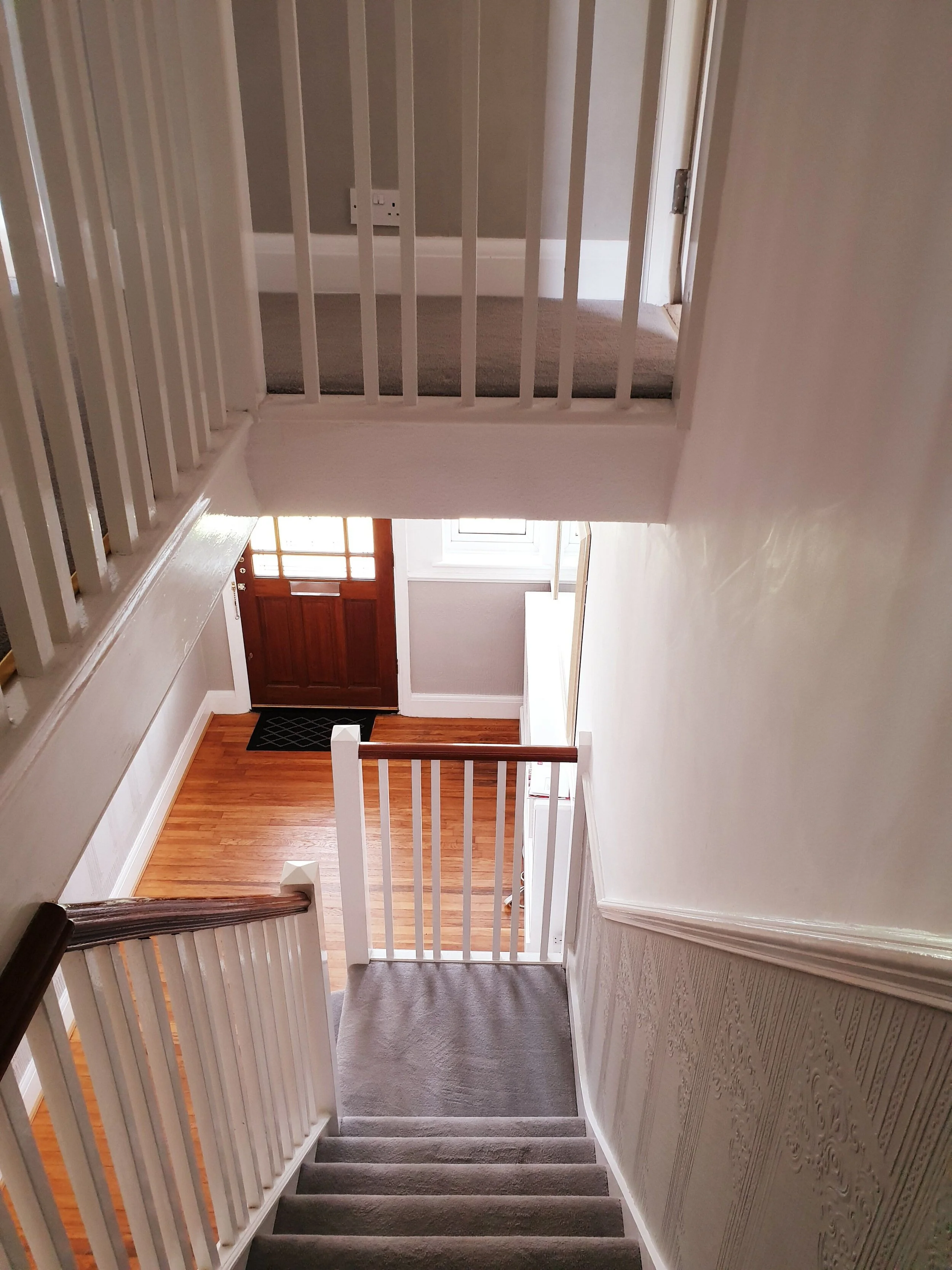
In a straw poll of reasons why people move house I reckon the most common answers would be: up sizing or down sizing; change of location; moving closer to family; school catchment; taking on a renovation. I would possibly be one of the only people to respond with: to gain a girthier entrance.  There were of course other drivers behind our recent move but it really was a close of love at first sight of spacious vestibule for me.

The skinny hallway in our old house (I miss those tiles!)

The skinny hallway in our old house (I miss those tiles!)

Our old house was an Edwardian Semi with the stairs located in the middle of the house meaning much of the hallway was a long thin corridor.  When the boys were smaller manoeuvring a buggy and bulging nappy bag out of the front door was like a challenge from the Krypton Factor.  On at least one occasion I became an unwitting hallway hostage after the zip of my coat got caught on a rogue radiator valve leaving me effectively manacled to the wall for a good 15 minutes.

The radiator upon which I got impaled and ended up a #hallwayhostage

The radiator upon which I got impaled and ended up a #hallwayhostage

IMG_3235.jpeg

In contrast, in our new house when you walk in the door the stairs are directly in front of you and there is double the width to play with so my days of corridor struggle are over. We also have a separate utility room with an extra set of pegs where a platoon of the army of anoraks can be kettled slashing the likelihood of being hit in the face by a smalls boys anorak as you take your shoes off.

It might not look like much but this was the #vestibuleview that won me over to our new house

It might not look like much but this was the #vestibuleview that won me over to our new house

My Hallway Makeover Plans

The extra space and high ceilings alone are hallway heaven for me and it was all pretty neutrally decorated but this month I have undertaken a mini hallway makeover, in partnership with Cox & Cox to further “enhance my entrance” so to speak.

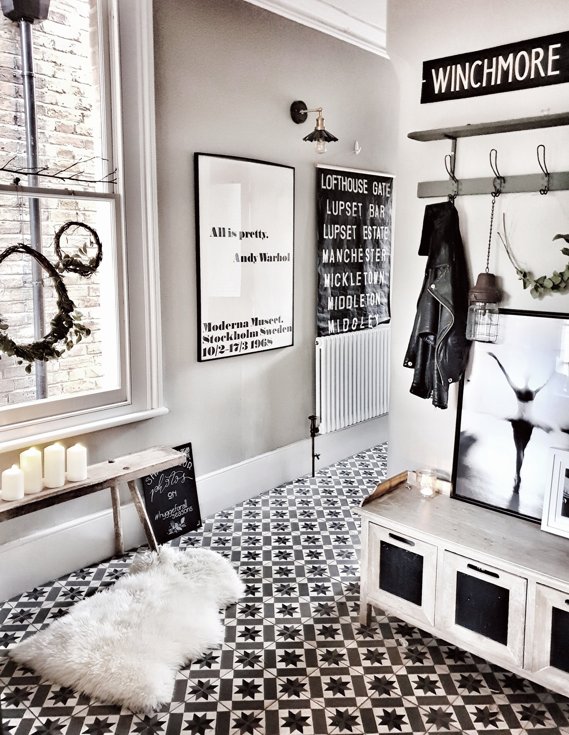
The main things on my hallway hitlist were: 1) finding a solution to the soviet sized radiator and accompanying cover that dominated the space to the left of the door; 2) changing the mirror for something with a more contemporary, clean feel; 3) finding a way to de-anagylpta that didn’t involve replastering the walls; 4) fitting in some more storage; and 5) lightening up the look and feel in particular of the floors.

Overall the look and feel that I wanted to achieve with the makeover is what I would describe as 1930s Scandi Rustic Chic.  Am thinking Neville Chamberlain was a huge fan of the relaxed Ibiza beach club look.

The decor is all light and pretty neutral it is just not quite Malmo so I will be looking to downgrade the orange factor on the floors and take things more 1930s Scandi Rustic

The decor is all light and pretty neutral it is just not quite Malmo so I will be looking to downgrade the orange factor on the floors and take things more 1930s Scandi Rustic

The anaglypta wallpaper is on my hallway hitlist even though I know it is coming back into fashion!

The anaglypta wallpaper is on my hallway hitlist even though I know it is coming back into fashion!

One of my go to brands when I am searching for Scandi/Rustic furniture, lighting and home accessories has always been Cox & Cox.  I have been shopping with them since right back in 2007 when I bought vintage table place holders from them for my wedding.  14 years and 3 kids later they still tick all my design boxes so I was over the moon when they said they wanted to collaborate with me on the revamp.

Adding Panelling

The first step in the makeover was to call Darren, my long suffering carpenter (who did the kitchen cupboards in my old house) and see if he would take on #Project Panelling aka my solution to “The Anaglypta Issue” (which, by the way, I think makes a great title for a Robert Ludlum Thriller!).  My plan was to remove the dado rail and just panel over the anglypta to avoid a lengthy battle with a wallpaper steamer. 

Panelling dilemmas: to stick below the dado or go above?

Panelling dilemmas: to stick below the dado or go above?

I deliberated long and hard about what height to go for.  The safe option was to stick below the dado rail whilst more adventurous option would be to go all the way to the celling.  In the end I went for a halfway (well ¾ way) house and panelled just under line of the doorway. 

I would love to show you an inspiring DIY tutorial of me doing the panelling but the reality was Darren doing battle with several large sheets of MDF in his garden shed and then attaching them to the wall with a mix of nails and glue with quite a bit of swearing along the way.  I am pretty sure he will be ghosting my calls in future. 

Despite a few doubts along the way I am thrilled with the 3/4 height of the panelling

Despite a few doubts along the way I am thrilled with the 3/4 height of the panelling

Radiator Solutions

Once the panelling was on the next big decisions was what to do about the radiator and what colour to paint the panelling. The radiator cover that was on the left hand side of the hallway as you walked in was my no means hideous but it pretty much dominated the whole space and precluded us having any storage on that wall.

The before with a large radiator on the left hand wall which took up lots of space

The before with a large radiator on the left hand wall which took up lots of space

The after with the radiator dropped in height beneath a bench. The woven fringed cushion and black and white chevron cushion are both Cox & Cox

The after with the radiator dropped in height beneath a bench. The woven fringed cushion and black and white chevron cushion are both Cox & Cox

It no longer dominates the space and I actually love the look of the column one

It no longer dominates the space and I actually love the look of the column one

The solution I came up with  was to go for a much shorter radiator that would sit much lower on the wall and build a  seating bench over the top thus ensuring the radiator was no longer the dominant feature in the hallway and we had somewhere to sit to put our shoes on. The bench was to be built out of reclaimed scaffold planks which I sourced from our local salvage yard and which cost £7 a plank.  They are my number one favourite building material although I don’t think Darren shares my love of reclaimed materials judging by his reaction when I brought them home.  Sample quote “you want me to leave the paint stains on??” accompanied by the kind of look you give someone who has just told you that they would like a threesome with Eaamon Holmes and Boris Johnson.

The Scaffold Planks that I love but which baffle Darren! This natural striped runner from Cox & Cox looks great against the sanded floorboards

The Scaffold Planks that I love but which baffle Darren! This natural striped runner from Cox & Cox looks great against the sanded floorboards

Paint Choices

With my radiator strategy in place it was time to make a decision about the colour of the panelling.  My first thought was to go dark after I came across this image in a Neptune catalogue.  However because the panelling was going on both sides of the hallway I was worried that it might narrow the room down so in the end I erred towards the light side.  A tester pot orgy later I had tried out every shade between bracken beige and perfect putty and arrived at my final choice: Ammonite by Farrow & Ball. 

Slightly too late for me but excitingly next year Cox & Cox are launching their own brand of paint.  There will be 16 dreamy shades and Flaxen or Landsdown would be a brilliant match for the look in my hallway.  It will be formulated by Mylands so expect a great quality consistent finish. 

cox and cox paint.JPG
Enjoying posing againg my newly Ammonite background with a rather spectacular faux string of pearls

Enjoying posing againg my newly Ammonite background with a rather spectacular faux string of pearls

With the panels painted it was time to install the radiator and build the bench.  I opted for a more contemporary column radiator which I bought from this website for roughly £170 which I think is pretty good value.  With the boards sanded down and installed over the top the radiator is now barely visible and it has transformed this side of the hallway. 

B0D323E0-ECE9-4A35-AFED-F0E022E4B01C.jpeg

Malmo vs Mahogany

My final step in lightening things up before I could tackle the fun finishing touches was to tone down the mahogany factor from the floor and the door which were a good 7.5 on the David Dickinson after a week in Barbados scale.  The floorboards are actually really nice pine ones and sanded down they look so much better.  In the longer term I would like to get a new door but for now just painting it in Railings has been a bit of a game changer (don’t look too closely at slapdash Scandi Handy Andy’s paint job!).

53ED77C8-B691-481F-9079-FE938C52370B.jpeg

Adding the finishing touches with Cox & Cox

With all of the structural changes complete it was time for the fun stuff: enter Cox & Cox. I have been obsessed with rattan style pendant lights ever since visiting Ibiza last year and Cox & Cox has some beauties. We are blessed with pretty high ceilings so we could afford to go for one of the bigger ones to make a bit of a statement.  I really like this one because it allows a view through it and doesn’t dominate the space too much (or hit us on the head every time we walk down the stairs.

E7E43601-DE94-4ECA-9CA6-D64A282617C2.jpeg

The other big decorative item I was after to complete the makeover was a new mirror.  With the radiator dropped and the bench in place I wanted to add a circular one to break up the square lines of the panelling a little bit.  I think I lost about 1.5 days of my life to the google search large circular mirror until I hit upon this oversized thin frame beauty from Cox & Cox.  Unlike lots of the ones I looked at it has a really thin black rim and adds a really subtle crisp contemporary edge to the hallway revamp.

The Oversized Mirror of dreams

The Oversized Mirror of dreams

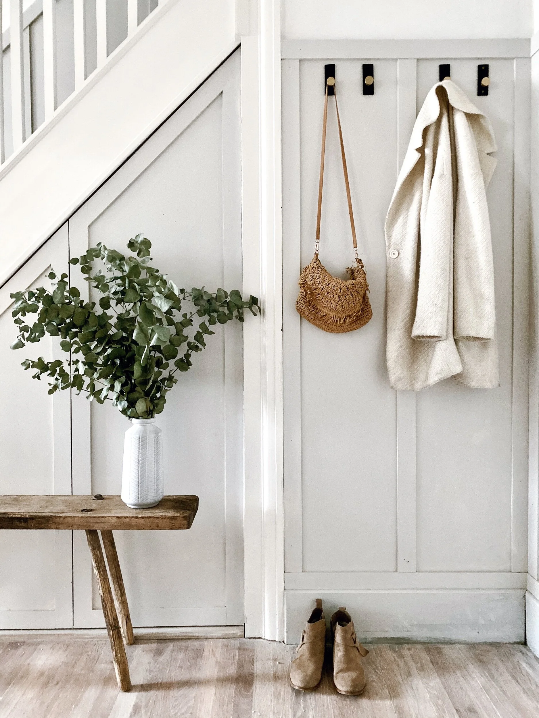
I know some people might have opted to put pegs where I have put the mirror but I think it really opens up the space and reflects light and I have, instead, added pegs further back so they are not in your face as you wanted in the door.  Oh and when I say added pegs let me introduce you to these #heavenlyhooks from Cox & Cox with a black slate base and burnished gold hook .  You can buy a set of three but I opted for four five individual hooks instead and think they add a nod to understated glamour. 

Obviously the insta reality of this photo is 5 primary coloured anoraks rather than an artful rattan bag and a pleasingly pale cream coat

Obviously the insta reality of this photo is 5 primary coloured anoraks rather than an artful rattan bag and a pleasingly pale cream coat

I have four behind the door for coats and practical items and one is located next to the mirror for maximum insta faffery.  I am imagine it will play host to artfully poised baskets, bags of impractical pampas and oft be draped in fairy lights.

Let the faffing commence. I am looking forward to the styling possibilities offered by the hook!

Let the faffing commence. I am looking forward to the styling possibilities offered by the hook!

The First Noel …..in my hallway

With the hallway revamp complete just in time for the opening of advent calendars I am super excited by all the fresh festive styling opportunities that it affords me.

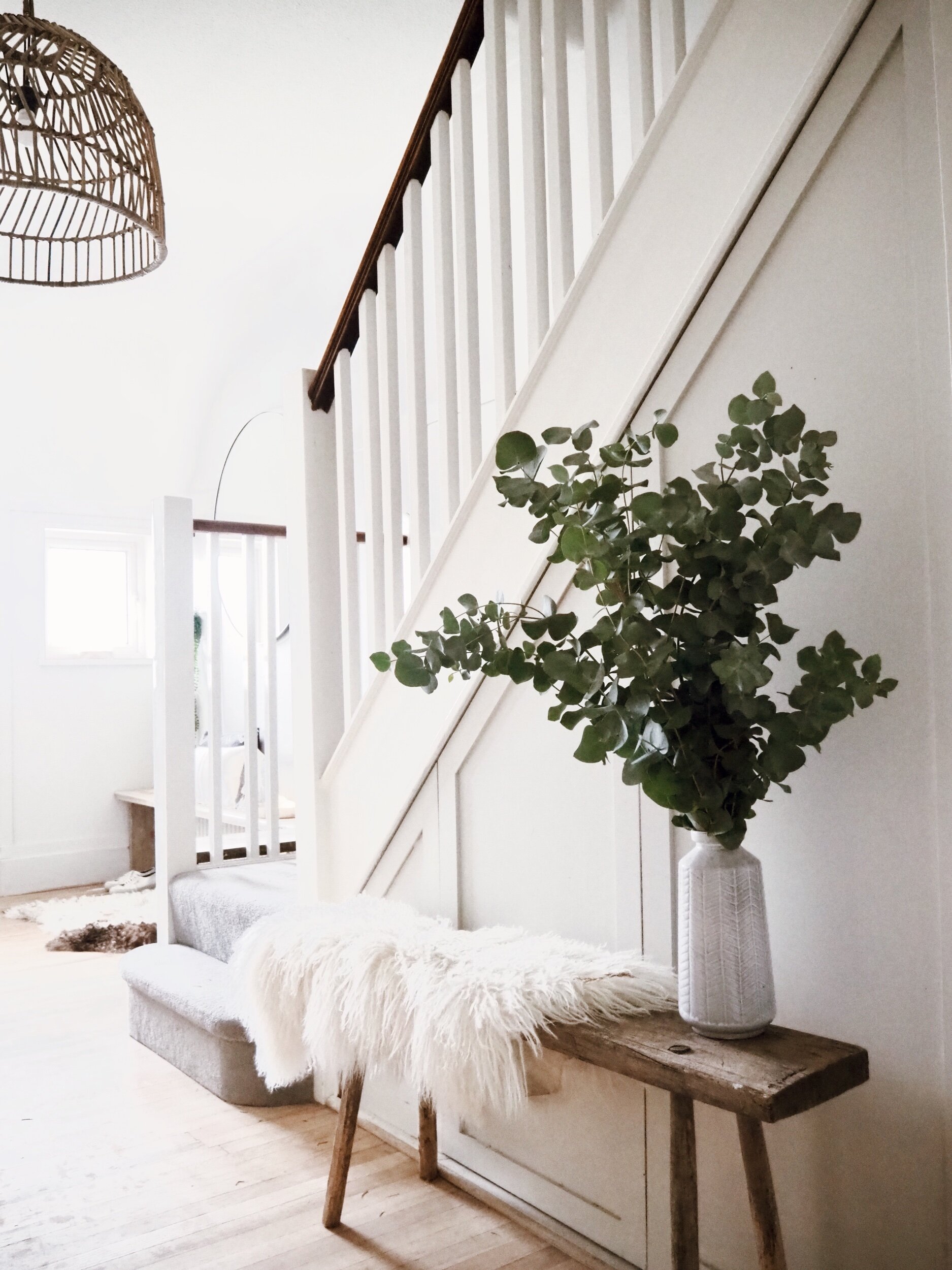
First and foremost the bannister!  Our old one was boxed in by the downstairs loo totally raining on my garland parade.   This year I will be going to Scandi town on our new ones.  Cox & Cox have a great range of garlands to grace your stairs and work with a variety of different looks.  I chose this really simple but effective pre lit pine one .  It looks great even just on its own but has really nice thick branches/foliage that are perfect for adding further foliage of the faux or real variety to if you wanted to add more drama to your bannister.

The pre lit eucalyptus garland is lovely and bushy and easy to manipulate and can easily have foliage added to it for extra drama

The pre lit eucalyptus garland is lovely and bushy and easy to manipulate and can easily have foliage added to it for extra drama

03FD0690-5936-4F84-8A0B-68EB1F66A144.jpeg

There is also a matching pre lit wreath which fits rather perfectly on my insta faffery hook by the mirror.  Again you could leave it plain of add extra foliage if you wanted to dial up the drama. 

With thanks to Your London Florist I have added some extra eucalyptus and soft white dried grasses to complement the wreath

With thanks to Your London Florist I have added some extra eucalyptus and soft white dried grasses to complement the wreath

768E8B9F-CCD1-4632-9733-3892B81F3184.jpeg
I have struggled for years with winding fairy lights into wreaths and trying to disguise the wires so really love the pre-lit one

I have struggled for years with winding fairy lights into wreaths and trying to disguise the wires so really love the pre-lit one

The bench has not only created a handy place to sit when putting our shoes on but also lends itself to lots of great display possibilities.  I love these beautiful crackle glaze ceramic Christmas trees that Cox & Cox have introduced this year to help you achieve a pared back minimal Christmas look.  They look great on their own or in small groupings.  I would happily have a whole forest of them!

These speckle glaze trees are a lovely minimal take on Christmas

These speckle glaze trees are a lovely minimal take on Christmas

But my very favourite type of tree has to be these beautiful illuminated ones. They add such a soft pretty twinkly light to the hallway and you can either keep them plain or hang them with baubles in the same way as a normal tree. 

Welcome to Malmo’s Winter Wonderland created with a little help from these illuminated snow tipped trees from Cox & Cox

Welcome to Malmo’s Winter Wonderland created with a little help from these illuminated snow tipped trees from Cox & Cox

It was the night before Christmas….

It was the night before Christmas….

I love the soft warm white light of the trees

I love the soft warm white light of the trees

Cox & Cox have a fantastic selection of baubles for all looks and plenty that appeal to my Scandi aesethic, I particularly like these ones which wooden cut out stars and trees in the middle of a thin gold ring which are from their New Neural Noir range.

White chevron baubles adding all the boho feels to my hallway

White chevron baubles adding all the boho feels to my hallway

A43513A3-5B66-4962-85D0-DA5F95836DB9.jpeg

If you wanted to add a bit of extra twinkle to your Christmas scheme then I have to let you in on a fairy light secret.  I have had my fingers burnt in the past by fairy lights which promised to be warm white on the box only to turn up and turn out to be football stadium floodlight florescent but Cox & Cox have some naked wire cluster lights which are genuinely the warmest of whites! 

My own mini forest of illuminated snow tipped trees

My own mini forest of illuminated snow tipped trees

To complete the warm white winter wonderland feel to my entrance I have also add a couple of great outdoor lighting products from the Cox & Cox range. I think I may love the 7ft outdoor illuminated tree more than any Christmas tree I have ever owned. Mr Malmo I fear has less fond feelings towards it after a botched erection attempted on his part saw the top section hit him on the head at 7:30am on a Monday morning! I have also given our porch a dusting of twinkle with a brilliant indoor/ourdoor star. The lights on both the star and the tree are also the warmest of warm whites #fairylightwin.

Announcing our arrival in the neighbourhood with some Christmas twinkle!

Announcing our arrival in the neighbourhood with some Christmas twinkle!

The new apple of my eye, our outdoor Christmas tree

The new apple of my eye, our outdoor Christmas tree

A4609B48-A230-4C61-BD73-9072EB9F088C.jpeg

The fairy lights along with all of the other Cox & Cox products I have used in the make over are listed below if you would like to shop my look!

Illuminated Indoor/Outdoor Star

Outdoor light up Christmas Tree

Indoor/Outdoor Magical Light Up Snow Tipped Trees

Grey and White Chevron Baubles

Speckle Glaze Tree

Indoor/Outdoor Pre-Lit Wreath and Garland

Indoor/Outdoor Naked Wire Cluster Lights

Oversized Frame Mirror

Round Rattan Pendant

Natural Striped Runner

Hanging Potted Faux String of Pearls

Black and Brass Hook

Black and White Chevron Cushion

Woven Fringed Cushion

There are a few final finishing touches I need to make to finish the makeover off like applying a stain to the newly sanded floors and deciding whether to paint the bannister or sand it down but those can wait until I have finished my figgy pudding.

 This blog post was part of a paid partnership with Cox & Cox. Many thanks also to Your London Florist for providing me with some foliage for styling my hallway and to Tia Talula for coming to my outdoor photography aid this week!

Creating My Dream Bathroom with Geberit

When I started using Instagram two years ago I wasn’t actually posting pictures of interiors.  Shoes yes, random day trips to National Trust Properties yes, pictures of my pudding yes but interiors no.  The mists of time and mum brain mean I can’t actually pinpoint why I switched from posting cakes to kitchens but I do remember that it was a picture of my bathroom which first got likes other than from my long suffering friends who were probably tempted to block me if I posted another picture of a profiterole by that point.

One of the first shots of my bathroom I ever posted to Instagram. Yes I did like the Valencia filter a lot back in 2016!!

One of the first shots of my bathroom I ever posted to Instagram. Yes I did like the Valencia filter a lot back in 2016!!

Having finally got my head around hashtags a picture of my bathroom was included in a midweek montage for #MyHomeVibe and it turned out that people rather liked the curve of my copper pipe taps and cut of my metro tiles.  And whilst I do feature other rooms in my house on my account (to avoid people feeling like they are trapped in some sort of Suburban Bathroom Groundhog Day) it is always pictures of my bathroom that do the best.  In fact this photo of it, when regrammed by Apartment Therapy garnered over 70K likes and was in the top ten most liked pictures on their feed last year.  Not bad for an e-bay bargain bath and a slightly dodgy 3am paint job.

The picture that got regrammed on Apartment Therapy

The picture that got regrammed on Apartment Therapy

Aside from its Instagram popularity it is also my favourite room in the house because a) it is the only room with a lock (a not to be underrated feature when you have three boys) and b) I am pretty sure I share DNA (and a waistline) with a Walrus in that I could happily spend 23 out of 24hrs submerged in warm water.

Designing My Dream Bathroom With Geberit

So when Geberit got in touch asking if I would like to design and style my dream bathroom using their Xeno²range I didn’t need asking twice.  In fact I don’t think I even needed asking once as I said yes before they had even got to the end of the sentence!  They had me at vanity unit of my choice. 

In case you have not heard of Geberit before they are a Swiss company with a long pedigree in designing and producing innovative, high quality, long lasting bathroom products.  To use a Swiss sporting analogy, they are to bathrooms what Roger Federer is to Tennis: stylish, refined, durable and always ahead of the rest of the pack.  The only difference is they are serving up sanitary ware rather than aces.

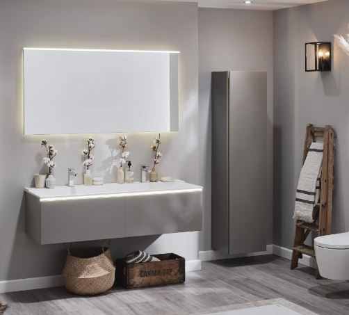
A basin and vanity unit from the Xeno² range

A basin and vanity unit from the Xeno² range

The crisp, clean design aesthetic of the Xeno² range obviously tickles my Scandinavian sensibilities but what I loved about the brief was the challenge of bringing some of my signature Modern Rustic/Industrial Vintage style into play to create a bathroom which mixes Geberit products with my personality.

My Design

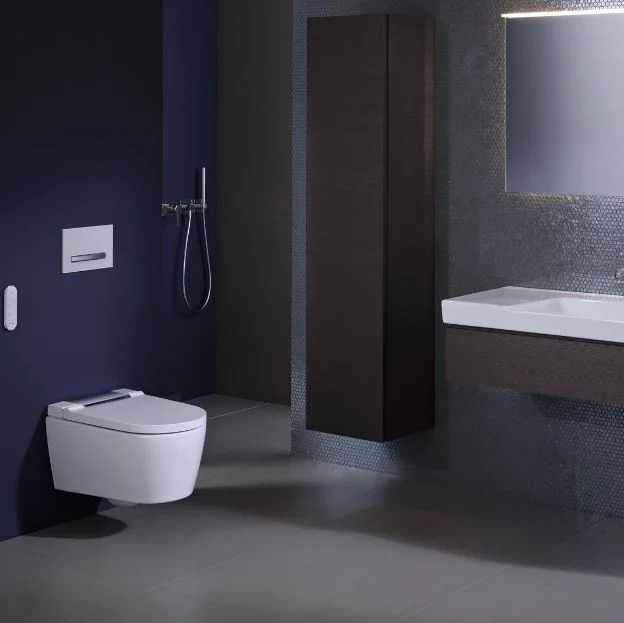
The building blocks of my fantasy bathroom chosen from the Xeno² range were a double vanity unit with built in basin, sleek intelligent sensor mirror, tallboy storage cupboard and a super intelligent AquaClean shower toilet.  Intelligent in the sense of its ability to leave your bits as shiny as a whistle rather than out score Steven Hawking in a Mensa test sense that is. 

The AquaClean Shower Toilet that will save you a trip to Japan

The AquaClean Shower Toilet that will save you a trip to Japan

I don’t know if you have found this but if you talk to friends and family who have visited Japan the number one thing they rave about is not the splendour of the cherry blossoms or the speed of the bullet trains but the technology the Japanese use in their toilets which come with heated seats, varying wash modes and just generally more of a brain than our standard British Bogs.  Thanks to Geberit there is no need to trek to Toyko for your derriere to experience that kind of dream experience. 

More information on all of the products featured in my dream bathroom from the Xeno² bathroom range is available here. 

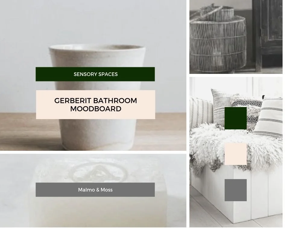
I actually initially found having totally freedom to design my dream bathroom left me a little stumped!  Not in the sense of having no inspiration but more in that my inspiration cup was overflowing and my mind was boggling at all the possibilities.  To marshall my inner runaway rustic I used Canva to create a mood board for my room.  This really helped me to focus on how everything would look together and create a cohesive vision for the room (without wishing to sound too  Llewelyn Bowen).

Geberit moodboard.jpg
Geberit Moodboard 2.jpg
Geberit moodboard 3.jpg

With my moodboard complete it was time to take things off the page and into the back of a sweaty battered Audi A6 estate and head up the motorway to a photographic studio in Warwick where a bathroom set, photographer, videographer and make up artist with her work cut out were awaiting me!  I was more than a little relieved to arrive without being pulled over by the police as am not sure how I would have gone about explaining the contents of the car to the boys in blue.  Yes officer that is an enormous dried flower cloud in the passenger seat and a rustic Hungarian milking stool you can see gracing the parcel shelf. 

Luckily I was not pulled over with this amount of pampa grass in the passenger seat

Luckily I was not pulled over with this amount of pampa grass in the passenger seat

Having never done anything as exciting as this before I thought it would be fun to share some behind the scenes footage with you from the day so that you can get a feel for what I was up to in a Warwickshire warehouse and to then talk you through the different elements of my dream room.  Spoiler alert soft neutral colours, warm natural textures and materials will feature rather than bright colours, clashing patterns and glitzy metallic finishes!

The Day

What initially threw me when I arrived was the fact that it was not a “bathroom” in the traditional sense that was awaiting me.  It was a bathroom within a roomset (so far so Truman Show) which meant there was no ceiling and half of the room had no walls! The next thing to get my head (and generous eye bags around) was the fact that it would be me as well as my dream bathroom captured on camera because as well as photographing the bathroom, the Geberit team have also made a clever video about my roomset to help you get a better sense of the look.   Click here to take a look at the video

upload.jpg
Eyebag and brow miracles worked ready to roll (looking a little like I am wearing my pyjamas)

Eyebag and brow miracles worked ready to roll (looking a little like I am wearing my pyjamas)

So it was actually quite a busy and buzzy set with a photographer and a great videography team there to capture all the action.

upload.jpg

As someone who has, to date, largely taken pictures on my phone, I learnt so much that day about all the tricks that professional photographers use to get the very best out of a room and space.  The positioning and strength of lighting in particular plays a huge role in how a finished photo looks.  Consequently, it will be a giant light reflecting umbrella and stage lighting rig rather than bubble bath and some new hair straighteners that will be on my Christmas list this year!  I loved seeing the shots come through on the photographer’s computer as we went along. 

upload.jpg
upload.jpg

So having seen glimpses are you now ready to see the end result?  I hope so because here it is!

My Rustic Scandi Dream Bathroom scheme

My Rustic Scandi Dream Bathroom scheme

Creating a Cosy Corner

This may make me strange but I love a bit of company when I am in the bath. Not in the actual bath itself just someone to sit and chat to me in the bathroom as I bathe.  Although my three year old frequently misinterprets this bit and climbs in to join me in the actual bath with a large toy boat/collection of aged flannels/a whole toilet roll.

I loved how this corner worked out with the flower cloud

I loved how this corner worked out with the flower cloud

Having an armchair in my dream bathroom was, therefore, an essential item. The chair of my bathroom dreams is actually from Ikea.  I am a huge fan of their Soderhamn range of seating.  It has simple clean lines and a great price point whilst looking easily more expensive.  It has a lovely wide back and deep seat meaning your companion can be as relaxed on the chair as you are in the bath.  To be honest even if I wasn’t having a bath I would be tempted to sneak in and sit on it curled up with a magazine

Adding Stylish Storage

Whilst the vanity unit and tallboy cupboard from the Xeno² offer great storage (with clever features like soft close doors) I also added in some additional storage options under the sink for stowing away bulkier items like toilet rolls and towels.  To contrast with the sleek lines of the Xeno² unit I chose rougher textures such as wood and rattan to bring some warmth and texture into the room scheme.  One of my favourite places to source baskets like the ones used in these photographs is from French Brand Maisons Du Monde.  The Candian Dry box is a vintage find which I paid £10 for at Ardingly Antiques Market 3 years ago and which I could, in the interim, have sold 10 ten times over for ten times the price.  I cannot, however, bring myself to part with it!  If you are not able to find a vintage equivalent H&M Home often have a great range of vintage style/rustic storage boxes to choose from.

The Canda Dry box that is one of my most prized possessions added great towel storage

The Canda Dry box that is one of my most prized possessions added great towel storage

Lowering the Lighting

It goes without saying that my dream bathroom would feature candles.  In fact that tallboy storage unit would probably be predominantly filled with them.  Scented, unscented, real, battery operated I love them all! My current obsession are these hurricane lanterns from Marks & Spencer which have a lovely limewashed wooden base and speckled glass and create a lovely soft glow when filled with candles.  However, woman cannot read Living Etc by candle light alone so I also added two wall lights into my bathroom scheme from Cox & Cox.  I chose black to add a nod to the industrial into the room and they are, of course, bathroom rated.  They are actually outdoor lights which is a great trick to employ if you are struggling to find bathroom rated indoor light options!

I was really pleased with the industrial edge the black carriage lights added

I was really pleased with the industrial edge the black carriage lights added

The Xeno² Vanity Unit and AquaClean toilet actually also have smart motion sensor lighting built into them as well to prevent you stumbling around in the dark in the morning/middle of the night.

Turning Towels into a Feature

I know a lot of people like their towels to be neither seen or heard (a talking towel would admittedly be rather alarming) but I like mine to become a feature of my bathroom design.  They are a great way to add subtle nods to colour, pattern and texture into a room.  Using a vintage ladder to display them on is also a great way to add some height into your bathroom scheme.  There is a probably a retired builder called Dave laughing all the way to the bank after I purchased his paint splattered step ladders (possibly brought out of the back of his van by mistake/an after thought) at a car boot a couple of months ago.  The selection of towels I have featured are all from HM Home. 

H&M Home have some great towels this season including this linen striped one

H&M Home have some great towels this season including this linen striped one

Elsewhere in the bathroom I have also added soft texture and a touch of hygge in with shaggy sheepskins on the floor and bench.

 All Hail the Humble Tooth Mug

When I first met Mr Malmo he was using an aged Sheffield Wednesday Mug with a fading picture of Chris Waddle on as a toothmug.  It took me four years and two house moves to finally give Waddle the red card from our bathroom and replace him with something more Scandi than Sheffield themed.  The moral of this tale is that small details can actually make all the difference to a room and there is no reason why practical things cannot also be beautiful ones.  With this in mind, I sourced a handmade tooth mug and soap dish in earthy colours from the ceramics range stocked by socially minded small business Aerende Store.  For display rather than practical purposes I also mixed in some vintage bottles I have amassed over the years as well as some new favourite vases from the Nordic inspired range at Marks & Spencer so that I had a range of different sizes, textures and colours.

Vintage and new ceramics adding some texture to the basin area

Vintage and new ceramics adding some texture to the basin area

The basin upon which they are resting from the Xeno² range is actually made from a super soft matt material called Varicor which I have never come across before but would happily now enter into a long term relationship with. 

In Praise of [dried] Plants

I have a confession to make which may make me an insta outcast by the time you finish reading this blog: I don’t really like houseplants.  Yes they have carbon dioxide absorbing life enhancing benefits to having them around but my ability to reduce a monstera to mulch in less than a month means I just don’t dig them.  However I am not an all round nature hater in my home, I do still like to bring the outdoors in and embrace plant life I just prefer, in the bathroom, for it to be in dried rather than semi biodegraded form. I think the 1970s kinda gave dried flowers a bad rap.  Pot Pourri has a lot to answer for. But the last 12 months has seen them having a major resurgence and no-one is happier about this than me.  They add soft texture, natural colours and a bit of drama to the bathroom, require zero maintenance and need never be thrown away.  I used them in two ways in my dream bathroom design.  Soft wavy pampas grass to soften the wall the toilet was hung on and then in a super size flower cloud in my cosy corner. 

www.malmoandmoss.com (5).png
geberit bathroom styling 8.JPG

The cloud is actually much easier to recreate than you might think, you just need a floristry oasis wreath (easily obtainable on Amazon) and then a selection of dried grasses and flowers.  Mine was made for me by Your London Florist and they use a mix of grasses and then dried hydrangea heads and roses to add in some (subtle) colour and drama.

Wall Art and the Wall Hung Toilet

I don’t know about you but I grew up in a house that had both a separate toilet (in a room no bigger than your average glovebox) and the cistern proudly on show.  With space now at a premium that sanitary set up is increasingly uncommon (I say this based on a survey of my friends houses rather than backed by official census data on the bathrooms of Britain).  With a toilet now more likely to be featured in the bathroom itself, the looks of your loo have become more important.  Geberit were actually one of the first companies to introduce and champion the wall hung loo in the UK:  stoying away cisterns and making flush plates a thing to covet not conceal.  When I visited their showroom in Warwick recently I was gob smacked by the range of flush plate options they offer.  My dream bathroom features one hewn from slate that looked completely unobtrusive and part of the general rustic theme.  Another great way to blend your toilet into your room scheme is to add art to the wall on which it is hung so people have something that draws their eye other than just the WC. 

www.malmoandmoss.com (2).png

So there you have it the bathroom of my dreams.  Hope it has provided you with inspiration for how to style your own Rustic/Scandi bathroom paradise and how to use the Xeno² bathroom range as part of that dream. 

One Bathroom Two Ways

If you fancy seeing how the colour loving Yin to my neutral décor Yang got on with the same challenge then head over to Come Down To the Woods Blog by clicking here.  Her dream is definitely different to mine but I still found myself seduced when I saw it.  She certainly has a way with wallpaper and I don’t mind admitting that I was tempted to nip up the motorway to Leeds and purloin the Tom Dixon marble bathroom lights she included in her scheme. 

Come down to the woods.jpg

There is also a line in her blog that made me laugh about imagining me wafting around with sheepskins, dried hydrangeas and hamman towels as I would say a solid 40 minutes of the day were spent with me either fluffing a sheepskin, positioning a hamman towel or handling a hydrangea.  You know me too well Woods….

upload.jpg

I hope you enjoyed this glimpse into the work I have been doing as part of my long term paid partnership with Geberit.  It has been so much fun so far (in fact I kind of feel a fraud calling it work!) and I have more exciting content to share with you later this year so watch this space!

My Living Room Makeover Plans

Do you have a room or area of your house that is off limits for Instagram? Without wishing to sound too Joseph Fritzl, our “hidden room” is our dining room. I call it the dining room because 8 years ago when we first moved in (and prior to doing the kitchen extension) this is where our kitchen table used to be. Once the extension was complete we moved the table to the bottom end of the kitchen, opened up the wall between the kitchen and this room and made it into a second living room. Confused?

This side of the room often pops up on Instagram as it features one of my favourite additions to the house: these faux crittal doors

This side of the room often pops up on Instagram as it features one of my favourite additions to the house: these faux crittal doors

The kitchen table which has been relocated to the new extension

The kitchen table which has been relocated to the new extension

I want to say I will artfully sketch you a floor plan in charcoal so you can see how it all fits together but unfortunately I have drawing skills that are on a par with those of a worm drunk on tequila so I am hoping that these next photos will help to make things a bit clearer!

The kitchen used to be accessed by a narrow door to the left of this picture. Knocking out more of the wall and shifting the entrance has allowed lots more light into the “dining room”

The kitchen used to be accessed by a narrow door to the left of this picture. Knocking out more of the wall and shifting the entrance has allowed lots more light into the “dining room”

Opening the artist formerly known as the dining room to the kitchen has made a huge difference to our family life and we use it lots as a relaxed family living room but this space very rarely graces the grid for the following reasons:

1) It is home to a toy storage unit which regularly belches out brightly coloured plastic objects and which can only be moved with the assistance of a small crane or Hulk Hogan

upload.jpg
Thanks to Hulk Hogan for popping round and helping me move it for the purposes of this blog. The whimsical rustic ladder was all Hulk’s idea.

Thanks to Hulk Hogan for popping round and helping me move it for the purposes of this blog. The whimsical rustic ladder was all Hulk’s idea.

2) There is a 1980s radiator stranded behind the sofa shitting on every shot with it’s Soviet Era bad looks (although it does come in incredibly handy for resting a mug of tea on). In all seriousness as well limiting my insta possibilities it’s current location means it is mainly heating the back of the sofa rather then us.

upload.jpg
My temporary radiator cover up solution!

My temporary radiator cover up solution!

3) The kids treat the sofa as both a trampoline and dinner table meaning it looks like the kind of two piece suite you often find in a mini cab office that has been sat on by 27,876 15 stone men called Keith eating kebabs whilst waiting for a cab.

But I have some plans for this space which may see it making more of an appearance on Instagram in 2019 which I thought I would share with you here (mainly to give myself a kick up the arse to get on with them)

The sofa in all of it’s banana and butter stained glory

The sofa in all of it’s banana and butter stained glory

Hoping that my mum isn’t reading this blog as I know she will be telling me off for having my shoes on the sofa!

Hoping that my mum isn’t reading this blog as I know she will be telling me off for having my shoes on the sofa!

Step One: Re-positioning the Shits On Every Shot Radiator

This is 95% because all of the heat it emits gets lost behind the sofa and 5% because it limits my insta possibilities in it’s current position (ok maybe more like 75%/25% but still…). Kevin my quotes guy has been round to suss out alternative positions and assures me it can fairly easily be removed from this wall and a new vertical column radiator positioned on the wall leading to the kitchen instead. I haven’t mentioned this plan to Mr Malmo yet on the basis that it involves taking floorboards up and he will probably therefore receive it as warmly as an invitation to set his own pubic hair on fire. There were some murmurings from Kevin about BTUs (which I believe relates to heat output rather than the currency of Moldova) which may slightly restrict the choice of radiator I can go for but I am thinking of either a white or light grey one so that it is not too noticeable in it’s new location.

upload.jpg
The re positioned radiator will go on the wall to the right in this picture

The re positioned radiator will go on the wall to the right in this picture

Step Two: Pimp My Wall Rustic Industrial Style

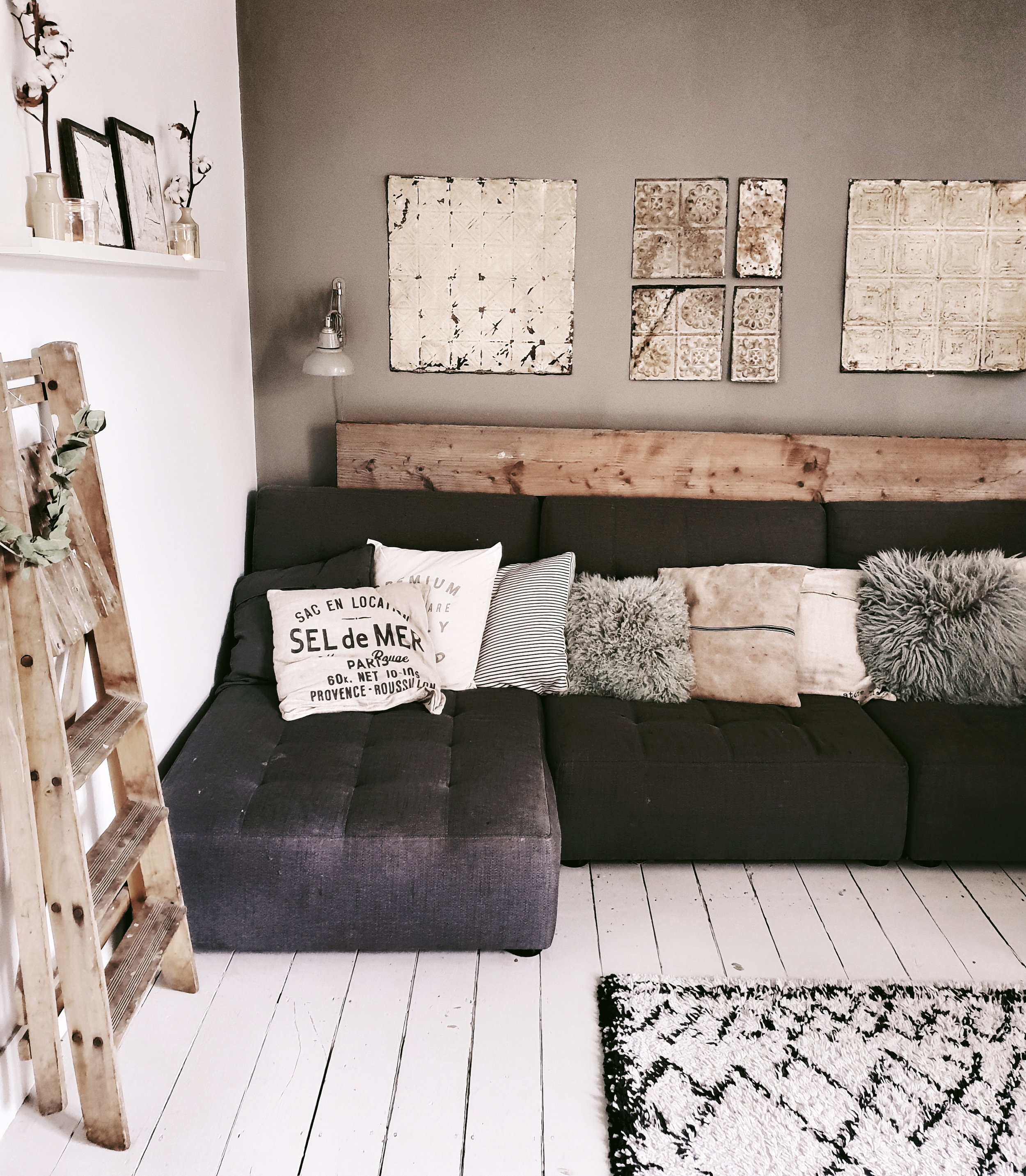
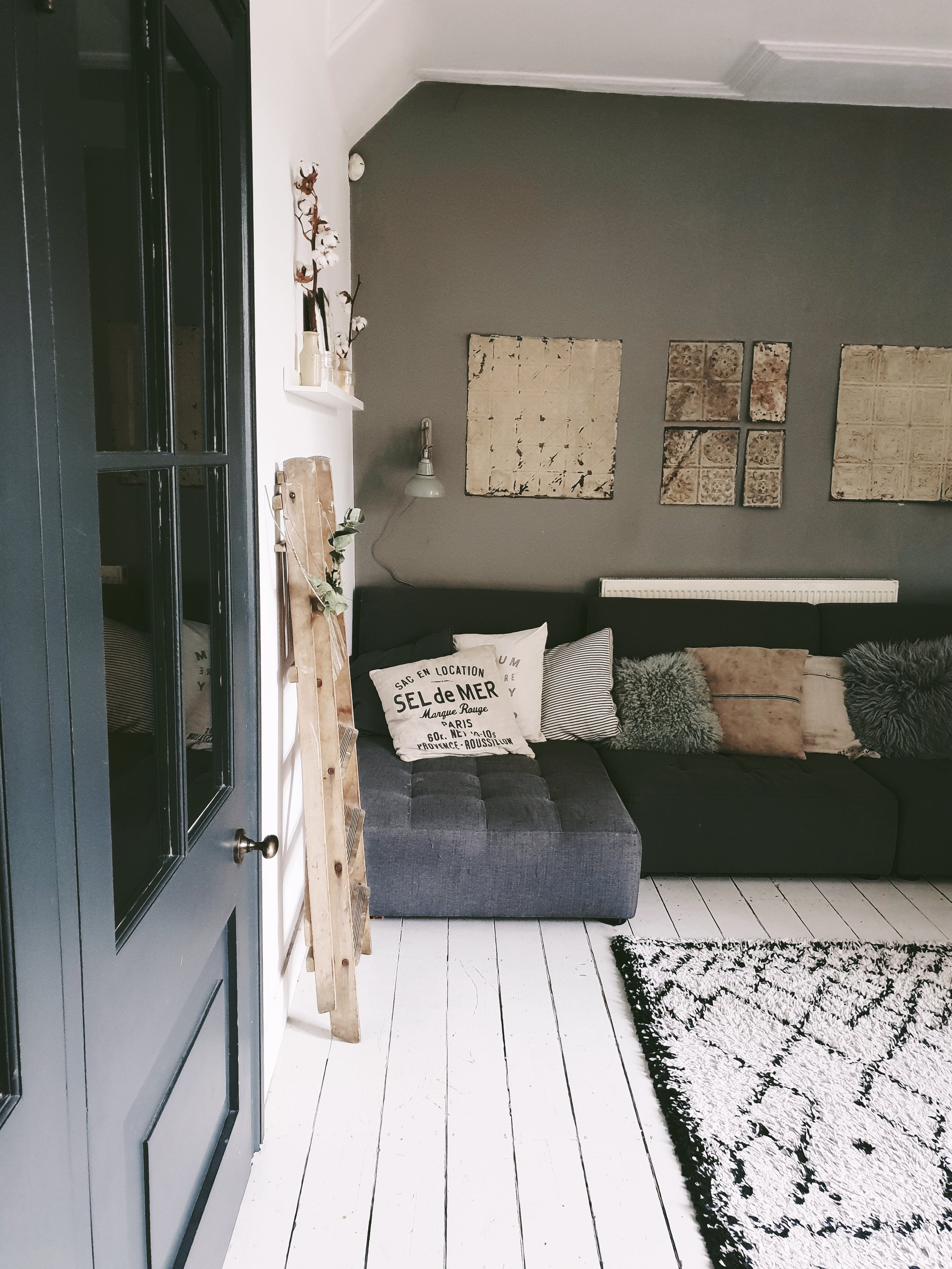
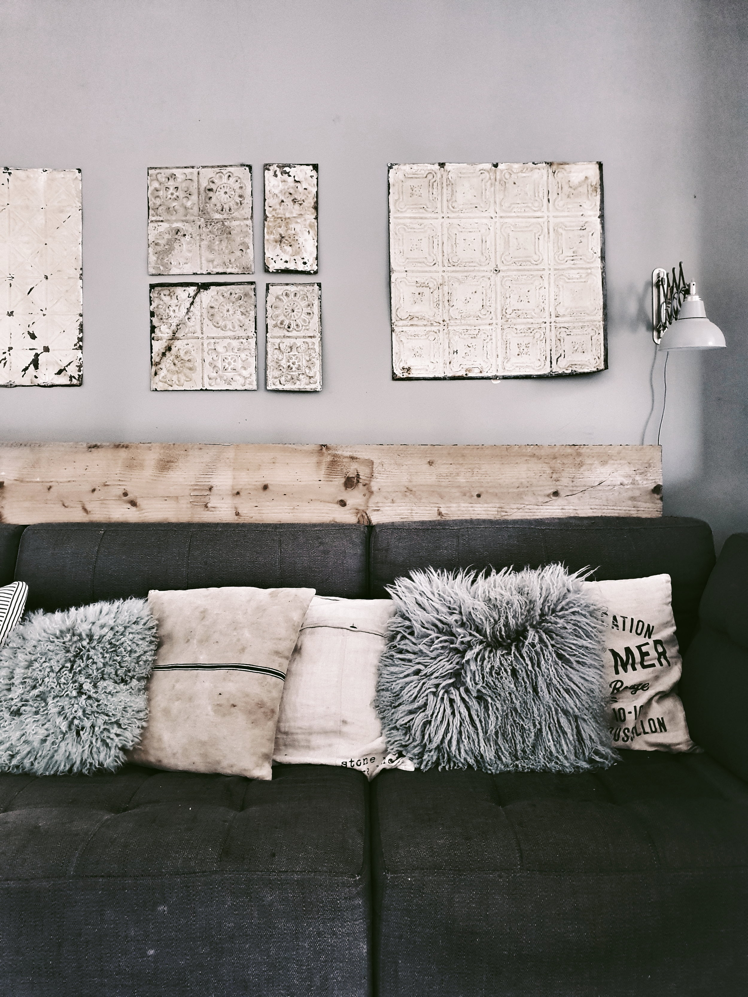
With the radiator shot cock block out of the way I am planning on making the wall behind the sofa more of a feature wall. Not in the Lawrence Lwellyn Bowen flocked wall paper sense obviously. It will not surprise you to learn that I have a more rustic/industrial plan up my sleeve. I currently have three of these gorgeous old Brooklyn ceiling tiles on the wall but I now want to go large and cover the whole wall with them. I know that you can now get wall paper with them printed on but I really want the texture and feel of the real deal. My inspiration comes from Baileys Home and Garden where they have done this to stunning effect. Nailing 50 of them to the wall should be simple right? If in the big room reveal it actually turns out to be a feature wall of LLB’s new satin flocked wallpaper you will know that it has turned out to be anything but.

Ceiling tiles on the bar at Baileys Home and Garden as captured by @kinshipcreative_dc

Ceiling tiles on the bar at Baileys Home and Garden as captured by @kinshipcreative_dc

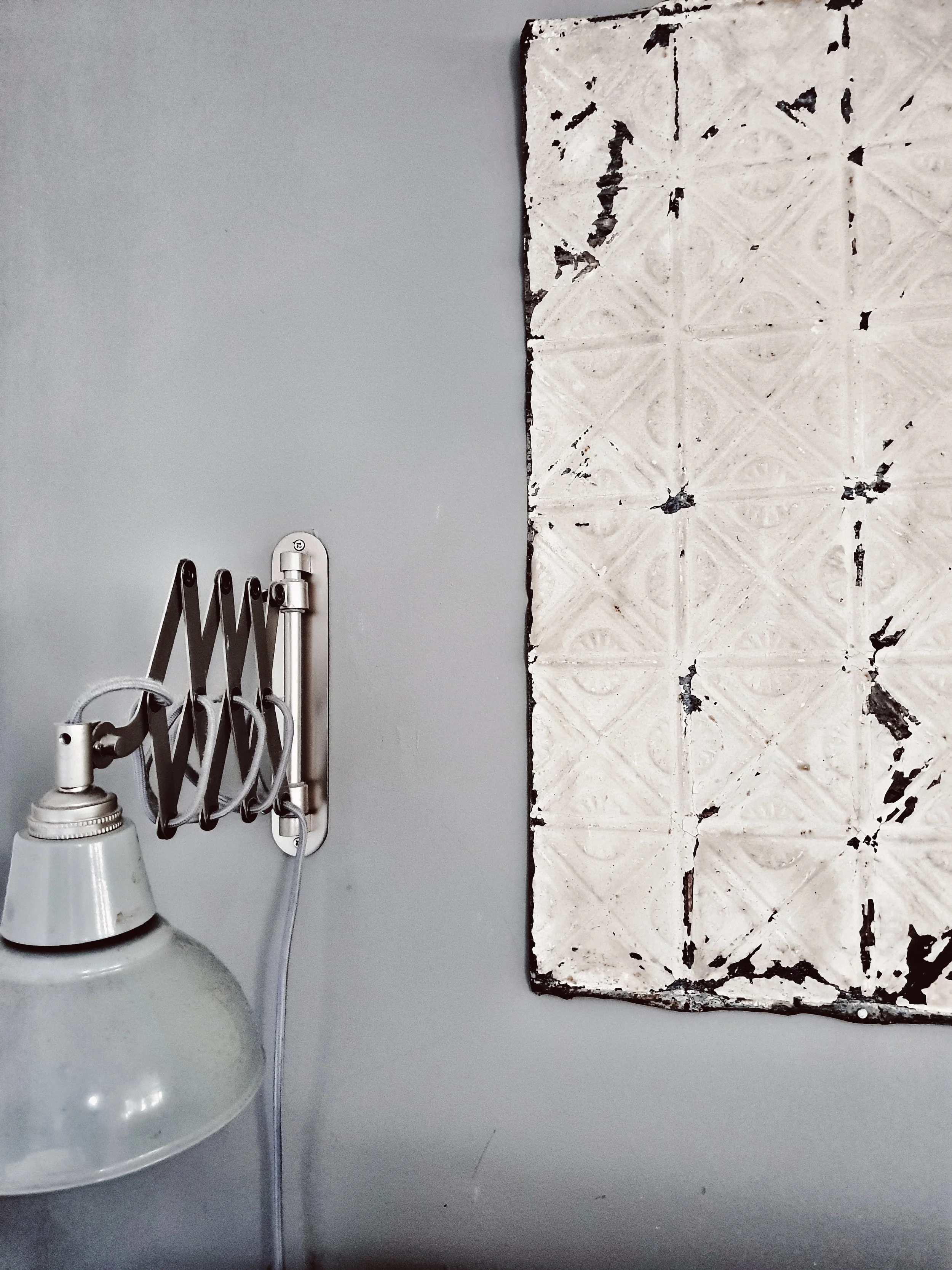
I picked up three of these beautiful Brooklyn ceiling tiles at Sunbury antiques fair a couple of years ago.

I picked up three of these beautiful Brooklyn ceiling tiles at Sunbury antiques fair a couple of years ago.

Only need to find another 49 of them now…..

Only need to find another 49 of them now…..

Step Three: Saying Goodbye to the Seatdrop Sofa

There is a school of thought that says that we should hang on to the minicab office sofa until the boys are of an age when they are able to eat a banana without nearby surfaces ending up looking like they have a bad case of fruit based thrush. However, I am going with a different more visually pleasing school of thought that says that if we have the corner sofa of my dreams in a smoky grey velvet they will love it so much that eschew their previous #badbananamanners. Has anyone else combined velvet soft furnishings and three boys without having to take a Valium anytime they go near it?

Trying to demonstrate to the boys that the sofa is for sitting pretending to read a coffee table interiors book on rather than trampolining

Trying to demonstrate to the boys that the sofa is for sitting pretending to read a coffee table interiors book on rather than trampolining

upload.jpg

Step Four: Trimming down the Toy Storage and Creating a Magazine Library

We are currently in the midst of a lengthy rearrangement and redecoration of the boys bedrooms which make building the Taj Mahal look like a quick project. Once that is complete I am hoping to relocate the current toy storage holder upstairs and replace it with something that belches plastic less frequently (ideas on a postcard please!). I would then love to add some more picture shelves to this wall to display some of my abundant collection of interiors mags because what woman doesn’t love to get her Kinfolk out for the lads? Although do you think that having more picture shelves might be too much with the wall of many rustic tiles as well?

This stunning shot from the home of @bloggabis is inspiration for my picture ledge extension

This stunning shot from the home of @bloggabis is inspiration for my picture ledge extension

The wall to the left is where I am envisaging the additional picture shelves going

The wall to the left is where I am envisaging the additional picture shelves going

But do you think it will be too much with my rustic tile feature wall as well?

But do you think it will be too much with my rustic tile feature wall as well?

Modern Scandinavian kitchen diner

So there you have it my Living Room makeover plans for 2019.  Apologies for the slightly analogue presentation of them.  Learning how to create a digital mood board is one of my life goals for 2019 after I have nailed more regular (by which I mean more frequently than twice yearly) maintenance of my bikini line and the art of loading the dishwasher so that it doesn’t look like it has been done by Gazza upon returning home from a night on the lash.


Malmo & Moss House: Bringing Scandi Back

As regular readers of the blog will know, we spent our Summer holiday this year in Denmark visiting both Copenhagen and Tisvildleje on the Danish Coast. It was a dream of a trip for a Scandophile like me.  I came home more convinced than ever before that I am in fact a Danish Girl trapped in a Geordie Girl's body (Danish girl in the sense of a female from Denmark rather than the Eddie Redmayne man wanting to be a woman film sense).  Unfortunately my actual body returned home looking less Helena Christensen and more Danny Devito owing to my excessive consumption of kanelsnegles.  Whilst I am waiting for Nationality realignment surgery to become available on the NHS I thought I would share with you some of the fresh Danish interiors inspiration for the kitchen and garden that I picked up on the trip and how I have been translating it into the Malmo & Moss house now I am home.

Let's Go Outside.....

Whilst staying in Tisvildleje we stumbled upon a cafe somebody had set up on their front garden to sell their own home brewed slow drip coffee.  The contrast with our own front garden couldn't have been greater.  There wasn't a wheelie bin or fox poo in sight.  What they had instead, which I fell more than a little bit in love with, was a garden seating area constructed out of palletts.  It was totally inexpensive but looked amazing and I loved the seating cushions they had made to fit it which were a mix of muted greys and monochrome and looked great against the backdrop of abundant lavender, mint and rosemary growing in the planters.  

I had already seen pallets used in other Scandi gardens on pinterest and loved them so when I got home I started scanning skips in search of some I could use to recreate the look.  Luckily @vintagecuratorinteriors came up trumps before I had to go full #StigOfTheSkip.  My long term plan for them is to create a coffee table on wheels but it has been a busy Summer and any time I have started the sentence "could you just pop to B&Q to get some castors" Mr Malmo has given me the kind of look that suggests I have got more chance of getting him to go on a crochet blanket making course with out 75 yr old neighbour Margery.  But for now I kind of like the way the look just stacked one on top of the other.

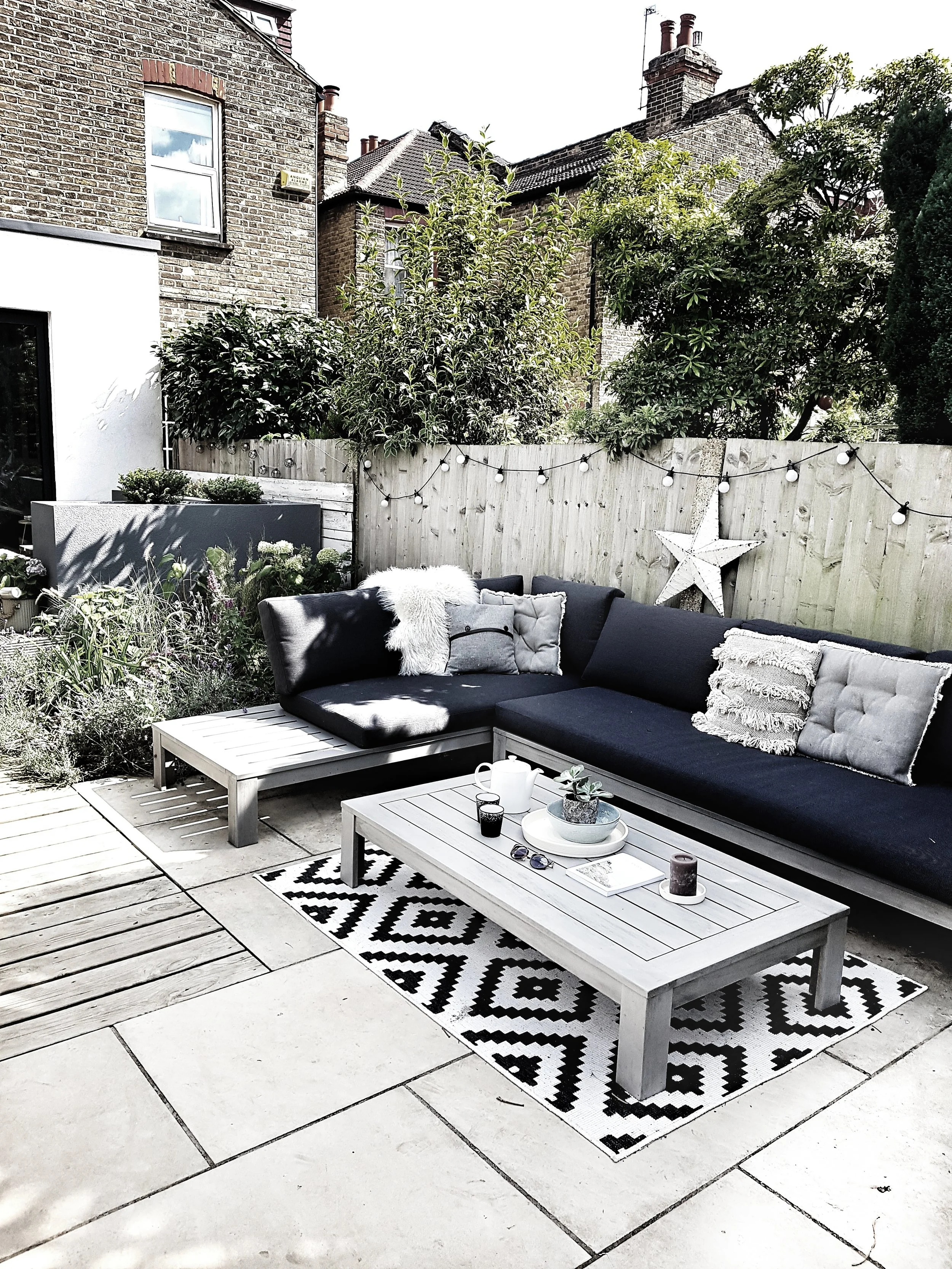
I have also added an extra shot of Scandi to my outdoor seating area through the purchase of some new cushions and a rug.  All in a mixture of patterns and textures but sticking to a monochrome palette.  I sourced some of the cushions from two of my favourite independent stores for Scandi homeware, Grey September Store and Jo & Co Home, but also picked up a cushion and the rug from B&Q who, in amongst the endless drill bits and polyfiller supplies actually have some really great soft furnishings at bargain prices (this is not a sponsored blog either!).  The large zig zag cushion was just £7 and the rug a mere £15. 

pallett seating 4.png
pallett seating 3.png

Now that Autumn is upon us, I have also borrowed another trick from the Danes and introduced a shot of hygge to the garden with a gorgeous rusty firepit from Cox & Cox.  I did a lot of research before choosing this one #firepitbore.   You can easily spend hundreds of pounds but this one is just £80 and is super lightweight and easy to move around the garden.  We gave it a debut burn at our tenth wedding anniversary party in October which was themed around recreating a mini version of the Woodstock festival in our garden.  

coxandcox1.jpeg
coxandcox.jpeg
outdoor 8.jpeg

Unfortunately as we are only amateur urban arsonists we did not dry our hastily purchased petrol station logs before chucking them on the fire.  Therefore, instead of creating a warm blaze around which people could huddle, drink hot chocolate and chat, we instead had a smoking inferno on our hands that sent people running inside for a drink of water.  I have since discovered that you can actually buy smokeless logs from Tesco should anybody else find themselves hosting a middle class party and not have twenty four hours to dry their wood out in advance. 

coxandcox5.jpeg

Bringing Scandi to the Kitchen Table

I follow lots of beautiful Scandinavian instagram accounts for inspiration but my all time favourite has to be that of Signe Bay, a photographer and stylist based in Copenhagen.  Her feed often features of two of my greatest Danish loves: cinnamon buns and ceramics.  Our Summer holiday featured lots of both.  I could have piled the car high with pottery but the reality of going away on holiday when you have 3 children is that you have to travel with essentially all of your possessions so slipping a small dinner service into the footwell was sadly not an option.  

Signe Bay 2.png

When we got home I started looking for places I could source some of the beautiful ceramics I had seen on holiday here in the UK.  My inner Signe lit up when I came across Feather & Marble,  a small independent business set up by Emily & Ollie in 2016 after they too visited Copenhagen and fell under the Danish spell.  They now stock over 1000 handpicked items from Danish brands including the beautiful tableware of Broste Copenhagen whose Salt cup and saucer is my new favourite mug and believe me I don't bandy that title around lightly.   It takes quite a cup to come along and turn my tea drinking head.

Taking a tea break with my new favourite mug. Gorgeous calligraphy label made for me by the very talented Kate of Oysterbridge & Co

Taking a tea break with my new favourite mug. Gorgeous calligraphy label made for me by the very talented Kate of Oysterbridge & Co

feather & marble 14.jpeg
This beautiful bluey bowl from Feather & Marble reminded me of the sea in Tisvileje

This beautiful bluey bowl from Feather & Marble reminded me of the sea in Tisvileje

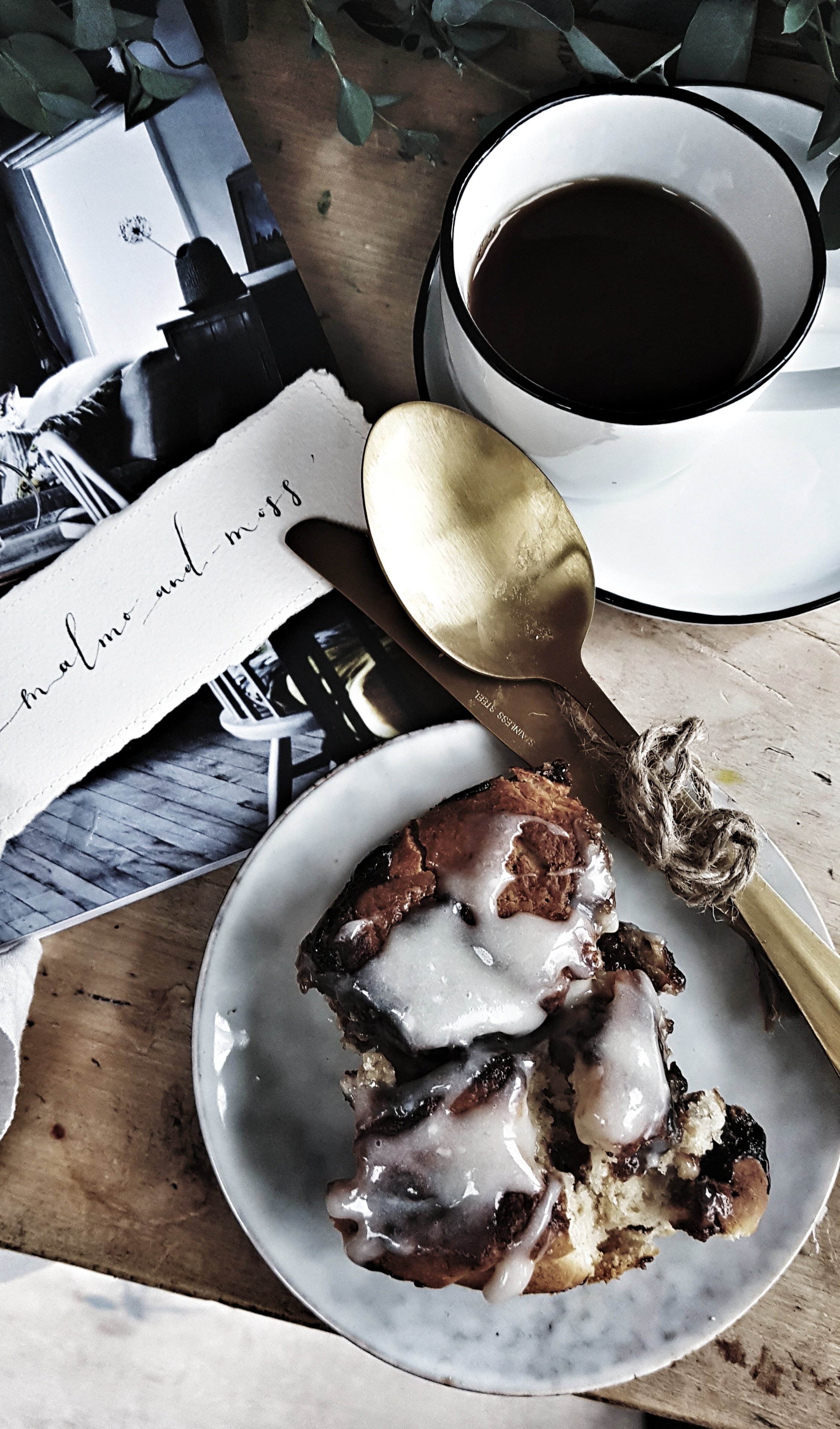
Having secured ceramics fit for a flat lay, I started researching cinnamon bun recipes so I had something #suitablysigne to serve up on my Danish table.  I am not, by nature, a patient baker.  If a recipe features more than 5 steps I tend to turn over.  This BBC Good Food recipe for "simple cinnamon rolls" has, therefore, proved perfect for me.   If I had to sum it up in 4 simple steps it would be mix dry and wet ingredients together to make a dough, roll out into a rectangle, smear huge ammounts of melted brown sugar, butter and cinnamon on said rectangle, roll up and cut into segments like a swiss roll, cook for 30 mins then cram into your mouth fresh from the oven.  The slightly more detailed version is set out below should you be the kind of person who likes to know actual quantiies of ingredients, cooking times and the like.

Feather & Marble 5.jpeg
Feather & Marble 6.jpeg

I made them on the morning of the Occasional Home Store Autumn Fair for our stallholders and they got hoovered up very quickly.  I have had a few mishaps along the way witht them though.  For example, if you add more cinnamon to the dough than the recipe dictates because you don't think they will be cinnamony enough all you will achieve is giving your buns an off brown appearance that is reminiscent of a pair of corduroy trosuers  your dad might wear in.  Leaving them in too long/cooking them at too high a temperature has also caused me problems as then the sugar filling bubbles out and goes black leaving you with buns that look more like lumps of coal than kanalsnegle.  But other than those two small glitsches I would say they are pretty much fool proof and I would love to know how you get on with making them.

Simple Cinnamon Bun served on beautiful Broste side plates from Feather & Marble

Simple Cinnamon Bun served on beautiful Broste side plates from Feather & Marble

Simple Cinnamon Buns

Ingredients

  • Rolls:

  • 350g/12oz self raising flour

  • Pinch of salt

  • 2tbsp caster sugar

  • 1tsp ground cinnamon

  • 100g/3.5oz butter, melted and extra for greasing

  • 2 egg yolks

  • 200ml/7 fl oz milk, extra for glazing

  • Filling:

  • 1 tsp ground cinnamon

  • 55g/2oz brown sugar

  • 2 tbsp caster sugar

  • 1 tbsp butter, melted

  • Icing:

  • 125g/4.5 oz icing sugar, sifted

  • 2 tbsp cream cheese, softened

  • 1 tbsp butter, softened

  • about 2 tbsp boiling water

  • 1 tsp vanilla essence

Method

  1. Grease a 20-cm/8-inch round tin and line the bottom with baking parchment.

  2. Mix the flour, salt, caster sugar and cinnamon together in a bowl. Whisk the butter, egg yolks and milk together and combine the dry ingredients to make a soft dough. Turn out onto a large piece of waxed paper, lightly sprinkled with flour, and roll out to a rectangle 30 x 25cm/12 x 10 inches.

  3. To make the filling mix the ingredients together, spread evenly over the dough and roll up, Swiss-roll style to form a log. Using a sharp knife, cut the dough into 8 even-sized slices and pack into the prepared tin. Brush gently with extra milk and bake in a preheated oven, 180C/350F, for 30-35 minutes or until golden brown. Remove from the oven and cool for 5 minutes before removing from the tin.

  4. Sift icing sugar into a large bowl and make a well in the centre. Place the cream cheese and butter in the centre, pour over the water and stir to mix. Add extra boiling water, a few drops at a time, until the frosting coats the back of a spoon. Stir in the vanilla essence, then drizzle the icing over the rolls. Serve warm or cold.

Recipe reproduced from BBC Good Food.