Autumnal Table Styling Ideas

There are a couple of job interview questions I always struggle to answer. The first is “what is your greatest weakness”. This is not tricky because I think I am perfect but more because the answer on the tip of my tongue is always Cornish Cruncher Extra Strength Cheddar Cheese and a packet of Pickled Onion Monster Munch rather than the more employment friendly “a small blind spot when it comes to understanding full functionality of the wrap text field of Microsoft Excel.” Second on my list of dreaded questions is “tell me about your hobbies”. I am pretty sure the “You’re Hired” answer has something to do with running triathlons whilst reading ‘A Brief History of Time’ whereas in truth one of my favourite ways to while away my leisure time is creating seasonal tablescapes. So when Sainsbury’s Home asked me if I would like to pick a few items from their Autumn/Winter range for my kitchen I was in my hobby heaven

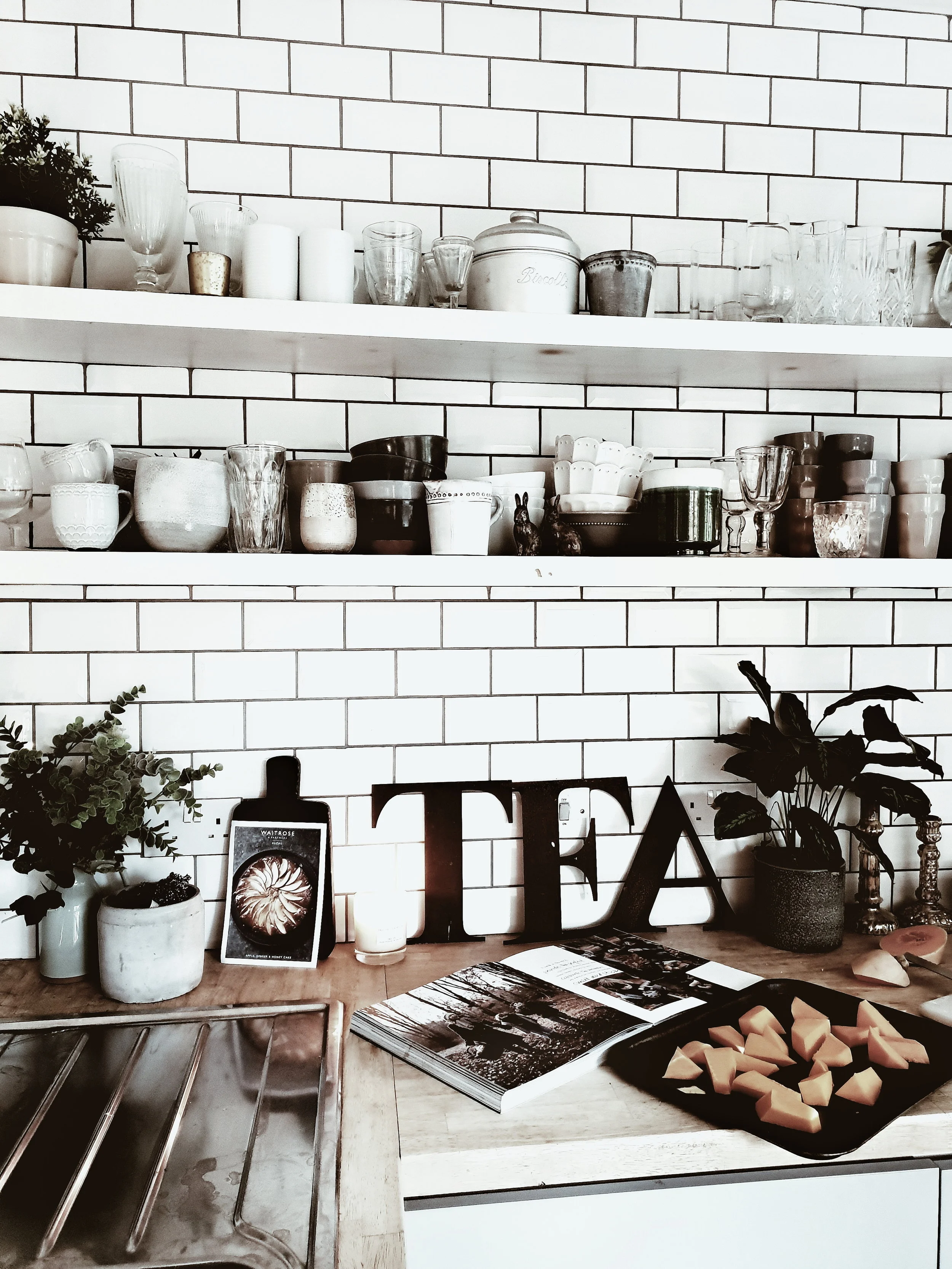
My kitchen in October

My kitchen in October

After 11 years of marriage and 14 years of dating a remarkably high percentage of our shared kitchenware still dates back to our student days when it was put through its paces cooking high end cuisine such as beans on toast and fish fingers on a bed of super noodles (don’t knock it until you have tried it people). With the motely selection we have accrued approaching the end of its life I chose a selection of kitchen and tableware from the rustic retreat and escape ranges that Sainsbury’s have introduced this Autumn/Winter. I selected Scandinavian inspired items in a neutral colour palette of soft greys and natural materials such as wood that would stand the test of time in my kitchen beyond this season. Affordable homeware doesn’t have to mean disposable homeware.

My scandinavian kitchen with grey kitchen units, open shelving and metro tiles on the wall. It is a light, contemporary kitchen with modern rustic feel #modernrustic #contemporarykitchen #greykitchen #kitchenideas #kitchendesign

I put them through their paces cooking a couple of my favourite autumnal recipes, taken from a book I cook from on repeat: Seasons by Donna Hay. The photography and the food are both amazing. The recipes I selected both use just 4 main ingredients and can be whipped up with about 5 minutes preparation: perfect for a quick but delicious midweek meal if, like me, you often need to cook with a toddler attached to a leg and whilst shouting at someone to stop playing FIFA and start doing their homework.

upload.jpg
upload.jpg

I sourced all of the ingredients for the recipes from our local Sainsbury’s which I think it is fair to say is where I spend about 35% of my life in trying to keep up with the insatiable appetites of 3 hungry sons who consume sliced bread, bananas and milk at an alarming rate.

Butternut squash after a struggle chopped up and ready to go in the oven once mixed with some olive oil and seasoned

Butternut squash after a struggle chopped up and ready to go in the oven once mixed with some olive oil and seasoned

Butternut Squash, Mozzarella and Palma Ham Salad

Ingredients (serves 2-3)

2 Butternut Squash, 375g Mozzarella Cheese, 500g Palma Ham, handful of thyme, salt and peppper to season

Method

It is so simple to make there is almost need to type out instructions! Basically you peel the Butternut squash then chop into wedges (this is the hardest part as I ending up sweating like a shotputter trying to slice through a particularly stubborn butternut), place on a tray, drizzle with olive oil and season then cook for 25-30 mins. In the meantime tear up the mozzarella and cut the palma ham into strips. Take the butternut squash out of the oven and combine in an instagram friendly fashion on a plate scattering chopped up thyme on to taste. Simple to make but totally delicious

Larking around with my big butternuts….

Larking around with my big butternuts….

I may look calm and composed in this picture but the outtakes capture me looking like an irate Bulgarian shotputter after the butternut refused to yield to my knife.

I may look calm and composed in this picture but the outtakes capture me looking like an irate Bulgarian shotputter after the butternut refused to yield to my knife.

Having emerged victorious from the #BattleOfTheButternut I set to work on the fun part: creating my tablescape. I chose dinner plates and pasta bowls from the Urban Escape range in a lovely muted grey. They are the kind of plate that you can use everyday without fear of chipping and stick in the dishwasher but their simple Scandi good looks lend themselves to fancier dining as well (featuring non-beige food). To compliment the plates I also selected a really lovely carafe and set of wine glasses in a smoked grey and I loved the contrast they create with the plates

Smoked grey wine glasses and carafe from the Urban Escape range and an oak chopping board from the Rural Retreat range

Smoked grey wine glasses and carafe from the Urban Escape range and an oak chopping board from the Rural Retreat range

Tablescape set and ready to receive food! I love how the simple minimal scandi style of the tableware and glasses works against vintage items that I added to the table to create texture and warmth

Tablescape set and ready to receive food! I love how the simple minimal scandi style of the tableware and glasses works against vintage items that I added to the table to create texture and warmth

The oak chopping board makes the perfect centre piece for bread to share, this is clearly not a tablescape for dining with the kids as the bread would be the far less instagrammable Hovis 50/50 medium sliced otherwise…

The oak chopping board makes the perfect centre piece for bread to share, this is clearly not a tablescape for dining with the kids as the bread would be the far less instagrammable Hovis 50/50 medium sliced otherwise…

Butternut squash, palma ham and mozzarella salad. Simple but totally delicious and the battle with the butternut guarantees you will probably burn more calories in preparing it than you will consume eating it!

Butternut squash, palma ham and mozzarella salad. Simple but totally delicious and the battle with the butternut guarantees you will probably burn more calories in preparing it than you will consume eating it!

I love the contrast that the smoked grey glasses create with the plates and it all pops out when using a dark linen table cloth as a backdrop

I love the contrast that the smoked grey glasses create with the plates and it all pops out when using a dark linen table cloth as a backdrop

Vintage wooden kitchen table set with grey linen table cloth, pale grey plates and bowls from Siansbury's Home and rustic oak chopping board #rustickitchen #tablesetting #autumntableideas #autumnalinteriors

For pudding I turned once more to Donna and selected a delicious sounding maple and pear tarte tatin.

Maple Pear Tarte Tatin

Ingredients (serves 4-6 depending upon how greedy they are!)

6 dessert pears, 375g puff pastry, 4 spoonfuls of golden syrup, 80g of butter

Method

Peel and slice the pears to about a one pound coin thickness (which are a joy to work with compared to the bastard butternuts). Melt the butter in a pan over a medium heat and then add to syrup and bring to the boil. Turn down to a simmer for 2 minutes and then remove from the heat. Arrange the pears to cover the bottom of a 20cm oven proof pan and then pour over the butter/syrup mixture. Then place over the top the puff pastry cut to a 22cm circle and place in the oven. Cook for 20 mins (or in my case until the smoke alarm goes off because some of the syrup mixture has escaped the pan and formed a mini bonfire on the bottom of the oven). Serve with creme fraiche or clotted cream

The kitchen set read for round two. Gorgeous grey mixing bowl and wooden and grey silicone cooking utensils pictured all from the Rural Retreat range

The kitchen set read for round two. Gorgeous grey mixing bowl and wooden and grey silicone cooking utensils pictured all from the Rural Retreat range

Taking time out for a cup of tea and praying that pears are easier to peel than butternuts…

Taking time out for a cup of tea and praying that pears are easier to peel than butternuts…

Bowl and whisk pictured from the Rural Retreat range. Behold the Maple Pear Tart Tatin of dreams

Bowl and whisk pictured from the Rural Retreat range. Behold the Maple Pear Tart Tatin of dreams

But will mine turn out this well?!

But will mine turn out this well?!

It is a stunningly easy and delicious dessert to make and it was a dream to use new kitchen utensils which had not seen active service in the University of Manchester Halls of Residence kitchens mainly stirring supernoodles. I love the earthy contrast of the oak handles of the rural retreat range against the scandi inspired grey. They look great against the white metro tiles in my kitchen and make my utensil selection about 100% more stylish!

Mixing the pears in with the butter and syrup mixture and trying not to set light to my ill advised take on chefs whites

Mixing the pears in with the butter and syrup mixture and trying not to set light to my ill advised take on chefs whites

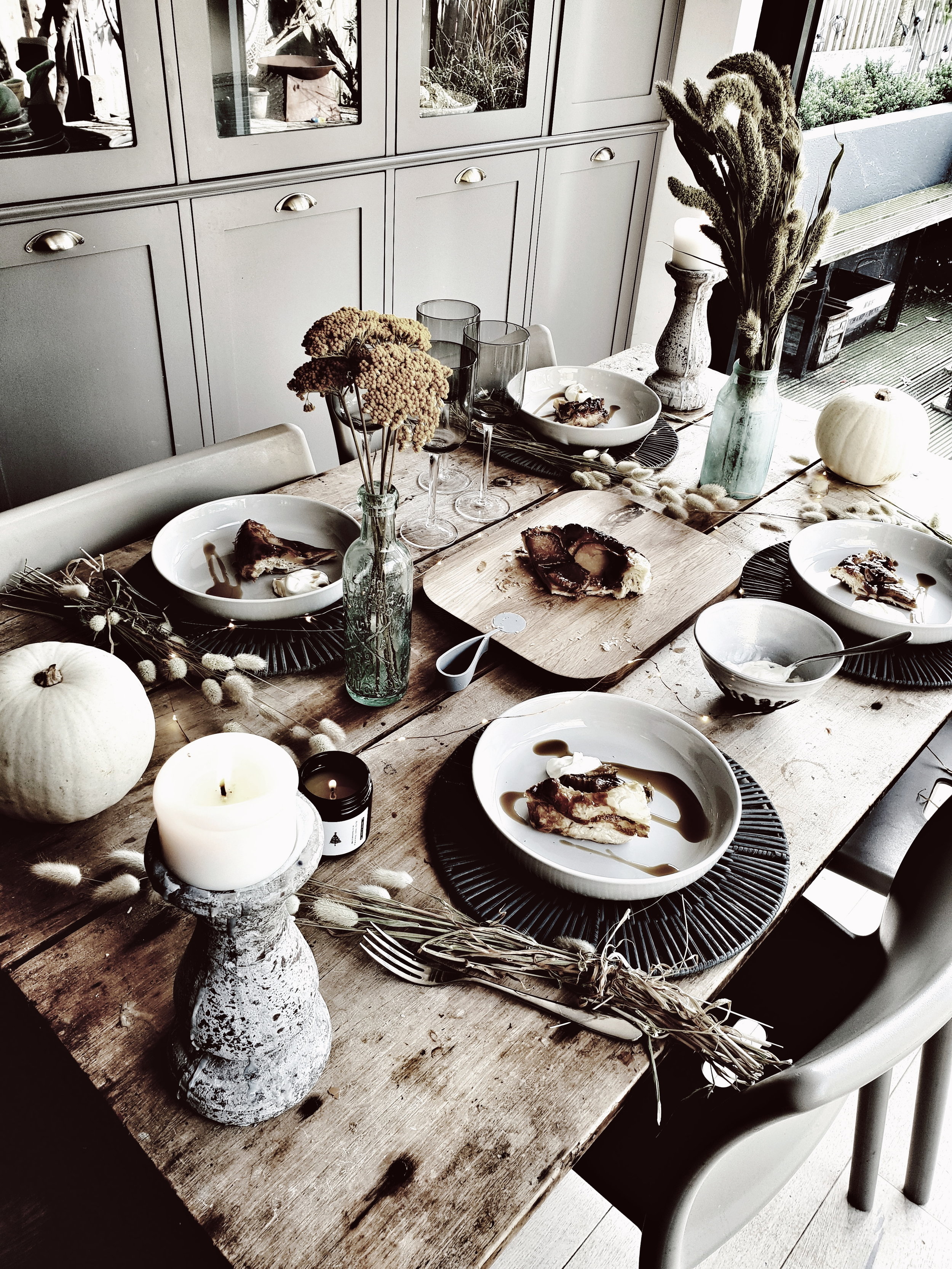
With the tarte tatin in the oven I performed a quick turnaround on tablescape number two. Whipping away the table cloth to reveal the natural texture of our vintage farmhouse kitchen table and adding in some gorgeous dried flowers in autumnal colours and some scandi white pumpkins to up the autumn factor. I love the contrast between the texture of the table and the simple pale grey of the plates. The pasta bowls are great for serving dessert in as you can add in a drizzle of maple syrup and dollop (is there a more satisfying word known to man?!) of creme fraiche without fear of it escaping!

The dark grey table mats look great against my vintage farmhouse table. They are available in store but not online

The dark grey table mats look great against my vintage farmhouse table. They are available in store but not online

White pumpkins adding a modern rustic touch to the table

White pumpkins adding a modern rustic touch to the table

I also added in these lovely rattan table mats from the Urban Escape range (available in store but not online) to provide a bit of additional contrast, they are a timeless style and colour that I know I will get lots of use out of. I used the oak chopping board to display the tarte on which turned out pleasingly like the picture despite its emergency evacuation from the oven

Dried flowers are a great alternative to fresh as they can last you through the Autumn season and beyond and are really versatile.

Dried flowers are a great alternative to fresh as they can last you through the Autumn season and beyond and are really versatile.

I love how the new items I have added from the Rural Retreat and Urban Escape ranges mix with my collection of vintage bottles and the natural texture of my french farmhouse table

I love how the new items I have added from the Rural Retreat and Urban Escape ranges mix with my collection of vintage bottles and the natural texture of my french farmhouse table

Just add creme fraiche and a drizzle of maple syrup to serve

Just add creme fraiche and a drizzle of maple syrup to serve

Pear Tarte Tatin served up on pale grey plates from Sainsbury's Home on a rustic wooden farmphuse table and set with vintage bottles and dried flowers for a modern rustic feel #farmhousekitchen #farmhousedecor #kitchentable #vintagekitchentable #aut…

So there you have it, two ideas for autumnal tablescapes with a rustic Scandi twist. I hope you enjoy giving the recipes a try and updating your kitchen with the Rural Retreat and Urban Escape ranges from Sainsbury’s Home.

Pear Tarte Tatin served up on pale grey plates from Sainsbury's Home on a rustic wooden farmphuse table and set with vintage bottles and dried flowers for a modern rustic feel

This blog post was kindly sponsored by Sainsbury’s Home

Mood board your perfect space with Corian® Design

*This blog post is a paid advertorial with Corian Design*

When we extended and renovated our kitchen back in 2012 I had just given birth to our second son and was about to embark upon a career change that would involve forfeiting two thirds of my previous salary (remind me why I thought that was a good idea again?!).  That meant we were working to quite a strict budget and so there were certain items on my wish list that I had to compromise on.  Worktops were one such item. 

Corian Kitchen.jpg

I had my heart set on marble, concrete, or Corian surfaces but it was a case of champagne taste and lemonade budget. In the end,  we ended up going for wood.  Five  years later,  I still regret that decision.  It is not that I don’t like the wood it is just that I don’t love it and I have been slowly working on persuading Mr. Malmo that it would be a good idea to upgrade the worktops ever since.

The worktop in the holiday home we recently stayed in during a trip to the Netherlands made me regret my original wooden worktop choice!

The worktop in the holiday home we recently stayed in during a trip to the Netherlands made me regret my original wooden worktop choice!

So when Corian® Design asked me to try their new Moodboard Maker tool I jumped at the chance!  I am one of those people who is literally unable to visualise anything using only my imagination so the Moodboard Maker is the perfect tool for me.

Who is  Corian® Design?

Corian® Design is a  designer and manufacturer of high quality Solid Surfaces which are made using a blend of minerals and acrylic and can be shaped into literally any design or size you want.  There are over 100 different colours and patterns available to choose from so whatever your interior style there will be an option that will work for your space. 

The Corian Moodboard Maker

If you are ever having a bad week at work or the kids are winding you up,  forget yoga, pilates or meditation and get mood boarding!  It may be less likely to tone your abs, improve your core or flexibility, but I think it is one of the most relaxing and therapeutic things you can do as it allows you to escape from reality for a little bit and get in touch with your creative side. The mood boarding I have done in the past when planning out room schemes has been of the analogue variety in the sense that it involved pritt stick, scissors and lots of ripped out pages from magazines.  I was really keen to try the much less messy digital version.

An introduction to the Moodboard maker

An introduction to the Moodboard maker

I am not naturally good with technology.  Actually, I am naturally terrible with technology.  I have an innate ability to crash an app at 50 paces and I think the IT guy at work has now started fielding my calls to avoid the almost daily questions I have about how to use Microsoft Excel.  Therefore, when I say if I can use the Corian Moodboard Maker tool, then anyone can. I really mean it!  It is super simple and straightforward.   The end goal is to create a visual mosaic with several  pieces that represent different surfaces, textures and materials to create a design story for your space. 

The first step in the process is to choose a style that you think best represents you. The options include Organic, Minimal, Relaxed, Modern, Refined, Bohemian or Edgy.  The different styles come with a different range of inspiration pictures to choose from. But, you can also upload your own images to the tool quite  easily to give you extra choices and personalization.  I played around with Organic and Bohemian styles but in the end decided on Minimal as I felt it best captured my Scandi-inspired look. 

My kitchen and the existing wooden worktops

My kitchen and the existing wooden worktops

You then have a blank Moasaic shape with several  different segments to fill.  The first step is to pick a Corian® Design swatch that you want to showcase and then you can build the rest of the mosaic around it.  You can select more than one Corian® Design Solid Surface swatch if you are struggling to narrow down your options or want to play around with the look and feel.   I chose Corian® Solid Surface in Silver Gray and Arrowroot because I am most drawn to these two and am struggling to make a decision.

Corian Moodboard Maker

You then fill up the rest of the segments either using the bank of pre-existing images available in the tool or by uploading your own images which could be anything that inspires you, it doesn’t have to be strictly interiors related.  So if you have of a beautiful sunset from your holiday that you really like the colours/feel of then add it into the mix. 

I used a combination of images from my own home (both room shots and close ups on textures such as the front of one of my cupboards) and then also drew upon some of the existing Corian images as they blended really nicely with my own pictures. 

Photo credit Vintage Piken

Photo credit Vintage Piken

I used a picture of the front of one of my kitchen cupboards because I like the distressed wood

I used a picture of the front of one of my kitchen cupboards because I like the distressed wood

You can easily drag and drop images in and switch them around if you don’t think you have the right combination.   Et voila one finished moodboard which you can download to your phone or computer, share on your social media platforms, pin to your Pinterest board for your project or even order a framed print of!  Here’s my final moodboard:

My final mood board created with the Corian Moodboard Maker

My final mood board created with the Corian Moodboard Maker

Malmo & Moss House: Taking our Living Room to the Dark Side

When we moved into the Malmo & Moss house 7 years ago, we inherited a colour scheme with lashings of lilac, the kind of shade favoured by sanitary pad and vaginal wash manufacturers.  Once we had the keys one of our first steps was to de Always Ultra the walls.  As this was 2010 aka 'The Days before Downpipe' going over to the dark side was more likely to be a reference to accidentally crossing the A10 and ending up in Ponders End than applying inky hues to your walls.  So we played it safe and went Wimborne White on the walls in the front room and slipper satin on the floorboards. 

Apologies for the slightly grainy photos, these were taken in the days before my instagram obsession began!

Apologies for the slightly grainy photos, these were taken in the days before my instagram obsession began!

Malmo & Moss Living Room 35.png

Having said sayonara to #SanitaryPadPurple we were intially happy with the newly decorated living room but, after a while, the combination of the white with draughty floorboards and sash windows insulated with cotton wool started to make it feel like quite a cold room.  After we had the rear extension done to create a kitchen/family room, we started to notice we were using the front room about as often as any of the 25 different fitness dvd I have ever bought. 

Malmo & Moss Living Room 36.png
Malmo & Moss Living Room 37.png

Our mission was to find a way to make it warm and cosy whilst retaining the Scandi look I love.  The boringly practical first step was getting a carpet.  In my twenties I was 100% Team Stripped Floorboard but, as time has gone by, I have realised that in some spaces I like to feel a tread between my toes.   Olga at the carpet shop' was desperate to sell us one of those velvet effect carpets favoured by premiership footballers, Russian oligarchs and high end brothels (although obvs have never actually been inside one of those so that is probably a wild sex carpet stereotype) but, much to her chagrin, we went sheep over synthetic and got a loop wool one instead. The next step in upping the warmth was getting rid of the shonky old radiator that was on the wall behind the sofa and replacing it with a vertical one that could actually release heat into the room.  This was an easy project if you ignore the fact that it fell off the wall in the middle of the night initially.

The radiator eyesore although it was a handy spot to balance a cup of tea.

The radiator eyesore although it was a handy spot to balance a cup of tea.

Malmo & Moss Living Room 13.jpeg

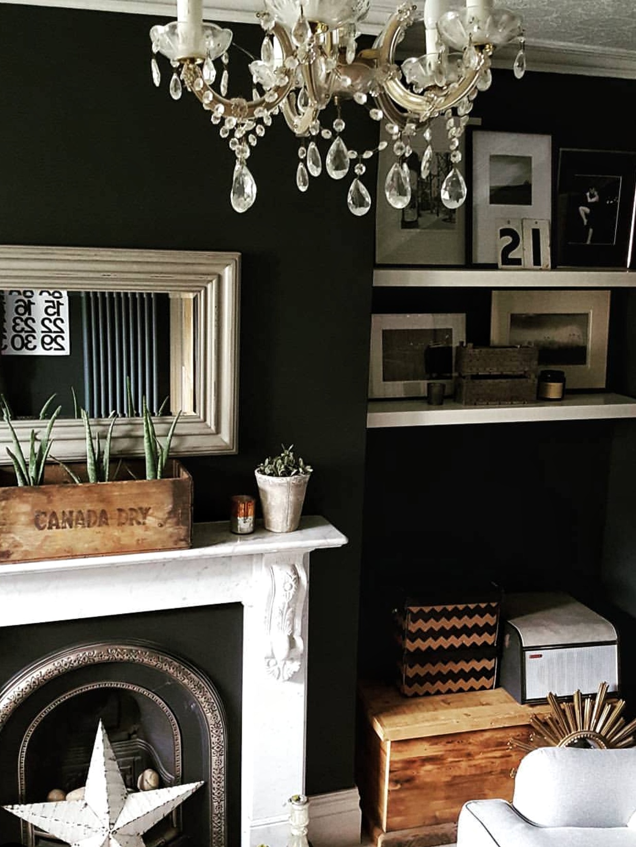
We went for a dark grey radiator because the other huge change we decided upon was going over to the dark side with the colour on the walls.  By that point in 2016 we were pretty much the only people in North London not to have a downpipe feature wall.  But when I brought a sample of it home I just couldn't shake the fact that, in our front room, there was a weird green tinge to it.  So we went back to the Farrow & Ball drawing board and ended up going even darker with Railings.  Because Mr Malmo and I possess the cutting in skills of a pair of toddlers let loose in a crayola factory we got the pros in to apply the paint whilst we went away for the weekend.  

Cutting in not completed by the Crayola twins

Cutting in not completed by the Crayola twins

This alcove is one of my favourite parts of the room

This alcove is one of my favourite parts of the room

I was nervous about returning home to see the results, as the last time I had gone over to the dark side was age 13 when I went the full De Niro and died my hair black to play a minor member of the Sharks in West side Story.  Growing up in the North East with a shade of pale skin that is one shade off albino I was perhaps an unusual choice to play as a Puerto Rican and the black hair merely lent me an air of bus station goth instead of hot blooded latino.  Happily this dalliance with the dark side worked out a lot better and we have no #RailingsRegrets.  Everything looked just instantly more dramatic and because we have big Edwardian sash windows we get plenty of light in the room so it never feels gloomy.  Well I say that but my 10 year old niece does refer to it as Auntie B's black front room so maybe it is a little more batcave than I think it is.

Malmo & Moss Living Room 25.jpeg
Malmo & Moss LIving Room 46.jpeg

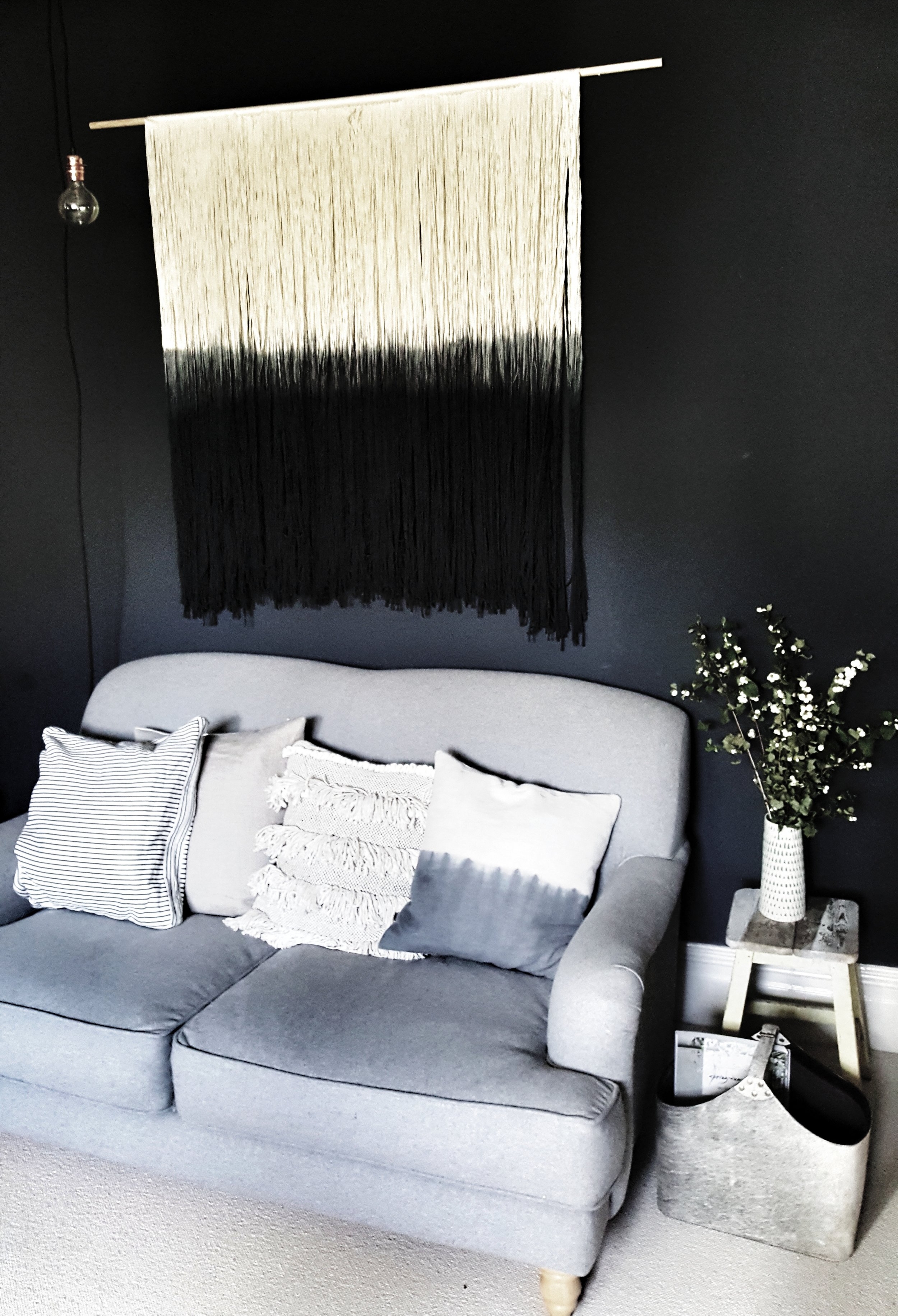
Having bold walls has made me a little bit bolder about what I put on them too.  Like this giant wall hanging I fell in love with in the home of @sara_lou_c on instagram (watch out for house tour coming to the blog soon).  It seems that I am not the only one to have fallen head over wall hanging heels as Sara has now set up a lovely website selling them called Fern Art & Interiors.  Whilst it had been love at first sight for me I was a little bit concerned that Mr Malmo would not experience the same level of lust but it turns out he is more of a modern bohemian than I gave him credit for as it didn't even come close to setting off his "What the f#uck have you bought now alarm".   He is also a massive fan of the new, stylish magazine storage solution I was sent by Life Of Riley as we were previously a couple of Living Etcs away from being buried under a magazine mountain.

Malmo & Moss Living Rooom 20.jpeg
My rather smart new magazine storage from @mylifeofriley works perfectly with all the other textures

My rather smart new magazine storage from @mylifeofriley works perfectly with all the other textures

Malmo & Moss LIving Room 54.jpeg

The other big change we made was to replace our oldest sofa which was purchased in the Designers Guild sale nearly a decade ago but had never really recovered from the 4 month's Mr Malmo's brother spent sleeping on it when he had just finished Uni.  Not because he was spilling kebabs and bodily fluids on it (although to be fair he might have been age 21) but because our cat weed on it and his possessions everyday until he finally moved out.  It seems that we had some sort of #CatConservative on our hands who had strong views about the young people of today pulling their bootstraps up and going out to work rather than watching repeats of the Brittas Empire on our sofa. Top of my dream sofa shopping list was a dove grey velvet button backed chesterfield until I remembered that we have 3 boys and that owning a velvet sofa was another thing to add to the "maybe in another 15 years time list" along with driving a car that doesn't look like a variety club minibus and going to work without a bad case of #BananaCrotch.  Having come to my senses, we compromised on the Dixie sofa from Loaf in a brushed cotton finish and it is such a comfy sofa.

The Dixie, don't look too closely at my dodgy paint job behind the sofa

The Dixie, don't look too closely at my dodgy paint job behind the sofa

Adding some extra hygge this Autumn with a new throw from Cox & Cox

Adding some extra hygge this Autumn with a new throw from Cox & Cox

Malmo & Moss Living Room 4.jpg

There are still a few more bits and pieces I would like to do to finish the room off.  The biggest of which is swapping the gas fire for a woodburner #MiddleGlassLifeGoals.  But whilst we save up for that on my more immediate hit list is a new pendant light as I am not sure the chandelier works in here anymore. What do you guys think?  Is it too delicate for the Batcave?

MAlmo & Moss Living Room 47.jpeg

Malmo & Moss House: Making Over the Spare Room

Shall we really go hard at it in the spare room on Saturday night would, in my twenties, have been an offer to Mr Malmo that included matching lingerie, Marvin Gaye and massage oil. Three kids in he knows that these days it is much more like to involve removing my knickers from the drying rack that is semi permanently erected in there, hearing through the grapevine instructions to rationalise the underbed storage drawers and massaging shampoo into the carpet to try and remove evidence of a #babysudocreamrampage.  When we moved into the Malmo & Moss House 7 years ago we started by turning this room into my eldest son's nursery. Because we didn't get the keys until 3 weeks before he was born, my husband had to pretty much carry out that transformation solo, heroically wallpapering up a ladder at 2am.  Although, if I am honest, even if i didn't have a 7 pound baby eager to get out of my clunge I would probably have still just stood around decoratively holding a wallpaper brush.   

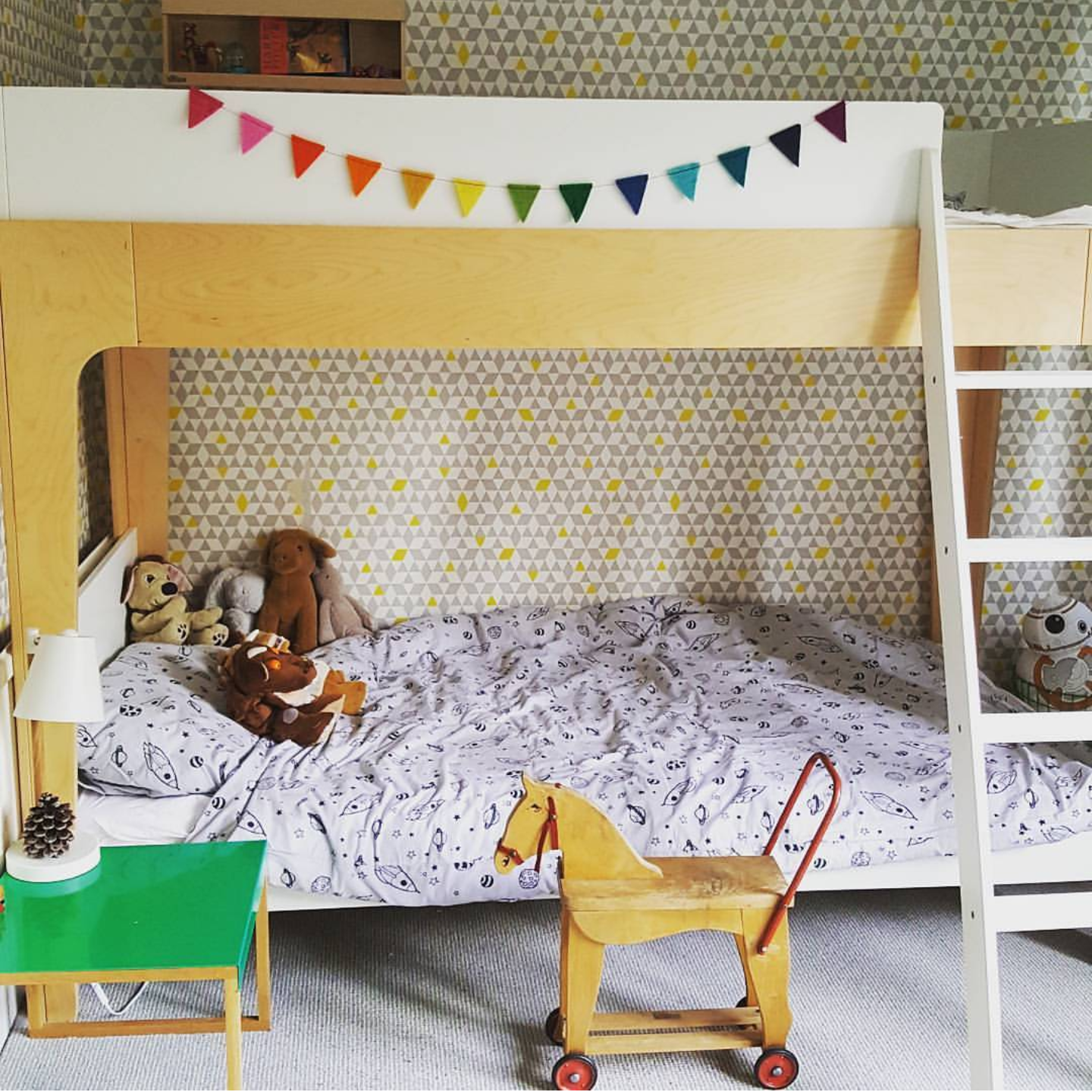
With the boys moved into new bunk quarters, the spare room became ripe for redevelopment!

With the boys moved into new bunk quarters, the spare room became ripe for redevelopment!

When we knew baby number three was on the way we decided to move the two older boys into what was then bigger spare room with this room, after a lick of Cornforth White (has a more middle class phrase ever been uttered) assuming a new identity as a temporary offshoot of the Big Yellow Storage Company.  I am going to spare you a shot of it buried underneath a mound of maternity knickers, tea towels, baby toys, dismantled furniture, tins of paint and coats because you probably have a room like that of your own that you can go into if you want an interiors reality check.  When someone was coming to stay all of that crap got temporarily shoved into the wardrobe and it looked ok but it was a bit like the maternity knickers it so often played host to in that it was a bit drab and tired.  

Temporarily tidy but all a bit bland

Temporarily tidy but all a bit bland

After a particularly steamy session in there one Saturday night when Mr Malmo went wild with the nozzle of the hoover (attached to the entrance to a vacumn bag rather than something else I hasten to add) it was enough of a blank canvas to start thinking about how we could add a bit of personality into it.   The first step I took was to try and break up the wall behind the bed a bit by stringing up some festoon lights using command hooks.  I got my festoon lights from Sainsburys homeware range.  I think they were £13 in the sale and they stock them all year round.  They are definitely not the same quality as say a set from The White Company (they are about as sturdy as an eggshell) but I think they pretty much do the job.  

The festoons instantly injected a bit of interest

The festoons instantly injected a bit of interest

With that job done I turned my attention to the bedside tables.  They were a couple of fairly non descript numbers that we bought for our first flat back when I was a #Living EtcVirgin. They were, brace yourself, originally a shade of pine that I would describe as akin to Dale Winton just back from a week in Marbella. Once I had popped my Living Etc cherry I hastily painted them Pavilion Grey in a bid to Farrow & Ball away the Winton.  However, because I am the kind of impatient painter that dips a paintbrush in without a second thought to masking tape, dust sheets or priming I managed to paint the drawers shut.  Consequently retrieving anything from the drawers was the kind of challenge they liked to set people on the Crystal Maze when they wanted to watch an accountant in a jumpsuit try and restrain himself from saying the words cunting hell on pre-watershed television. 

Spot the #DuluxWeldedDurexDrawers

Spot the #DuluxWeldedDurexDrawers

The dressing table in its previous home in our main bedroom. Just to reassure you that is a curatin pole not crow bar you can see peaking out from under the bed.

The dressing table in its previous home in our main bedroom. Just to reassure you that is a curatin pole not crow bar you can see peaking out from under the bed.

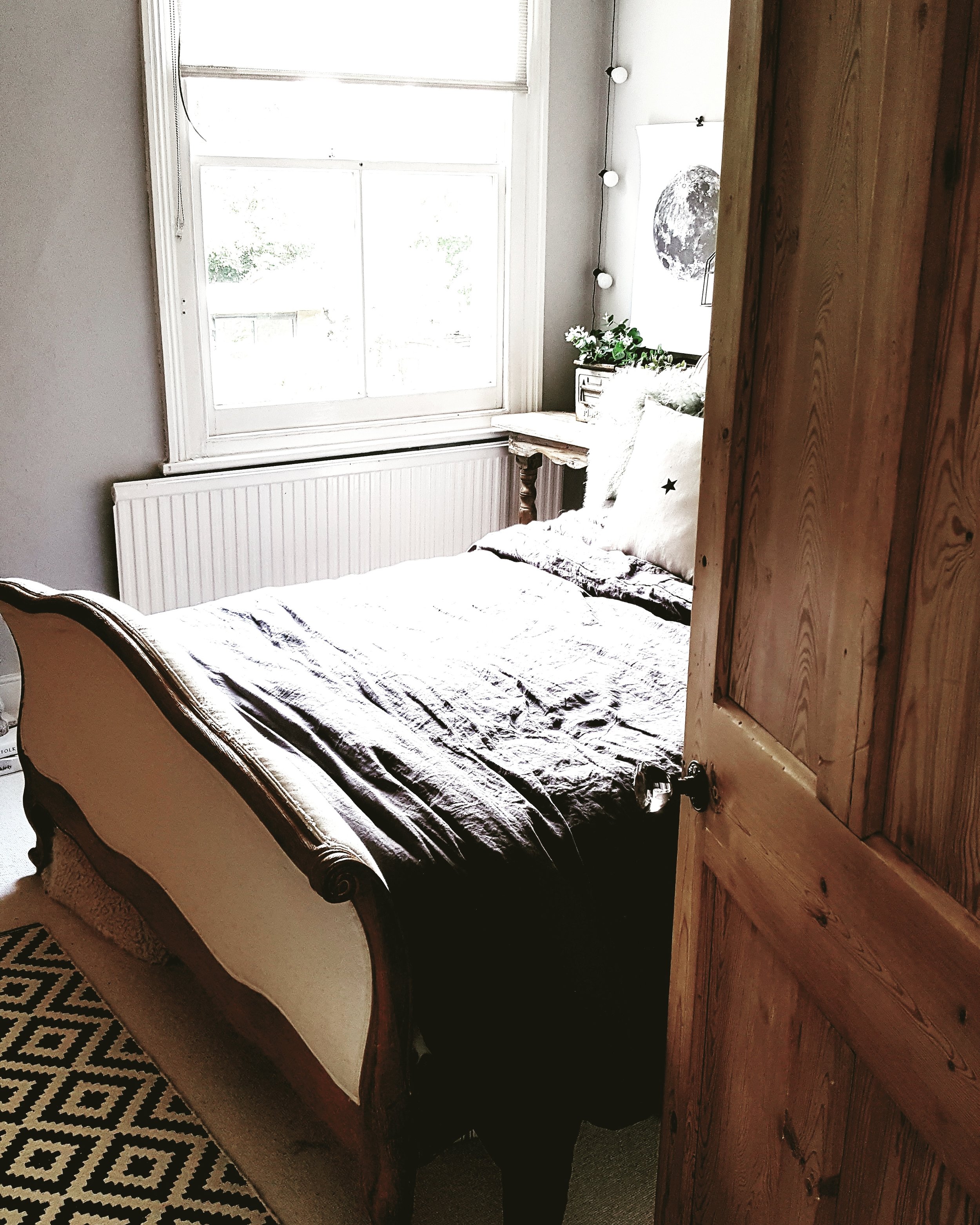
Having finally jimmied the drawers open using the type of tool favoured by teenager car jackers, and disposed of the contents (which included some aged condoms which if used would almost certainly have led to the birth of our 4th child) the #DuluxWeldedDurexDrawers were taken to the tip.  Does anyone else's husband enjoy a trip to the tip almost as much as a blow job? In their place on the left hand side I brought down from our bedroom a dressing table which was the first piece of furniture we ever bought together.   Although Mr Malmo has never been a very big fan of it because apparently in his words it has shades of something Wolfgang Amadeus Mozart would have sat at whilst powdering his wig. I think it works really well in the spare room though with the style of our Loaf bed (and am sure Amadeus would have sided with me on this one inbetween whiping up preludes).  On the otherside of the bed we reconstructed the desk that used to be downstairs before Project Partition happened (future blogpost coming on that one!).

A lovely spot for Mozart to powder his wig

A lovely spot for Mozart to powder his wig

My attention turned next to a subject in which I could complete a doctorate: cushions.  I wanted something which created a bit of texture and drama so when I was on a work trip in Cardiff I thought all my Christmases had come at once when I popped into TK Maxx and spotted two of their divine Mongolian fur cushions in the sale for half price.    Unfortunately they are each the size of a small Mountain Yak so the only carrier bag that would contain them was a pink bag for life plastered in pictures of dogs in camp spectacles.  I think it is probably the first time the security guard at the Welsh Government Building has had  to X-Ray scan soft furnishings for explosives in a bag that looked like something Dame Edna Everidge might take with her to the lauderette.  Having wrestled the Yaks all the way home from Cardiff on the train I realised when I got home that they are in fact not the smokey grey I had intially thought they were but had a distinctly greenish tinge to them, a bit like a Yak that had fallen a pond....However I have actually really come to like the colour and it fits really nicely with the rustic wood of the tables and bed. 

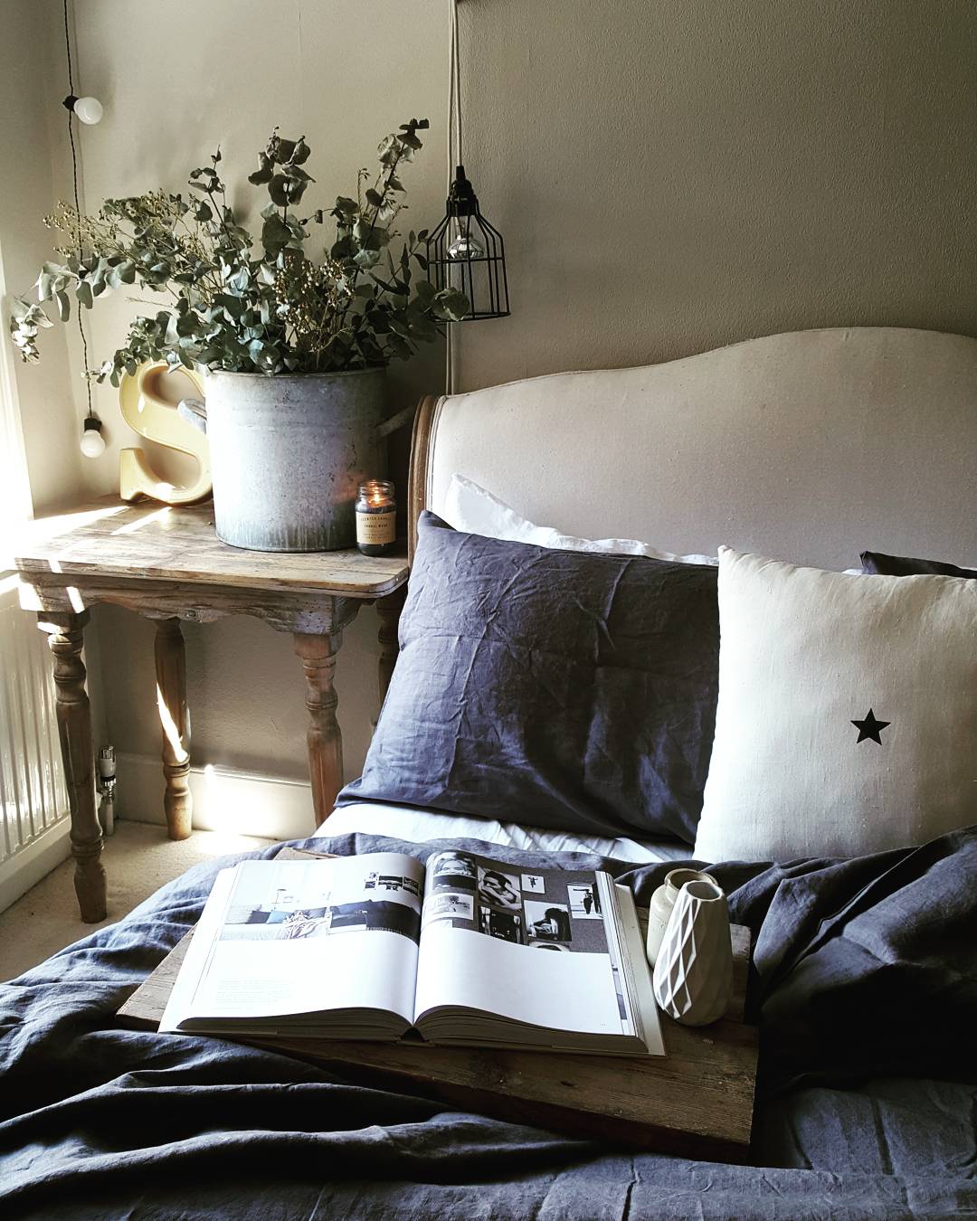
With the soft furnishings in hand I turned my attention to the bed linen.  One of my absolute favourite instagram accounts belongs to @teawithruby who has the most beautiful antique bed and really gorgeous slubby (is that even a word?!) linen bedding in smoky colours.  The charcoal linen set I chose from Piglet In Bed fitted the #SlubbySleeping bill perfectly!  They do a lovely range of durable low maintenance linen bedding that gets softer and softer with wear and most importantly of all doesn't require me to iron it for it to look good!

The beautiful bedroom of @teawithruby

The beautiful bedroom of @teawithruby

Slubby Sleeping Goals achieved thanks to Piglet in Bed.

Slubby Sleeping Goals achieved thanks to Piglet in Bed.

It was all coming together nicely but I wanted it to have a bit more of an industrial/boho edge inspired by some of my favourite instagram bedrooms.  Although I don't have bare bricks to work with (unless I start tearing chunks of plaster away from the walls which I suspect would be about as popular with Mr Malmo as my cauliflower burgers) I really like the earthy industrial feel they add to Reena of Hygge for Home's bedroom.  I decided to add that feel through the use of rustic reclaimed wood instead like the gorgeous bohemian bedroom of Kate Young.  A trip to our local salvage yard resulted in us returning with some suitably distressed planks and the owner 22 Stone Tony laughing all the way to the bank as he took our cash for what transpired to be the bench he used to saw up wood on to sell to yuppy renovators.

Rustic woods and linen bedding getting my modern rustic pulse racing.

Rustic woods and linen bedding getting my modern rustic pulse racing.

Beautiful Bare Brick Boho Bedroom inspiration from @hygge_for_home

Beautiful Bare Brick Boho Bedroom inspiration from @hygge_for_home

I love how @kateyoungdesign uses texture to create warmth in her bedroom

I love how @kateyoungdesign uses texture to create warmth in her bedroom

22 Stone Tony's Planks stand proud in the corner next to the rehomed desk.

22 Stone Tony's Planks stand proud in the corner next to the rehomed desk.

I also decided to keep all of the artwork black and white to create a crisp, clean impact with prints from Desenio doing the honours.  I can't quite decide whether to have some more artwork above the bed and if so whether to go with one big print, a mini gallery wall or a picture shelf with a small selection of different size prints or alternatively whether to go with a bit set of vintage antlers there instead to provide a further nod to the nordic.  Would love to know your thoughts.  Would it look too busy?  We were originally intending to turn our #YuppySalvageHaul into shelves in the alcoves but that would mean the festoons couldn't hang down the sides so I think I have changed my mind about it.  

I have added a real olive tree in beside the bed whilst I continue the search for a faux one which doesn't require me to take a bridging loan to afford it.  I have recently received a tip off that Ikea may have one so I am hoping that there has not been a middle class stampede to my local branch since this faux foliage rumour started doing the rounds.  

On the right hand side of the bed in these pictures are a set of vintage pegs that are displaying a throw and a lovely cage light I got from Of Special Interest.  In reality my husband has an infuriating habit of using these pegs as the resting place for a waterproof coat he has which makes him look like a cross between a 1990s indie band member and a bird watcher, sort of Bez meets Bill Oddie.  The trunk below them is one of my favourite vintage finds from Newark collectors market, where I also got the old French Railway Station clock which adds some extra monochrome interest.

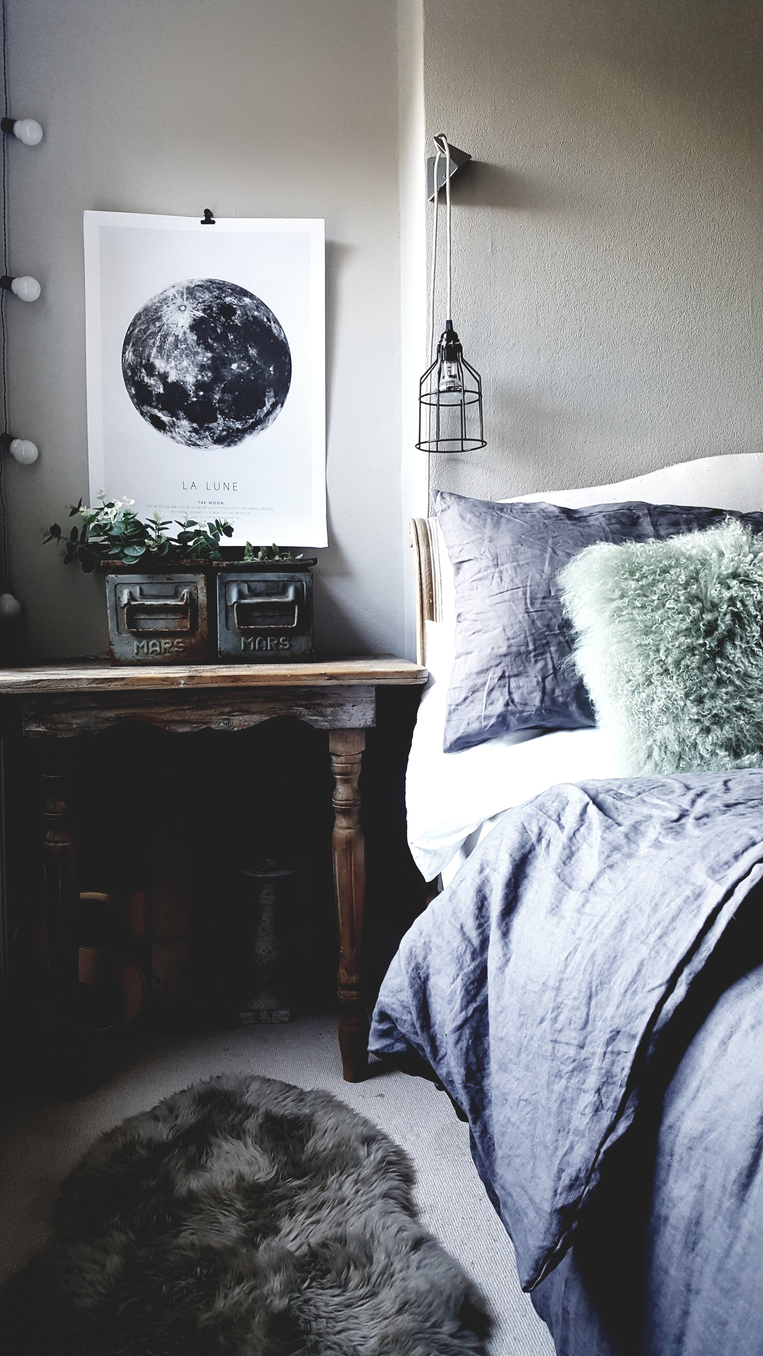
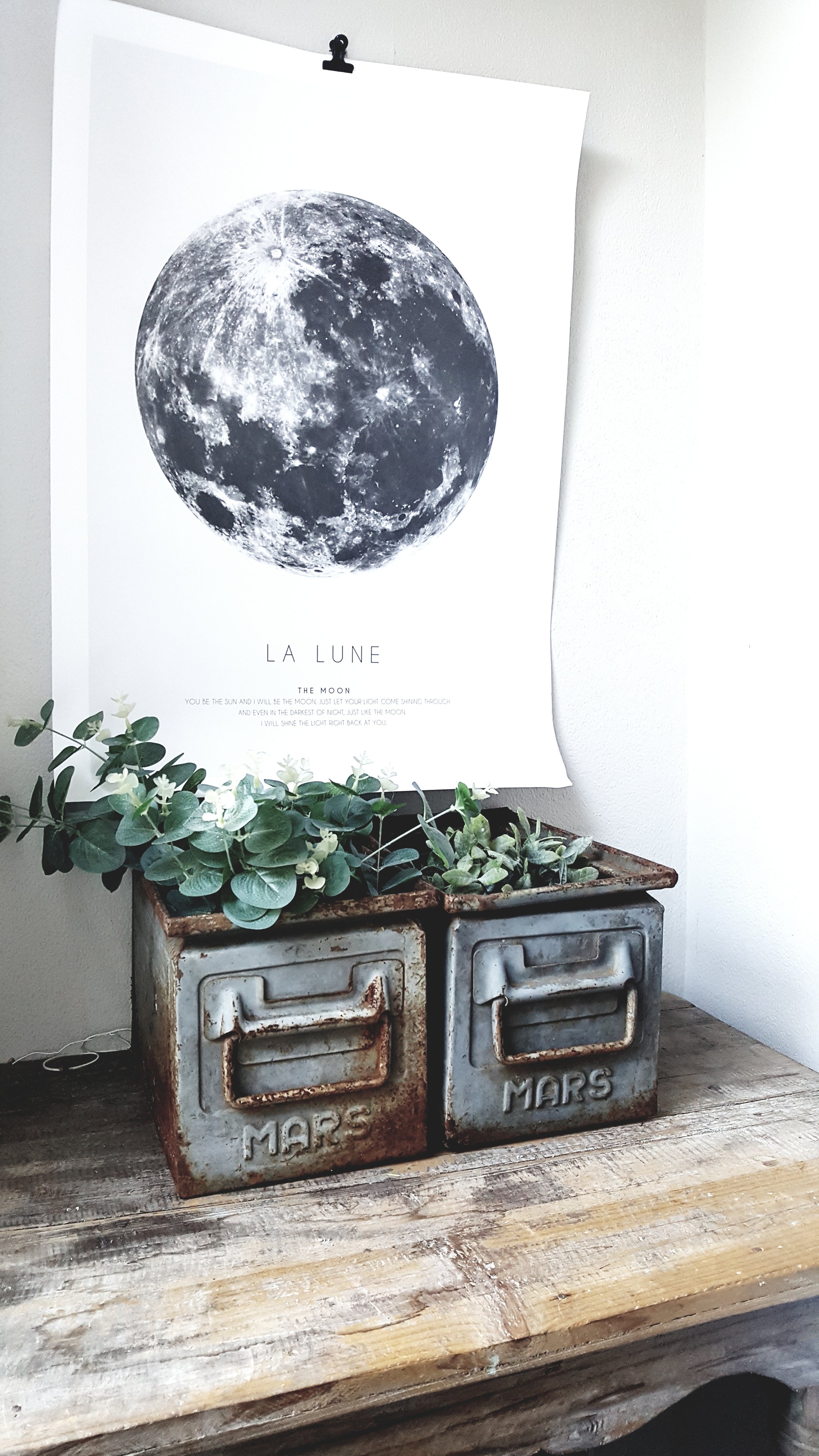
Completing the industrial touches on the other side of the bed are some old Mars tins which have been outside until recently so picked up quite a bit of rust although I personally think that just adds to their character.  I bought them about 5 years ago from a man at Newark who had literally hundreds of them so I am always kicking myself that I only came away with three which was the most I could fit under the pram at the time.  I think Bugaboo are really missing gap in the market by not designing a pram with a huge undercarriage for vintiquing mums on the go.

The mars tins and a John Lewis sheepie to add some more texture and warmth under foot

The mars tins and a John Lewis sheepie to add some more texture and warmth under foot

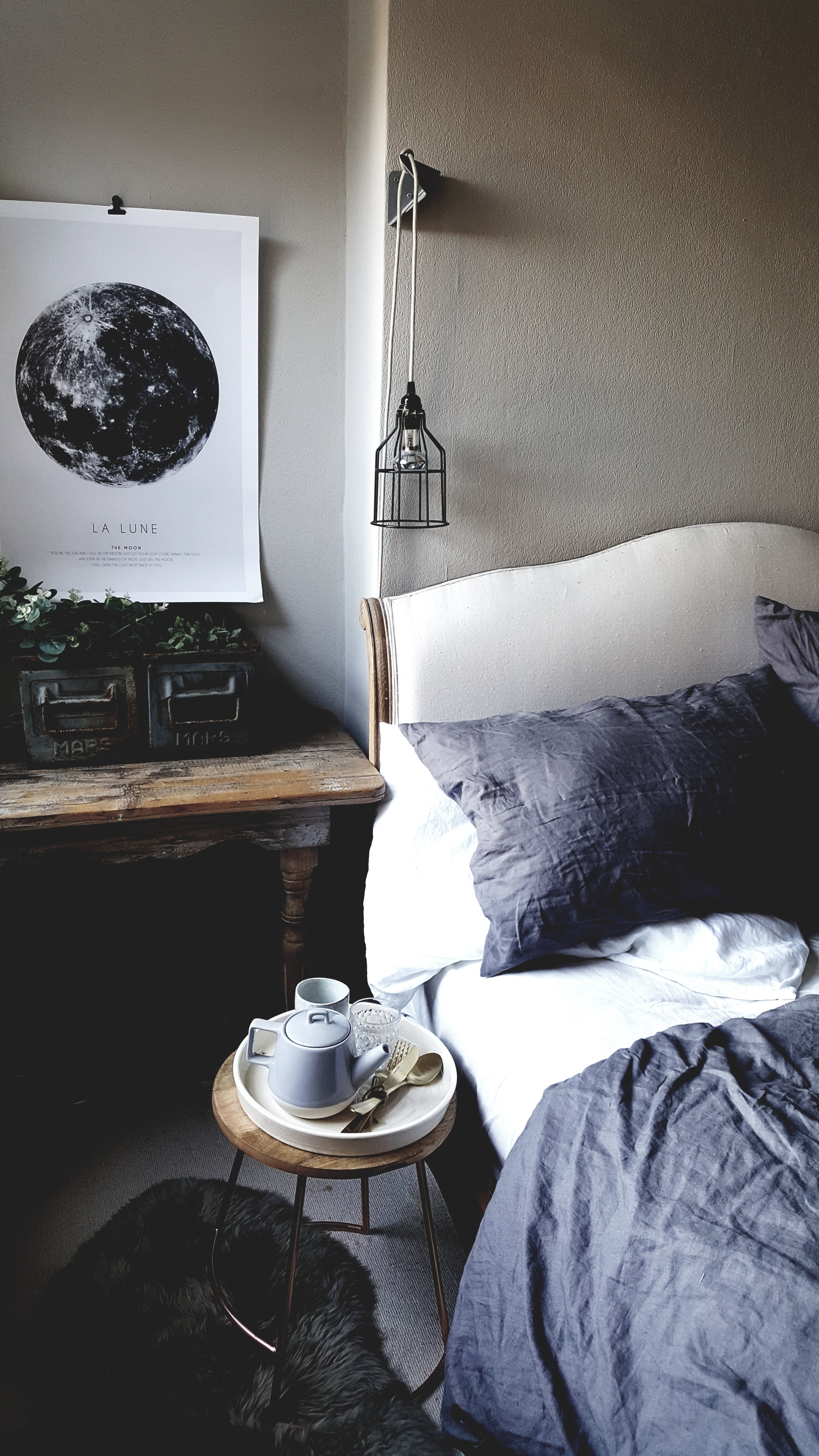
The copper legged stool from Sainsbury's adds an extra industrial touch

The copper legged stool from Sainsbury's adds an extra industrial touch

The La Lune print is a recent purchase from Desenio

The La Lune print is a recent purchase from Desenio

The cage lights were from a little shop in Canal St Martin on the Il de Re

The cage lights were from a little shop in Canal St Martin on the Il de Re

The Cushion Yaks provide nice contrast to my Florence Bouvier cushion from Lisa Valentine Home

The Cushion Yaks provide nice contrast to my Florence Bouvier cushion from Lisa Valentine Home

The final touch I added recently after a rock n roll Thursday night trip to Enfield Town B&Q, was this Scandi inspired carpet runner which was a total bargain and neatly disguises where my middle son went rogue with his freshly sudocreamed bottom when 18 months old. Sudocream and wool fibres go about as well together as Theresa May and chocolate brown leather trousers.  Oh and am also very happy that we no longer have the 1980s doors that were all over the house when we first moved in which were reminiscent of doors the Corkhills used to slam during arguments on Brookside circa 1988.  This beautiful reclaimed one came from 22 Stone Tonys yard aka Stoneage Salvage on the way to Cuffley.

To the left of the bed as you walk in the door are a set of Ikea wardrobes constructed by Mr Malmo to which he added bespoke chipboard doors.  They are a very marmite feature of the room with my dad surpisingly numbering amongst their fans despite them being decidely non cluttered gothic, his signature interiors style.  They tend to create what I like to describe as the "shit why the hell did they do that face" in most guests.  I can't decide whether I want to leave them like that, paint them, or wallpaper them with tin effect paper like the panel hanging on the wall that caught my eye on the Rockett St George website.  What do you guys think? Let me know in the comments below whether you are #TeamChipboard or #TeamTin.


Malmo & Moss Diary: The Occasional Home Store Autumn Fair
3 weeks before the birth of our first son we moved from South to North London in search of a family house we could afford without assuming a debt the size of Germany's GDP. We left behind many of our closest friends who were die hard South Londoners and thus regarded Enfield as a spot on the map somewhere near outer Mongolia.  I was, therefore, a bit worried that it was just going to be me and the baby with Mr Tumble for company.all day.   So when we arrived for our crash NCT course in an old Quaker Hall I was desperately hoping to meet some kindred spirits to avoid becoming overly acquainted with the contents of Mr Tumble's spotty bag.  After an uncomfortable first 90 minutes of the class when the word vagina was said about 113 times more than I wanted to hear it in the company of 10 strangers, we took a tea break.   It was then, over an intensely stewed cup of PG tips and a soggy Rich Tea that I met Sally,  my kindred spirit.   It turned out that as well as both drinking our teas black and both being able to name all of Jordan and Peter Andre's children we also shared a love of vintage homeware.

Bottle blondes who love black tea it was meant to be!

Bottle blondes who love black tea it was meant to be!

After the first intense period of motherhood passed when conversation revolved around shades of shit rather than chaise lounges we got our non baby produced shit together enough to think about pursuing our passion for all things old and interesting (excluding Des O'Connor to be clear) and took a stall together at a local vintage market.  We enjoyed it is so much that inbetween getting Sally to tell me, for the 417th time,  the story from her BBC runner days about when she blow dried Nicky from Westlife's hair, we started to dream about putting together an event of our own in the Quaker meeting hall where we had first met.  

Some of the lovely vintage bits that @so_sally_vintage took along to our stall together

Some of the lovely vintage bits that @so_sally_vintage took along to our stall together

Malmo & Moss stock from the early days

Malmo & Moss stock from the early days

Sally's most popular items are always her bus destination blinds which mean she has a strong insta following amongst the bus spotter community!

Sally's most popular items are always her bus destination blinds which mean she has a strong insta following amongst the bus spotter community!

A couple of years passed and although our pelvic floors got weaker as we gave birth to our second (and in my case third) children, the dream just got stronger.  Enter Beth.   Her stall was often opposite ours and featured a beautifully curated mix of quirky curiosities but whilst we ogled it from afar it wasn't until we got chatting during a drop in trade one Saturday that we realised that she too lived in Winchmore Hill and, in a happy piece of coincidence, used to both edit the wonderful Selvedge magazine and organise their fairs which are renowned in London and beyond.  Suddenly the idea of organising our own event started to look a little bit less like something Duncan Bannatyne would laugh out of the Dragons Den and more like something Peter Jones would give a serious ponder.  

The kind of beautiful items we used to ogle on Beth's Little Game stall

The kind of beautiful items we used to ogle on Beth's Little Game stall

Her home is just as beautiful

Her home is just as beautiful

As is her photographic styling, picture by Katya de Grunwald

As is her photographic styling, picture by Katya de Grunwald

Several Monday night meetings around our three kitchen tables later, the Occasional Home Store was born.  An event which will bring the best in both vintage and contemporary homeware to our little corner of North London along with some delicious food and drink to sustain you whilst you shop.  Over the last few months Beth has grappled with Wix to build us a lovely website whilst Sally has become an overnight expert in event licensing, insurance, food hygiene and pretty much every other sensible thing that i forget to think about when I am getting overexcited about how great it is all going to look on instagram.
My kitchen table aka OHS Headquarters

My kitchen table aka OHS Headquarters

Thank you to the wonderful Tia Talula (@tiatalula) for being patient when it took about 1000 shots to get a photo when it didn't look like at least one of us was being tortured/trying to hold in a fart

Thank you to the wonderful Tia Talula (@tiatalula) for being patient when it took about 1000 shots to get a photo when it didn't look like at least one of us was being tortured/trying to hold in a fart


And as for me?  Well I have been working my way through our wishlist of dream vintage sellers, contemporary designer/makers and interiors shops we would like to pop up at the OHS and spent a lot of time pinching myself as one by one they have all said yes.  All my Modern Rustic Christmases came at once when Kay of Kinship Creative DC (aka the Modern Rustic Madonna) said she would love to come along and run a workshop for us on how to blend Scandi and Vintage pieces to create a Modern Rustic home.  But it didn't stop there, within a fortnight that workshop had become a double bill with Kate Watson-Smyth aka superstar interiors blogger Mad About the House who will be imparting ten top tips to improve any room for those lucky enough to have bagged one of the limited places available.

Styling from a previous Kinship Creative workshop which gives me the complete interiors horn.

Styling from a previous Kinship Creative workshop which gives me the complete interiors horn.

Sign up to our workshop and you will go home armed with tips to transform your rooms into beautiful spaces like this, the gorgeous sitting room of Kate Watson Smyth aka Mad About the House (image taken from her instagram @mad_about_the _house)

Sign up to our workshop and you will go home armed with tips to transform your rooms into beautiful spaces like this, the gorgeous sitting room of Kate Watson Smyth aka Mad About the House (image taken from her instagram @mad_about_the _house)

The final icing on the cake came when Vicky, the owner of the beautiful home and body brand Plum & Ashby, said she thought our event sounded great and that they would love to collaborate with us on putting it together.  So on the 9th of September, in association with Plum & Ashby, the doors of the first Occasional Home Store event will be opening at 10am in St Peter's Church Hall, 10 Langham Gardens, N21 2DN.  Our OHS venue is just 2 minutes away from Grange Park overground station which connects to Finsbury Park in just 10 minutes from where you can access the Victoria and Piccadilly Lines.  It is also just 10 minutes drive onto the M25, North Circular or M11 so wherever you are coming from we should be within easy reach (unless you are coming from the Isle of Skye in which case I admit the transport might be more tricky). We are feeling equal parts hugely excited and hugely terrified at this point in time so I would love it if you guys could come along and hold my hand for the day.
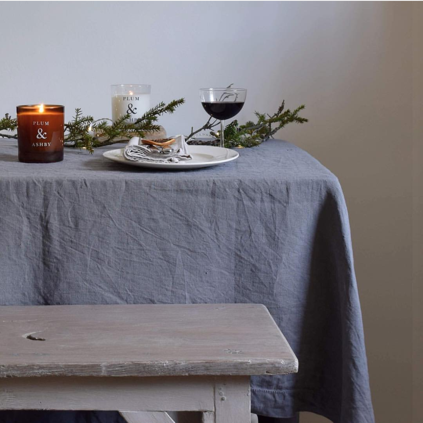
Some of Plum & Ashby's beautifully packaged products, you can see why I was doing cartwheels when they said they would like to be involved!
Some of Plum & Ashby's beautifully packaged products, you can see why I was doing cartwheels when they said they would like to be involved!

Until then (to give you an incentive to come along that doesn't involve my clammy hands) I wanted to share with you just a few of the amazing sellers we have coming along on the day and to give you a peak into some of their homes so you can see how their style translates from stall to semi-detached. Look out for more glimpses through the keyholes of our fabulous stallholders in future blog posts.  

Of Special Interest

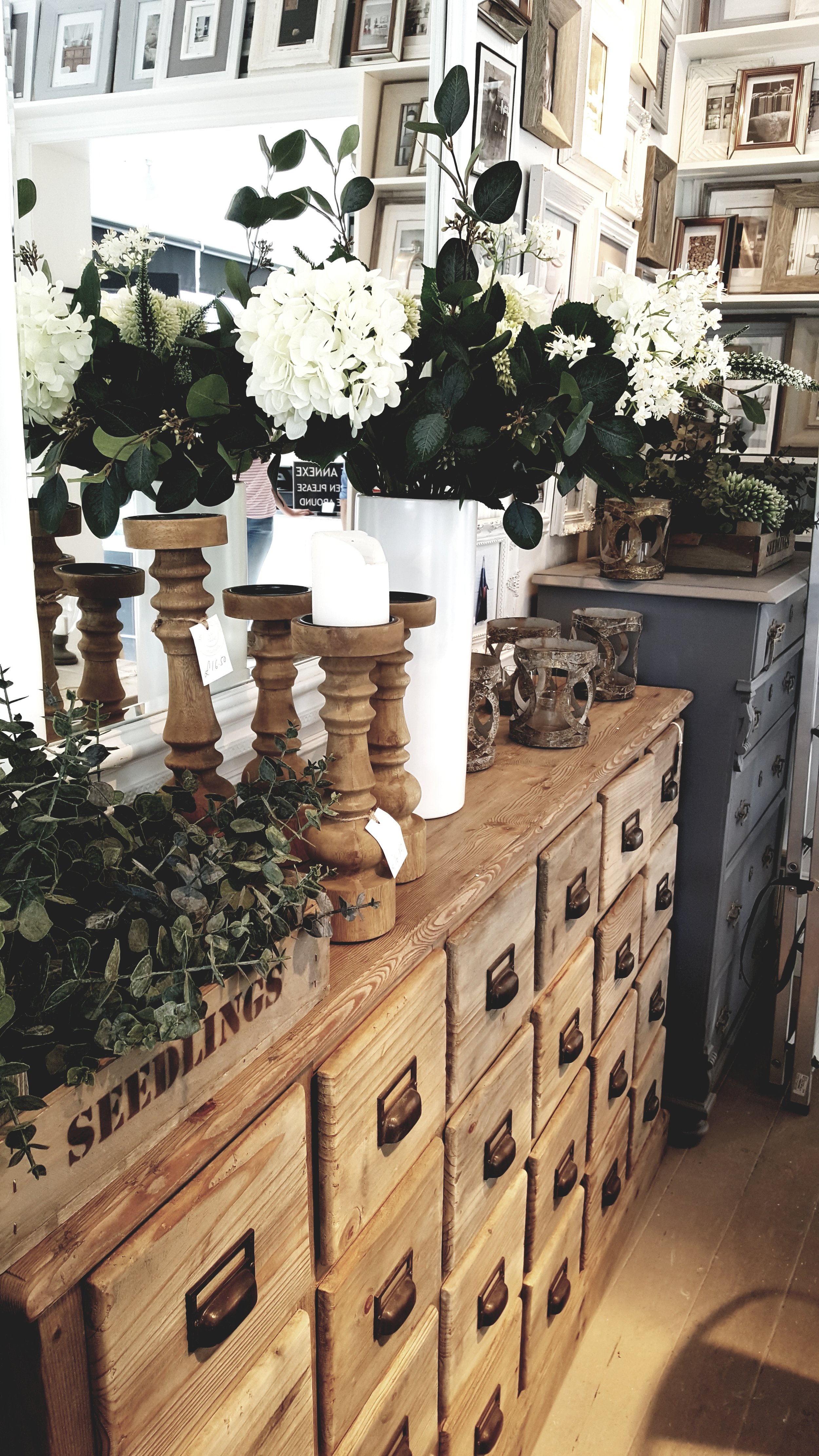
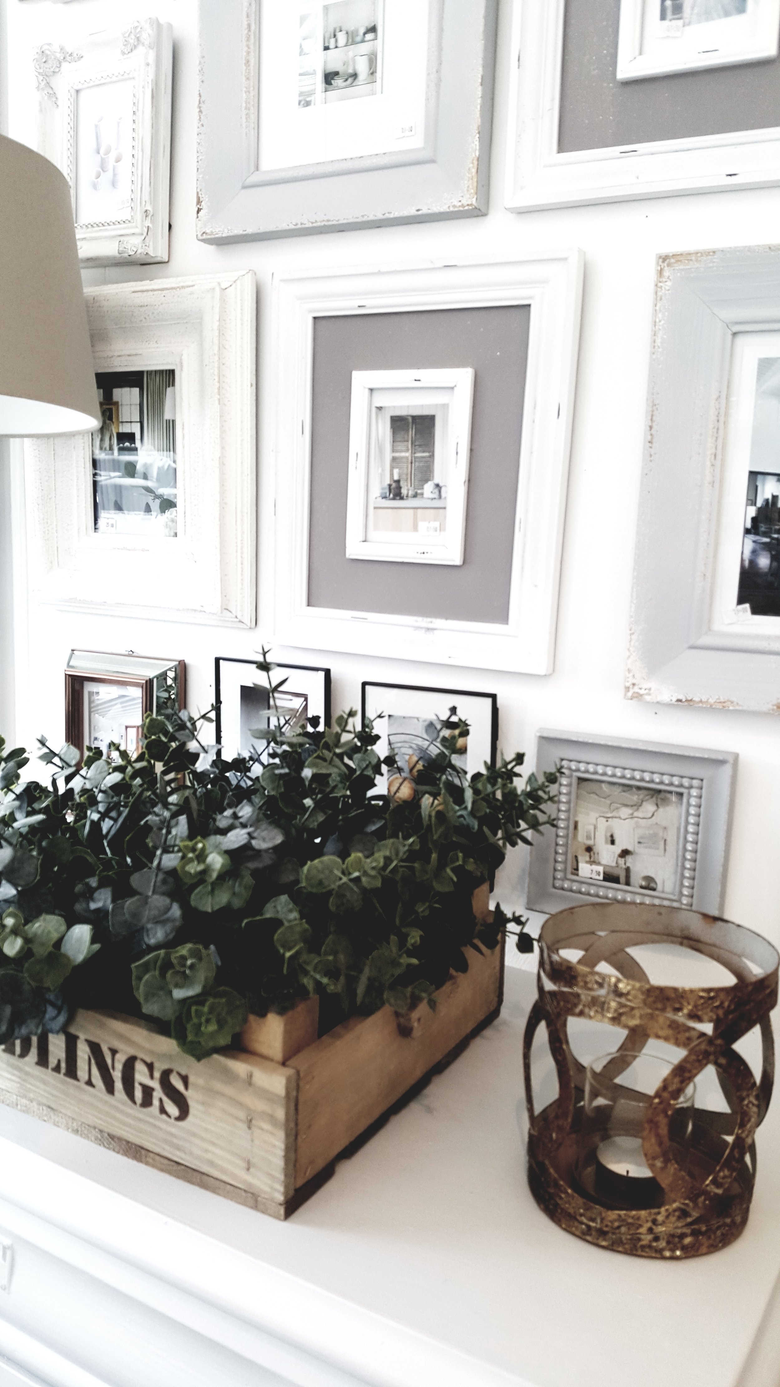
Of Special Interest is a Crouch End interiors institution. Offering a prodigious range of elegant pieces for the home, the store has grown from its early incarnation as junk shop. Over the last two decades owner Belinda Fulton has taken over two neighbouring shops as their owners moved on and then the annex behind when it came up for rent. Her loyal customer base (including me!) can choose from antique European furniture sourced in Holland, stylish lighting, mirrors and irresistible impulse buys in the form of candles, kitchenware and faux foliage.  Her home is every bit as stylish as her shop and if you would like to see more of it be sure to have a look at Malmo & Moss Meets: Belinda Fulton

IMG_20170507_181433_235.jpg
I start mentally moving furniture around my house as soon as I step inside Of Special Interest because I instantly want to buy things like these beautiful drawers

I start mentally moving furniture around my house as soon as I step inside Of Special Interest because I instantly want to buy things like these beautiful drawers

Of Special Interest Shop 3.jpg

Beetle & WILDE

Beetle & WILDE is a vintage emporium that delights in blurring the boundaries between art, anatomy, natural history & design - adding drama and intrigue to interiors with an eclectic mix of cultures, periods, styles & scale - from Victorian wunderkammer curiosities to mid century classics and quirky modern finds. If you’re the kind of person who longs to linger in the Natural History Museum past closing time you will love what Beetle & WILDE have to offer and I am certain you will love owner Caz's sultry, darkly sexy home even more. 

Parquet floor of dreams in Caz's fabulous kitchen

Parquet floor of dreams in Caz's fabulous kitchen

A cornucopia of curiosities will be coming with Caz to the Occasional Home Store

A cornucopia of curiosities will be coming with Caz to the Occasional Home Store

Wicker & Weft

Baskets are definitely in the category of “items you simply can’t have too many of” – they are just so useful. And they last – a toy basket can become a home for a yarn stash, a picnic or a pet! Since becoming a Mum, Mim English Morgan  founder of Wicker & Weft feels more aware of society's 'throw-away' nature. “I want to play a tiny part in preserving skills and teaching the value of using something beautiful with a story." Her traditional handcrafted goods are sourced from workers paid a fair wage; not out of pity, "but because their time and skills are worth it.” Mim's home is a 1960s bungalow which acts as the perfect neutral backdrop for her beautiful baskets.  Whilst there are big renovation plans in store for the future, I love how calm and serene it feels already.

Mim's beautiful bedroom

Mim's beautiful bedroom

One of Wicker & Wefts gorgeous handcrafted baskets

One of Wicker & Wefts gorgeous handcrafted baskets

Wicker & Weft's baskets in &Hobbs, another one of our exciting pop ups.

Wicker & Weft's baskets in &Hobbs, another one of our exciting pop ups.

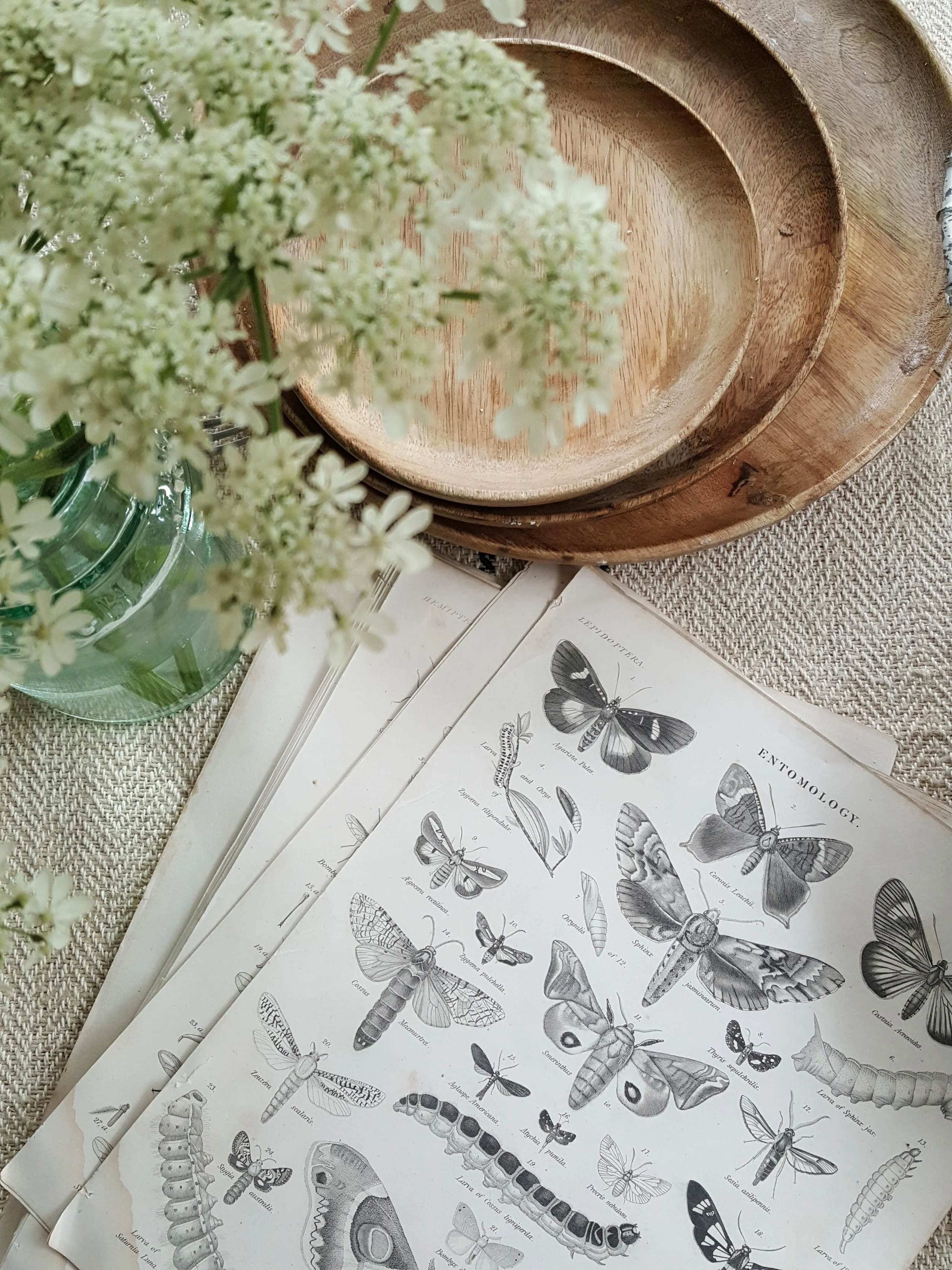
To see more details of all of our exhibitors hop over to our website www.occasionalhomestore.com and make sure to follow @occasionalhome to hear all of the latest announcements.  Over the next month I will be out and about sourcing more finds for my own Malmo & Moss stall and trying not to keep everything that I buy for myself instead #failedvintagemogul. Here are just a few of the things I have hunted out to bring along so far.

As you will notice from this picture the ladder from picture above is already looking very at home in my bathroom....

As you will notice from this picture the ladder from picture above is already looking very at home in my bathroom....

Beautiful 18th Centry entomology drawings 

Beautiful 18th Centry entomology drawings 

Hope that has helped wet your appeitite.  Sally, Beth and me and my clammy hands very much hope to see you on the 9th of September when we open the doors of the Occasional Home Store for the very first time!  If you have any questions at all about the event please do drop us an e-mail at occasionalhomestore@gmail.com or DM @occasionalhome and make sure to check out our website www.occasionalhomestore.com