It has been two months since we moved into our new house and, bar one bad wobble unpacking cardboard box 3456, we haven’t looked back. I thought I would be longing for my metro tiles and modern rustic interiors but we have been so busy making renovation plans for the new place there hasn’t really been time to pine for the old one.
The room I am pining for the most: our old bathroom
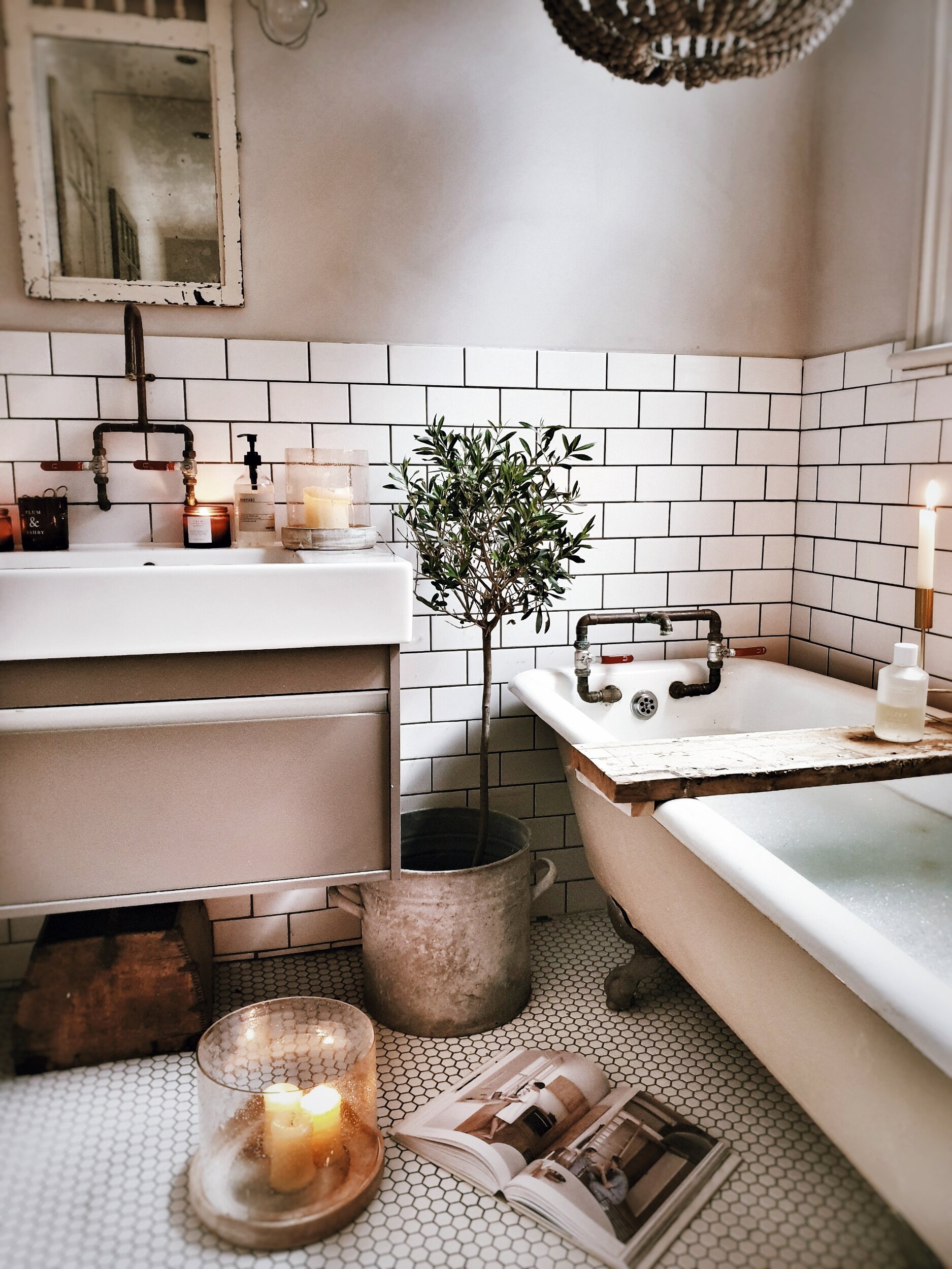
However, there is one room that I haven’t quite got over saying goodbye to and that was my bathroom. It wasn’t the largest room in the house but, as the only one with a lock on the door and a ready supply of scented candles, it was my sanctuary. Apparently it is not just me that feels that way either: 43% of people in recent survey by top bathroom brand Geberit listed it as their sanctuary space. I am guessing I am not the only mum who barricades herself in there for a bubble bath after the end of full day adulting!
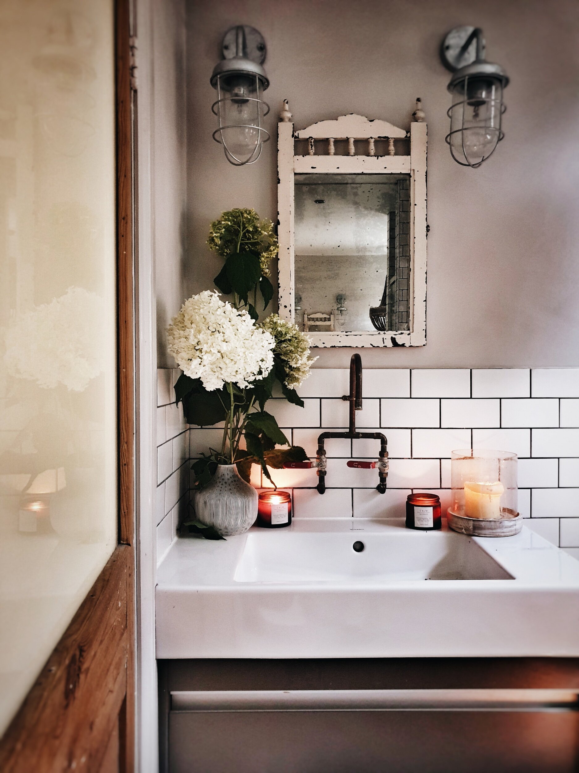
The copper taps made by my builder added an industrial edge to the bathroom that I loved
It was one of the first rooms that I completely designed by myself from scratch and the combo of a vintage roll top bath, copper piping taps and hexagonal floor tiles was probably responsible for 89% of my Instagram growth!
Even managed to acheive my ultimate goal before we left and snuck an olive tree in
Candles lit, bubble bath poured ready for relaxation
So are you ready to see what my new bathroom is like and find out more about my plans for transforming it into my ultimate sensory sanctuary space with some clever tips I have picked up from working with the clever bathroom people at Geberit? Ok here she is!!
This was the bathroom when we first came to visit. All clean and tidy with strong folded towel game
Like most of the house we are lucky in that everything is in pretty good (ish) condition and fairly neutral style – we are not overwhelmed by an avocado suite or battling a beige bog. It is more of a case of things looking a little bit dated oh and the shower running at a temperature indistinguishable from lukewarm tea.
Up close the bath panel and unit are starting to show their age and I would like to swap them for something more contemporary
One of number one desires is to find space for a separate shower as at the moment we have a shower over the bath
As you can see from this floor plan there is a very obvious reconfiguration of the space we can do that will allow me to escape from my own personal bathroom hell: a shower over the bath. By shifting the water tank out of the cupboard shown on this plan we will be able to separate the shower out and then I would like to switch the bath so that it sits under the window.
The current configuration is a bit awkward with an airing cupboard containing a water tank in a space that would be perfect for a standalone shower
Detail Architects have drawn up some plans to show how we could incorporate the shower into the bathroom
I love the arrangement of have the bath under the window that @the_girl_with_the_green_sofa went for in her new bathroom
By knocking through into the airing cupboard we would be able to achieve a shower space similar to @the_girl_with_the _green_sofa bathroom as well.
With those structural changes made I can then hopefully get down to the fun part: designing a bathroom to stimulate all my senses!
It’s all about the Olafractory
Ok smell may not seem the obvious sense to start with but if there was one thing that took the edge off my old “dream bathroom” it was the fact that the toilet was positioned in the bathroom 30 cms from the tub meaning that a) 1 in 2 baths were interrupted by one or more of the boys bursting in to drop off something that smelt like it had been ejected from the bowels of a Victorian and b) when they burst back out again a smell remained that even a whole pine forest of toilet duck couldn’t shift.
In the new house the toilet is actually separate from the bathroom an arrangement that some people view as old fashioned but which I am increasingly coming round to! But what do you think? Would we be better bringing it into the bathroom as shown on the floorplan below?
The alternative option of bringing the toilet into the bathroom
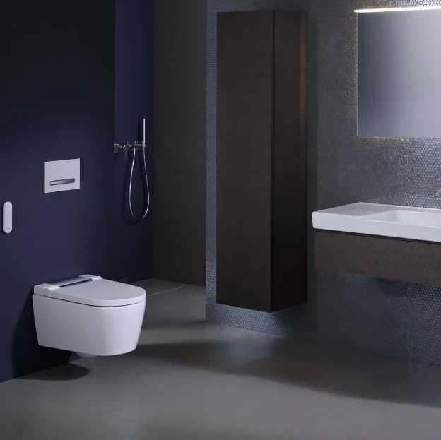
However, if we do incorporate it into the bathroom to create more of a spacious feel, then it is reassuring to know that Geberit’s toilets actually have the latest in duo fresh odour extraction technology incorporated into them, filtering the surrounding air to diminish unpleasant smells and extracting odours directly from the loo before they have the chance to spread!
I love the fact that Geberit have developed a toilet with built in odour extraction
Coming Over All Kinesthetic
Come again Malmo I hear you say? I realise it sounds like I have got in touch with my inner Mystic Meg but your kinaesthetic senses actually relate to your awareness of the position and movement of parts of your body (in essence your sense of touch) rather than your ability to read the fortune of a reader of The Sun.
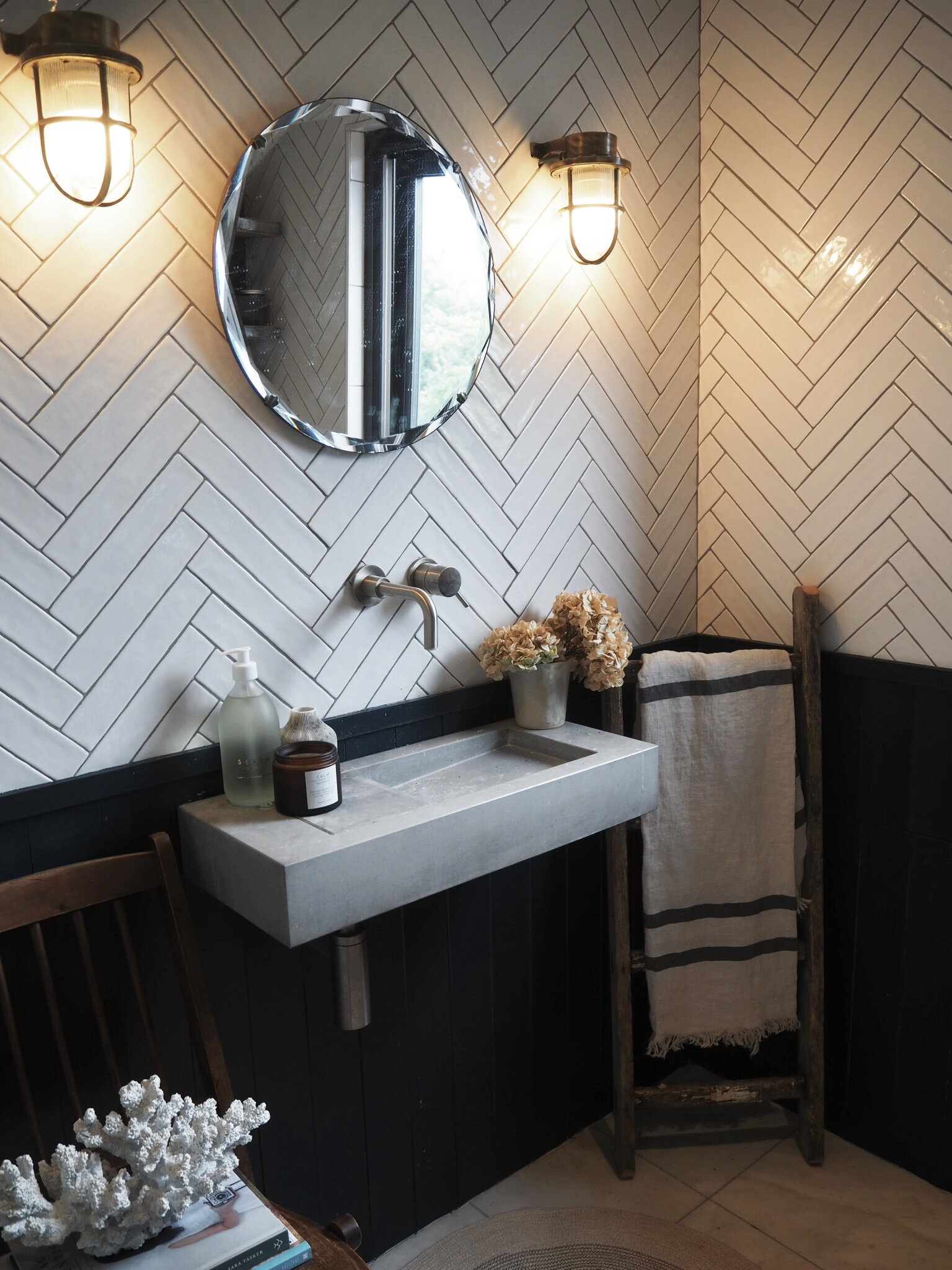
So in designing a bathroom to stimulate your kinaesthetic side you need to pay attention to things that are tactile and nice to touch! In our last house the polished concrete sink in our ensuite totally ticked this box.
The concrete sink in our old ensuite
I would love to be bolder and introduce more concrete or micro cement into the new space this time potentially on the walls or even on the bath itself. These are a couple of the inspo pics on my pinterest board that I keep coming back to.
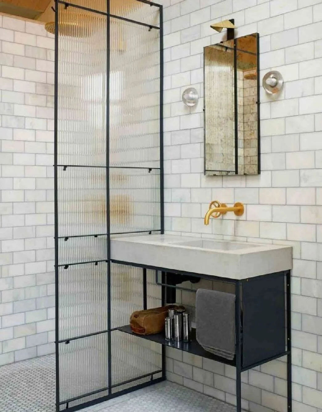
I love the way in this one that the concrete sink sits against a polished concrete wall. Image via Pinterest source unknown
I love this concrete bath from @viaparissi but wonder if it might be a bit much in a family bathroom?
If I can make it work without having to take on a second mortgage I would also love to bring a reeded glass shower screen into the scheme for some additional texture. I saw it used to great effect in this bathroom
I think I have pinned this image approximately 6788 times I love it so much! Image via Living Etc
The reeded glass shower screen is a great way of bringing texture in. Image from Living Etc
I also fell in love with a basin at the photoshoot I did with Geberit earlier in the year (click here to read all about it) that was made of a super matt, soft material called varicor. I don’t know quite how to describe it but it felt like the basin was made out of the softest silk you can imagine.
This Geberit basin made of a soft material called varicor is super tactile
As you can see I coulnt’t keep my hands off it!
On the techy side my derriere very much likes the idea of sitting down on an intelligent Aqua Clean toilet that is programmed to know exactly the warmth to heat my toilet seat to for me.
Scroll Stopping Visuals
I started with smell but obviously the other biggy when designing your ultimate sensory bathroom space has to be how it all looks! Whilst I loved my old bathroom and the rustic vintage industrial vibes it was channelling I actually have in mind a softer slightly more minimal look for the new bathroom. Still retaining touches of industrial edge but introducing calmer colours and softer textures. Also shockingly even to me I am toying with the idea of bring some non neutral colours in. Before you start imagining bright pinks and neon yellow I should probably clarify that I am more thinking of dabbling with a very light mint green. I adore these tiles for example and how they look with brass taps.
Soft mint green is the new avocado in this bathroom by Sarah Shearman Samuel
Lighting is also a hugely important part of the visual experience. My Malmo would happily bathe with the big light on (any other Northerners call the overhead light that?!) but for me dimmable wall lights are a massive important part of creating a relaxing bathroom experience.
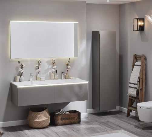
Geberit have also come up with some smart solutions to avoid dazzling your eyes when you enter you bathroom space such as soft automatic orientation lighting as part of their vanity units and mirrors. Exposure to harsh light sources in the middle of the night can apparently negatively effect your sleep patterns so incorporating gentle orientation lighting into your bathroom design is a great way to avoid being awake all night after popping for a 3am wee!
Soft orientation lighting built into the vanity unit and mirror avoids dazzling your eyes if you pop to the loo in the night!
Turning up the tranquillity factor
Unless I at bathe at 11pm (which has been known to happen!) there is very rarely silence in our house. The very best I can usually hope for is no-one under the age of 10 breaking through the door to enquire why there is a hairy glove floating in the bath or to ask my opinion on the Sheffield Wednesday back four.
There are some clever things you can do to maximise tranquillity and reduce noise in the bathroom though. Geberit recommend planning features into your bathroom such as a decoupled pre-walls, opting for acoustically optimised pipework and choosing wall hung ceramics. The soft touch buttons on their flush plates also ensure a super quiet flushing action. I can confirm I have heard louder whispers!
Geberit's soft touch flush plates ensure the tranquility of your bathroom experience is not disturbed
Also there is one person I always enjoy taking into the bathroom with me (when Ryan Gosling is too busy to pop by for a bubble bath) and that is Alexa! Being able to ask her to play Zero 7 to drown out any rows that might be happening elsewhere in the house about turning the Octonauts off is invaluable!
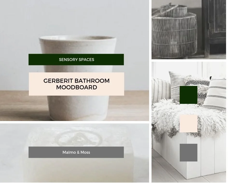
I look forward to sharing more details of our bathroom makeover with you as our renovation plans progress. Hopefully soon I will be in a position to pull together a moodboard that whittles down the 3567890 bathroom images I have saved and shapes them into a coherent design incorporating the sensory design principles I have picked up from Geberit!
*This post is part of the my long term paid partnership with Geberit*

