How to renovate a bathroom in just eight weeks! Follow the story of how we transformed two tired bathrooms in just eight weeks with a scandinavian inspired revamp using Crosswater brushed brassware,
Read MoreMalmo in Cornwall: Bathroom Renovation Plans
Planning two Scandinavian style bathroom renovations with brushed brass taps and shower from Crosswater
Read MoreRenovating our bathroom to create my ultimate sanctuary space
It has been two months since we moved into our new house and, bar one bad wobble unpacking cardboard box 3456, we haven’t looked back. I thought I would be longing for my metro tiles and modern rustic interiors but we have been so busy making renovation plans for the new place there hasn’t really been time to pine for the old one.
The room I am pining for the most: our old bathroom
However, there is one room that I haven’t quite got over saying goodbye to and that was my bathroom. It wasn’t the largest room in the house but, as the only one with a lock on the door and a ready supply of scented candles, it was my sanctuary. Apparently it is not just me that feels that way either: 43% of people in recent survey by top bathroom brand Geberit listed it as their sanctuary space. I am guessing I am not the only mum who barricades herself in there for a bubble bath after the end of full day adulting!
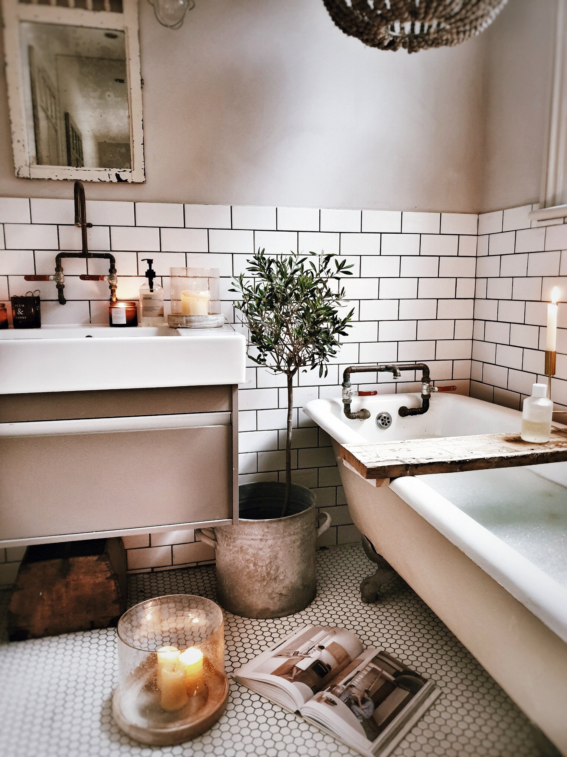
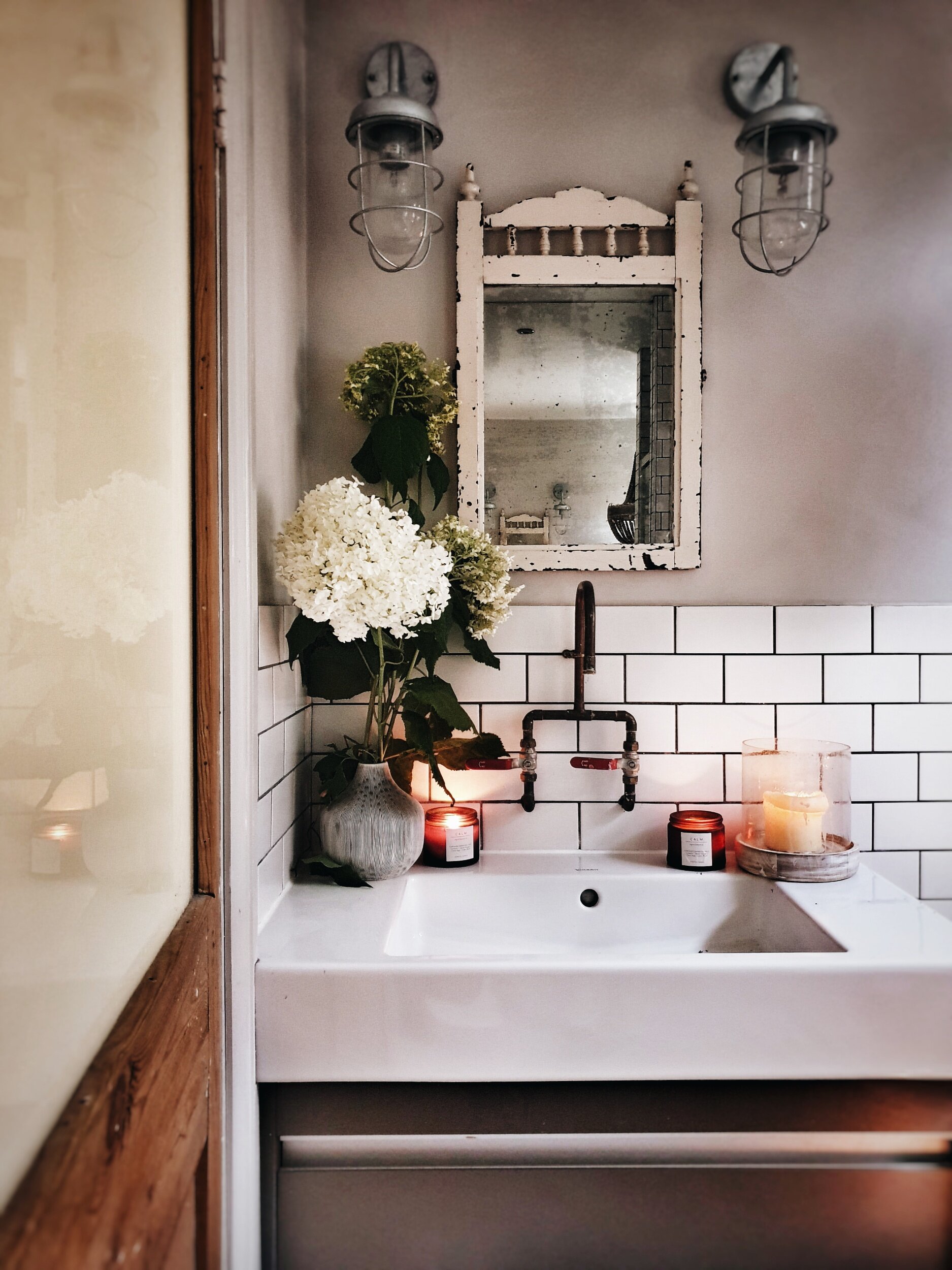
The copper taps made by my builder added an industrial edge to the bathroom that I loved
It was one of the first rooms that I completely designed by myself from scratch and the combo of a vintage roll top bath, copper piping taps and hexagonal floor tiles was probably responsible for 89% of my Instagram growth!
Even managed to acheive my ultimate goal before we left and snuck an olive tree in
Candles lit, bubble bath poured ready for relaxation
So are you ready to see what my new bathroom is like and find out more about my plans for transforming it into my ultimate sensory sanctuary space with some clever tips I have picked up from working with the clever bathroom people at Geberit? Ok here she is!!
This was the bathroom when we first came to visit. All clean and tidy with strong folded towel game
Like most of the house we are lucky in that everything is in pretty good (ish) condition and fairly neutral style – we are not overwhelmed by an avocado suite or battling a beige bog. It is more of a case of things looking a little bit dated oh and the shower running at a temperature indistinguishable from lukewarm tea.
Up close the bath panel and unit are starting to show their age and I would like to swap them for something more contemporary
One of number one desires is to find space for a separate shower as at the moment we have a shower over the bath
As you can see from this floor plan there is a very obvious reconfiguration of the space we can do that will allow me to escape from my own personal bathroom hell: a shower over the bath. By shifting the water tank out of the cupboard shown on this plan we will be able to separate the shower out and then I would like to switch the bath so that it sits under the window.
The current configuration is a bit awkward with an airing cupboard containing a water tank in a space that would be perfect for a standalone shower
Detail Architects have drawn up some plans to show how we could incorporate the shower into the bathroom
I love the arrangement of have the bath under the window that @the_girl_with_the_green_sofa went for in her new bathroom
By knocking through into the airing cupboard we would be able to achieve a shower space similar to @the_girl_with_the _green_sofa bathroom as well.
With those structural changes made I can then hopefully get down to the fun part: designing a bathroom to stimulate all my senses!
It’s all about the Olafractory
Ok smell may not seem the obvious sense to start with but if there was one thing that took the edge off my old “dream bathroom” it was the fact that the toilet was positioned in the bathroom 30 cms from the tub meaning that a) 1 in 2 baths were interrupted by one or more of the boys bursting in to drop off something that smelt like it had been ejected from the bowels of a Victorian and b) when they burst back out again a smell remained that even a whole pine forest of toilet duck couldn’t shift.
In the new house the toilet is actually separate from the bathroom an arrangement that some people view as old fashioned but which I am increasingly coming round to! But what do you think? Would we be better bringing it into the bathroom as shown on the floorplan below?
The alternative option of bringing the toilet into the bathroom
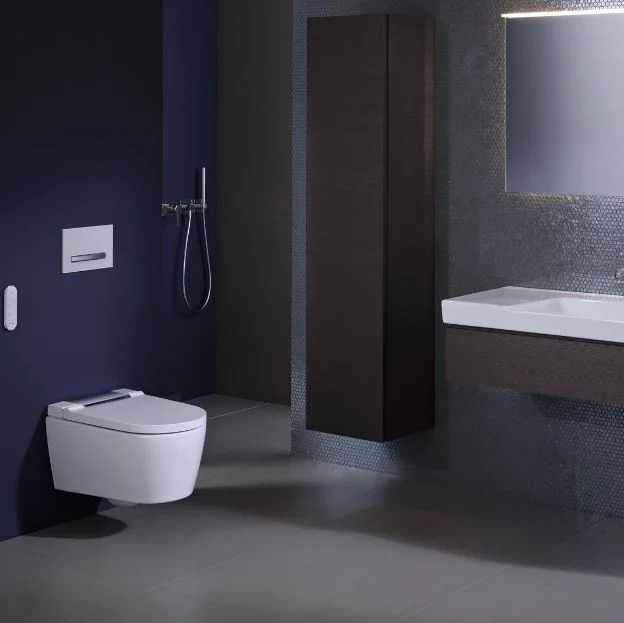
However, if we do incorporate it into the bathroom to create more of a spacious feel, then it is reassuring to know that Geberit’s toilets actually have the latest in duo fresh odour extraction technology incorporated into them, filtering the surrounding air to diminish unpleasant smells and extracting odours directly from the loo before they have the chance to spread!
I love the fact that Geberit have developed a toilet with built in odour extraction
Coming Over All Kinesthetic
Come again Malmo I hear you say? I realise it sounds like I have got in touch with my inner Mystic Meg but your kinaesthetic senses actually relate to your awareness of the position and movement of parts of your body (in essence your sense of touch) rather than your ability to read the fortune of a reader of The Sun.
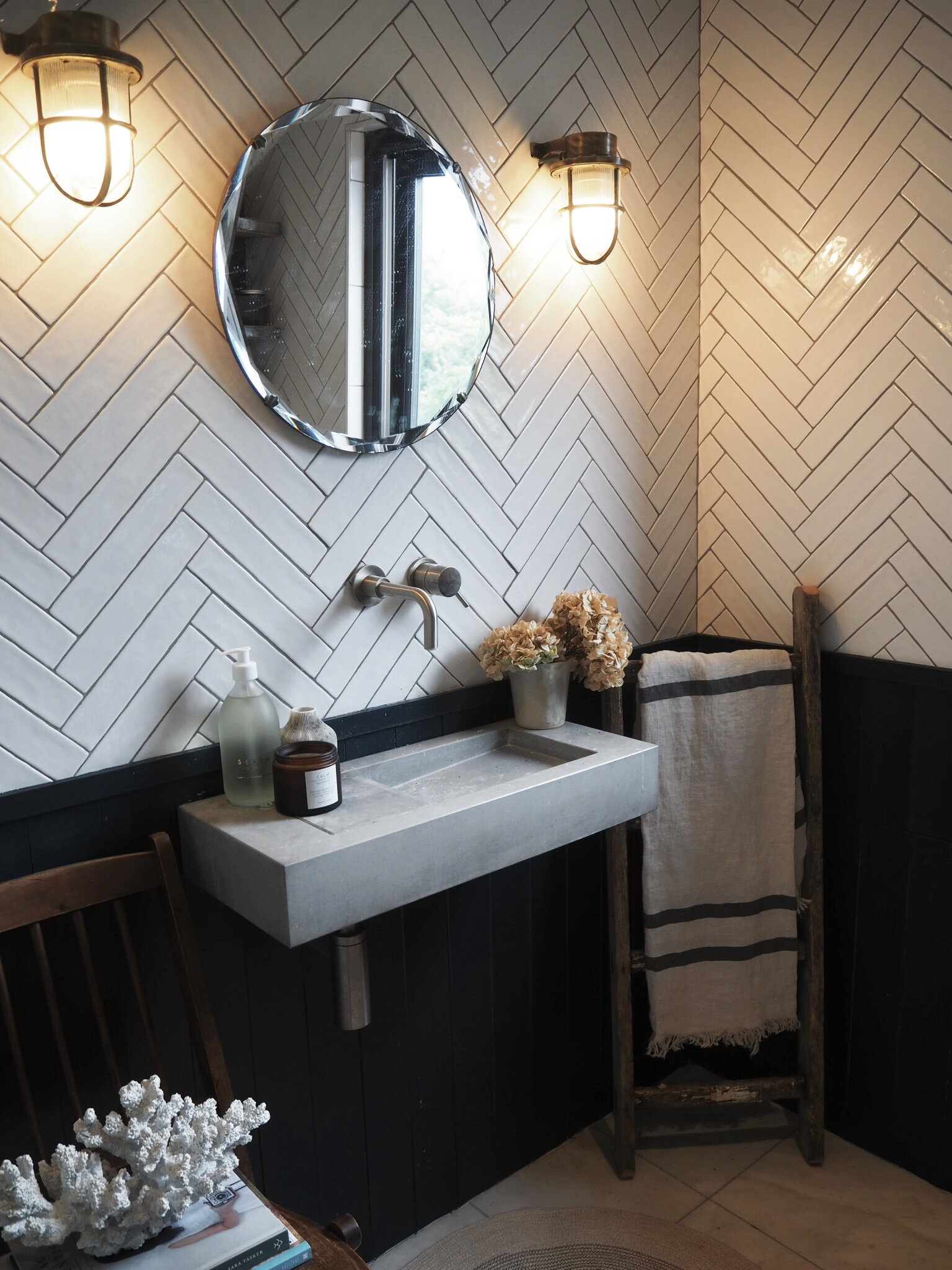
So in designing a bathroom to stimulate your kinaesthetic side you need to pay attention to things that are tactile and nice to touch! In our last house the polished concrete sink in our ensuite totally ticked this box.
The concrete sink in our old ensuite
I would love to be bolder and introduce more concrete or micro cement into the new space this time potentially on the walls or even on the bath itself. These are a couple of the inspo pics on my pinterest board that I keep coming back to.
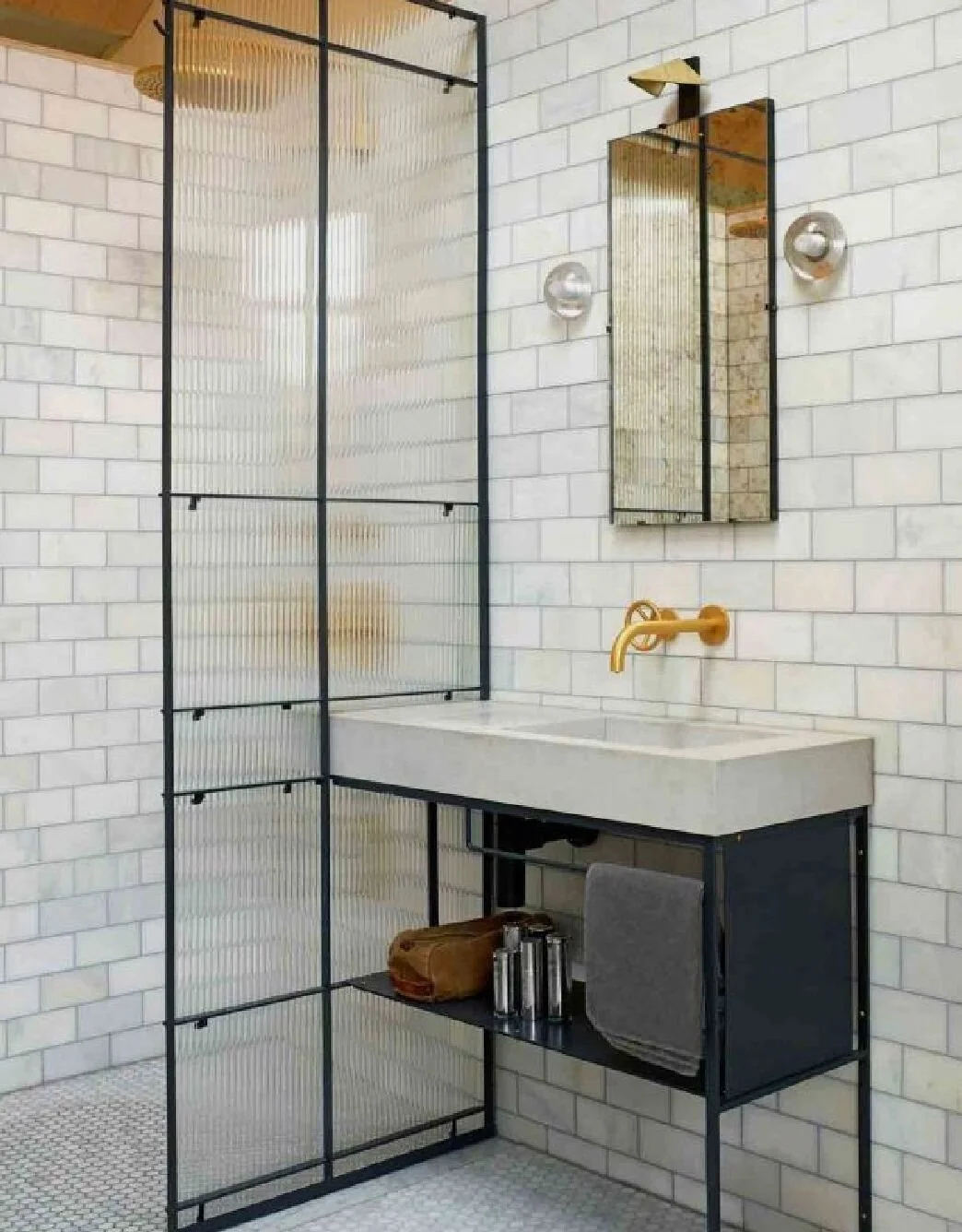
I love the way in this one that the concrete sink sits against a polished concrete wall. Image via Pinterest source unknown
I love this concrete bath from @viaparissi but wonder if it might be a bit much in a family bathroom?
If I can make it work without having to take on a second mortgage I would also love to bring a reeded glass shower screen into the scheme for some additional texture. I saw it used to great effect in this bathroom
I think I have pinned this image approximately 6788 times I love it so much! Image via Living Etc
The reeded glass shower screen is a great way of bringing texture in. Image from Living Etc
I also fell in love with a basin at the photoshoot I did with Geberit earlier in the year (click here to read all about it) that was made of a super matt, soft material called varicor. I don’t know quite how to describe it but it felt like the basin was made out of the softest silk you can imagine.
This Geberit basin made of a soft material called varicor is super tactile
As you can see I coulnt’t keep my hands off it!
On the techy side my derriere very much likes the idea of sitting down on an intelligent Aqua Clean toilet that is programmed to know exactly the warmth to heat my toilet seat to for me.
Scroll Stopping Visuals
I started with smell but obviously the other biggy when designing your ultimate sensory bathroom space has to be how it all looks! Whilst I loved my old bathroom and the rustic vintage industrial vibes it was channelling I actually have in mind a softer slightly more minimal look for the new bathroom. Still retaining touches of industrial edge but introducing calmer colours and softer textures. Also shockingly even to me I am toying with the idea of bring some non neutral colours in. Before you start imagining bright pinks and neon yellow I should probably clarify that I am more thinking of dabbling with a very light mint green. I adore these tiles for example and how they look with brass taps.
Soft mint green is the new avocado in this bathroom by Sarah Shearman Samuel
Lighting is also a hugely important part of the visual experience. My Malmo would happily bathe with the big light on (any other Northerners call the overhead light that?!) but for me dimmable wall lights are a massive important part of creating a relaxing bathroom experience.
Geberit have also come up with some smart solutions to avoid dazzling your eyes when you enter you bathroom space such as soft automatic orientation lighting as part of their vanity units and mirrors. Exposure to harsh light sources in the middle of the night can apparently negatively effect your sleep patterns so incorporating gentle orientation lighting into your bathroom design is a great way to avoid being awake all night after popping for a 3am wee!
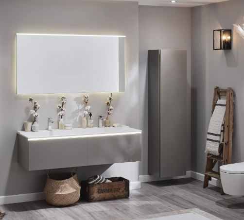
Soft orientation lighting built into the vanity unit and mirror avoids dazzling your eyes if you pop to the loo in the night!
Turning up the tranquillity factor
Unless I at bathe at 11pm (which has been known to happen!) there is very rarely silence in our house. The very best I can usually hope for is no-one under the age of 10 breaking through the door to enquire why there is a hairy glove floating in the bath or to ask my opinion on the Sheffield Wednesday back four.
There are some clever things you can do to maximise tranquillity and reduce noise in the bathroom though. Geberit recommend planning features into your bathroom such as a decoupled pre-walls, opting for acoustically optimised pipework and choosing wall hung ceramics. The soft touch buttons on their flush plates also ensure a super quiet flushing action. I can confirm I have heard louder whispers!
Geberit's soft touch flush plates ensure the tranquility of your bathroom experience is not disturbed
Also there is one person I always enjoy taking into the bathroom with me (when Ryan Gosling is too busy to pop by for a bubble bath) and that is Alexa! Being able to ask her to play Zero 7 to drown out any rows that might be happening elsewhere in the house about turning the Octonauts off is invaluable!
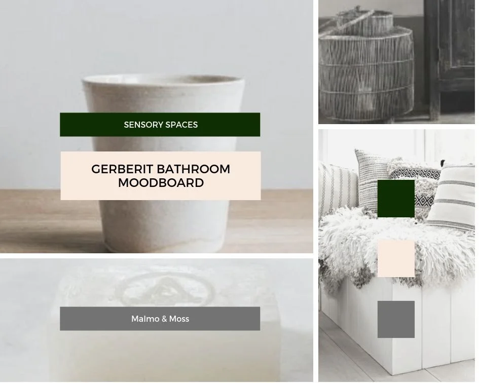
I look forward to sharing more details of our bathroom makeover with you as our renovation plans progress. Hopefully soon I will be in a position to pull together a moodboard that whittles down the 3567890 bathroom images I have saved and shapes them into a coherent design incorporating the sensory design principles I have picked up from Geberit!
*This post is part of the my long term paid partnership with Geberit*
Creating My Dream Bathroom with Geberit
When I started using Instagram two years ago I wasn’t actually posting pictures of interiors. Shoes yes, random day trips to National Trust Properties yes, pictures of my pudding yes but interiors no. The mists of time and mum brain mean I can’t actually pinpoint why I switched from posting cakes to kitchens but I do remember that it was a picture of my bathroom which first got likes other than from my long suffering friends who were probably tempted to block me if I posted another picture of a profiterole by that point.
One of the first shots of my bathroom I ever posted to Instagram. Yes I did like the Valencia filter a lot back in 2016!!
Having finally got my head around hashtags a picture of my bathroom was included in a midweek montage for #MyHomeVibe and it turned out that people rather liked the curve of my copper pipe taps and cut of my metro tiles. And whilst I do feature other rooms in my house on my account (to avoid people feeling like they are trapped in some sort of Suburban Bathroom Groundhog Day) it is always pictures of my bathroom that do the best. In fact this photo of it, when regrammed by Apartment Therapy garnered over 70K likes and was in the top ten most liked pictures on their feed last year. Not bad for an e-bay bargain bath and a slightly dodgy 3am paint job.
The picture that got regrammed on Apartment Therapy
Aside from its Instagram popularity it is also my favourite room in the house because a) it is the only room with a lock (a not to be underrated feature when you have three boys) and b) I am pretty sure I share DNA (and a waistline) with a Walrus in that I could happily spend 23 out of 24hrs submerged in warm water.
Designing My Dream Bathroom With Geberit
So when Geberit got in touch asking if I would like to design and style my dream bathroom using their Xeno²range I didn’t need asking twice. In fact I don’t think I even needed asking once as I said yes before they had even got to the end of the sentence! They had me at vanity unit of my choice.
In case you have not heard of Geberit before they are a Swiss company with a long pedigree in designing and producing innovative, high quality, long lasting bathroom products. To use a Swiss sporting analogy, they are to bathrooms what Roger Federer is to Tennis: stylish, refined, durable and always ahead of the rest of the pack. The only difference is they are serving up sanitary ware rather than aces.
A basin and vanity unit from the Xeno² range
The crisp, clean design aesthetic of the Xeno² range obviously tickles my Scandinavian sensibilities but what I loved about the brief was the challenge of bringing some of my signature Modern Rustic/Industrial Vintage style into play to create a bathroom which mixes Geberit products with my personality.
My Design
The building blocks of my fantasy bathroom chosen from the Xeno² range were a double vanity unit with built in basin, sleek intelligent sensor mirror, tallboy storage cupboard and a super intelligent AquaClean shower toilet. Intelligent in the sense of its ability to leave your bits as shiny as a whistle rather than out score Steven Hawking in a Mensa test sense that is.
The AquaClean Shower Toilet that will save you a trip to Japan
I don’t know if you have found this but if you talk to friends and family who have visited Japan the number one thing they rave about is not the splendour of the cherry blossoms or the speed of the bullet trains but the technology the Japanese use in their toilets which come with heated seats, varying wash modes and just generally more of a brain than our standard British Bogs. Thanks to Geberit there is no need to trek to Toyko for your derriere to experience that kind of dream experience.
More information on all of the products featured in my dream bathroom from the Xeno² bathroom range is available here.
I actually initially found having totally freedom to design my dream bathroom left me a little stumped! Not in the sense of having no inspiration but more in that my inspiration cup was overflowing and my mind was boggling at all the possibilities. To marshall my inner runaway rustic I used Canva to create a mood board for my room. This really helped me to focus on how everything would look together and create a cohesive vision for the room (without wishing to sound too Llewelyn Bowen).
With my moodboard complete it was time to take things off the page and into the back of a sweaty battered Audi A6 estate and head up the motorway to a photographic studio in Warwick where a bathroom set, photographer, videographer and make up artist with her work cut out were awaiting me! I was more than a little relieved to arrive without being pulled over by the police as am not sure how I would have gone about explaining the contents of the car to the boys in blue. Yes officer that is an enormous dried flower cloud in the passenger seat and a rustic Hungarian milking stool you can see gracing the parcel shelf.
Luckily I was not pulled over with this amount of pampa grass in the passenger seat
Having never done anything as exciting as this before I thought it would be fun to share some behind the scenes footage with you from the day so that you can get a feel for what I was up to in a Warwickshire warehouse and to then talk you through the different elements of my dream room. Spoiler alert soft neutral colours, warm natural textures and materials will feature rather than bright colours, clashing patterns and glitzy metallic finishes!
The Day
What initially threw me when I arrived was the fact that it was not a “bathroom” in the traditional sense that was awaiting me. It was a bathroom within a roomset (so far so Truman Show) which meant there was no ceiling and half of the room had no walls! The next thing to get my head (and generous eye bags around) was the fact that it would be me as well as my dream bathroom captured on camera because as well as photographing the bathroom, the Geberit team have also made a clever video about my roomset to help you get a better sense of the look. Click here to take a look at the video
Eyebag and brow miracles worked ready to roll (looking a little like I am wearing my pyjamas)
So it was actually quite a busy and buzzy set with a photographer and a great videography team there to capture all the action.
As someone who has, to date, largely taken pictures on my phone, I learnt so much that day about all the tricks that professional photographers use to get the very best out of a room and space. The positioning and strength of lighting in particular plays a huge role in how a finished photo looks. Consequently, it will be a giant light reflecting umbrella and stage lighting rig rather than bubble bath and some new hair straighteners that will be on my Christmas list this year! I loved seeing the shots come through on the photographer’s computer as we went along.
So having seen glimpses are you now ready to see the end result? I hope so because here it is!
My Rustic Scandi Dream Bathroom scheme
Creating a Cosy Corner
This may make me strange but I love a bit of company when I am in the bath. Not in the actual bath itself just someone to sit and chat to me in the bathroom as I bathe. Although my three year old frequently misinterprets this bit and climbs in to join me in the actual bath with a large toy boat/collection of aged flannels/a whole toilet roll.
I loved how this corner worked out with the flower cloud
Having an armchair in my dream bathroom was, therefore, an essential item. The chair of my bathroom dreams is actually from Ikea. I am a huge fan of their Soderhamn range of seating. It has simple clean lines and a great price point whilst looking easily more expensive. It has a lovely wide back and deep seat meaning your companion can be as relaxed on the chair as you are in the bath. To be honest even if I wasn’t having a bath I would be tempted to sneak in and sit on it curled up with a magazine
Adding Stylish Storage
Whilst the vanity unit and tallboy cupboard from the Xeno² offer great storage (with clever features like soft close doors) I also added in some additional storage options under the sink for stowing away bulkier items like toilet rolls and towels. To contrast with the sleek lines of the Xeno² unit I chose rougher textures such as wood and rattan to bring some warmth and texture into the room scheme. One of my favourite places to source baskets like the ones used in these photographs is from French Brand Maisons Du Monde. The Candian Dry box is a vintage find which I paid £10 for at Ardingly Antiques Market 3 years ago and which I could, in the interim, have sold 10 ten times over for ten times the price. I cannot, however, bring myself to part with it! If you are not able to find a vintage equivalent H&M Home often have a great range of vintage style/rustic storage boxes to choose from.
The Canda Dry box that is one of my most prized possessions added great towel storage
Lowering the Lighting
It goes without saying that my dream bathroom would feature candles. In fact that tallboy storage unit would probably be predominantly filled with them. Scented, unscented, real, battery operated I love them all! My current obsession are these hurricane lanterns from Marks & Spencer which have a lovely limewashed wooden base and speckled glass and create a lovely soft glow when filled with candles. However, woman cannot read Living Etc by candle light alone so I also added two wall lights into my bathroom scheme from Cox & Cox. I chose black to add a nod to the industrial into the room and they are, of course, bathroom rated. They are actually outdoor lights which is a great trick to employ if you are struggling to find bathroom rated indoor light options!
I was really pleased with the industrial edge the black carriage lights added
The Xeno² Vanity Unit and AquaClean toilet actually also have smart motion sensor lighting built into them as well to prevent you stumbling around in the dark in the morning/middle of the night.
Turning Towels into a Feature
I know a lot of people like their towels to be neither seen or heard (a talking towel would admittedly be rather alarming) but I like mine to become a feature of my bathroom design. They are a great way to add subtle nods to colour, pattern and texture into a room. Using a vintage ladder to display them on is also a great way to add some height into your bathroom scheme. There is a probably a retired builder called Dave laughing all the way to the bank after I purchased his paint splattered step ladders (possibly brought out of the back of his van by mistake/an after thought) at a car boot a couple of months ago. The selection of towels I have featured are all from HM Home.
H&M Home have some great towels this season including this linen striped one
Elsewhere in the bathroom I have also added soft texture and a touch of hygge in with shaggy sheepskins on the floor and bench.
All Hail the Humble Tooth Mug
When I first met Mr Malmo he was using an aged Sheffield Wednesday Mug with a fading picture of Chris Waddle on as a toothmug. It took me four years and two house moves to finally give Waddle the red card from our bathroom and replace him with something more Scandi than Sheffield themed. The moral of this tale is that small details can actually make all the difference to a room and there is no reason why practical things cannot also be beautiful ones. With this in mind, I sourced a handmade tooth mug and soap dish in earthy colours from the ceramics range stocked by socially minded small business Aerende Store. For display rather than practical purposes I also mixed in some vintage bottles I have amassed over the years as well as some new favourite vases from the Nordic inspired range at Marks & Spencer so that I had a range of different sizes, textures and colours.
Vintage and new ceramics adding some texture to the basin area
The basin upon which they are resting from the Xeno² range is actually made from a super soft matt material called Varicor which I have never come across before but would happily now enter into a long term relationship with.
In Praise of [dried] Plants
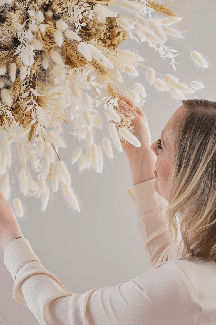
I have a confession to make which may make me an insta outcast by the time you finish reading this blog: I don’t really like houseplants. Yes they have carbon dioxide absorbing life enhancing benefits to having them around but my ability to reduce a monstera to mulch in less than a month means I just don’t dig them. However I am not an all round nature hater in my home, I do still like to bring the outdoors in and embrace plant life I just prefer, in the bathroom, for it to be in dried rather than semi biodegraded form. I think the 1970s kinda gave dried flowers a bad rap. Pot Pourri has a lot to answer for. But the last 12 months has seen them having a major resurgence and no-one is happier about this than me. They add soft texture, natural colours and a bit of drama to the bathroom, require zero maintenance and need never be thrown away. I used them in two ways in my dream bathroom design. Soft wavy pampas grass to soften the wall the toilet was hung on and then in a super size flower cloud in my cosy corner.
The cloud is actually much easier to recreate than you might think, you just need a floristry oasis wreath (easily obtainable on Amazon) and then a selection of dried grasses and flowers. Mine was made for me by Your London Florist and they use a mix of grasses and then dried hydrangea heads and roses to add in some (subtle) colour and drama.
Wall Art and the Wall Hung Toilet
I don’t know about you but I grew up in a house that had both a separate toilet (in a room no bigger than your average glovebox) and the cistern proudly on show. With space now at a premium that sanitary set up is increasingly uncommon (I say this based on a survey of my friends houses rather than backed by official census data on the bathrooms of Britain). With a toilet now more likely to be featured in the bathroom itself, the looks of your loo have become more important. Geberit were actually one of the first companies to introduce and champion the wall hung loo in the UK: stoying away cisterns and making flush plates a thing to covet not conceal. When I visited their showroom in Warwick recently I was gob smacked by the range of flush plate options they offer. My dream bathroom features one hewn from slate that looked completely unobtrusive and part of the general rustic theme. Another great way to blend your toilet into your room scheme is to add art to the wall on which it is hung so people have something that draws their eye other than just the WC.
So there you have it the bathroom of my dreams. Hope it has provided you with inspiration for how to style your own Rustic/Scandi bathroom paradise and how to use the Xeno² bathroom range as part of that dream.
One Bathroom Two Ways
If you fancy seeing how the colour loving Yin to my neutral décor Yang got on with the same challenge then head over to Come Down To the Woods Blog by clicking here. Her dream is definitely different to mine but I still found myself seduced when I saw it. She certainly has a way with wallpaper and I don’t mind admitting that I was tempted to nip up the motorway to Leeds and purloin the Tom Dixon marble bathroom lights she included in her scheme.
There is also a line in her blog that made me laugh about imagining me wafting around with sheepskins, dried hydrangeas and hamman towels as I would say a solid 40 minutes of the day were spent with me either fluffing a sheepskin, positioning a hamman towel or handling a hydrangea. You know me too well Woods….
I hope you enjoyed this glimpse into the work I have been doing as part of my long term paid partnership with Geberit. It has been so much fun so far (in fact I kind of feel a fraud calling it work!) and I have more exciting content to share with you later this year so watch this space!

