Malmo & Moss Renovation Diary: August

This week marked the end of our first month living in our new house.  I would like to say we celebrated this milestone wrapped in each others arms sipping chilled glasses of Dom Perignon but the reality involved mugs of builders tea and an aborted attempt to change a light fitting that nearly ended in divorce and Mr Malmo losing a testicle to an electric screwdriver.

The light fitting seen in our old house

The light fitting seen in our old house

Living room revamp.jpg

To briefly recap in case you didn’t see my previous blog post about the move, we have swapped our old Edwardian semi for a bigger 1930s style house which offers us the potential to extend up, out and sideways but which currently looks like it got caught up in a pebble dash hurricane.

Here she is, our pebble dash princess…

Here she is, our pebble dash princess…

I am not going to lie, I was worried that leaving behind our old house (which we had completely renovated) would leave me feeling like a fish out of modern rustic water with nothing to instagram but laminate floors and Laura Ashley wallpaper.  But, despite all its current imperfections and a distinct lack of metro tiles, this place surprisingly already feels like home.  It helps that we have actually only moved five minutes around the corner so we haven’t had to leave behind friends or change schools.  The move was driven by wanting more space and whilst the current configuration of rooms is a bit of a jumble (more on that to come….) gaining a garage, utility and a bigger, leafier garden has already made family life much easier. 

There is not a metro tile in sight at the new house so having to get my fix looking at pictures of our old bathroom instead

There is not a metro tile in sight at the new house so having to get my fix looking at pictures of our old bathroom instead

Although my dad has expressed some deep concerns about the width of the toilets.  Apparently in order to stay on the right side of his bowels I need to factor toilet cubicles the size of a small Belgian city into my renovation plans.

Me and my Dad who is smiling despite his narrow toilet concerns

Me and my Dad who is smiling despite his narrow toilet concerns

To keep me sane as we attempt to create a contemporary Scandinavian inspired family home (with spacious toilets) out of this pebble dash Princess,  I thought I would keep a monthly renovation diary here on the blog.  That way I can show you the ‘Before’ , share our plans for the ‘After’, and hopefully acquire and impart some wisdom along the way about designing and building your dream home. Although there is not much renovation to document so far as most of the first month has been spent unpacking endless boxes.  It turns out a girl can have too many shoes, coats, rustic benches and artfully distressed candleholders (33 and counting….).  It felt at one point that Rogers Removals boxes were waiting until we went to bed and then frantically procreating.

The procreating removal boxes and some wallpaper that looks like it could have inspired one of Lawrence Llewellyn Bowen’s frock coats

The procreating removal boxes and some wallpaper that looks like it could have inspired one of Lawrence Llewellyn Bowen’s frock coats

Obviously I unpacked the really important things first like a giant rustic flower wreath

Obviously I unpacked the really important things first like a giant rustic flower wreath

To escape the #RampantRogersRemovalBoxes we have been spending as much time as possible outside in the garden.  The previous owner was a keen gardener so we will hopefully just need to try and keep things alive rather than starting from ground zero.  It is south facing which means the outdoor seating area pictured below, gets lots of sunshine.  Actually I know it feels wrong to say this (given that August seems to have got itself confused with February) but if anything it actually gets a little too much sun for this pale skinned Northern girl. 

To escape the chaos inside we have been spending a lot of time outside in the lovely leafy garden

To escape the chaos inside we have been spending a lot of time outside in the lovely leafy garden

Because it is south facing it is a bit of a sun trap

Because it is south facing it is a bit of a sun trap

I was, therefore, excited to discover that we have actually inherited an awning. Although that excitement slightly fizzled out when I discovered that it was in Sheffield Wednesday colours and looks about as Scandinavian as the Go Jetters.

The current sun shade situation is more Sheffield Wednesday than Stockholm

The current sun shade situation is more Sheffield Wednesday than Stockholm

Apologies for the eyeful of my pebble dash

Apologies for the eyeful of my pebble dash

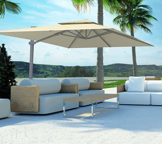
The hunt as begun for some alternative shade solutions with more of a relaxed Ibizan beach club vibe. So it was great timing when Solero Parasols got in touch to tell me about their extensive range of garden parasols. This cantilevered gem would completely meet the beach club brief.  It is what is known as a free arm parasol and can rotate 360 degrees.  It comes with lots of smart features as well.  The fabric is fade resistant and hydrophobic and  also has a UPF Value of 50+.   On days when temperatures soars the fabric will release rather than retain hot air adding to the stability of the parasol.  It also comes with wireless rechargeable lighting meaning you can stay outside and enjoy long Summer evenings.  To be honest I think it might be cleverer than I am!

A Cantilevered parasol from the Solero range.

A Cantilevered parasol from the Solero range.

Another option I really like (and hadn’t seen before) was having a wall parasol.  The patio area we have to play with is not huge so I like the idea of saving space by having one mounted to the wall.  And lets face it I am 100% there for any solution which obscures more of the pebble dash! 

This wall parasol might be the perfect replacement for the awning!

This wall parasol might be the perfect replacement for the awning!

When it comes to inside there are even bigger plans afoot.  We have appointed Detail Architect to start drawing up plans for re-configuring and extending the current space and hopefully by my next diary entry I will be able to share some preliminary floorplans with you!

In the meantime I am going to leave you with a couple of shots of areas of the house that are starting to look vaguely Instagrammable (if you squint…..) Do you recognise the light fitting from our old house? 10 points if you can remember which room it used to hang in!

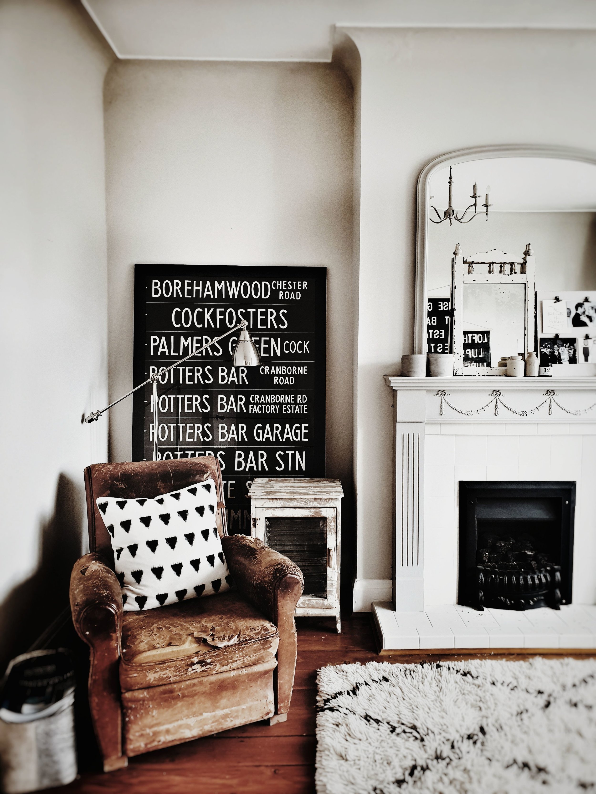
This is one of my favourite areas of the house so far. It has got quite high ceilings so it is possible to show my Abigail Ahern light off to full effect!

This is one of my favourite areas of the house so far. It has got quite high ceilings so it is possible to show my Abigail Ahern light off to full effect!

I have big plans for making over the fireplace in here but for now enjoying this corner

I have big plans for making over the fireplace in here but for now enjoying this corner

New house mantel piece.jpg

This Blog Plost was kindly sponsored by Solero Parasols

Secrets of a Successful Loft Conversion

When we first bought our house nine years ago one of the main attractions was the fact that it already had the loft converted saving us the expense and hassle of doing so. Thanks to six big VELUX windows it was flooded with light and had beautiful views out over the blossom trees on our street. However, after living in the space for a couple of years, we came to realise that whilst it was light, bright and spacious, it had about as much character as Keanu Reeves. Sorry Keanu but I have seen beige carpets with more dramatic impact that your performance in The Lake House.

The bright, bright loft conversion was one of the factors that sold our house to us

The bright, bright loft conversion was one of the factors that sold our house to us

Over the last few years we have made a series of changes to the space to de-Keanu it and it is now one of my favourite rooms in the house. So I was delighted when VELUX asked me if I would like to team up with them to share my top five tips for designing a successful and stylish loft conversion. VELUX started out by installing their first roof window in a Danish school house 75 years ago and now sell their products in over 40 countries so working with them is a Scandi dream come true for me!

We have made a series of changes to add character, warmth and texture to it

We have made a series of changes to add character, warmth and texture to it

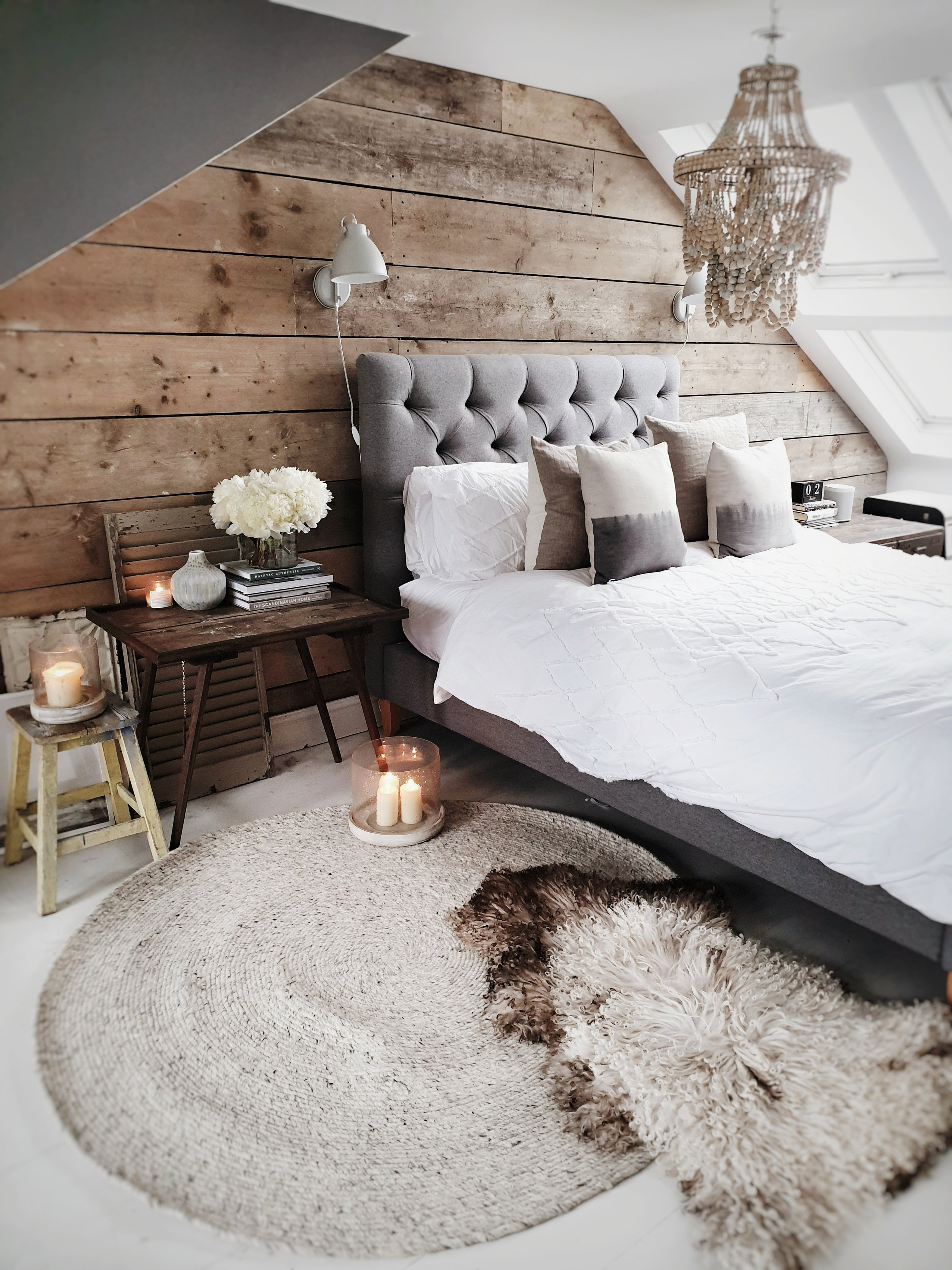
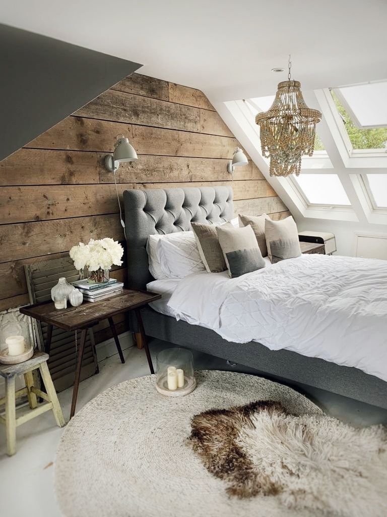
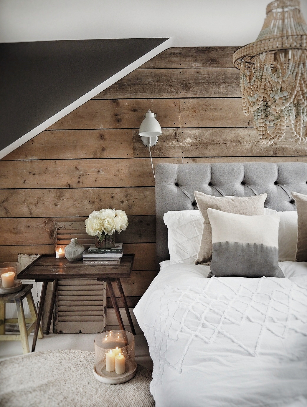
My favourite of which has to be the addition of a scaffold plank wall

My favourite of which has to be the addition of a scaffold plank wall

I hope my tips will help anyone planning a loft conversion or struggling to inject some character into their existing space to #BeLessKeanu. I have included in my tips advice shared with me by my Instagram followers who have some pretty stunning loft conversions of their own and have some cautionary tales of misplaced internal walls, incorrectly spaced skylights and awful attics!

Tip One: Perfect Your Floorplan

There are essentially three main types of loft conversion: a simple VELUX loft conversion where the roof slope is not altered; a dormer loft conversion which allows for vertical windows and doors; or a mansard loft conversion which is less boxy in appearance than a dormer (although there are multiple possible variations on each design and VELUX windows can easily be combined with mansard and dormer style conversions as well).

Our conversion is a dormer which is a popular choice as it is often the design which best maximises available space and does not, typically, need planning permission. Although click here for more detailed Government Guidance about when planning permission might be required (my inner lawyer is still strong!). If I was to tackle another renovation and convert a loft from scratch I would be tempted to go for a Mansard conversion (budget allowing) as they are less boxy in appearance than a dormer.

Seen here from the outside our loft extension is a dormer conversion

Seen here from the outside our loft extension is a dormer conversion

Once you have decided on the best option for your space start work early on your floor plan and how you will actually use the space. Loft conversions are often full of awkward spaces and getting the most out of them often relies upon embracing and finding clever uses for them. Think, in particular, about how you will use any space under the eaves. Ours was predominantly dedicated to storage but there was a large space tucked around a corner that was left empty in which I originally had my dressing table .

Once I realised that post children I had about as much chance of sitting on Brad Pitt’s lap as I did sitting at a dressing table we converted that corner into a walk in wardrobe which has made much better use of the space. It also allowed us to get rid of a large bulky wardrobe that sat in front of one of the windows blocking the view through to the outside.

Don’t be afraid to change your mind as you go along either. @Sodia _ Haddassi _ Amma shared with me that she would regularly go up and check on her loft as it was being built even if it meant balancing on scaffold boards and as she saw how the space actually looked made several decisions to change internal walls that infuriated her builders at the time but left her much happier with the end result!
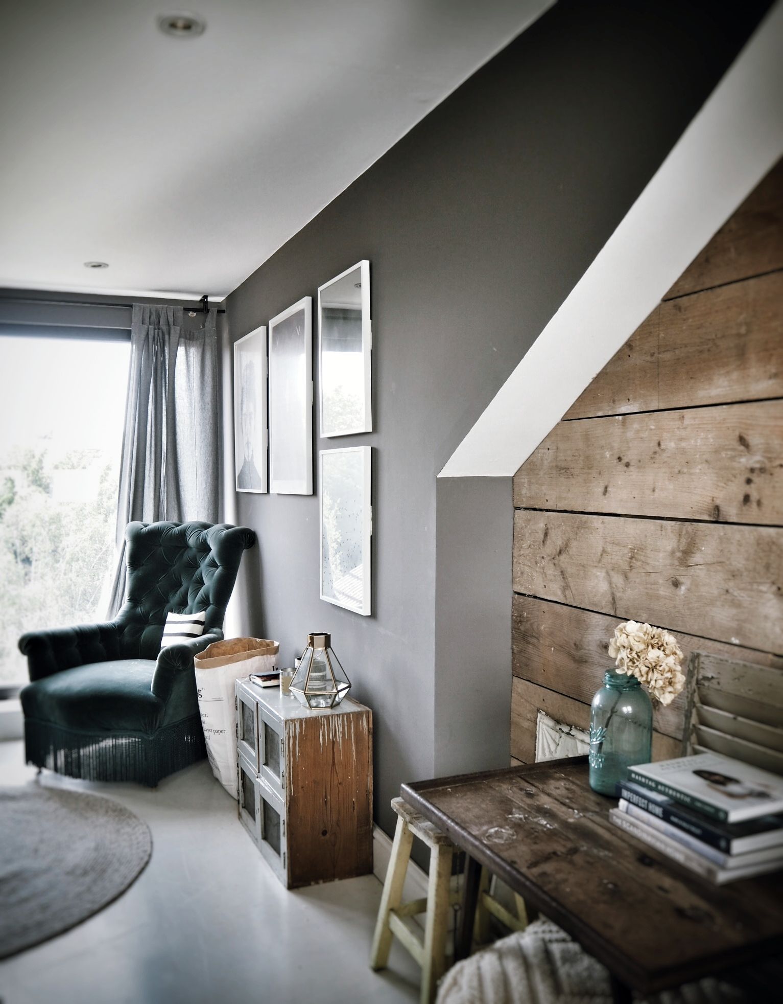
Loft conversion with reclaimed scaffold plank wall

Tip Two: Let the Light In

Did you know that according to the World Health Organisation we spend a whopping 70% of our lives indoors? When you have small children and 70% of that 70% is also spent in the company of Mr Tumble that can feel like a long long time! Sunlight is actually a natural anti-depressant so in the absence of it (and in the near constant company of Mr Tumble) it is easy to become glum! It turns out that people need daylight to help control the most basic metabolic processes, just as they need food and water. So getting the design of your loft right in terms of the number, size and position of windows can actually improve your mood, reduce your risk of obesity (although not if you , like me, keep an emergency packet of wotsits by the bed) help you get more restful sleep and boost your immunity to diseases and infections! 

Our bed is position underneath our Velux windows to take advantage of the natural daylight and fresh air

Our bed is position underneath our Velux windows to take advantage of the natural daylight and fresh air

We have six large VELUX roof windows in the front sloping side of our loft and as a general rule you should aim for glazing to take up to 15-20% of your room’s floorspace to maximise the amount of natural light. We have top-hung VELUX roof windows because they open at the bottom making them a within arms reach and gives us a great view out of the windows to the blossom trees beyond.

upload.jpg

@KBro1979 asked what VELUX options are available if your windows are out of reach? Because of your roof height rather than you being the size of a Borrower. Fear not the answer does not involve a trapeze. VELUX has an INTEGRA® range of electric and solar powered windows that open remotely with the touch of a button. They have blinds that can be controlled this way too!

Our windows are within easy reach but it is possible to automated opening systems if yours are a little further up

Our windows are within easy reach but it is possible to automated opening systems if yours are a little further up

The position of your roof windows will likely be dictated by the shape of the roof; for example, a long, shallow room will benefit from windows spaced evenly along its length, whereas a narrow, deeper room might benefit better from fewer larger windows.  However in terms of reaping those sleep enhancing benefits consider positioning your bed close to your windows to soak up as much daylight as possible and speed up your metabolism when you have raided that emergency packet of Wotsits.

Tip Three: Create Character

Some of the loft conversions I love most on Instagram are actually the VELUX rooflight type where the shape of the roof has not been altered and cosy spaces have been created with original features such as exposed brick walls left in place.

The challenge with our dormer was that it felt very much like a new build in the worse sense of those two words. It was spacious and bright but had no distinguishing features and it often felt like we were echoing around in it. I had a couple of attempts at injecting a bit character in using “feature wallpaper” both in the dressing table nook and then also behind our bed to break up the space and create some drama. Whilst Lawrence Lwellyn Bowen may have been proud of my paste and paper efforts it wasn’t until we added the scaffold plank wall behind our bed that the space really started to come together for me. The rough sawn wood creates warmth, texture and character and I would really recommend thinking about how you can bring rougher less “perfect” finishes into your loft conversion. It might be be asking your builder to leave a wall unplastered, or by using brick slips to create the same effect or using lime wash or concrete effect paint but try and get some texture in if you can.

It cost about £250 in materials and labour but the reclaimed scaffold plank is worth every penny

It cost about £250 in materials and labour but the reclaimed scaffold plank is worth every penny

I love how cosy it makes the loft space feel at night

I love how cosy it makes the loft space feel at night

Tip Four: Glaze to Amaze

When our dormer loft conversion was carried out over 10-15 years ago white uPVC doors in dormers were as ubiquitous as Noel Edmonds. Their popularity has since gone the same way as Noel’s TV career and thankfully a host of much more visually pleasing glazing options are now emerging. When we were renovating our loft ensuite we had a little bit of budget left over a decided to say sionara to our uPVC doors, the chunky frames of which obscured our view to the garden beyond. If money had been no object I would have loved to go with either crittall style doors like those in the loft of @FallowGrey or for a sleek sliding door system like in this conversion by Mulroy Architects. 

Replacing the white UpVC doors with a picture window has transformed our loft space

Replacing the white UpVC doors with a picture window has transformed our loft space

I love sitting in this corner looking out over the garden

I love sitting in this corner looking out over the garden

Picture widnow loft.jpg

However we came up with a compromise that overall I am pretty pleased with which was to replace the doors with one large fixed picture window.  The frame is still uPVC but because it is dark grey instead of white it is not as noticeable and to be honest the difference in price didn’t justify going for aluminium on basis probably only I would notice the thinner frames. We retained the smaller opening window to the left hand side so that we still had ventilation and through draft.  The cost of doing this was approximately £1000 including labour which I consider to have been money well spent.

upload.jpg
Yes we did run out of floor paint ……

Yes we did run out of floor paint ……

So when you are planning your loft conversion think really carefully about your glazing options and don’t just go with what builders and loft conversion companies fit as standard.  There lots of still cost effective options out there which offer much better wow factor.

VELUX, for example, have a really cool pop out balcony window product called CABRIO ® which I discovered through this collaboration that I would love to incorporate into any future renovation I take on! When shut it sits flush to the roof like a normal window and when open it pops out to create a mini balcony , have a watch of this little video to see what I mean, is so clever!

A window that can become a balcony!

A window that can become a balcony!

Velux balcony window.JPG

Tip Five: Zone it Like Beckham

Sadly I do not have any pictures for this section of David Beckham reclining in my loft.  The tip I want to pass on here is about how to break up your loft space into mini sections.  Our loft has a fairly large footprint overall at 21sqm but because we are semi detached it is a long but relatively narrow space at 7m by 3m. The challenge is, therefore, how to stop it feeling like a big spacious corridor. We have always had our bed positioned underneath the Velux windows because I love going to bed able to see the stars, lying back listening to the rain falling on them in colder months (and the Summer months based on this June) and opening them up for a breeze on stuffier nights. However the second section of the room originally didn’t really work for us at all. We had a massive double wardrobe on one side and then a double set of chest of drawers on the other side both of which blocked the view out of the back windows and made it feel a bit being inside a storage locker at BIg Yellow Storage.

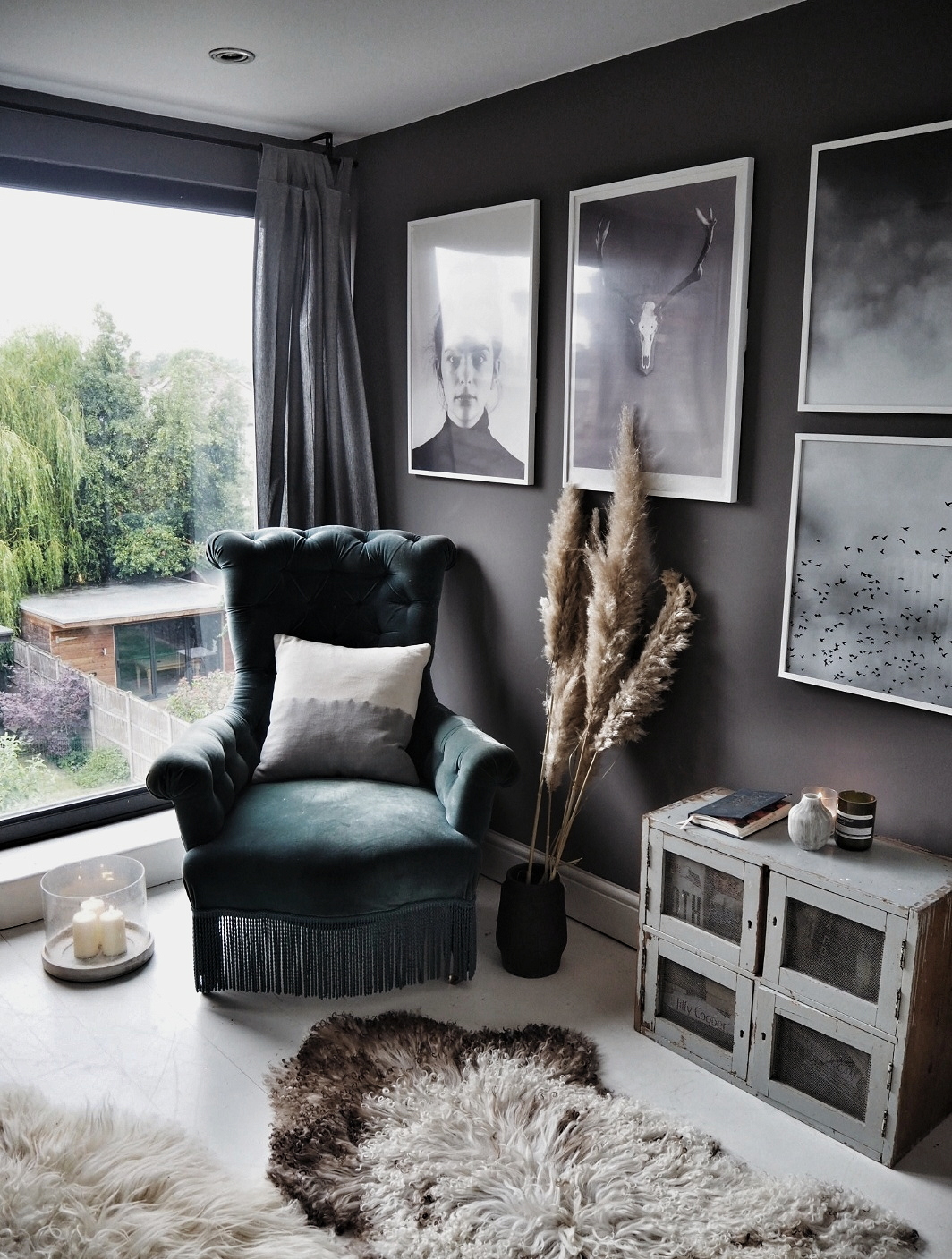
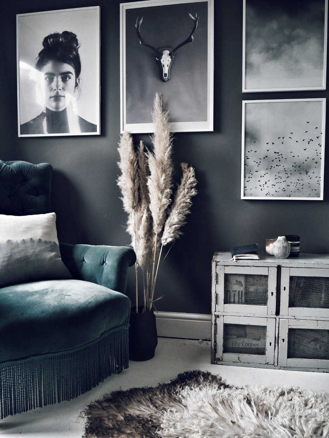
I added a monochrome gallery wall and armchair to this corner to create a separate sitting area within the room

I added a monochrome gallery wall and armchair to this corner to create a separate sitting area within the room

Loft Conversion Room.jpg
Hopefully this picture gives you a feel for how the space fits together

Hopefully this picture gives you a feel for how the space fits together

I am one picture short of a full gallery wall!

I am one picture short of a full gallery wall!

Loft extension 1.jpg
Ideas for loft conversion velux windows

Making the alcove into a walk in wardrobe meant we were able to get rid of the bulky wardrobe, move the radiator that had been under the window to that wall instead and then put the chest of drawers where the radiator had been (still with me?!) On the side of the room where the chest of drawers used to be I have now created a seating area with a vintage armchair and side table and made this area distinct from the sleeping area by painting it a different colour and adding a gallery wall. It makes it feel as if there are two rooms within a room so if you have a large loft space or large and awkward footprint think about the different ways in which you can use the space and how you can decorate to subtly create different zones.

upload.jpg
Velux Loft windows 2.jpg

So there you have it my five top tips for creating a truly instagrammable loft conversion in collaboration with VELUX as part of my paid partnership with them. Thanks to everyone who shared their loft conversion stories and questions with me to help me write this post.