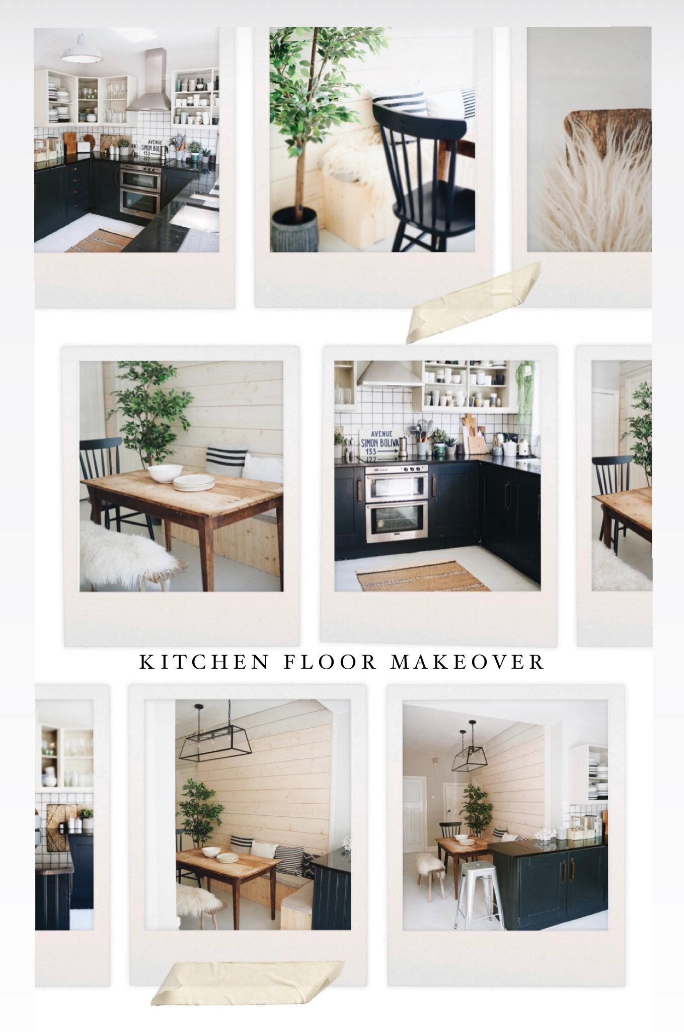
Kitchen/Diner Revamp: Sanding The Floor By Hand

In my last blog post I unveiled the long term renovation plans for our Pebble Dash Princess. However, this week I have an exciting update for you on the shorter term revamp of the kitchen/dining space I have been working on for what may feel like the last millennium.

Sanding the Kitchen Floor

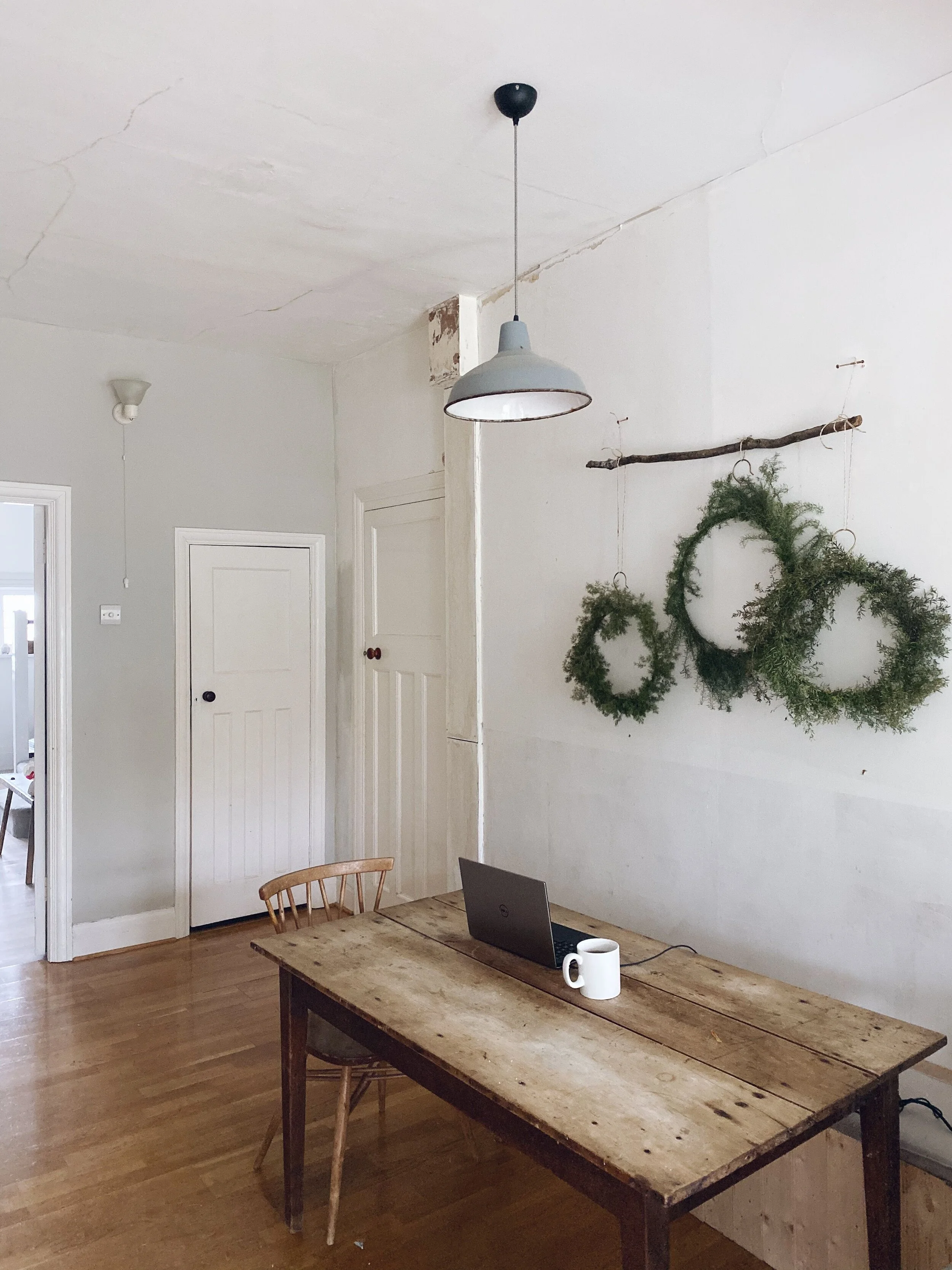
One of the main items on my revamp hit list for this room was the floor. We inherited engineered wooden floorboards that were in pretty good condition but which had an orange varnish that made this Scandi girl wince. In the longer term plan I am hoping to have polished concrete floors throughout the open plan kitchen/living space but, for now, it is sanding rather than concrete mixing on my mind.

The kitchen floor when we came to view the house

The kitchen floor when we came to view the house

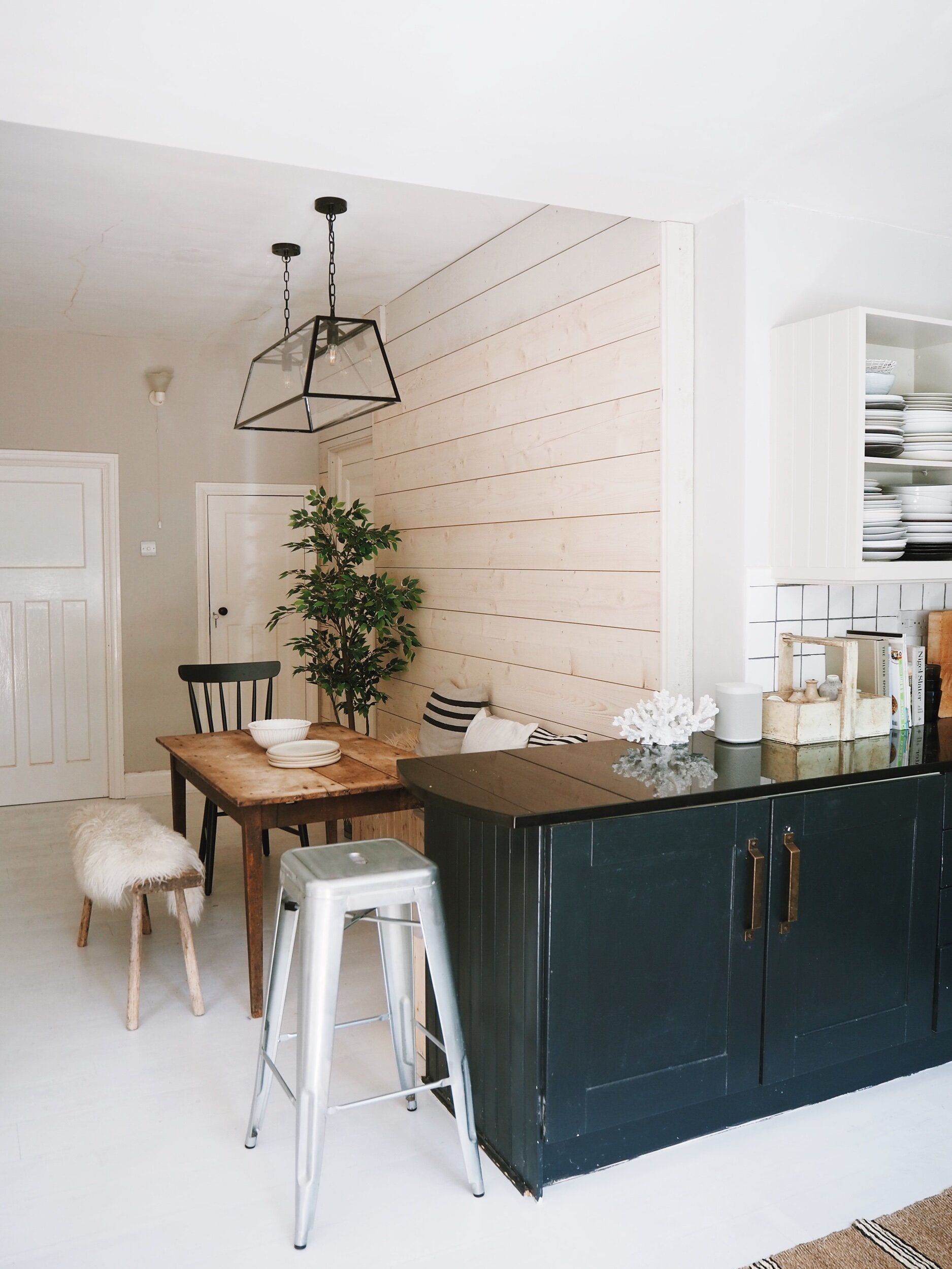
After stage one of the Kitchen/Diner Revamp with a filter applied to take the tango edge off the floor

After stage one of the Kitchen/Diner Revamp with a filter applied to take the tango edge off the floor

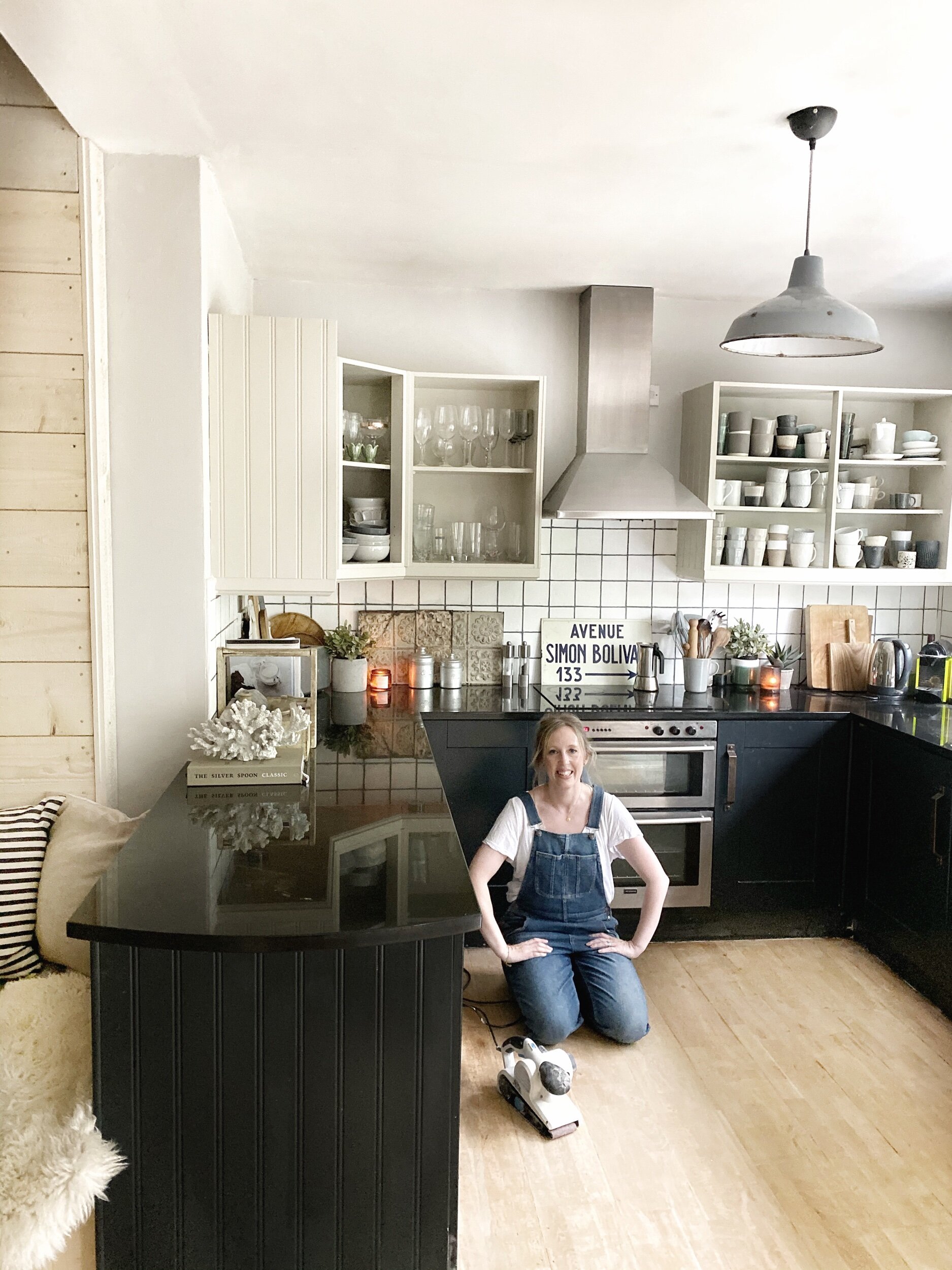
This is not my first brush with David Dickinson floor varnish. We inherited very similar stained floorboards in our old house. On that occasion it was my husband who tackled the tango floor, hiring an industrial sander and then painting them off white. This time round he was less keen to take on the task (perhaps understandably when trapped at home with 3 kids in the midst of a global pandemic). As a result I found myself in Aisle 24 of B&Q on a socially distanced Saturday night, surrounded by power tools, looking as out of place as a nun in Ann Summers.

Like a Nun in Ann Summers I had no idea what I was doing in B&Q’s power tool aisle

Like a Nun in Ann Summers I had no idea what I was doing in B&Q’s power tool aisle

How I Sanded The Floor By Hand

I had decided against hiring a big industrial sander because the space is quite narrow and, quite frankly, it would be like putting Thora Hurd behind the wheel of a double decker bus, After half an hour , and a lot of quizzical looks from men in tool belt trousers in B&Q, I selected a MacAllister belt sander for the job instead. According to Screwfix (not me) they offer a powerful, high speed sanding experience for fast removal of material and are ideally suited for use on large flat surface areas. At £40 it was a cheaper option than hiring the large industrial sander.

Malmo & MacAllister: the belt sanding dream team

Malmo & MacAllister: the belt sanding dream team

There followed many hot dusty nights for Becca and the Belt Sander which satisfyingly stripped off the varnish - albeit creating storm clouds of sawdust in the process. I would definitely recommend a mask and googles for the job and having someone in the house who doesn’t mind following you around with a hoover. I did the most back breaking part of the job but, by the end Mr Malmo took pity on me and got his mouse sander out (not a euphemism) to finish off the edges and corners. If you are sanding a bigger room I would definitely say hiring a big industrial sander would be the better option because it collects the sawdust for you into a vacuum bag as you go along and doesn’t involve you being hunched over the floor in a position resembling a toad going to the toilet.

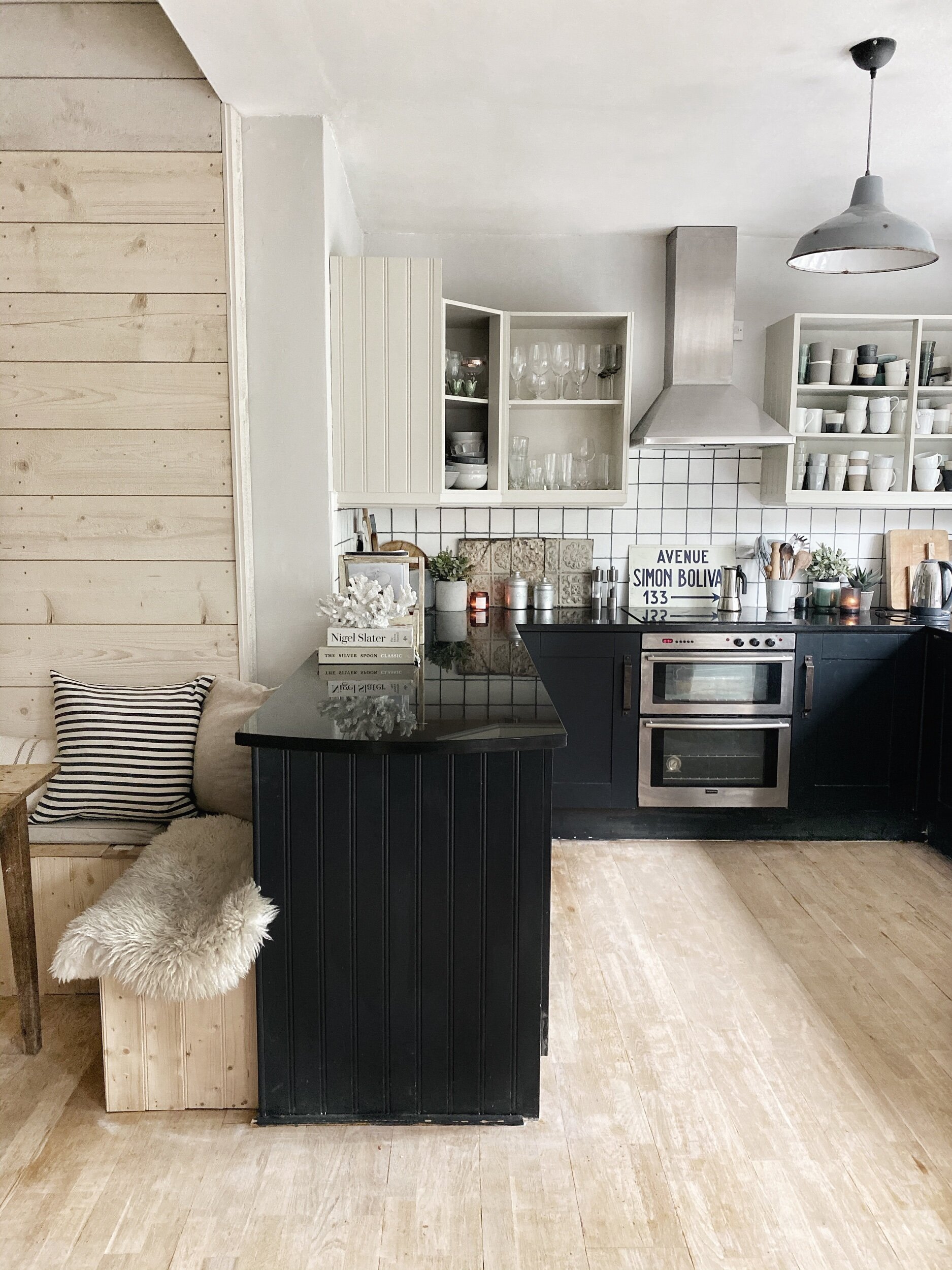
With the worst of the sanding out of the way I became tempted to leave the floors au naturel

With the worst of the sanding out of the way I became tempted to leave the floors au naturel

How To Give Your Floor a Nordic Look

Once the floors were sanded, I had originally been thinking I would paint the floors white but as the varnish came off I really liked the natural floorboards that were revealed so I started to toy with just staining/white washing them to leave them with an au naturel finish. That is what we did in the hallway and living room using Bona Floor Oil in Frosted to create a Scandi flooring effect that I am really happy with.

We used Bona floor oil in Frosted on our hallway and living room floors

We used Bona floor oil in Frosted on our hallway and living room floors

If you are thinking of going down this road some of the other products that people recommended to me to achieve a white washed natural floor feel were Osmo White Tint Oil, Spruce by Treatex, Dinesen White Oil, Woca Softwood Lye and Blanchon Raw.

However, in the end, I went back to my original plan to paint them because, truth be told, the quality of my sanding job was suspect with lots of uneven areas. The paint I chose for the job was Little Greene Portland Stone Mid, which is a great off white option that we have also used on the open shelves in our kitchen. We used a paint brush to do the edges and then a roller for the main areas.

At the moment we have only down one coat so you can still see the grain of the wood

At the moment we have only down one coat so you can still see the grain of the wood

Don’t look too closely at the quality of my cutting in!

Don’t look too closely at the quality of my cutting in!

It has made the kitchen feel so much lighter and brighter

It has made the kitchen feel so much lighter and brighter

37CA754C-2AA9-44A9-BCEC-7DC207026583-47D5CD0D-87DF-4AD5-A269-B0FDDCB76C40.jpeg
I have a new rug on order which is wider for this space

I have a new rug on order which is wider for this space

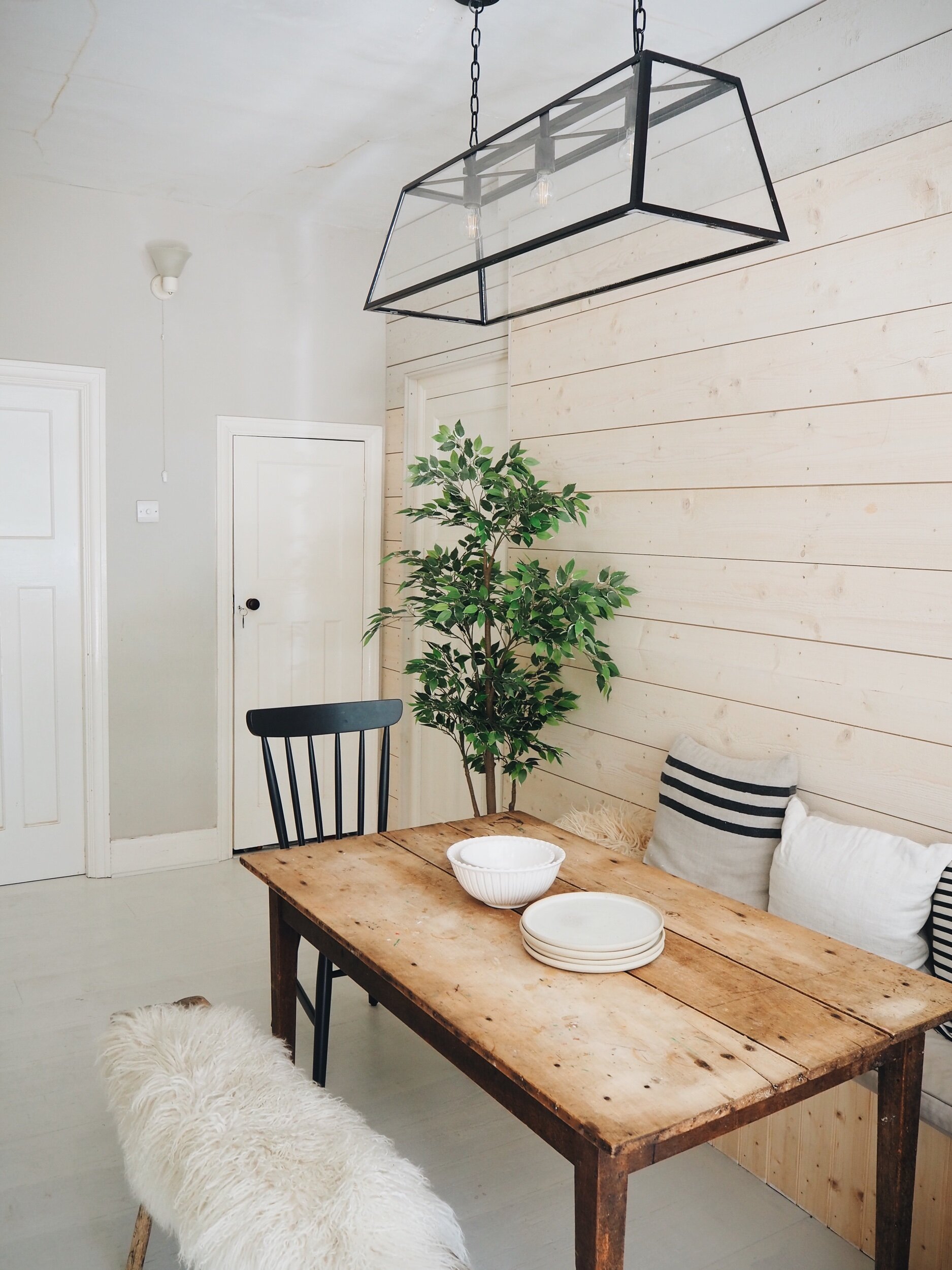
At the moment we have only done one coat as I want to still be able to see the grain of the wood (and because I am lazy and would rather watch Selling Sunset than do a second coat). Although I agonized a lot about painting the floor in the end I am really happy I went for it. The whole room feels instantly bigger, brighter and more spacious.

A3D6FA6C-1952-4F14-863E-9FA4B9D67CA3-4D23823B-ED07-421D-8595-9FF8A2B6AC4D.jpeg
4FB0DAD0-D71C-46E4-9AD8-049FEF953242-6B771667-8827-44DF-84F6-877853EE0D71.jpeg

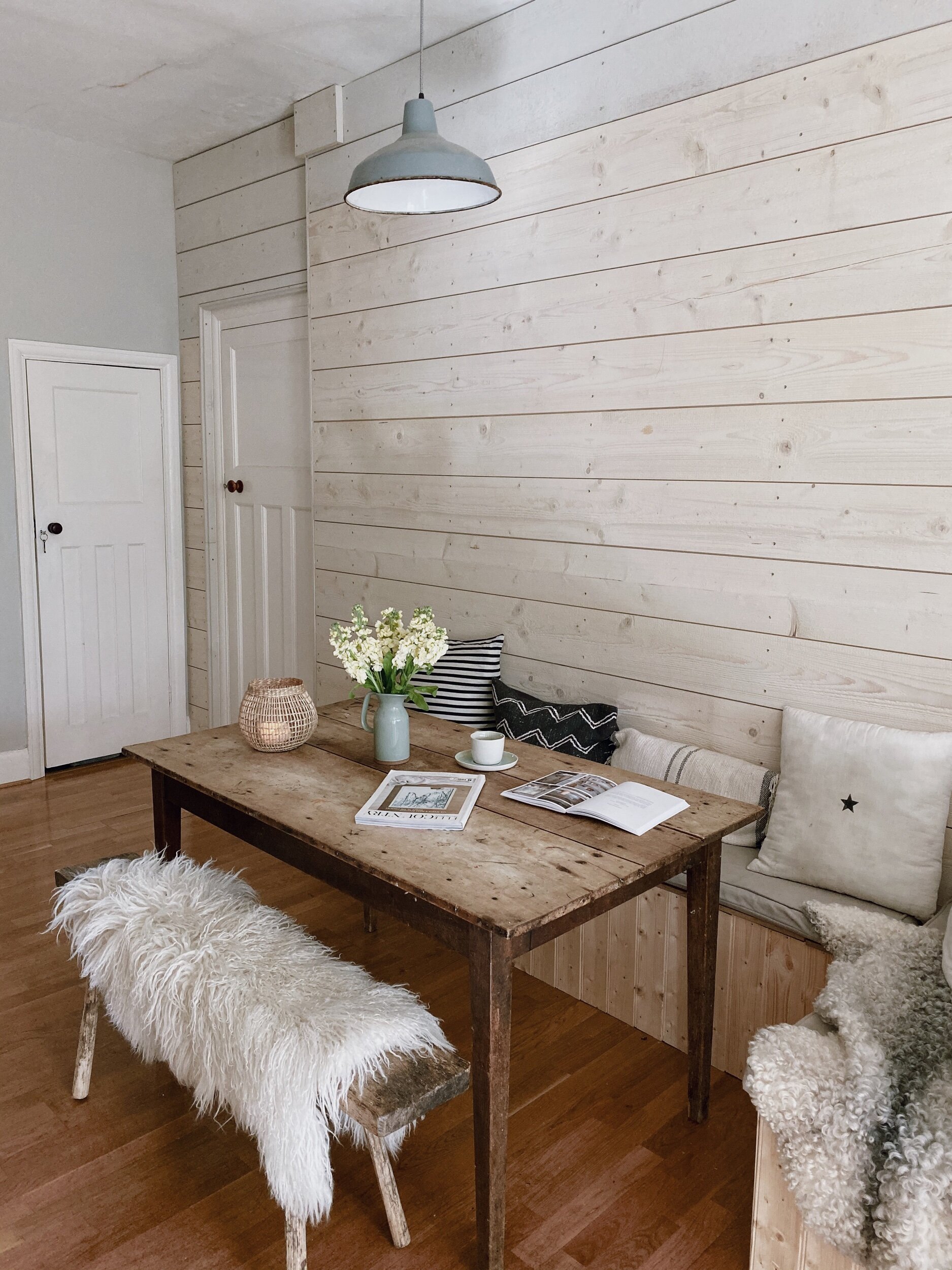
The eagle eyed among you will also spot that there has been another exciting lighting revamp development since last I blogged about the project. The ceilings are pretty high in the dining space so the single pendant light we had hanging over the table before lent the room distinct interrogation cell vibes. I wanted something that would fill more of the space without dangling down into our dinner- and creating a pendant in pasta situation. Step forward the Browning 3 light pendant of my dreams from Neptune. I love the contrast it provides to the cladding and the wooden table and it has really evened up the space.

The Browning 3 light pendant from Neptune is a much better light for this space, I love the slight industrial edge it adds

The Browning 3 light pendant from Neptune is a much better light for this space, I love the slight industrial edge it adds

5BDDC6C8-C88D-4BDE-9560-24E12C3FB77E-6B9FDC62-1FC6-40DB-80DE-B91455479FF4.jpeg
1D2D48BB-29B8-4999-A49D-CC55AE3A0ADA-CC1D4691-0559-4D3A-A118-F55997769542.jpeg

Next stop on the renovation express? The faux crittal door transformation. Prepare to see me wade even further out of my DIY depth with this one!

IMG_8691.png

The Browning Pendant is part of my ongoing collaboration with Neptune on this project

Updating My Kitchen/Diner with Timber Cladding

A couple of weeks ago on the blog I revealed my plans to revamp the second half of our kitchen/dining space.  The project is my lockdown sanity saver – giving me something to focus on other than Twinkl worksheets and how little it turns out I know about how to calculate and teach improper fractions. The space is fairly non descript at the moment meaning I have a blank canvas to work with but it is also quite narrow and doesn’t get much natural daylight so it is potentially a bit of a tricky beast to breathe some Scandi Rustic style into.

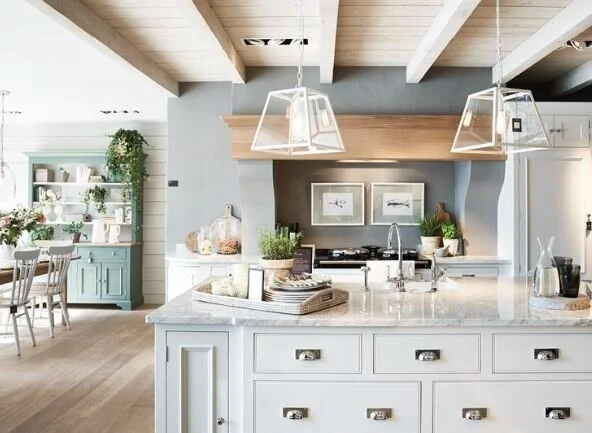
Top left image from Plain English, Top middle, Middle left and Bottom Left images from Neptune

Top left image from Plain English, Top middle, Middle left and Bottom Left images from Neptune

One of my main revamp conundrums is what to do with the wall that I over enthusiastically stripped wallpaper off before Christmas with no real plan as to what to replace it with. In hindsight that gin fuelled decision may have been slightly hasty as the wall below the paper was not in great condition and in its naked state it is currently lending the kitchen more of a 1970s squat than Scandi feel. Over Christmas I added a festive sprinkle to it with three rustic wreaths but with Saint Nicholas having long since returned to the North Pole it is time to find a more permanent solution to the problem.

The wall after my Friday night wall paper stripping frenzy

The wall after my Friday night wall paper stripping frenzy

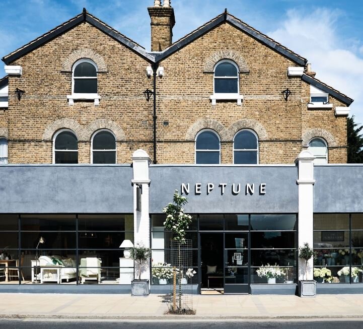
Because the dining space doesn’t really have any distinguishing/interesting features I don’t just want to paint the wall as I feel like it needs something that can help to add (non seventies squat) character and texture to the room.  On a pre-lockdown visit to the Wimbledon branch of Neptune I stumbled across the perfect solution. The ceilings of the store (which is a new build) were clad in a really gorgeous timber with a white washed/grey finish that created my ideal Scandi- Coastal look.  Upon quizzing the store manager (yep I know I have great chat) I discovered that it was in fact Neptune’s own Cranbrook Shiplap cladding which I already had pinned to lots of my Pinterest boards! It is made from Norwegian Spruce (no less) and comes with a silver birch finish but can also be customised to any of the other colours in the Neptune paint range.

Because the dining space is quite narrow and doesn’t get much natural daylight the light wash of the Cranbrook Shiplap cladding is perfect for adding texture without making the space feel gloomy or oppressive.  With Neptune having made all my interior dreams come true by teaming up with me on the revamp I can actually now give you guys a first peek at what it looks like in my house because work had actually begun on installing the cladding before lockdown began ( I was just a little behind on my blog writing and Instagram documentation of the project!)

Goodbye depressing wall hello Cape Cod Clapboard vibes

Goodbye depressing wall hello Cape Cod Clapboard vibes

As you can probably tell from the amount of power tools in the above picture this was a task above my DIY pay grade but if you have a better grasp of a spirit level than I do and wanted to take on a cladding project of your own then the basic principles are pretty straightforward. The first step is to attach batons (hark at me with my technical terms) to the wall to create a frame on which to attach the cladding and then, once this is done, saw the planks to size to fit the wall and affix them to the batons with screws.

Although work had to stop when lock down began so some of the boards still need the silver birch colour wash applied it has made such a huge difference to how the space feels. I can’t wait to get to work painting the floor to take the David Dickinso…

Although work had to stop when lock down began so some of the boards still need a colour wash applied it has made such a huge difference to how the space feels. I can’t wait to get to work painting the floor to take the David Dickinson factor down several notches.

timber clad dining room.jpg

When lockdown is lifted and work can resume all that is left to do is to colour wash the remaining boards with the silver birch finish so that it has a consistent look overall. Hopefully by then I will have also made more progress on the other aspects of the revamp like the painting of the bench seat, floor and other walls so that I can give you a better idea of the final look. However, I already absolutely love how the cladding has transformed the space - it is giving me all the Cape Cod Clapboard feels.

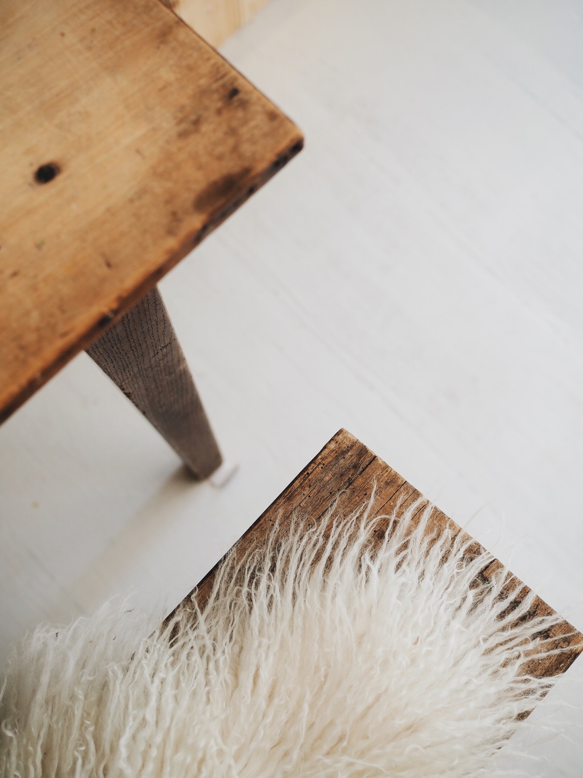
I love the rustic natural feel of the Norwegian spruce boards.  When we do the longer term renovation of the kitchen we will reuse these planks in the utility.

I love the rustic natural feel of the Norwegian spruce boards. When we do the longer term renovation of the kitchen we will reuse these planks in the utility.

montage of cranbrook cladding.jpg

Five Great Ways to Use Timber Cladding to Update your Decor

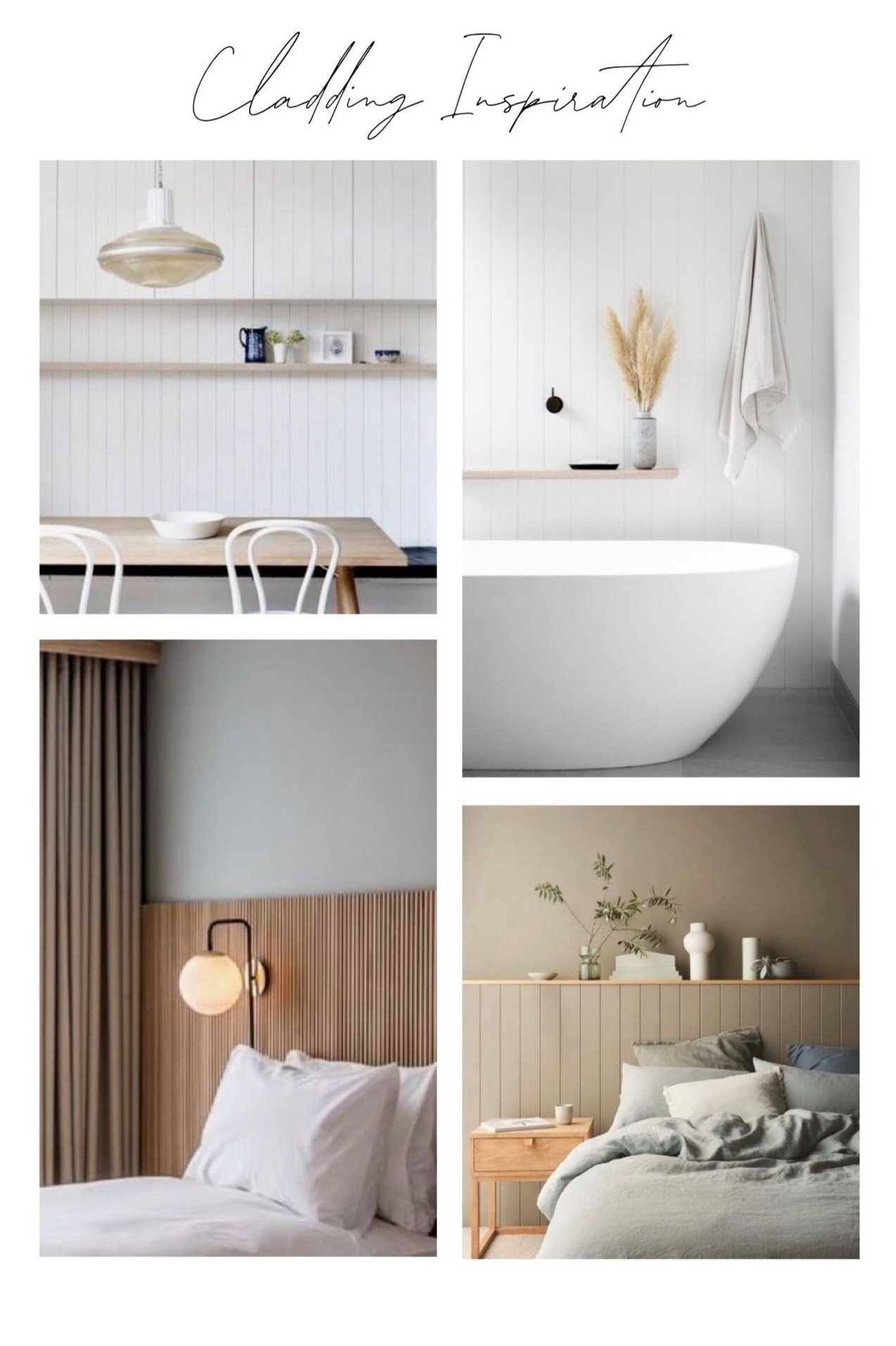
If you fancy taking on a cladding project of your own I have rounded up below some of my favourite ideas for how you can use it in your home. From hallways to bedrooms and lots of rooms in between there are plenty of ideas to get your timber juices flowing. The cladding I have used in our dining space has a rustic appearance but I also love how both more contemporary cladding or traditional tongue and groove style boards can look.

Image Credits. Top left image Domino Magazine, Top Right Project Felix via the Local Project, Bottom Left Mollies Motel and Bottom Right from Remonis
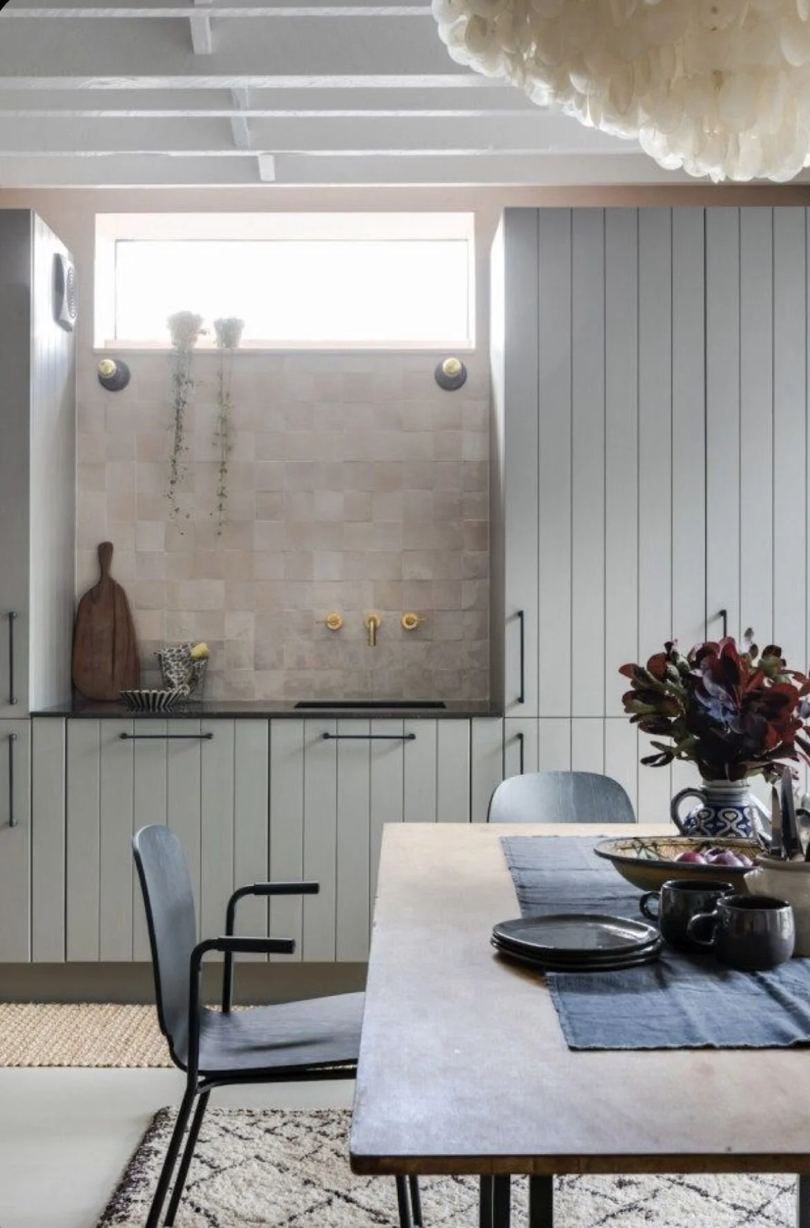
Image Credits. Top left image Domino Magazine, Top Right Project Felix via the Local Project, Bottom Left Mollies Motel and Bottom Right from Remonis

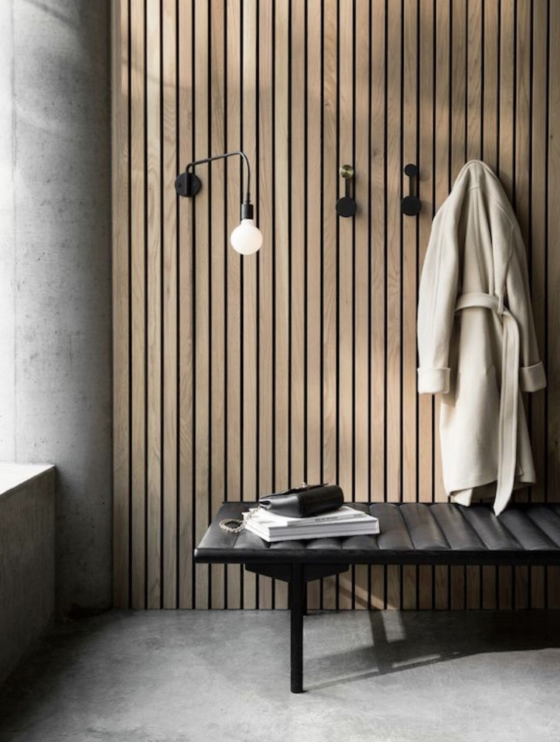
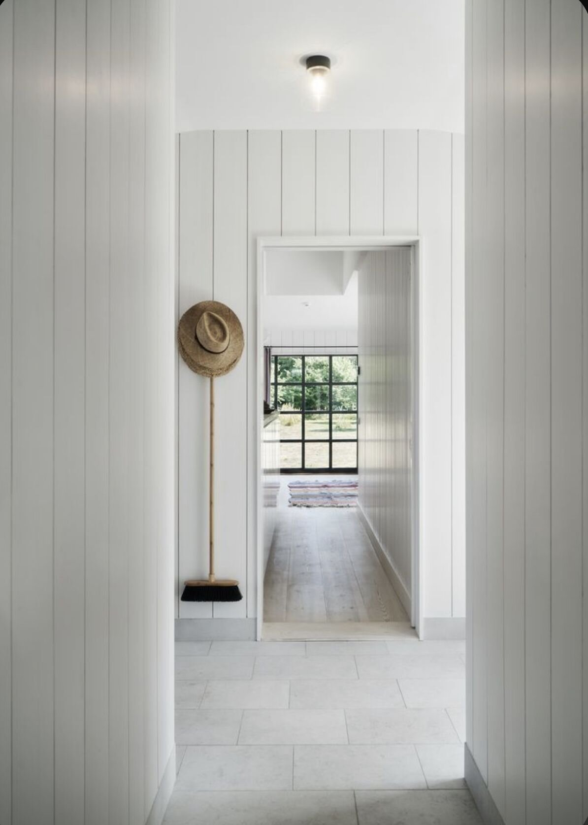
Whilst I ultimately used panelling rather than cladding in our hall it was a very close call because I think cladding can be a really great way to zone a space like a hallway. For example, I love how the contemporary cedarwood cladding in the first picture below has been used to create a backdrop to the pegs. But it can be equally effective if you go bold and clad the entire space

Image Credit Oak House, Derek Swalwell . Pictures below left hand Vosges Paris, right hand M Arkitekur

Image Credit Oak House, Derek Swalwell . Pictures below left hand Vosges Paris, right hand M Arkitekur

When the dining room revamp is done (some time in 2025 judging by my current rate of progress) I have my sights set on updating the wardrobes in our master bedroom and the boys bedroom. They are fitted and although structurally sound I would love to bring them more up to date. I have a whole pinterest board devoted to them (no you are too much fun) and one of my favourite ideas is have new cladding style doors made to fit the carcasses. I absolutely love how Simply Scandi Kate has done something very similar in her bedroom so that it looks like a wall of cladding rather than wardrobes. The blush pink wardrobes below are actually MDF with lines scored into them to make them look like Tongue & Groove.

Image credits Top Image Suzy Hoodless, Bottom left Simply Scandi Kate, Bottom Right

Image credits Top Image Suzy Hoodless

Although we don’t have a kitchen island in our current kitchen (unless you count our jazzy breakfast bar) I think using cladding on an island can be a great way to make it stand out. If you don’t have an island or wanted to keep yours more neutral then you could look to the walls or the cupboards to clad instead. The tongue and groove style cupboards in the kitchen of Imperfect Interiors are some of my favourite on Instagram.
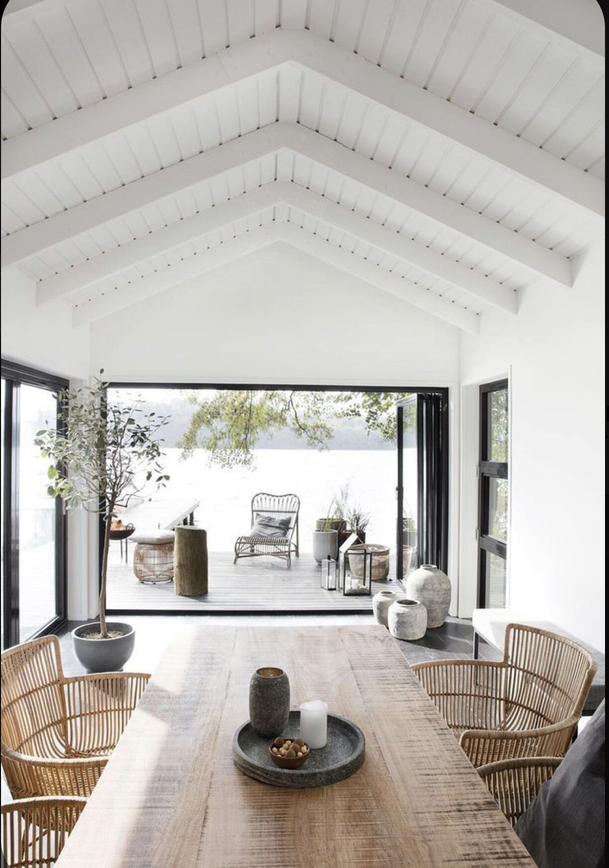
Image credits Main image EST Magazine, Bottom left Gloria.Fi and Bottom Right Imperfect Interiors
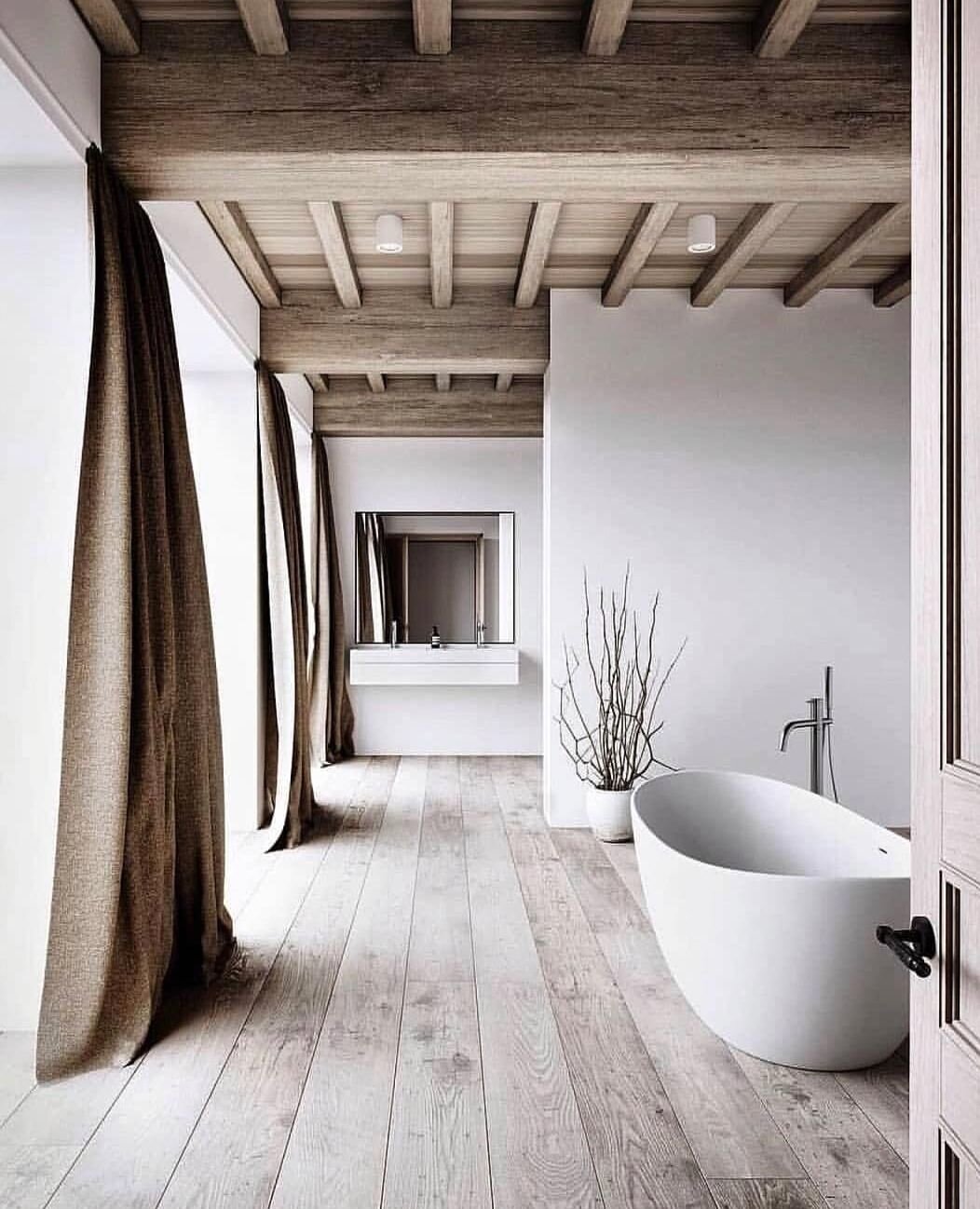
Image credits Main image EST Magazine, Bottom left Gloria.Fi and Bottom Right Imperfect Interiors

There has been a lot of talk about the ceiling being the fifth wall of late and if you can get up there with a drill and some timber without ending up accidentally adding rustic character to your head it is the perfect place for some cladding. I think it looks particularly good in more modern style or new build homes where it can introduce real character and warmth.

Image credits Main Image  M Arkitekur , Bottom left House Doctor and Bottom Right EST Magazine

Image credits Main Image M Arkitekur , Bottom left House Doctor and Bottom Right EST Magazine

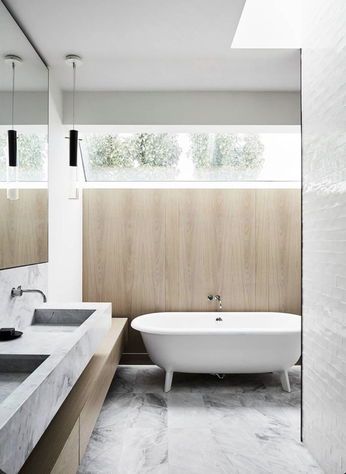
I know not everyone is a fan of wood in a bathroom as they worry about it getting damp and mouldy but we had tongue & grovve pannelling to a half height in our old ensuite and we never had any problem with it. If you are on a budget and want to make use of reclaimed materials then using scaffold boards like in the picture below is a great way to add an industrial edge in an eco friendly way.

Image Credits Main Image Project Felix via the Local Project  Bottom left Unique Home Stays and Bottom Right EST Magazine

Image Credits Main Image Project Felix via the Local Project Bottom left Unique Home Stays and Bottom Right EST Magazine

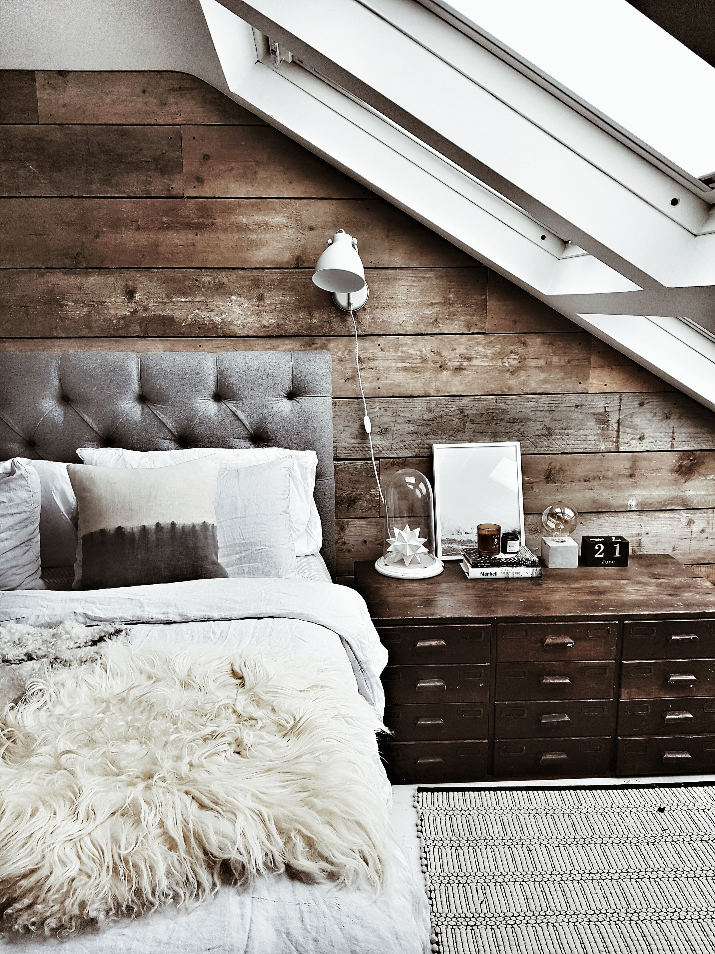
I am a particular fan of using cladding to add texture and interest in loft bedrooms as they can very often feel like bland spaces. Adding a scaffold plank wall to our old loft bedroom was certainly a game changer for me. and using reclaimed boards is an inexpensive and environmentally friendly way to add a statement wall. I also love the idea of using cladding as an inexpensive way to create a statement headboard. If you are after inspiration for this idea when lock down ends then book yourself a night a Mollies Motel where I loved the contemporary cladding headboards in red cedar wood.

Image Credits Main Image Remonis , Bottom Left unknown source Pinterest, Bottom Right Malmo & Moss old bedroom

Image Credits Main Image Remonis , Bottom Left unknown source Pinterest, Bottom Right Malmo & Moss old bedroom

I hope that round up has given you some ideas for creating statement wooden walls in your own homes. With the cladding part of my revamp now almost complete the next task I am planning to tackle is my radiator cover colossus. Brace yourself for big questions coming your way about my best option for minimising its presence in the room!

The Cranbrook Cladding was supplied to me as part of my paid partnership with Neptune